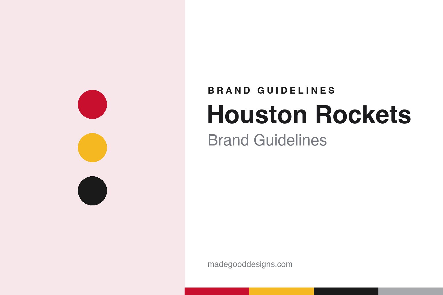
Houston Rockets Brand Guidelines
A name from San Diego that found its home in Space City.
Aa
Two constants: a rocket red, mustard gold and launch black palette and a condensed block sans register. Abstract homage — not a Houston Rockets mark; no logo, jersey or wordmark is reproduced.
A city in motion
Named in San Diego, carried to Houston.
The Houston Rockets began in 1967 as the San Diego Rockets, an NBA expansion team founded by the San Diego sports owner Robert Breitbard. English Wikipedia says the league wanted more clubs in the western United States and chose San Diego for its growth and for the local following of Breitbard’s ice hockey team, the San Diego Gulls. The new team played at the San Diego International Sports Center, which Breitbard also owned.
The name came from the public. According to Wikipedia, a local contest chose “Rockets” as a tribute to San Diego’s civic theme of “a city in motion” and to the local arm of General Dynamics, which was developing the Atlas missile and booster rocket programme. The San Diego colours were green and gold. Wikipedia says the road uniforms carried the city name and the home uniforms the team name, both in serifed block lettering, and that the club’s original logo showed a rocket streaking alongside a basketball, ringed by the team name. That was the only uniform design the team wore in San Diego.
In 1971 the franchise was bought by Texas Sports Investments and moved to Houston before the 1971–72 season. Wikipedia notes that the nickname took on more meaning in a city with a long connection to the space industry. The move changed the colour scheme rather than the design: the club replaced green with red, kept the San Diego layout with the new city name, and adopted a logo of a player with a spinning basketball launching upward on boosters, trailing red and gold flames above the words “Houston Rockets.”
A new logo followed a season later. Wikipedia says that for 1972–73 the Rockets introduced what fans called the “ketchup and mustard” logo: a gold basketball flanked by two red trails, with “Houston” on the upper trail and “Rockets” in black around the ball, all in capitals except a lowercase “e” and “t.” The road uniforms echoed that mixed-case lettering in the city name. In 1976–77 the club changed its uniforms again, setting the lettering in Cooper Black, with white lettering on the road set, the logo on the right leg of the home shorts and the wordmark on the road shorts. Wikipedia says that design, with small changes to the numerals, lasted until 1995.
Ownership changed hands during that period. Wikipedia records that Leslie Alexander bought the Rockets on 30 July 1993.
Colour
A cartoon rocket, then an “R” built for distance.
After the 1995 season the club opted for a modern look. Wikipedia says the team ran a fan contest and chose the idea of the Missouri City artist Thomas Nash: a rocket orbiting a basketball. The Houston designer Chris Hill reworked it, and at the NBA’s suggestion the result followed the cartoon-inspired imagery other teams were adopting at the time, a rocket painted with sharkmouth nose art circling the ball. Wikipedia adds that Nash later sued the club for breach of contract over unpaid contest prizes. Red stayed, but navy blue and silver became the primary uniform colours, with gradient-fading pinstripes, futuristic numerals and side stripes fading from navy to red. That set lasted until 2002–03.
The identity that still anchors the club arrived in 2003–04. Wikipedia credits the Japanese designer Eiko Ishioka, working with Rafael Esquer of the New York studio Alfalfa, with simplified logos and uniforms: Ishioka concentrated on the uniform, Esquer on the logo and a custom typeface. The logo is a stylised “R” shaped like a rocket at takeoff, wrapped in a red orbit that can also be read as the centre circle of a basketball court. Wikipedia says the “R” inspired the new typeface, which Esquer drew so that every digit could be read from a distance, in the arena or on television. Red became the dominant colour again, with silver and black as secondaries.
Alternates explored the club’s history and its space theme. Wikipedia says a red alternate with gold numbers and side stripes recalled the 1990s from 2009, a silver sleeved design of 2015–16 referenced NASA’s Gemini-Titan rocket, another carried the nickname “Clutch City,” and a black alternate appeared in 2016–17. When Nike took over the league’s uniforms in 2017, the side striping was shortened and a City uniform replaced “Rockets” on the chest with Chinese lettering.
The current ownership began in 2017, when, according to Wikipedia, the Houston restaurant owner Tilman Fertitta bought the club. The mascot dates from the 1990s: Wikipedia says Clutch the Bear, a large teddy-bear character, debuted in 1995 alongside an acrobatic mascot named Turbo, and became the sole mascot when Turbo’s performer retired.
Typography
Design and documentation.
A professional basketball logo has to work at very different sizes: as a centre-court graphic seen from the rafters, as a small patch on a shorts leg and as a square icon on a phone. Clubs often keep a family of marks rather than a single emblem, pairing a primary logo with a wordmark, a monogram and a secondary badge that can stand in where space is tight. Redesigns usually adjust that family together, simplifying outlines, thickening strokes and limiting the colour list so the marks print cleanly on fabric and wood.
Uniform patterns carry much of a team’s personality. Pinstripes, side panels, gradient fills and skyline or landscape motifs give a jersey a recognisable silhouette even when the lettering cannot be read. Throwback or “classic” editions revive an older set for a season, often with its original typeface and trim, and they let a club test how fondly a past look is remembered before deciding whether to bring parts of it back permanently. Mascots add a third layer: a costumed character with its own colours and personality gives the identity a playful voice for younger audiences, community events and arena entertainment.
Aa
A condensed block sans — the register of a launch-pad stencil and a scoreboard numeral. (Specimen set in Oswald, a condensed sans STAND-IN; NOT the Houston Rockets logo, typeface or wordmark.)
Houston Rockets
A globe logo, launch panels and the return of red and yellow.
The 2019 refresh began with a secondary mark. Houston’s ABC13 reported on 8 June 2019 that the Rockets had added a new secondary logo that appeared to be inspired by Saturn, adding a basketball and an orbiting ring to the classic logo. Wikipedia says the mark, unveiled on 6 June 2019, depicts a basketball as a planet with “Houston Rockets” on the ring and the “R” at its centre.
The uniforms followed two weeks later. Adam Wexler of KPRC 2 Click2Houston reported on 21 June 2019 that the club had revealed three new uniforms for 2019–20. The red Icon and white Association jerseys introduced a new “Rockets” font that moved away from the previous gothic typeface for a clearer, more streamlined look; side panels that evoke a rocket launch, with propulsion trails at the bottom of the shorts; and black as a core colour, partly because of the popularity of the black Statement jersey introduced in 2016–17. KPRC said the “R” would remain the primary logo, and that the new planet mark was a “global” logo for international use. The same report described a “ketchup and mustard” Classic uniform that repeated the colours and design of the mid-1990s set in current performance fabric, with the original U-shaped neckline and no logo on the waistband.
Later City uniforms kept mining the archive. Wikipedia says the 2019–20 City set took a NASA-inspired space theme; the 2020–21 version used a powder blue base as a nod to the city; the 2021–22 version combined the navy and white pinstripes of the 1995–2003 set, a diagonal “Houston” wordmark and the modern “R”; and the 2023–24 and 2024–25 sets wrote “H-Town” across the chest, the latter in lettering modelled on the 1972–1995 logo. Before the 2026–27 season, Wikipedia says, the Rockets brought red and yellow back as the core scheme, keeping the 2003 “R” with a yellow drop shadow, adding wordmarks based on the 1970s logo and retaining an astronaut character called the “Dunkstronaut” from a City uniform.
For a design guide, the Houston Rockets show how a name chosen for one city’s aerospace industry can become a whole visual vocabulary in another, from orbits and boosters to launch-trail panels. Compare the Houston Astros, the city’s baseball club, and the NBA, the league the Rockets joined in 1967. For this guide we use rocket red, mustard gold and launch black with a sans, an unofficial interpretation; no product or logo is reproduced.
Explore & save
Keep Houston Rockets’s identity on hand — save it to a board in the Made Good inspiration library.
Houston Rockets identity set
Pin the Houston Rockets red, mustard gold and black palette and the condensed block sans register to your own board.