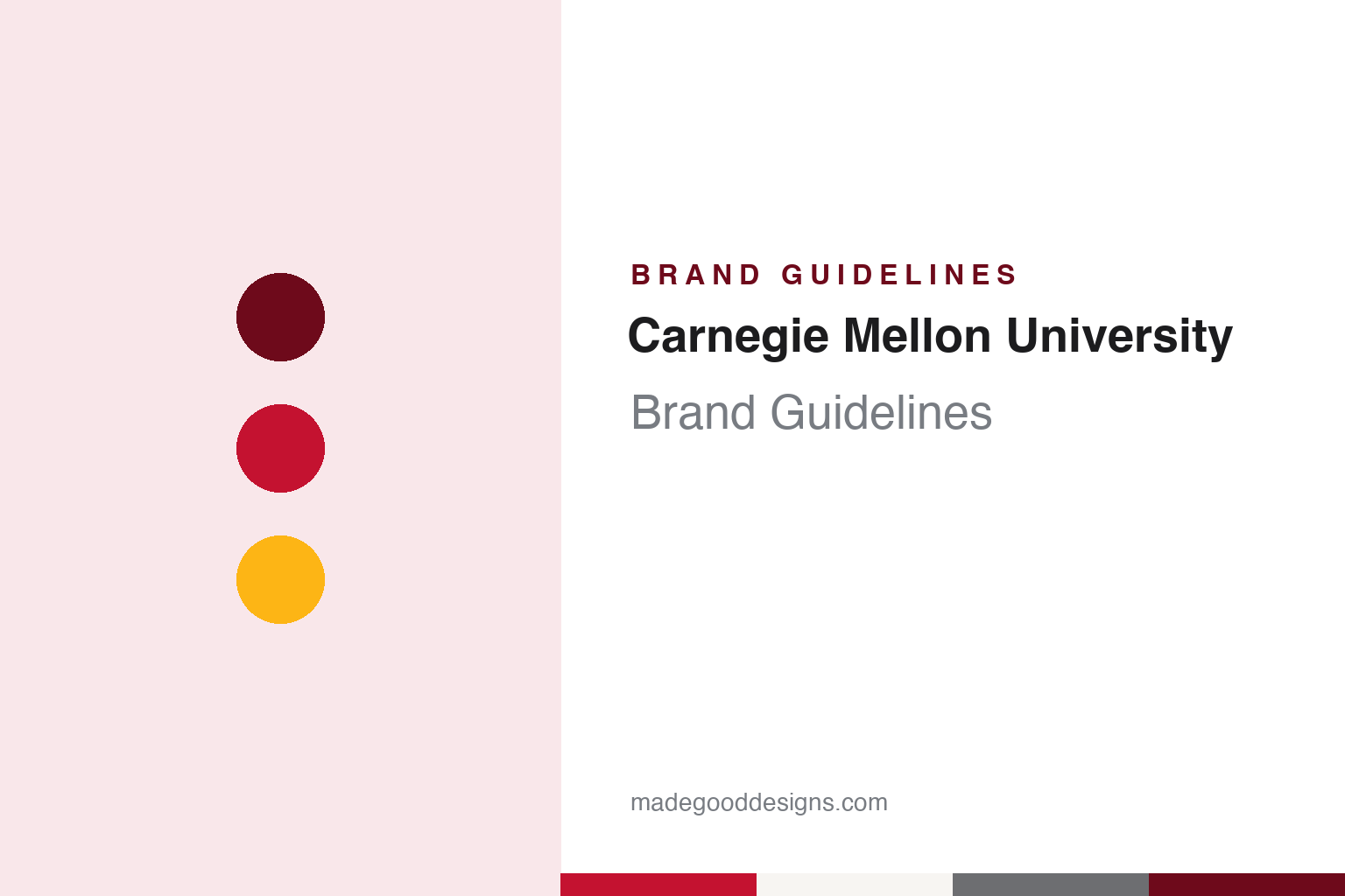
Carnegie Mellon University Brand Guidelines
A steelmaker’s trade school, a banking family’s institute and a terrier in a plaid scarf.
Aa
Two constants: a Carnegie Red and gray palette and a transitional serif register. Abstract homage — not a Carnegie Mellon University mark; no seal, tartan, Scotty or logo is reproduced.
Two names, one university
A trade school from 1900 and an industrial research institute from 1913.
The name joins two Pittsburgh fortunes. English Wikipedia says the institution began in 1900 as the Carnegie Technical Schools, founded by the Scottish-American industrialist Andrew Carnegie as a vocational school for the sons and daughters of working-class Pittsburghers, many of whom worked in his mills. Carnegie took the Pratt Institute in Brooklyn as a model, and when he gave the funds he wrote the line “My heart is in the work”, which the university still uses.
In 1912 the school became the Carnegie Institute of Technology and began granting four-year degrees. At that point, Wikipedia says, it had four constituent schools: fine and applied arts, apprentices and journeymen, science and technology, and the Margaret Morrison Carnegie School for Women. The arts school matters to the brand story, because it gave a technical institute a design faculty from its early decades, and the university’s identity material is still produced with an eye on that mix of engineering and art.
The second half of the name came in 1967. The Mellon Institute of Industrial Research had been founded in 1913 by the banker and industrialist brothers Andrew Mellon and Richard B. Mellon in honour of their father, Thomas Mellon, initially as a department within the University of Pittsburgh. It was incorporated as an independent nonprofit in 1927, and its building on Fifth Avenue was completed in 1937. With support from Paul Mellon, Wikipedia says, the Carnegie Institute of Technology and the Mellon Institute merged in 1967 to form Carnegie Mellon University. The women’s college merged its academic programmes with the rest of the university in 1973.
The double name brings a practical rule with it. The university’s logo guidance asks designers always to include the word “University” so that the institution is distinguished from other organisations called Carnegie or Mellon. That instruction sits alongside a broader Scottish theme that runs through campus life: Wikipedia lists the student newspaper The Tartan, the yearbook The Thistle, Skibo Gymnasium, a Céilidh weekend each autumn for homecoming and the Scottish terrier mascot, and ties the theme to Carnegie’s Scottish birth and the Mellon family’s Scots-Irish ancestry.
Colour
A formal seal, a red square and a hierarchy of six marks.
The university’s published brand site describes a set of six university marks, each with its own job. At the formal end is the University Seal, which the guidelines treat as the formal academic expression of the brand. It is used for diplomas, the highest awards and certificates, presidential and trustee correspondence and official documents. A one-colour version is available for commencement items, gifts, appropriate clothing and environmental graphics, but only in the core palette, while the full-colour seal is reserved for the Office of the President and the Board of Trustees and is not offered for download. The guidelines ask that the seal always stay upright, that its elements never be separated, and that “Carnegie Mellon” remain legible if it is cropped.
For everyday use the University Logo takes over. The brand site calls it the predominant mark and describes the preferred version as a red square carrying a white wordmark set in three stacked lines. Seven other combinations of the core colours are allowed, and nothing else. Designers are told not to build their own version, not to let the square bleed off the edge of a page and not to let a background show through the letters, and the logo is never to be paired with another mark or with text. A minimum width of three-quarters of an inch in print, or 150 pixels on screen, keeps the stacked name readable.
A looser mark sits underneath. The Lettermark, the initials, is described as an informal presence reserved for a close community, and must always come with another clear reference to the university, such as Carnegie Red, the tartan pattern, Scotty or the written name. It may be rotated to run up the spine of a binder or along a shirt sleeve, but the guidelines rule out arcs, curves and diagonals, and warn designers not to drop the final “U”. Wordmarks and a system of unit marks for colleges and departments complete the set, so that every school speaks with the same red and the same letterforms.
Type is set in two open-licence families. The guidelines name Open Sans as the sans-serif, chosen for crisp typography across print, web and mobile, with Helvetica as the fallback, and Source Serif Pro as the serif for a more traditional feel, with Times as the fallback. Additional typefaces are allowed only on rare thematic occasions.
Typography
Seals, tartans, colours and mascots.
Technical universities tend to build their identities from a small, durable kit: a formal seal or shield for diplomas and ceremonies, a wordmark for everyday communication, a short list of official colours, and a separate family of athletic marks that carries the same colours onto uniforms, courts and stadium walls. Because engineering and science schools often grew out of trade institutes or land-grant charters, their earliest symbols tend to be practical rather than heraldic, and later identity programmes usually tidy those older marks rather than replace them.
Colour does much of the work. Two-colour schemes, frequently a metallic gold paired with a dark neutral or a saturated red, are fixed by name long before they are fixed by number, so modern guides translate a traditional colour into print, screen and thread specifications. Some campuses add a registered tartan, which turns a colour story into a woven pattern for scarves, pipe bands and graduation regalia.
Mascots extend the system into three dimensions. Costumed characters, live animals and restored vehicles, from vintage cars to locomotive replicas, appear at games and parades, and each one is usually governed by its own usage rules alongside the logo, so that a single colour pair and a consistent letterform hold the whole family together.
Aa
Transitional serif capitals — the register of a diploma and a library spine. (Specimen set in Source Serif 4, a serif STAND-IN; NOT the Carnegie Mellon University logo.)
Carnegie Mellon University
One red, a tartan cut into swatches and a Scottish terrier.
The colour is fixed to the number. The brand site lists Carnegie Red as hex #C41230, PMS 187 C, and says it should be a standout colour; the core palette adds black, Iron Gray (#6D6E71), Steel Gray (#E0E0E0) and white, and it must be used for external collateral, uniforms, vehicles and signs. A secondary Tartan Palette draws its tones from the threads of the cloth, among them Scots Rose, Gold Thread (#FDB515), Green Thread, Teal Thread and Blue Thread, while a Campus Palette takes softer tones from the buildings, such as Machinery Hall Tan.
The tartan itself is treated as a design element. The guidelines describe the tartan pattern as representing different thoughts, interests and backgrounds coming together, offer it only as supplied files, and refer to the original wool fabric from the Carnegie clan, which can be bought through the University Store but not downloaded. Designers are told to show every thread colour when cropping, never to crop it so that it looks like a different tartan, never to use two tartans together, and to fade the full-colour version into a colour called Weaver Blue. The varsity teams are known as the Tartans, and the athletics mascot mark combines a mascot shield, the wordmark and the word “Tartans”.
The dog arrived as an official mark in 2007. The Pittsburgh Post-Gazette reported on 10 November 2007 that the university released the image of its official mascot that day, during a football game against Washington and Lee University: a Scottish terrier wearing a plaid scarf, set inside a shield. The paper said a Mascot Identity Task Force had been formed in November 2006 and chose the terrier after surveys and a town meeting, and noted that Andrew Carnegie owned a Scottish terrier. A university news page from that autumn says the task force worked with the mascot design firm SME Branding, that the graphic showed the terrier in profile, and that a costume was expected in the 2008 spring semester. The mascot is called Scotty.
For a design guide, Carnegie Mellon University shows how one exact red, a woven pattern and a disciplined family of marks can carry a double name. Compare it with MIT and the Stanford guide. For this guide we use Carnegie Red, Iron Gray and Gold Thread with a serif, an unofficial interpretation; no product or logo is reproduced.
Explore & save
Keep Carnegie Mellon University’s identity on hand — save it to a board in the Made Good inspiration library.
Carnegie Mellon University identity set
Pin the Carnegie Mellon University Carnegie Red, Iron Gray and Gold Thread palette and the transitional serif register to your own board.