Tour de France Brand Guidelines
A newspaper stunt from 1903 that dressed its leader in the colour of its pages.
Aa
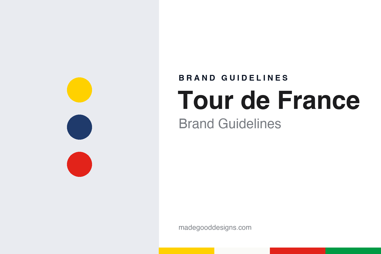
Two constants: a yellow, navy and red palette and a brush script register. Abstract homage — not the Tour de France logo, jerseys or any trade mark; no logo is reproduced.
Montgeron
A circulation war, a meeting in 1902 and a start outside a café.
The Tour de France was a newspaper’s promotion. English Wikipedia says the race was created in 1903 to increase sales of L’Auto, a sports daily set up in 1899 by journalists and businesspeople including Comte Jules-Albert de Dion, Adolphe Clément and Édouard Michelin. The paper was a rival to Le Vélo, and its founders appointed Henri Desgrange, a cyclist who co-owned the velodrome at the Parc des Princes, as editor.
The idea came from the cycling desk. Wikipedia says L’Auto was selling fewer copies than it had hoped, and that at a crisis meeting on 20 November 1902 at the paper’s Paris office, its chief cycling journalist, Géo Lefèvre, proposed a race of the six-day type then popular on the track, but run around France. The race started on 1 July 1903 almost outside the Café Réveil-Matin in the village of Montgeron, south of Paris, with stops planned in Lyon, Marseille, Bordeaux and Nantes before the return to the capital.
The race outlived the paper. Wikipedia says the Tour was not held from 1915 to 1918 or from 1940 to 1946 because of the two world wars. Desgrange’s deputy Jacques Goddet took over in 1940. In 1944 L’Auto was closed and its assets, including the Tour, were taken by the state over articles judged too close to the German occupiers; Goddet was allowed to publish a new daily sports paper, L’Équipe, which Wikipedia describes as L’Auto’s successor.
Today the race is organised by Amaury Sport Organisation, the company Wikipedia names as the organiser that host cities pay to stage the Grand Départ. The format has settled into three weeks in July, with time trials, stages through the Pyrenees and the Alps, and, from 1975, a finish on the Champs-Élysées in Paris, a tradition Wikipedia says was broken only in 2024.
The race’s name has itself been edited. Creative Bloq reported in August 2019 that the logo used that summer dropped the article “Le,” leaving “Tour de France,” although the event was still called Le Tour on its own social channels.
Colour
An armband, a colour from newsprint and a set of jerseys.
The race’s colour came from paper. Wikipedia says the leader of the 1903 race wore a green armband, and that the yellow jersey, or maillot jaune, was added for the 1919 edition, its colour chosen because L’Auto was printed on yellow paper. The rider who wore it on its debut was Eugène Christophe. Mental Floss gives the same account as the race’s official story: with the race revived after the war, Desgrange wanted the leader to be easier for spectators and rivals to see, the armband had not worked, and a yellow jersey would both mark the leader and advertise the pale yellow pages of the paper he edited.
There is a competing claim. Mental Floss says the Belgian rider Philippe Thys later said Desgrange had asked him to wear a coloured jersey as early as 1913, which would put the idea before the war; the 1919 date remains the race’s own account.
Other jerseys followed, each with its own colour code. Wikipedia says the mountains classification was added in 1933, but its leader had no distinctive jersey until 1975, when the organisers chose a white jersey with red dots, known in English as the polka-dot jersey. The points classification arrived in 1953, the Tour’s fiftieth anniversary year; its original sponsor, the lawn-mower maker La Belle Jardinière, made the jersey green. Wikipedia says the jersey turned red in 1968 to please a sponsor and went back to green the following year. A white jersey for the young rider classification was introduced in 1975, though it was not awarded between 1989 and 2000.
Wikipedia says the team classification has no jersey, but since 2006 the riders of the team heading it have worn black-on-yellow race numbers, and since 2012 yellow helmets; until 1990 they wore yellow caps. The rider in last place overall is called the lanterne rouge, after the red light at the back of a vehicle, and in past years sometimes carried a small red lamp under the saddle.
The result is a colour system tied to the classifications: yellow for the overall leader, green for points, red dots on white for the mountains and plain white for young riders.
Typography
Yellow, green, dots and white.
A league or event identity has to work at sizes a single club badge rarely meets. The same emblem may sit on a sleeve patch, a corner flag, a ticket, a mobile app icon and a screen graphic in the corner of a live broadcast, often within the same afternoon. That pushes designers toward simple silhouettes, a limited set of colours and a wordmark that stays readable when it is shrunk to a few pixels or stretched across a stand.
Title sponsorship adds a second layer. When a company buys naming rights, its name is set beside or inside the competition mark, and the lock-up has to change when the contract ends. Organisers often keep a core symbol stable and treat the sponsor line as a replaceable module, so that kits, signage and graphics can be updated without redrawing the whole system.
Trophy imagery is a third resource. A cup, plate or shield is a recognisable shape, and some identities borrow its outline for the emblem itself. Broadcast graphics then extend the system with score bugs, line-up cards and motion templates, which is where a custom typeface or a strict grid tends to show its value.
Aa
A loose brush script — the register of a hand-painted road sign and a finish-line banner. (Specimen set in Kaushan Script, a script STAND-IN; NOT the Tour de France logo.)
Tour de France
A brush script, a yellow wheel and a rider in the letters.
The logo is a typographic picture. Creative Bloq wrote in July 2017 that the current mark was created by the French designer Joël Guenoun in 2002, in a playful brush script, with a splash of yellow that reflects the yellow jersey. Within the word “Tour” the letters form a small sketch of a cyclist: the yellow circle is the front wheel and the “r” is the rider. The magazine said the logo was introduced in 2003 for the race’s hundredth anniversary, with a grey “100e” beneath and the “e” set over the last letter of “France” to suggest a drop shadow, and that the main part of the mark was kept after the anniversary.
What it replaced was plainer. Creative Bloq described the previous logo as blue and white sans-serif capitals ringed by lines meant to evoke bicycle spokes, and a more colourful version used from 2000 to 2003 with the year added in red italics.
The mark was refined in 2019. Creative Bloq reported in August that year that a new version, designer not named, kept the hand-drawn script but made the “o” a full circle, so it reads more as a wheel, gave the “u” more room, made the rider in the “r” easier to see, and moved the “de” so the logo was less likely to be read as “Le de Tour France.” The “Le” was dropped, a TM symbol was added, and the yellow circle, which had leaned towards orange, was brightened to match the jersey more closely. The magazine noted that the same bright yellow ran across the wider race identity that year.
Host cities design their own layer. Creative Bloq wrote in 2017 that the Grand Départ often takes place outside France and that each start town brands it: Utrecht’s 2015 identity, by the agency Total Identity, set a red triangle taken from the city’s coat of arms beside a yellow circle standing for the start of the Tour and a rotating tricolour that alternated between the Dutch and French flags.
For a design guide, the Tour de France shows how a colour taken from a newspaper’s stock became a jersey, then a wheel inside a wordmark. Compare Formula 1, which rebuilt its own mark in 2017, and the Olympic Games, where host cities also design around a fixed symbol. For this guide we use jersey yellow, Tour navy and climber red with a brush script, an unofficial interpretation; no product or logo is reproduced.
Explore & save
Keep Tour de France’s identity on hand — save it to a board in the Made Good inspiration library.
Tour de France identity set
Pin the Tour de France yellow, navy and red palette and the brush script register to your own board.