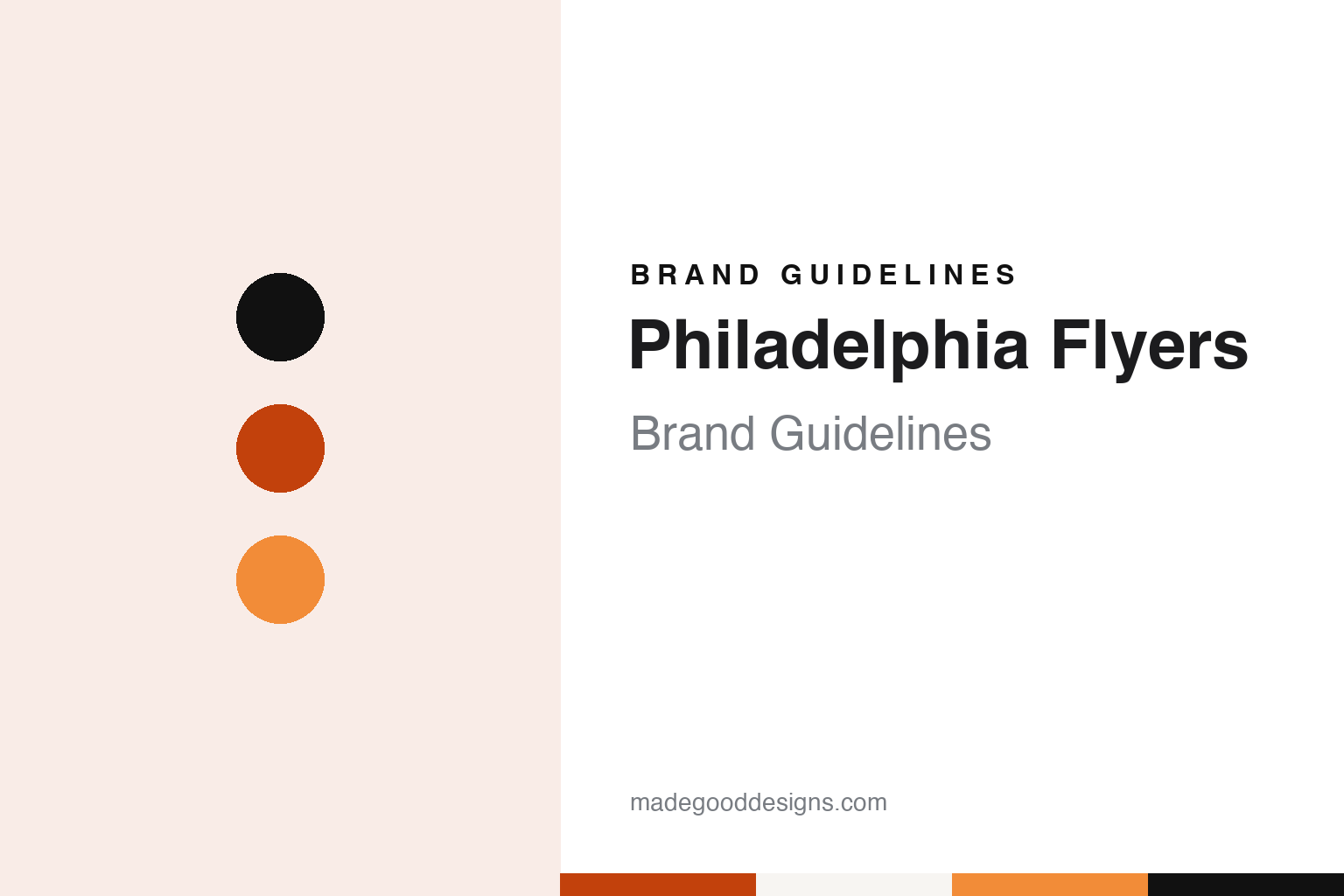
Philadelphia Flyers Brand Guidelines
A contest name, a winged P and a fuzzy orange mascot, in orange and black.
Aa
Two constants: a Broad Street orange, flare orange and puck black palette and a condensed sans register. Abstract homage — not a Philadelphia Flyers product or mark; no crest, sweater or logo is reproduced.
Broad Street
A contest, a sister and a name that fit.
The Philadelphia Flyers are one of the six clubs added to the National Hockey League in its 1967 expansion, and the second NHL team to represent the city after the Philadelphia Quakers of 1930–31. The franchise grew out of an idea of Ed Snider, then an executive with the Philadelphia Eagles. An Associated Press obituary carried by 6abc.com on 11 April 2016 said Snider had arrived in Philadelphia in 1964 as a part owner of the Eagles, petitioned the league when it decided to grow beyond its original six teams, and was awarded an expansion club in 1966. The Flyers took the ice in October 1967.
English Wikipedia says Snider formed his bid group with Bill Putnam, Jerome Schiff and the Eagles owner Jerry Wolman. On 4 April 1966 Putnam announced a name-the-team contest and, in the same breath, the club’s colours. Details followed on 12 July 1966: ballots were handed out at Acme Markets grocery stores, the contest’s sponsor. Wikipedia lists names considered behind the scenes, among them Quakers, Ramblers and Liberty Bells; the first two had belonged to earlier Philadelphia hockey teams, and Liberty Bells was already the name of a local racetrack.
The name that won came from inside the family. Wikipedia says Snider’s sister Phyllis suggested “Flyers” on the way back from a Broadway play, and that Snider liked how it captured the speed of the game and sounded alongside “Philadelphia.” The name was announced on 3 August 1966. A drawing among the contest entries that had proposed it produced a winner from Narberth, Pennsylvania, whose ballot had spelled it “Fliers.”
The club’s first home was the Spectrum on Broad Street, which it used from 1967 until 1996. The AP obituary said Snider took control of the Spectrum in 1971 and three years later set up Spectacor, a management company that controlled the Flyers and the arena. The Broad Street address gave the team the nickname “Broad Street Bullies,” which Wikipedia traces to a headline in the Philadelphia Bulletin on 3 January 1973. The team later moved across the parking lots to a new arena opened in 1996, the building known today as Xfinity Mobile Arena.
Snider remained the public face of the club for five decades. The AP reported that he died on 11 April 2016, and quoted the Snider family describing the Flyers as “the team he created 50 years ago.”
Colour
Hot colours, and a P with wings.
Orange came first. Wikipedia says Putnam wanted what he called “hot” colours, and that his choice of orange, black and white drew on the orange and white of his alma mater, the University of Texas at Austin, and on the orange and black of the Quakers, Philadelphia’s earlier NHL team. The colours were announced with the contest, months before the club had a name.
With name and colours fixed, the club turned to an advertising agency. Wikipedia says the Philadelphia firm Mel Richman Inc. was hired to design a logo and a jersey, with Tom Paul leading the project, and that the artist Sam Ciccone drew both. His brief was speed. The mark he produced is a slanted capital P with four stylised wings trailing from it and an orange dot standing in for a puck; Wikipedia says it was preferred over his other sketches, one of which showed a winged skate. The same encyclopedia says the winged P has been kept since the first season, with only small changes to the shade of orange.
Ciccone’s sweater carried the idea onto the body. The original home jersey was orange, with a white stripe running over each shoulder and down the arm to suggest wings, and the away jersey was white with orange striping. Wikipedia says this basic look lasted until the end of the 1981–82 season. Second-generation sweaters for 1982–83 widened the stripes and edged them in black, and a black jersey of the same design arrived as a third uniform in 1997–98 before becoming the main dark sweater in 2000. A 2002–03 orange alternate broke the pattern with new striping, new lettering, a three-dimensional metallic version of the logo and silver-grey trim; it was retired after 2006–07.
The club has used its history as a design library since then. Wikipedia lists an orange third jersey in 2008–09 based on the 1973–74 sweater, white throwbacks for the 2010 Winter Classic at Fenway Park, a cream-trimmed orange sweater with a lace-up neck for the 2012 Winter Classic, and a white 50th-anniversary jersey for 2016–17 with gold numbers, gold borders on the logo and the founding season written inside the neckline. For two seasons from 1981–82 the Flyers also wore Cooperalls, full-length hockey trousers, before the league barred them.
Typography
Design and documentation.
A hockey sweater carries its identity in a few fixed places. The crest sits large on the chest, where it has to read from the upper rows of an arena and on a television screen at the same time, so club marks are often built from bold, simple shapes with thick outlines that hold up when stitched in twill. Shoulder patches add a secondary mark, and the numbers on the back and sleeves follow their own lettering style, which often echoes the wordmark.
Colour changes are the clearest signal of a new era. A club that swaps one palette for another usually reworks the crest, the striping on the sleeves and hem, the helmets and the arena dressing together, because the colours have to match across every surface fans see. Third jerseys give teams room to test an alternate mark or a throwback palette without retiring the main identity, and several alternates have later been promoted to the primary set.
The ice itself is part of the system. Centre-ice logos are painted under the surface along with the lines, and the boards, banners and scoreboard graphics repeat the same marks, so a redesign reaches far beyond the sweater.
Aa
A condensed sans — the register of block sweater numbers and arena signage. (Specimen set in Oswald, a condensed sans STAND-IN; NOT the Philadelphia Flyers logo.)
A new era of orange
Burnt orange returns, and a mascot found in the walls.
The most recent full redesign came with a change of leadership. Wikipedia says that after the 2022–23 season the club rebuilt its front office and paired the change with new uniforms, branded a “New Era of Orange.” The sweaters returned to the burnt orange worn on the 1984–2007 uniforms, with wider shoulder and sleeve stripes, single-colour sleeve numbers, a black stripe at the hem and a contrasting nameplate, all drawn from earlier Flyers looks. A black alternate first worn at the 2017 Stadium Series stayed in rotation.
The Associated Press, in a story by Dan Gelston carried by 6abc.com on 5 October 2018, said the Flyers unveiled Gritty on 24 September 2018, and that their only previous mascot, Slapshot, had lasted a single season in 1976. The AP said the team’s marketing staff decided to build a mascot programme after watching other clubs’ characters at the 2016 All-Star Game in Nashville, and took advice from Dave Raymond, the consultant who originally performed the Phillie Phanatic. Joe Heller, the Flyers’ vice-president of marketing, told the AP that no animal or person seemed to fit what a Flyer would be. The club looked at more than a hundred options before settling on a sketch by the freelance designer Brian Allen of Flyland Designs, who said the club picked “a big dumpy monster” from his early drawings. Character Translations, a costume maker outside Philadelphia, built the suit, and the name came from team president Paul Holmgren. The club’s story is that Gritty was found during renovations at the arena.
Ownership has sat inside a larger company since the 1990s. The AP obituary said that in 1996 Snider merged Spectacor with Comcast Corp., bringing together the Flyers, the 76ers, the Philadelphia Phantoms and both arenas; Snider served as chairman of the resulting Comcast-Spectacor, and the company sold the 76ers in 2011. The Flyers remain part of Comcast Spectacor, and the arena they share with the 76ers now carries the Xfinity Mobile name of Comcast’s wireless brand.
For a design guide, the Philadelphia Flyers show how a colour scheme chosen before a name, a single winged letter kept since 1967 and a mascot built as a character rather than an animal can carry one idea of speed through every uniform cycle. Compare it with Philadelphia 76ers, the basketball club that shared the same owner and arenas, and Pittsburgh Penguins, Pennsylvania’s other 1967 expansion club. For this guide we use Broad Street orange, flare orange and puck black with a sans, an unofficial interpretation; no product or logo is reproduced.
Explore & save
Keep Philadelphia Flyers’s identity on hand — save it to a board in the Made Good inspiration library.
Philadelphia Flyers identity set
Pin the Philadelphia Flyers Broad Street orange, flare orange and puck black palette and the condensed sans register to your own board.