Dallas Stars Brand Guidelines
A northern name cut to fit Texas, then a D inside a star, in Victory Green and silver.
Aa
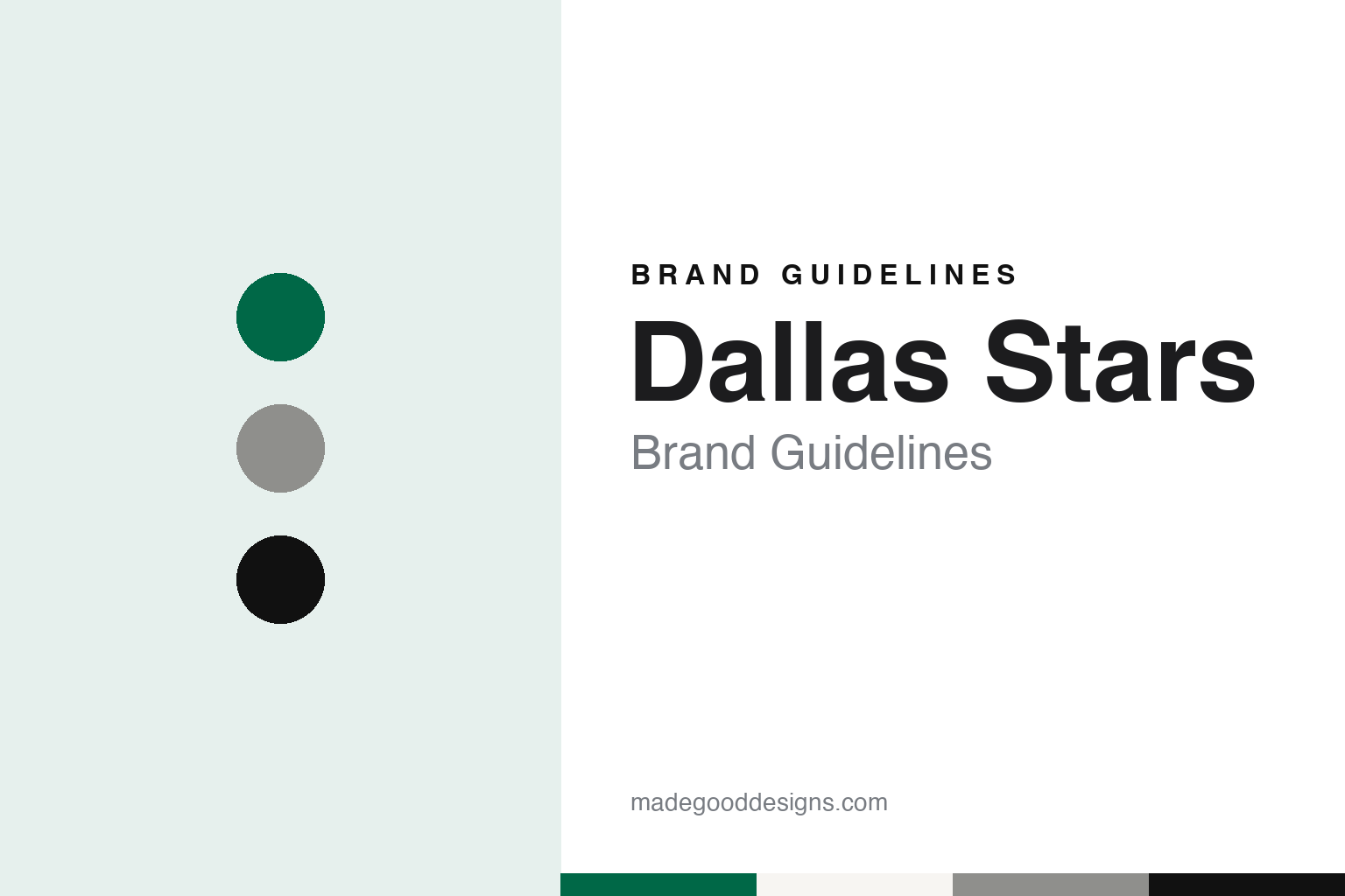
Two constants: a Victory green, star silver and night black palette and a condensed sans register. Abstract homage — not a Dallas Stars product or mark; no crest, sweater or logo is reproduced.
From the North Star State to the Lone Star State
A franchise that kept its name by dropping one word.
The Dallas Stars began in Minnesota. An entry from MNopedia, the online encyclopedia of the Minnesota Historical Society, republished by MinnPost on 13 January 2020 and written by Alex Tieberg, says the NHL chose Minnesota for one of its new franchises on 9 February 1966, on condition that the investors build a new arena. That condition produced the Metropolitan Sports Center in Bloomington, and the Minnesota North Stars played their first home game there on 21 October 1967. English Wikipedia says the club was part of the league’s six-team expansion of 1967.
The franchise changed shape more than once before it left. Wikipedia says that in 1978, with both clubs struggling, the league allowed the North Stars to merge with the Cleveland Barons, owned by George and Gordon Gund, and the merged team continued as the North Stars under the Gunds. When the Gunds asked to move the team to the San Francisco Bay Area in 1990, the league instead gave them an expansion club, the San Jose Sharks, and the North Stars were sold to a group in which the businessman Norman Green eventually took control.
The MinnPost entry says that when the Metropolitan Sports Facilities Commission refused Green’s plan to improve the Met Center and link it to the new Mall of America, he decided to look for another city. On 10 March 1993, in the middle of the season, he announced that the team would move to Dallas for 1993–94. The North Stars lost their last game at the Met Center on 13 April 1993, and the entry records that fans turned Green’s name into “Norm Greed.” Minnesota returned to the league in 2000 with the Minnesota Wild.
The name travelled with only one cut. NHL.com, in its team-nickname feature of 23 November 2016, says the franchise dropped “North” from its name after moving to the Lone Star State. Wikipedia adds two details. In the club’s final two Minnesota seasons it had already adopted a logo that left out the word “North”. And Green had first explored a move to Anaheim, where he intended to call the team the Los Angeles Stars, before the league asked him to leave that market to the Walt Disney Company. Wikipedia says the former Dallas Cowboys quarterback Roger Staubach helped persuade Green that Dallas could support a hockey team.
Colour
Green, gold and black, a star-shaped jersey and a constellation.
The Stars arrived in Texas wearing Minnesota’s clothes. Wikipedia says that for the 1993–94 season the team kept the uniform design of its later Minnesota years, adding a Texas logo patch on the shoulders; the road uniforms were black and the home uniforms white. In 1994–95 the green was darkened, the word “Dallas” was added and black pants carried “Dallas” in gold down the sides with green stripes. The club played its home games at Reunion Arena downtown, which it shared with the NBA’s Dallas Mavericks.
The jersey itself soon took the shape of the name. Wikipedia says an alternate introduced in 1997–98, partly resembling the All-Star Game uniforms of the time, was mostly green on top and black at the bottom, cut in a star-shaped design. In 1999–2000 it became the main road uniform, paired with a home version in white over green, and the design stayed until 2006–07.
Not every alternate was welcomed. Wikipedia says the alternate jersey of 2003–04 added red as a trim colour and carried a modern rendering of the constellation Taurus topped by a trailing green star. Critics and fans thought the crest resembled a uterus and nicknamed it the “Mooterus”, and it was dropped after 2005–06.
The Reebok Edge template brought another full redesign in 2007. Wikipedia describes a black home jersey with the player’s number on the chest and an arched “Dallas” in white with gold trim, the primary logo moved to the shoulders, and a white road jersey with lettering in green, gold and black. Those uniforms lasted until 2012–13.
Ownership changed twice during these years. Wikipedia says financial problems in his other businesses forced Green to sell the team to the businessman Tom Hicks in December 1995. Before the 2001–02 season the Stars and the Mavericks moved together into the new American Airlines Center in the Victory Park neighbourhood of Dallas. By 2011, Wikipedia says, the team had filed for bankruptcy so that it could be sold at auction.
Typography
Design and documentation.
Hockey clubs added during expansion periods usually begin with a blank sheet: a new name, a new crest and a set of colours chosen before a single game has been played. Those early decisions tend to lean on place. Designers often reach for local landscape, wildlife, regional history or a civic symbol, so that the mark feels rooted in the city even though the club itself is new. Colour names follow the same instinct, with teams describing their reds, greens, golds and blues through references to local industry, forests, rivers or civic heritage rather than plain swatch labels.
Crests also change over time. A club may introduce a sharper, more illustrative mark in one era, then later return to a simpler letterform or an older emblem drawn from the city’s earlier hockey history. These heritage returns are usually presented as a reconnection with the past and often arrive alongside new jerseys, refreshed wordmarks and updated arena graphics. Arenas carry their own visual traditions too, from goal songs and horns to banners and entrance rituals, and those elements become part of how a hockey brand is experienced as much as any logo printed on a sweater.
Aa
A condensed sans — the register of block sweater numbers and arena signage. (Specimen set in Oswald, a condensed sans STAND-IN; NOT the Dallas Stars logo.)
A new star rising
An owner from Vancouver, a brighter green and silver in place of gold.
The sale ended in November 2011. Fox Sports, carrying an Associated Press report on 18 November 2011, said the NHL board of governors had unanimously approved the purchase of the Stars by Tom Gaglardi, president of the Vancouver hospitality company Northland Properties, and that Jim Lites would return as team president and chief executive. Jason Brough of NBC Sports reported the same day that a Delaware bankruptcy court had approved the deal. Gaglardi has owned the Stars since 2011.
A new identity followed in 2013. Wikipedia says that from the 2013–14 season silver replaced gold as the third colour and green returned as a main uniform colour, in a new shade called Victory Green, close to the old North Stars green. The new logo puts the letter D at the centre of a star, a reference to the city’s nickname, “Big D.” Home uniforms are green with black and white striping, and road uniforms white with a green yoke.
The reveal did not go entirely to plan. Writing on the SB Nation site Defending Big D on 15 May 2014, a year after the change, the blog recalled that a developer had posted three wallpapers carrying the new primary and secondary logos on the team’s mobile app before the official launch. The full look was then shown at an event in downtown Dallas called “New Star Rising.” The same post says Gaglardi told that event the club had strongly considered switching to a blue scheme before the former Stars forward Mike Modano talked him out of it, and that the team instead brightened its existing green.
Later alternates have played with the same parts. Wikipedia says the 2020 Winter Classic uniform drew on the Dallas Texans of the United States Hockey League, with the word “Stars” set inside a large D. A black alternate from 2020–21 used neon green accents and a “Texas D” logo, with a neon green star on the collar for the Lone Star State, and two “Reverse Retro” uniforms recoloured the star-shaped design of 1999 and the black set of 1993 in Victory Green and silver. When Adidas became supplier in 2017, the words “Victory Green” were stitched inside the collar. Wikipedia also records a fan habit at home games: during the national anthem, the crowd shouts “Stars” at the lines that mention them.
For a design guide, the Dallas Stars show how a moved franchise can keep its name by trimming one word, and then rebuild an identity around a colour it chose to own. Compare it with Dallas Mavericks, the basketball club it has shared arenas with since 1993, and Minnesota Wild, the club that brought NHL hockey back to the state the Stars left. For this guide we use Victory green, star silver and night black with a sans, an unofficial interpretation; no product or logo is reproduced.
Explore & save
Keep Dallas Stars’s identity on hand — save it to a board in the Made Good inspiration library.
Dallas Stars identity set
Pin the Dallas Stars Victory green, silver and black palette and the condensed sans register to your own board.