Bahlsen Brand Guidelines
The Hanover Leibniz-Keks maker behind the TET sign.
Aa
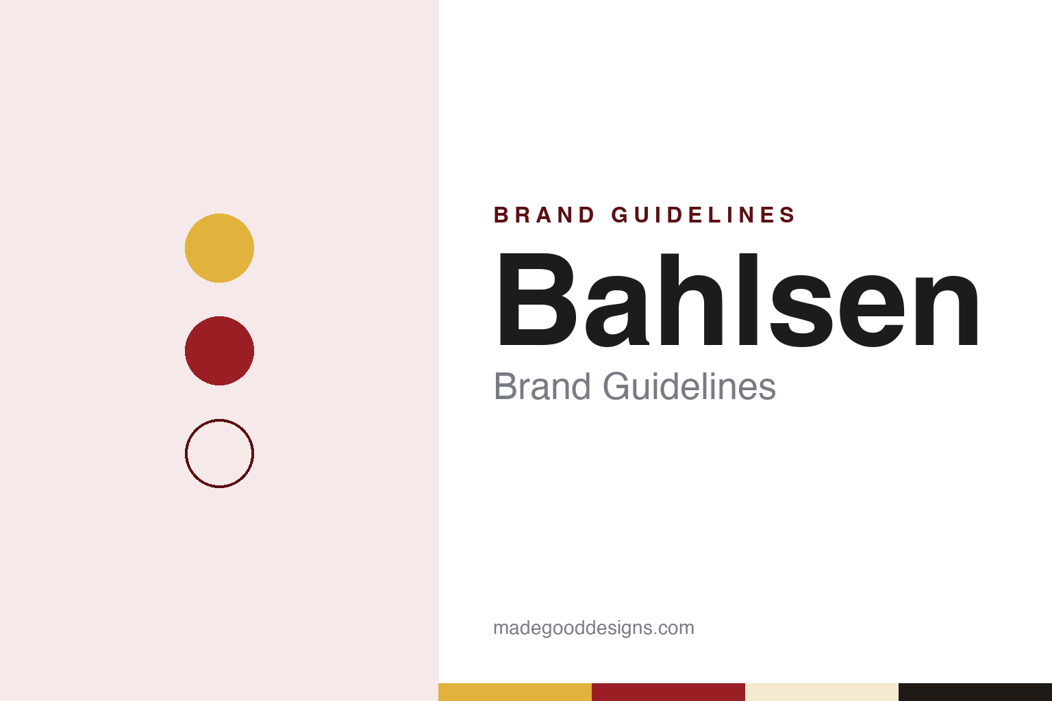
Two constants: a Bahlsen gold, red and cream palette and a Geometric sans register. Abstract homage — not a Bahlsen product or mark; no biscuit, TET sign or pack is reproduced.
Hannoversche Cakesfabrik
A Hanover merchant’s son and an English idea.
Bahlsen was founded in Hanover in 1889 by Hermann Bahlsen (1859–1919). The company says that on 1 July 1889 he took over the “Fabrikgeschäft engl. Cakes und Biscuits,” a maker of English-style cakes and biscuits on Friesenstraße, from H. Schmuckler, and named it the Hannoversche Cakesfabrik H. Bahlsen; it had ten employees. English Wikipedia’s biography says Bahlsen came from a Hanover family of cloth merchants and goldsmiths, trained in Geneva and worked in London, where he came across the English “cakes” he went on to sell at home.
The product that made the company followed in 1891: a butter biscuit named after Gottfried Wilhelm Leibniz (1646–1716), the philosopher who served for decades as court librarian in Hanover. German Wikipedia notes that it was made in the manner of the Petit Beurre that Lefèvre-Utile had produced in Nantes since 1886; the company says naming foods after famous people was the fashion of the time. By 1898 the slogan ran “Was ißt die Menschheit unterwegs? Na selbstverständlich Leibniz Cakes!” — “What does humanity eat on the move? Leibniz Cakes, of course!” — and the company says the LEIBNIZ lettering lit Berlin’s Potsdamer Platz that year as one of Germany’s first illuminated advertisements.
Growth was fast. Bahlsen’s biscuits won gold medals in Brussels and at the World’s Columbian Exposition in Chicago in 1893, and the firm had 300 employees by 1899 and around 1,700 before the First World War, Wikipedia says. The company says it introduced Europe’s first conveyor-belt production in 1905. In 1911 Hermann Bahlsen Germanised the English “cakes” into “Keks,” a word that, the company says, then entered the Duden dictionary, and in 1912 the firm became H. Bahlsens Keksfabrik. After his death in November 1919 his sons took over the management.
Colour
The TET sign and a house style.
Bahlsen is one of the clearest cases of a biscuit maker treating design as part of the product. Its trademark, the TET sign, replaced an earlier springing-horse mark registered in 1896; German Wikipedia dates the change to 1903 and English Wikipedia to 1904, and both credit the design to the graphic artist Heinrich Mittag. The sign is based on the Egyptian hieroglyph ḏt (“djet”), which German Wikipedia says means “everlasting” and which Bahlsen rendered as “TET”; the idea came from the Hanover museum director Friedrich Tewes, who had brought it back from a trip to Egypt. The company describes the sign as a rising sun and a snake.
The everlasting meaning was a point about packaging. In 1904 Bahlsen launched the TET pack, a dust- and moisture-resistant packet for Leibniz biscuits; English Wikipedia’s biography of the founder says a patent for the long-life packaging was granted in 1903. The biscuit has its own fixed features: the same article lists its 52 “teeth” around the edge, 15 punched holes on the face and the typical Leibniz lettering. When the gilded biscuit on the company’s headquarters was stolen in 2013, both the thieves and Bahlsen played on the number 52 in their messages, and it was rehung that July.
Hermann Bahlsen commissioned artists widely. Between 1912 and 1914 the company issued eight series of artistic advertising stamps, by designers including Heinrich Vogeler, Änne Koken, Lucian Bernhard and Mittag, and during the First World War it issued 64 field postcards by artists including Ludwig Hohlwein and Carl Otto Czeschka, according to Wikipedia. English Wikipedia adds that Emanuel Josef Margold of the Wiener Werkstätte, Kurt Schwitters and Lotte Pritzel worked on the Leibniz biscuit’s image. In 1911 the company built an administration building on Podbielskistraße and a factory on Lister Straße, which German Wikipedia counts among the finest Jugendstil architecture in Hanover; plans for a whole “TET-Stadt” for its workers, drawn up with the sculptor Bernhard Hoetger in 1916–17, were never built. In 2014 Berlin’s Bröhan-Museum marked the company’s 125th anniversary with an exhibition catalogued as Kunst und Keksdose.
Typography
The biscuit trade in Britain and Europe.
The seven brands in this group all bake biscuits, and they come from five countries: McVitie’s, Walker’s Shortbread and Tunnock’s from Scotland, Fox’s from England, Jacob’s from Ireland, Bahlsen from Germany and Lotus Biscoff from Belgium. Biscuit brands in general sit at many different points in the trade, from family-run bakeries that still work from the town where they began to names that have passed through several corporate owners, and a single packet on a supermarket shelf rarely says which of those it is.
A biscuit brand’s identity is usually carried by a wrapper, a shape and a habit — the biscuit eaten with tea or coffee, at a desk, in a lunchbox or on a plane — more than by the factory behind it, because the name on the front may have changed hands, or changed countries, long after the recipe was settled. That makes the questions behind each name worth asking plainly: who started it, who owns it now, and where its biscuits are actually baked.
Each guide separates what independent sources record from what the company says about itself — its founding story, its owners over time, its factories and its packaging — and marks plainly what rests only on the company’s own word.
Aa
A geometric sans — for a brand built on a hieroglyph and a lettering. (Specimen set in Jost, a sans STAND-IN; NOT the Bahlsen or Leibniz logo.)
Bahlsen
A family company and its history.
The company’s history includes the Nazi period. After public criticism in 2019, the family commissioned the historian Manfred Grieger that July to study it; the result, by Hartmut Berghoff and Manfred Grieger, was published by Wallstein in 2024 as Die Geschichte des Hauses Bahlsen. Keks – Krieg – Konsum 1911–1974. According to the summary of its findings that Bahlsen publishes, the company used more than 800 foreign forced labourers between 1940 and the end of the war, most of them women from Poland and Ukraine, and from March 1942 to September 1943 it managed a large biscuit factory in occupied Kyiv. In a statement dated August 2024, the family called the suffering inflicted “inexcusable” (our translation) and said it regretted not facing that history sooner.
After the war the company expanded and diversified. It bought Feurich-Keks of Munich in 1963, the Gubor chocolate factory in 1968 and, in 1980, Austin Quality Foods of Cary, North Carolina, Wikipedia says; from 1971 to 1976 its managing director was Ernst Albrecht, later premier of Lower Saxony, according to German Wikipedia. Production left the original Hanover works for nearby Barsinghausen in 1987, and Bahlsen Polska was set up at Skawina, near Kraków, which the company places in its timeline under 1993. In 1999 the group split three ways: sweet baked goods stayed with Bahlsen, savoury snacks went to what became The Lorenz Bahlsen Snack-World, and the property business went separately. Werner Michael Bahlsen was sole shareholder from 1999 to 2018 and now chairs the board; Alexander Kühnen became chief executive on 1 January 2023, German Wikipedia says.
Today Bahlsen describes itself as a family company in its fourth generation, headquartered on Podbielskistraße in Hanover. Its website says it bakes at four sites — Barsinghausen, Berlin and Varel in Germany and Skawina in Poland — and sells in more than 80 markets; Wikipedia, citing earlier data, also lists a second Polish plant at Jawornik, so we give the company’s current count. Its brands include Bahlsen, Leibniz and Pick Up!. Since 2002 it has run a two-brand strategy, with new logos for Bahlsen and Leibniz alongside the company mark, and between 2014 and 2025 it changed the Bahlsen brand’s look and packaging three times, the latest redesign arriving in June 2025, German Wikipedia says.
For a design guide, Bahlsen shows how a trademark, a pack and a biscuit can be designed as one system over more than a century. Compare Niederegger, the Lübeck marzipan maker, and Ritter Sport, the family-owned chocolate maker from Waldenbuch. For this guide we use a Leibniz gold, a deep red and a butter cream with a sans, an unofficial interpretation; no product or logo is reproduced.
Explore & save
Keep Bahlsen’s identity on hand — save it to a board in the Made Good inspiration library.
Bahlsen identity set
Pin the Bahlsen gold, red and cream palette and the Geometric sans register to your own board.