Baltimore Orioles Brand Guidelines
A state bird, a borrowed city name and a cartoon that came back to the cap.
Aa
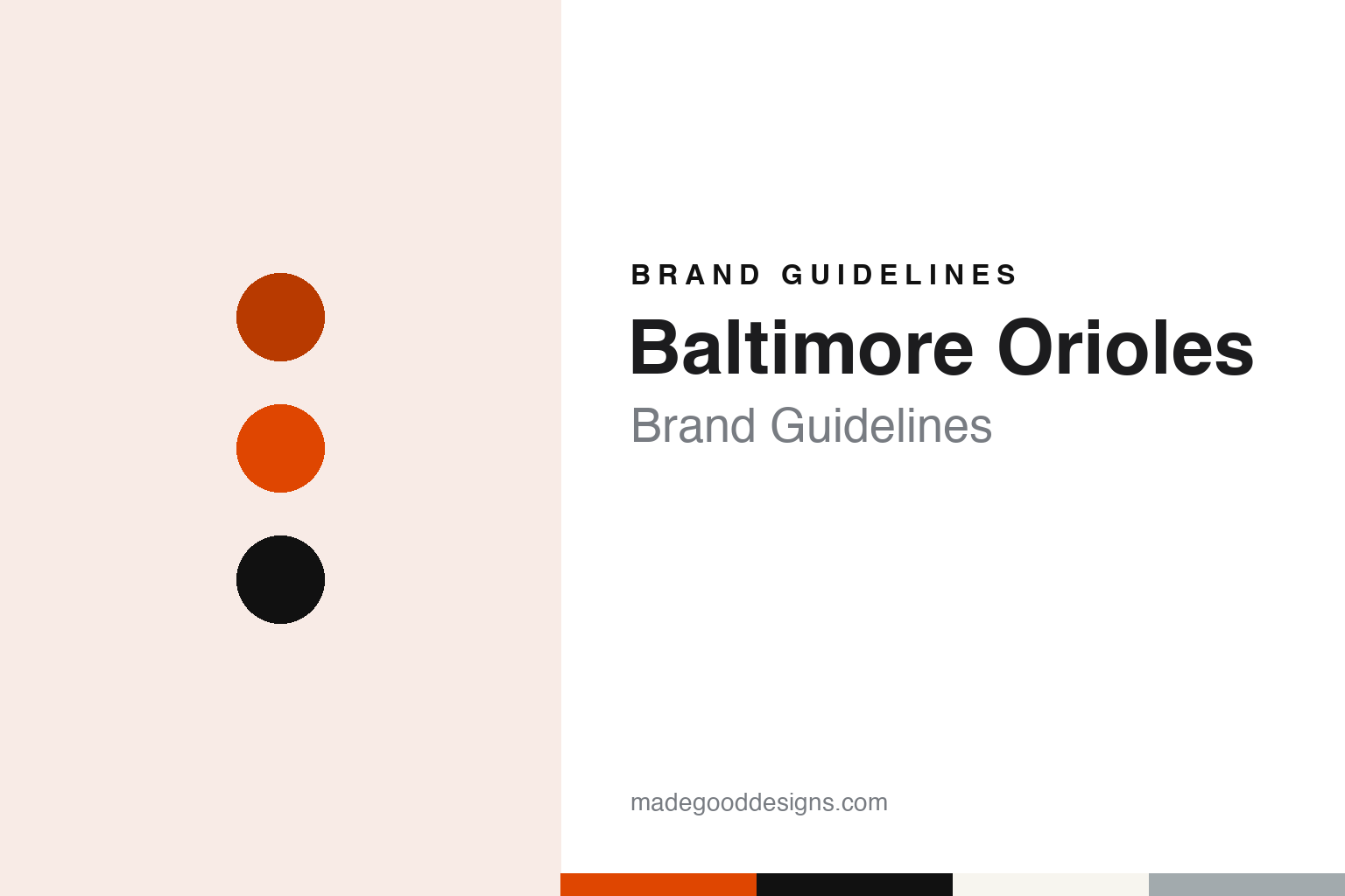
Two constants: an Oriole orange, feather black and home white palette and a script wordmark and bird cap logo register. Abstract homage — not a Baltimore Orioles mark; no cap logo, script or wordmark is reproduced.
A charter club in its third city
Milwaukee, St. Louis and a name taken from Maryland’s state bird.
The Baltimore Orioles reached Baltimore by way of two other cities. English Wikipedia records that the franchise traces its roots to the Milwaukee Brewers of the Western League, which reorganised in 1894 and renamed itself the American League in 1900. When that league declared itself a major league for 1901, the Brewers were one of its eight charter clubs. In 1902 the team moved to St. Louis and became the Browns, a name taken from the original name of the 1880s St. Louis club now known as the Cardinals.
The move to Maryland took several attempts. Wikipedia says Bill Veeck bought the Browns in 1951 and tried to move them first to Milwaukee and then to Baltimore, but other American League owners blocked both moves at first. In the end the franchise was bought in 1953 by a syndicate of Baltimore business and civic interests, led by the attorney Clarence Miles and the city’s mayor, Thomas D’Alesandro Jr., and the club began the 1954 season in Baltimore under a new name.
The name was already local. The Baltimore oriole is the official state bird of Maryland, and Wikipedia notes that the name had been used by several earlier baseball clubs in the city, including a different American League charter club that folded after the 1902 season and was replaced the following year by the New York Highlanders, later the New York Yankees. Wikipedia lists the “O’s” and the “Birds” as the club’s nicknames, and its colours as black, orange, white and grey.
The first Baltimore home was Memorial Stadium, on the city’s north side, which the club used from 1954 to 1991. In a history of the club’s current ballpark for the Society for American Baseball Research, published on 3 April 2018, Curt Smith describes Memorial Stadium as plain, large and horseshoe-shaped, anchoring a residential neighbourhood.
Colour
From a downtown rail yard to the Rubenstein group.
The club’s second Baltimore home turned an old rail yard into a ballpark. Smith writes that the architecture firm Helmuth, Obata and Kassabaum, later HOK Sport, designed Oriole Park at Camden Yards, which opened in 1992. Behind right field stands the brick B&O Railroad Warehouse, built between 1898 and 1905. Smith records that some wanted to tear it down, but it was refurbished instead and now houses bars, restaurants and team offices, so that it reads as part of the park.
The street became part of the ground too. Smith writes that a promenade extends Eutaw Street between the park and the warehouse, lined with shops, with plaques for members of the Orioles Hall of Fame and small baseball-shaped plates set into the pavement. He adds that the site has a family link to Babe Ruth: the café run by Ruth’s father stood on ground now beneath center field.
Ownership has changed hands twice since the park opened. Smith writes that in October 1993 the trial lawyer Peter Angelos and other investors bought the club from Eli Jacobs. Wikipedia records that in January 2024 John Angelos agreed to sell the club to a group led by David Rubenstein, a Baltimore native and a founder of the Carlyle Group, whose members include the former Orioles shortstop Cal Ripken Jr. and the former Baltimore mayor Kurt Schmoke, and that the group took full control on 1 August 2024. Rubenstein’s group has owned the Orioles since 2024.
The mascot is the bird itself. Wikipedia says the costumed Oriole Bird has been the club’s official mascot figure since 6 April 1979.
Typography
Design and documentation.
A baseball club’s identity can predate its arrival in its current city. When a franchise moves, the name, the colours and the lettering may travel with it, be quietly adapted, or be replaced outright, and the choice tells you a good deal about how the owners want the club to be read in its new home. A relocated team’s visual history often comes in layers, with earlier marks surviving as throwback uniforms, museum pieces and merchandise long after they leave the field.
The cap logo carries an unusual amount of weight in this system. It has to work at a small size, stitched in thread, seen from the stands and on television, so clubs tend to settle on a single letter, a monogram or a compact symbol, and to change it far less often than the wordmark or the uniform trim. Colour choices frequently borrow from local symbolism, such as a state bird, a regional landscape or a civic flag, which gives a palette a story beyond the field.
The ballpark completes the picture. Signage, scoreboards, concourse graphics and distinctive architectural features all repeat the club’s colours and marks at architectural scale, turning the stadium itself into part of the brand.
Oo
A brushy, slanted script — the register of a club whose home jersey has carried a flowing “Orioles” for most of its history. (Specimen set in Kaushan Script, a script STAND-IN; NOT the Baltimore Orioles logo, script or wordmark.)
Baltimore Orioles
Two birds on the cap, a city name off and on the road jersey, and a script that stayed.
The uniform has changed less than the cap. Wikipedia says the home uniform is white with “Orioles” written across the chest and the road uniform grey with “Baltimore,” a style worn for much of the club’s history with changes in script, striping and materials. From 1963 to 1965 the home jersey used block lettering instead of script, and the underline beneath “Orioles” disappeared from 1966 to 1988. The road jersey carried the team name rather than the city from 1954 to 1955 and again from 1973 to 2008; Wikipedia ties the second spell to the era of owner Edward Bennett Williams, when the club was also marketing itself to fans around Washington, and records a long campaign by fans and writers to bring the city name back.
Two birds have taken turns on the cap. Wikipedia says the caps carried a full-bodied bird from 1954 to 1965, with a black cap bearing an orange block “B” for part of 1963. The “cartoon bird” arrived in 1966 and, with minor tweaks, stayed until 1988, from 1975 on a black cap with a white front panel and an orange brim. The full-bodied bird returned in 1989. In 2012 the club brought back a modernised cartoon bird together with the white-paneled, orange-brimmed home cap. A script “O’s” cap followed in 2005 for the black alternate, and a script “B” cap in 2026.
Alternates add colour and the city. Black jerseys have been worn since 1993, and orange alternates first appeared in 1971. The 2023 City Connect uniform was black with “BALTIMORE” across the chest and collar and sleeves carrying a set of colours and shapes standing for the city’s neighbourhoods. A second City Connect in 2026 used a cream base with dark green and orange sleeves and “BMORE” on the chest, as an homage to Camden Yards.
For a design guide, Baltimore Orioles shows how a borrowed local name can supply a whole palette, and how a cap logo can be retired and revived without changing the script on the chest. Compare the city’s football club in our Baltimore Ravens guide, and the club that replaced Baltimore’s earlier American League team in our New York Yankees guide. For this guide we use Oriole orange, feather black and home white with a script, an unofficial interpretation; no product or logo is reproduced.
Explore & save
Keep Baltimore Orioles’s identity on hand — save it to a board in the Made Good inspiration library.
Baltimore Orioles identity set
Pin the Baltimore Orioles Oriole orange, feather black and home white palette and the script wordmark and bird cap logo register to your own board.