Korean Air Brand Guidelines
A taegeuk in dark blue, on a sky-blue body.
Aa
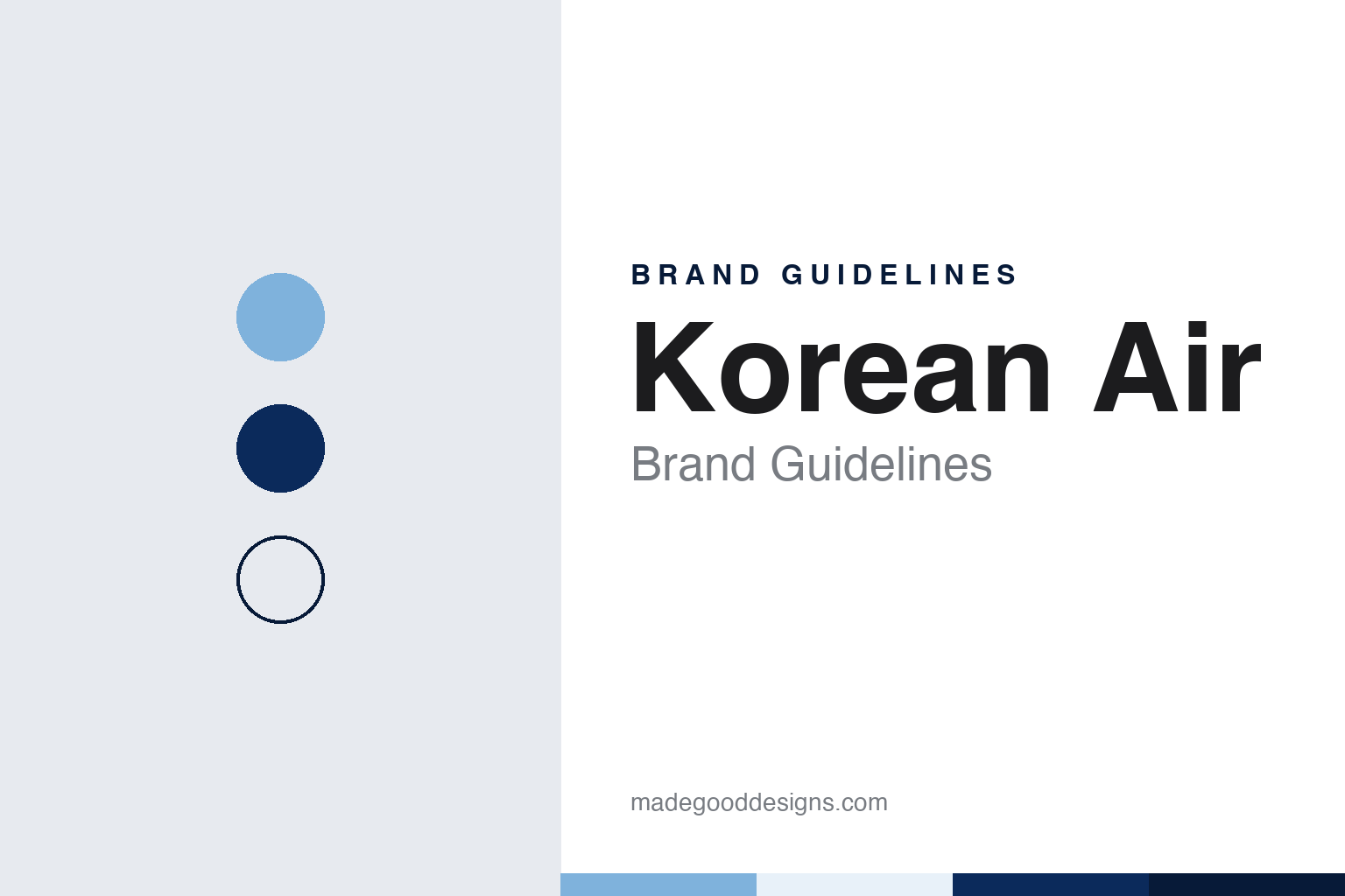
Two constants: a sky blue, dark blue and red palette and a Brush-edged serif register. Abstract homage — not a Korean Air asset or mark; no logo, symbol or wordmark is reproduced.
From state airline to Hanjin
Korean National Airlines, Korean Air Lines, then Korean Air.
Korean Air is the flag carrier of South Korea, headquartered in Seoul. Its history runs through three names. English Wikipedia says the airline traces back to Korean National Airlines, founded in 1946. In 1962 the government of the Republic of Korea acquired that company and renamed it Korean Air Lines, operating it as a state-owned airline from June of that year.
The modern company dates its own story to a change of owner. English Wikipedia says that on 1 March 1969 the Hanjin Group acquired the state-owned Korean Air Lines, and that this is the beginning of Korean Air as it exists today. Hanjin has owned the airline since 1969. English Wikipedia describes the present structure as Korean Air being owned by the Hanjin Group and majority controlled by its holding company, Hanjin KAL, with Walter Cho, a third-generation member of the controlling family, serving as chairman and chief executive.
The airline took its current name in the 1980s. According to English Wikipedia, on 1 March 1984, exactly fifteen years after the Hanjin takeover, Korean Air Lines changed its name to Korean Air and introduced a new corporate logo and livery at the same moment. The marketing publication Marketech APAC, reporting in March 2025, also dates the arrival of the taegeuk symbol to 1984.
The 2020s brought a merger that shaped the next identity. English Wikipedia says the South Korean government announced in November 2020 that Korean Air would acquire its rival Asiana Airlines, and that the purchase was completed in December 2024, as reported by Reuters. The same article says the Asiana brand is due to be fully absorbed into Korean Air in 2027, and the new visual identity was presented in the months after the deal closed, as the brand that both airlines would eventually share.
That connection between merger and identity was made explicit at the launch. Marketech APAC reported that Walter Cho, speaking as chairman and CEO of Hanjin Group and Korean Air, presented the refreshed look as the identity of a unified Korean Air. The aviation news site Aviacionline, writing on 10 March 2025, likewise linked the rebranding to the recent acquisition of Asiana and to the arrival of new wide-body aircraft.
Colour
A blue top in 1984, a single blue in 2025.
The 1984 identity set the pattern for four decades. English Wikipedia describes it as a blue-top, silver livery with a new “Korean Air” logo featuring a stylised taegeuk, the red-and-blue circle of the South Korean national flag, and says it was designed in cooperation between Korean Air and Boeing. It was introduced on the airline’s MD-80s and Boeing 747-300s.
The replacement was unveiled in March 2025. Marketech APAC, in a report by Aliza Carmona dated 13 March 2025, said the airline presented a refreshed corporate identity after 41 years, unveiled at its headquarters hangar in Seoul. The Korean design publication Design Compass, writing the same day, named the New York agency Lippincott as the airline’s partner on the rebrand, and English Wikipedia gives the unveiling date as 11 March 2025.
The taegeuk remains at the centre. Design Compass said the overall frame of the taegeuk, taken from the national flag, was kept, but redrawn to reflect the movement of the ribbon in sangmo nori. Marketech APAC described the new symbol as rendered in dark blue, replacing the red and blue of the earlier mark, and reported three versions of the logo: the taegeuk with “KOREAN AIR,” a shorter version reading just “KOREAN,” and the taegeuk on its own.
The lettering was redrawn too. Marketech APAC said the logotype has subtle brushstroke-inspired details, smooth curves and open connections, and that the airline created a proprietary typeface and icon set to match. Design Compass added that the typeface covers both English and Korean, and that the wordmark uses a solid Korean Air Dark Blue.
The aircraft changed in step. Both reports describe a new livery shown on a Boeing 787-10, which Aviacionline identified by its registration HL-8515. Marketech APAC said the scheme keeps the signature sky blue, now with metallic paint, shows a bold “KOREAN” on the fuselage and an enlarged taegeuk on the tail, and replaces the old straight cheatline with a smooth, flowing curve. Design Compass said the metallic blue was developed with the paint maker AkzoNobel as a modern reading of the original colour.
Typography
Asian airlines and their marks.
Airline identities work on a scale few other brands face. A mark has to read on a tail fin seen from a terminal window, on a boarding pass, on a seat-back headrest and on a phone screen, and it has to do so in many languages at once. Carriers often lean on a single strong symbol rather than a wordmark alone.
National symbols are a common answer. Flowers, birds, kites, animals and stylised suns or stars appear on tails because they can be drawn simply, coloured boldly and recognised without reading a word. A symbol of this kind also lets an airline speak for a place, which matters when the carrier is, or once was, a state enterprise.
Mascots form a second tradition. A painted character can travel across posters, menus and advertising for decades, and can be retired, revived or redrawn as tastes change.
Livery refreshes tend to arrive with change of ownership, new aircraft types or a merger. Privatisation in particular often brings a renaming, a new typeface and a reworked tail, while the core symbol is kept so that travellers still recognise the brand at the gate.
Aa
A brush-edged serif — after a wordmark with open joins and stroke-like ends. (Specimen set in Nanum Myeongjo, a serif STAND-IN; NOT the Korean Air logo or its typeface.)
Korean Air
A symbol kept, a palette narrowed.
The 2025 identity keeps the elements that defined Korean Air since 1984 and narrows how they are used. The taegeuk stays, but in a single dark blue rather than red and blue. The sky blue fuselage stays, but in a metallic finish. The name stays, but on the side of the aircraft it is reduced to one word, KOREAN, as Design Compass and Marketech APAC both reported in March 2025.
Red has not disappeared. Marketech APAC said a three-dimensional motif based on the flowing curves of the taegeuk, in light blue with red accents, would appear on check-in screens, mobile SKYPASS cards and the airline’s website. Design Compass named the colours Korean Air Light Blue and Korean Air Red, used as a base and as an accent. On textiles and printed material, Marketech APAC reported, the airline would use two-dimensional patterns based on Korean mountain landscapes, the curves of the taegeuk and jogakbo, the traditional Korean patchwork wrapping cloth.
The rollout was planned to be gradual. Marketech APAC said the assets would be introduced across airport facilities, lounges and cabins over time, and Aviacionline said the change would be applied step by step across the fleet. Design Compass said the new identity would begin to be applied globally from March 2025, with a digital design system built to manage the brand across screens.
The sky blue itself has a long record. It has been carried on the airline’s upper fuselage since the 1984 livery, through the changes of aircraft types since then, and the 2025 scheme kept it as the base colour of the aircraft rather than replacing it, according to the March 2025 reports.
For a design guide, Korean Air shows how a national symbol can be kept while its colours are reduced to one, and how a long-held fuselage colour can be refreshed with a new finish instead of a new hue. Compare Singapore Airlines, an Asian carrier built around a stylised bird, and Cathay Pacific, whose brushwing mark also draws on brush-stroke forms. For this guide we use sky blue, dark blue and red with a serif, an unofficial interpretation; no product or logo is reproduced.
Explore & save
Keep Korean Air’s identity on hand — save it to a board in the Made Good inspiration library.
Korean Air identity set
Pin the Korean Air sky blue, dark blue and red palette and the Brush-edged serif register to your own board.