Singapore Airlines Brand Guidelines
A golden bird drawn from a Malay dagger — and a service brand so strong the aircraft is almost the least of it.
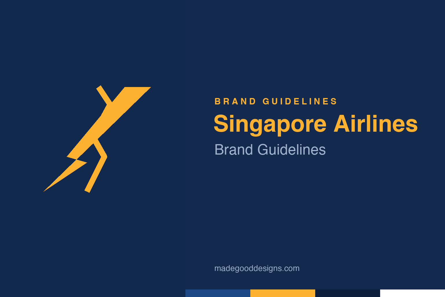
An abstract kris / wing form in gold — the cultural root, not the bird. Deliberately not the SIA bird.
A bird with a dagger’s shape
SIA’s symbol carries Southeast Asian culture in its very form.
The Singapore Airlines bird — a swept, stylised golden bird on the tail and throughout the brand — is inspired by the kris (or keris), the wavy-bladed Malay dagger that is a deep cultural symbol across the region. That’s a beautifully deliberate choice: rather than a generic swoosh, SIA rooted its emblem in local heritage, giving the mark meaning that resonates at home while reading as elegant and distinctive abroad. The identity dates to 1972, when Singapore Airlines was formed from the split of Malaysia-Singapore Airlines. The bird has remained essentially unchanged ever since — a mark confident enough to leave alone. Our homage nods to that kris-and-wing form in gold, rather than the bird itself.
The Singapore Girl
SIA’s most famous ‘logo’ isn’t a symbol at all — it’s a person.
Singapore Airlines built one of the most powerful service brands in the world, and its defining image is the “Singapore Girl” — the cabin crew in a distinctive sarong kebaya uniform (its batik-patterned design created by the couturier Pierre Balmain in the late 1960s). The advertising icon and “Singapore Girl, you’re a great way to fly” positioning were developed by ad man Ian Batey and his agency Batey Ads. It was a landmark idea: making the brand’s promise human — gracious, personal service — rather than resting on planes and routes. Decades on, SIA is still synonymous with premium service, proof that the strongest airline branding can be about people and feeling as much as any tail-fin symbol.
Batik, navy and gold
The whole identity is a coordinated act of consistency.
Everything in the Singapore Airlines look pulls toward refined, warm, premium. The batik motif from the crew’s kebaya carries through into cabin interiors and brand materials, tying the visual identity to the service experience. The palette — deep navy and warm gold — reads as quietly luxurious, reassuring and elegant, exactly the register a premium carrier wants. This coordination is the point: from the bird on the tail to the pattern on a menu to the colour of a lounge, the elements reinforce one another. SIA is a case study in total brand consistency — a company that understood, early and completely, that a great airline brand is an experience designed end to end, not just a logo applied to metal.
Service as the real logo
SIA’s identity endures because the brand keeps its promise.
The deepest reason the Singapore Airlines identity works is that the design and the reality match. The elegant bird, the batik, the navy-and-gold, the Singapore Girl all promise gracious, world-class service — and for decades SIA has consistently delivered it, topping best-airline rankings again and again. That alignment is everything. A premium identity written on a mediocre experience curdles into cynicism; a premium identity backed by genuine quality compounds into one of the most valuable reputations in the industry.
That’s the real lesson for brand-builders. Logos, colours and campaigns can set an expectation, but only the actual product can keep it, and SIA’s greatest branding achievement is that its service has honoured its beautiful design for half a century. The kris-inspired bird has barely changed since 1972 because it never needed to — the company simply kept being what the mark promised. In an industry where most carriers feel interchangeable, Singapore Airlines built something rare: an identity, rooted in local culture and expressed with total consistency, that customers genuinely trust. The symbol is elegant; the service is the substance; and together they make one of the great brands in the sky.
Type & the wordmark
A refined wordmark, in navy and gold.
The Singapore Airlines wordmark is a clean, elegant set of letters that reads as premium and international, paired with the golden bird. The specimen below stands in with a refined serif in that spirit.
A great way to fly
Refined, elegant, international — type tuned to feel premium in any airport in the world. (Specimen set in Newsreader, a neutral stand-in.)
Navy & gold
Deep navy, warm gold. Click a swatch to copy the hex.
SIA’s identity runs on a deep navy #1D4886 and a warm gold #FCB130, with white. Exact values aren’t publicly specified, so treat these as best-supported reconstructions. Lead with navy and gold below.
Explore & save
Keep the kris-bird idea on hand — save the homage and the navy-and-gold to a board.
Singapore Airlines identity set
Pin the kris homage, the navy-and-gold palette and the service-brand lesson to your own board.