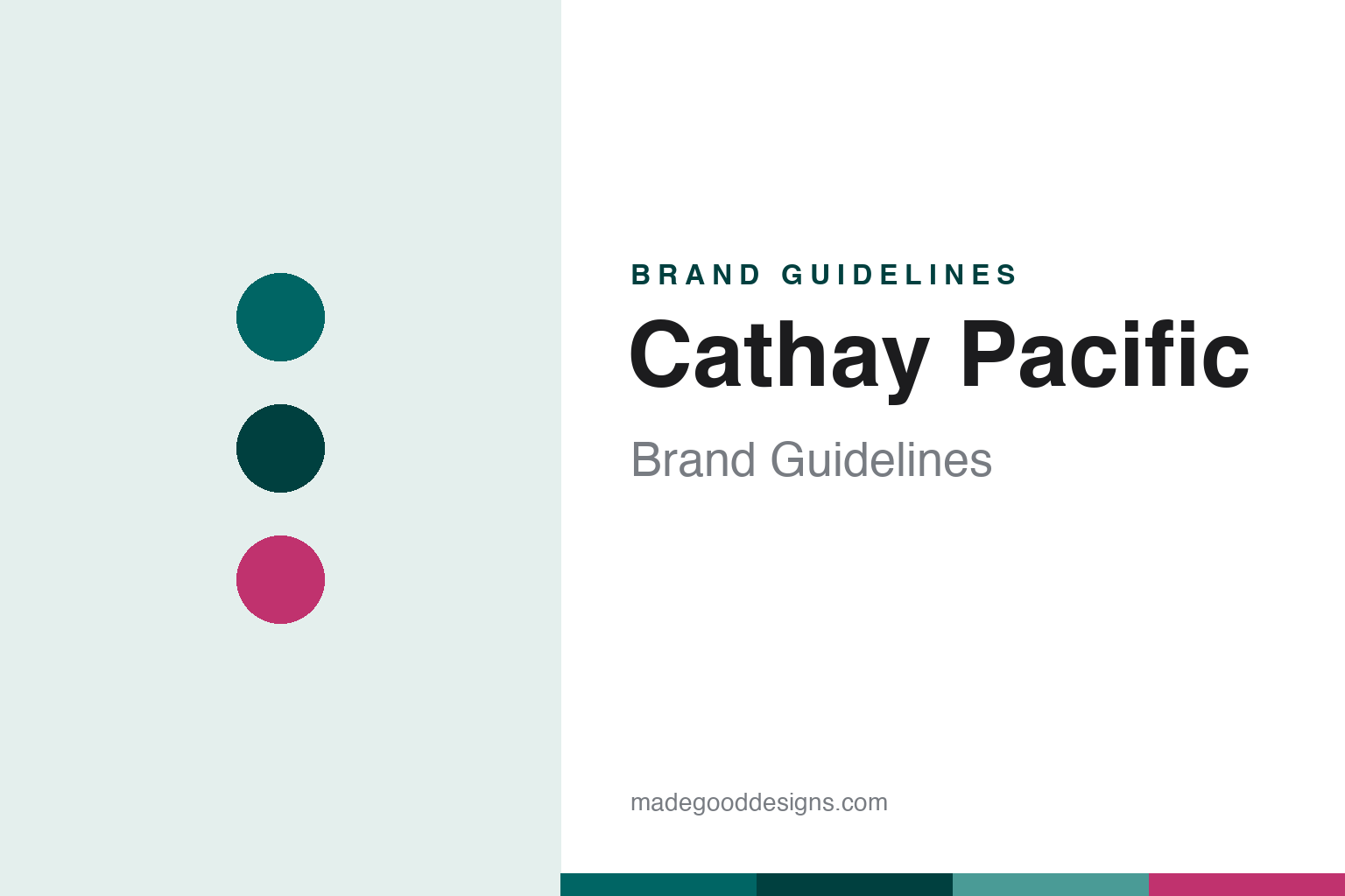
Cathay Pacific Brand Guidelines
A single calligraphic brushstroke and a deep jade green — Hong Kong’s flag carrier in one wing.
Aa
Two constants: a deep jade green and a clean, modern sans. Abstract homage — not the Cathay Pacific brushwing or wordmark.
A wing in one brushstroke
Cathay Pacific reduced a flag carrier to a single calligraphic stroke.
Cathay Pacific’s identity is the “brushwing” — a single calligraphic brushstroke that suggests a stylised wing or bird in flight, evoking Asian brush calligraphy. It was introduced in November 1994 in a full rebrand by Landor Associates, and it appears white on the green tail fin above a red-magenta base sweep. (An honest caveat: the brushwing was refined in October 2014 by Hong Kong studio Eight Partnership, which freed it from its box and simplified the logotype — there was no “2011 refresh,” so cite 1994 and 2014. The wordmark typeface is undocumented, so treat font names as unverified.) It’s a beautifully economical mark: East-meets-West, elegant and instantly recognisable on a tail.
Cathay Pacific was founded in 1946 in Hong Kong (its first flight registered 24 September 1946) by two men — the American Roy C. Farrell and the Australian Sydney H. de Kantzow. The name pairs “Cathay,” an old European poetic name for China, with “Pacific,” reflecting their trans-Pacific ambitions. As Hong Kong’s flag carrier, Cathay became a premium, full-service Asian airline (a founding member of the oneworld alliance in 1998, with the “Life Well Travelled” campaign from 2014–15). On ownership: Cathay Pacific is majority-owned by the Swire Group (John Swire & Sons / Swire Pacific), with Air China holding a significant stake — around Swire ~48% and Air China ~32% after Qatar Airways sold its holding back to Cathay in 2025 (so Qatar is a former, not current, shareholder).
Colour
Cathay Pacific lives in a deep jade green. Click a swatch to copy the hex.
Cathay Pacific’s signature colour is Cathay green — a deep, jade-like teal-green, specified in its guidelines as Pantone 323 (RGB 0/101/100), commonly rendered around #006564. It’s an unusual, sophisticated choice in a category full of blues and reds: the jade green reads as premium, calm and distinctly Asian, giving Cathay an instantly ownable identity on the tarmac. A red-magenta sweep at the base of the tail adds warmth and contrast. The honest caveat: the brand guidelines direct users to the Pantone/CMYK/RGB values rather than a single hex, so treat #006564 as an approximate conversion. The green-and-magenta combination is the ownable core.
The lesson is owning an unexpected colour. By choosing a deep jade green in a blue-and-red-dominated category, Cathay Pacific made its palette a recognition asset in itself — you spot the tail before you read the name. For designers, it’s a reminder that a distinctive, category-breaking colour (when it fits the brand’s character and origin) can be a powerful differentiator. The takeaways: consider a signature colour that sets you apart from category conventions; choose one that carries meaning (a jade green with an Asian, premium resonance for a Hong Kong carrier); and cite the authoritative colour system (here Pantone 323) while treating hex as an approximation.
Typography
The wordmark is a clean, modern sans — calm and premium.
Cathay Pacific’s clean, modern sans wordmark is calm and premium — a quiet, contemporary counterpart to the expressive brushwing. Its restraint is deliberate: the brushwing carries all the personality and cultural resonance, so the wordmark simply needs to look modern, legible and sophisticated, reinforcing the airline’s premium, full-service positioning. Set alongside the jade-green mark, it reads as considered and international — East-meets-West without cliché. The 2014 refinement tightened the logotype for a cleaner, more contemporary feel. (Because the exact face is undocumented, the honest description is “a clean, modern sans,” not a named font.) The typography behaves like the brand: calm, premium and quietly confident, letting the brushwing be the star.
Aa
A clean, modern sans — calm and premium. (Specimen set in Jost, a geometric sans in the spirit of the Cathay Pacific wordmark; the real face is custom.)
East meets West in one mark
Cathay Pacific turned brush calligraphy into a global aviation logo.
Cathay Pacific is a lesson in a culturally-rooted mark done with global polish. The brushwing takes the visual language of Asian brush calligraphy — expressive, fluid, human — and distils it into a single, modern, instantly recognisable wing, perfectly capturing a Hong Kong airline that bridges East and West. Paired with the unusual, ownable jade green and a clean, premium wordmark, it gives Cathay one of aviation’s most distinctive and sophisticated identities. The calligraphic stroke means something (flight, and Asian heritage), which makes it far more resonant than a generic swoosh.
For designers, Cathay Pacific offers a clear takeaway: a mark rooted in genuine cultural language, executed with modern polish, can be both distinctive and globally credible. The lessons: drawing on an authentic visual tradition (brush calligraphy) gives a logo meaning and warmth that abstract marks lack; an unexpected, ownable colour (jade green) sets a brand apart in a crowded category; and a restrained wordmark lets an expressive symbol lead. It’s also a reminder to keep facts precise — the brushwing is from 1994 (Landor), refined in 2014 (not 2011); Cathay was founded in 1946 by an American and an Australian; and it’s Swire-controlled (Qatar exited in 2025). Cathay Pacific turned a single brushstroke into a world-class aviation identity — proof that cultural roots and modern craft together make a mark that flies.
Explore & save
Keep Cathay Pacific’s identity on hand — save it to a board in the Made Good inspiration library.
Cathay Pacific identity set
Pin the Cathay-green palette and the type spirit to your own board.