Sacramento Kings Brand Guidelines
A crown that travelled from Rochester to the Sacramento Valley.
Aa
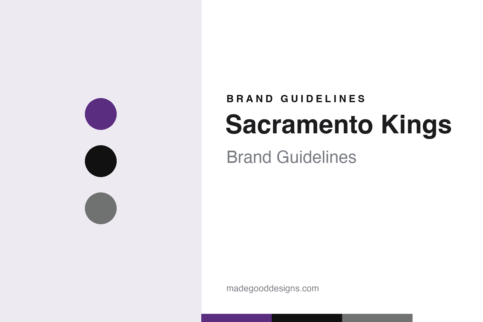
Two constants: a purple, black and gray palette and a condensed athletic lettering register. Abstract homage — not a Sacramento Kings mark; no crown logo, jersey or wordmark is reproduced.
Rochester, Cincinnati, Kansas City, Sacramento
Royals in two cities, Kings in two more.
The Sacramento Kings began as a basketball team in upstate New York, and as Royals rather than Kings. English Wikipedia traces the franchise to the Rochester Seagrams, a sponsored semi-professional team named after its main backer, the Canadian distiller Seagram, which played in Rochester from the 1920s. One of its early players, Les Harrison, went on to serve as captain, coach, manager and scout. When the National Basketball League announced an expansion as the Second World War was ending, Wikipedia says, the sponsor balked at the cost, but Harrison and his brother Jack, a lawyer, pooled their money and were granted a franchise in 1945. They called it the Rochester Royals.
The Royals moved from the NBL to the Basketball Association of America in 1948 and became part of the NBA when the two leagues merged a year later. Their first logo, Wikipedia says, was a blue and white shield with “ROCHESTER” across the top and a white banner reading “ROYALS”. Road uniforms were blue with the city name on the front and home uniforms were white with the team name, a split the franchise would keep, with red accents added later in Rochester.
In April 1957 the Harrison brothers moved the team to Cincinnati, a city then trying to obtain an NBA franchise. The Royals name continued to fit, Wikipedia notes, because Cincinnati was often called the “Queen City”. The new logo was a basketball with a cartoon face, wearing a crown with the city inside it, with “CINCINNATI” above and “ROYALS” below. In 1971 the team adopted a simpler mark: a red crown above a blue half-basketball, with “ROYALS” in white on the crown. The uniforms switched to a script “Royals” with red numbers and, on the back, the unusual order of number above name.
The crown outlasted the name. Before the 1972–73 season the club moved to Kansas City, Missouri, and split its home games with Omaha, Nebraska, so it became the Kansas City–Omaha Kings. Wikipedia says the nickname was changed to avoid confusion with the city’s baseball team, the Kansas City Royals. The team kept its uniforms and logo apart from the name change, shortened its name to the Kansas City Kings in 1975, and played some home games in Omaha until March 1978.
Colour
From the Harrisons to a Sacramento group, the Maloofs and Vivek Ranadivé.
The move west came through new owners. Wikipedia says the Kings were sold in June 1983 to a Sacramento-based investment group led by Joseph Benvenuti and real estate developer Gregg Lukenbill, the managing partner. The group honoured the remaining two years of the team’s lease at Kemper Arena in Kansas City, and in October 1984 announced the conversion of a warehouse in Sacramento into what became the first ARCO Arena. NBA owners approved the transfer to Sacramento on 16 April 1985, and the Kings began play there in the 1985–86 season. A second ARCO Arena opened in 1988 and remained the team’s home until 2016.
In the 2000s the club was owned by the Maloof family. Wikipedia records that the Maloofs sought to move the team to Anaheim in 2011 before the NBA’s Board of Governors ended that effort, and that a later plan to move it to Seattle was also rejected. On 16 May 2013 the family agreed to sell the Kings to a group led by the Silicon Valley technology entrepreneur Vivek Ranadivé.
The Sacramento Bee reported the decisive step on 28 May 2013. Tony Bizjak wrote that the NBA Board of Governors had voted unanimously that day to approve the sale of the Sacramento Kings to the Ranadivé group, taking the team from the Maloof family, and that the new owners intended to keep the team in Sacramento and build a new downtown arena. The paper also reported Ranadivé’s public message thanking the league for its approval. Wikipedia says the sale closed escrow on 31 May 2013; the group led by Vivek Ranadivé has owned the Kings since 2013.
The arena followed. Wikipedia says Turner Construction was chosen to build it in July 2013, and the team moved into Golden 1 Center in downtown Sacramento in 2016, leaving the ARCO building, by then called Sleep Train Arena. The gray exterior of Golden 1 Center later supplied the base colour for one of the team’s City edition uniforms.
The mascot has been part of the same story. Since the 1997–98 season, Wikipedia says, the official Kings mascot has been Slamson the Lion; before that the team used a character called The Gorilla. During the 2022–23 season the club began shining a large purple beam into the night sky from the arena after home wins, which led to crowds chanting “Light the Beam” at the end of home victories.
Typography
Design and documentation.
Team names travel more easily than teams do. When a club changes city, the name sometimes goes with it, sometimes stays behind for a later team to claim, and sometimes returns years afterwards with its old colours and records attached. Each path leaves a design problem: a nickname chosen for one place has to make sense in another, and a revived name has to look familiar without looking dated.
Uniforms are a second thread. Clubs have occasionally hired fashion designers rather than sports outfitters to set a palette and a jersey, and those choices can outlast the people who made them, coming back as throwback or anniversary editions once the original fans have grown up.
Colour revivals follow a recognisable pattern. A team retires a shade, fans keep buying the old merchandise, and the shade returns first on an alternate jersey, then on the court, then on the primary mark. Arena graphics then carry the identity at full scale: floor paint, baseline lettering, banners, scoreboards and concourse signage all have to work with the same few colours under bright light and on television. For a designer, the useful lesson is how a small set of marks and tones is stretched across a building as well as a shirt.
Aa
A condensed athletic letter — the register of a jersey wordmark and an arena scoreboard. (Specimen set in Oswald, a condensed sans STAND-IN; NOT the Sacramento Kings logo or wordmark.)
Sacramento Kings
Powder blue, then purple and black, then the crown again.
For nearly a decade in Sacramento the Kings looked like the Kansas City team that had arrived. Wikipedia says they kept the red, white and blue colour scheme and the crown above a half-basketball, with royal blue home uniforms and powder blue road uniforms, and they kept the Kansas City habit of placing player names below the number on the front. A 1990 revision moved royal blue to the road and restored the usual name-above-number order on the back; it was also the last use of the classic script “Kings” wordmark until 2005.
Then, in 1994, the Kings changed their look entirely. They adopted purple, silver, black and white, with a new primary logo set on the shorts, a white home uniform and a black road uniform. Wikipedia notes that baseball’s Colorado Rockies had adopted a similar combination in 1993, and that hockey’s Los Angeles Kings used one from 1998 to 2011. From 1994 to 1997 the team also wore a half-purple, half-black alternate with checkerboard side panels, which Wikipedia says was panned by fans, though the club revived it for Hardwood Classics Nights in 2012–13. A purple uniform followed in 1997–98, and a 2002–03 set modernised the “Kings” script.
The 2016 rebrand turned back toward the crown. Wikipedia says the Kings adopted a logo reminiscent of their 1971–1994 design, dropping black from the logo while keeping purple and silver, and unveiled four new uniforms on 15 June 2016. The home and away sets carried a modernised “Kings” script with an updated crown above it; a black “Global” uniform swapped the crown for a standing lion crest; and every uniform had a baby blue collar, stitching and a tab reading “Sacramento Proud”, a nod to the powder blue of the first Sacramento seasons. When Nike became the league’s supplier in 2017, the Kings carried their uniforms over under the Association, Icon and Statement names. For 2023–24 they made black the primary colour, moved purple to an accent, and introduced a “Kings” script drawn from the 1972–1994 uniforms.
The City editions read like a family album. Wikipedia lists a powder blue and red set for 2017–18 that echoed the 1985–1990 road uniform; several seasons of a “Sactown” wordmark from 2018 onwards; a 2021–22 uniform carrying a modified Rochester Royals logo on the waistband; a 2023–24 blue uniform with a vertical “Kings” wordmark inspired by the late-1960s Cincinnati Royals, commemorating the centennial of the franchise’s Rochester Seagrams roots; and a 2025–26 uniform with a deep ink purple base and bright violet accents, honouring the Light the Beam celebrations.
For a design guide, the Sacramento Kings show how a club that has worn blue, red and powder blue, then purple and black, can keep one idea constant across four cities: a crown resting on a basketball. Compare it with the NBA, whose uniform programme frames every Kings kit, and the Cincinnati Reds, the baseball club of the city the Royals called home from 1957. For this guide we use royal purple, black and gray with a condensed sans, an unofficial interpretation; no product or logo is reproduced.
Explore & save
Keep Sacramento Kings’s identity on hand — save it to a board in the Made Good inspiration library.
Sacramento Kings identity set
Pin the Sacramento Kings royal purple, black and gray palette and the condensed athletic lettering register to your own board.