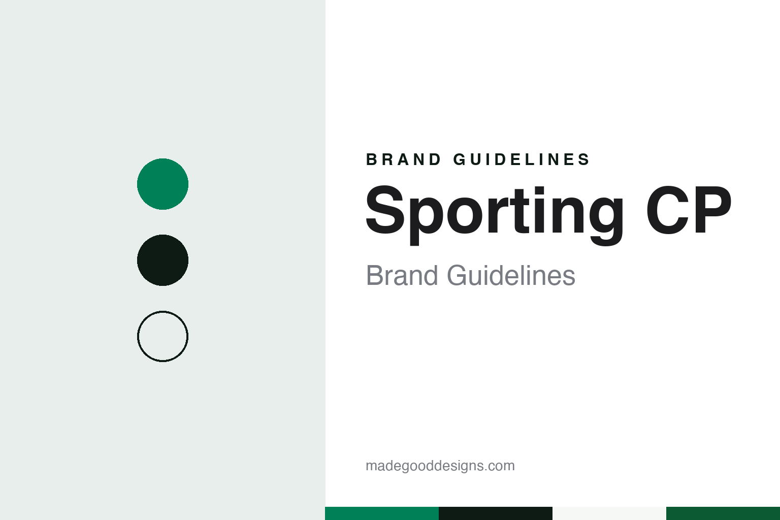
Sporting CP Brand Guidelines
A lion in front, hoops on the shirt, green throughout.
Aa
Two constants: a Leão green, ink and hoop white palette and a narrow grotesque sans register. Abstract homage — not a Sporting CP product or mark; no crest, shirt or logo is reproduced.
Sporting Clube de Portugal
A picnic quarrel, a grandfather and a national name.
Sporting CP grew out of a run of short-lived clubs in Lisbon. English Wikipedia says that in June 1902 a group of young men including the brothers Francisco and José Maria Gavazzo formed Sport Club de Belas, which played a single match and broke up that summer. Two years later the idea returned as the Campo Grande Football Club, now joined by José Alvalade (José Holtreman Roquette) and José Stromp. It played on the estate of the Viscount of Alvalade, Alfredo Holtreman, José Alvalade’s grandfather.
A disagreement split that club. Wikipedia says that at a picnic on 12 April 1906, some members wanted the club to focus on picnics, balls and social events while others wanted it to focus on sport. José Gavazzo, José Alvalade and other members left, and Alvalade turned to his grandfather for support. A new club was formed on 8 May 1906 and named Campo Grande Sporting Clube on 26 May. The Viscount of Alvalade, whose money and land helped found it, became its president.
The national name came two months later. According to Wikipedia, on 1 July 1906 António Félix da Costa Júnior suggested the name Sporting Clube de Portugal, and since 1920 that date has been the club’s official foundation date. Wikipedia lists the founders as including José Alvalade and the Viscount, the brothers António, José and Francisco Stromp, the Gavazzo brothers, José Maria do Couto Valente da Ponte and José Ferreira Roquette. The club’s motto, Esforço, Dedicação, Devoção e Glória (Effort, Dedication, Devotion and Glory), dates from its formation.
The name is still something the club defends. Wikipedia says UEFA and FIFA refer to the club by its full name or as “Sporting CP”, and that the label “Sporting Lisbon”, common in foreign media, has been a source of contention for many supporters because it is not the club’s official name. The football business runs through Sporting Clube de Portugal – Futebol, SAD, created in 1998 and listed on the Lisbon stock exchange that year; Wikipedia says the club announced it would hold a majority of the SAD’s capital from 15 February 2024 after a debt restructuring.
Colour
A lion from Cascais and a shirt that changed at half-time.
The lion was borrowed. English Wikipedia says the stylised rampant lion on the crest was taken by the Viscount of Alvalade from the heraldry of Dom Fernando de Castello-Branco, mayor of Cascais and the main promoter of football at Sporting Club de Cascais. Castello-Branco set one condition: the new club should not use blue, a colour his own club had already adopted. The lion gives Sporting its nickname, Leões, “the Lions”, and the club’s mascot Jubas, whose name is the Portuguese plural for mane, is a lion in the team’s kit.
The crest has been modernised several times without losing its core. Wikipedia says that in every version the rampant lion, the colour green and either the full name or the initials SCP have been prominent, and that the club has also used commemorative crests for its fiftieth and hundredth anniversaries, in 1956 and 2006. In 2001 Sporting changed its emblem more radically, to look more modern: a simplified green shield with three horizontal white stripes for the shirt, the words “Sporting” and “Portugal” written out in full to clarify the name internationally, a golden lion, and the initials SCP set like a crown on top.
The shirt took two decades to settle. Wikipedia says the players wore white jerseys when the club was founded. On 25 October 1908 Sporting presented the shirt that became known as the Stromp kit, at the initiative of founder Eduardo Quintela de Mendonça: split at the top, right half white and left half green, named after the founder Francisco Stromp. Shorts were white, then black from 1915.
The hoops came from rugby. Wikipedia says the horizontally striped green and white jerseys had been chosen for the club’s rugby team in 1926 by Salazar Carreira, and the football team wore them in a friendly against Casa Pia on 6 November 1927. The team took them on a tour of Brazil in July 1928 because they were lighter, then went back to the Stromp kit. On 5 October 1928, in a match against Benfica, the players swapped to the striped shirts at half-time, possibly because heavy rain had soaked the split ones. The green and white hooped shirt with black shorts has been the main kit since, and it gives the club its other nickname, Verde e Brancos, “the Green and Whites”.
Typography
Design and documentation.
Many football club identities are assembled from a handful of borrowed symbols, and each one sets a different design problem. A national flag placed inside a crest brings a fixed set of colours and shapes with it, such as a star, a crescent or a cross, and the designer has to fit the club’s own colours around them without the two schemes fighting at small sizes.
Laurel wreaths come from classical imagery and frame a figure or a set of initials. They read well when embroidered on a shirt, but their fine leaves tend to fill in on a phone screen, so a simplified outline is often drawn for digital use. Animal emblems, from birds of prey to lions, give a club a nickname and a mascot as well as a mark, and the same animal may exist as a detailed drawing, a flat silhouette and a matchday costume.
Two-colour kits are durable brand assets in sport, because stripes or halves in a fixed pair of colours can be recognised from the top of a stand long before any badge is legible. Stadium names add another layer: a ground named after a person or a district carries its own lettering on gates, roofs and tickets, and that signage becomes part of how the club is pictured.
Aa
A narrow grotesque sans — the register of a stadium gate and a shirt number. (Specimen set in Archivo Narrow, a sans-serif STAND-IN; NOT the Sporting CP logo or the Sporting Sans typeface.)
Sporting CP
A 2026 redraw, Sporting Sans and Porta 10-A.
The badge was redrawn for the club’s 120th anniversary. English Wikipedia says the new emblem was unveiled on 1 July 2026, the club’s birthday. Dezeen reported on 6 July 2026 that the updated badge and identity were designed by the branding agency Jones Knowles Ritchie (JKR). The redesign removed the outer shield to put the focus directly on the lion, which also removed the white bars and the wording around it, and recoloured the lion from yellow to white to concentrate on the club’s main colours. The lion was redrawn with a more curved, flowing mane, and its tail was shaped into an S as a nod to the club’s name. Dezeen said the final design draws heavily on the club’s 1940s identity.
The identity goes beyond the badge. Dezeen reported that JKR created a custom typeface, Sporting Sans, with the type foundry F37, and that the typeface and the redrawn lion are used across the club’s merchandise. The system is built on five symbols that matter to the club: the lion, the shield, the crown, the stripes and Porta 10-A, the wrought-iron entrance to the club’s stadium, whose ironwork pattern is worked into graphics and merchandise. Dezeen quoted JKR’s global executive creative director Sean Thomas as saying the project “was not a case of starting from scratch”, and the club’s chief strategy and operations officer André Bernardo as linking the identity to the club’s principle of developing “the human, then the athlete”.
The ground carries a founder’s name. Wikipedia lists the club’s early grounds as Sítio das Mouras, opened on 4 July 1907, the Estádio do Campo Grande (1917–1937) and the Estádio do Lumiar (1937–1956). The original Estádio José Alvalade opened on 10 June 1956 and was used until 2003. Its successor, designed by Tomás Taveira, opened on 6 August 2003 as part of a wider complex called Alvalade XXI and was used at UEFA Euro 2004.
For a design guide, Sporting CP shows how a club can redraw its mark from its own archive rather than invent a new one: a lion kept from 1906, a colour rule set by a neighbour, hoops borrowed from the rugby team and a gate turned into a pattern. Compare it with Benfica, its Lisbon rival with an eagle crest, and FC Porto, another Portuguese club built around an animal on its badge. For this guide we use Leão green, ink and hoop white with a sans, an unofficial interpretation; no product or logo is reproduced.
Explore & save
Keep Sporting CP’s identity on hand — save it to a board in the Made Good inspiration library.
Sporting CP identity set
Pin the Sporting CP Leão green, ink and hoop white palette and the narrow grotesque sans register to your own board.