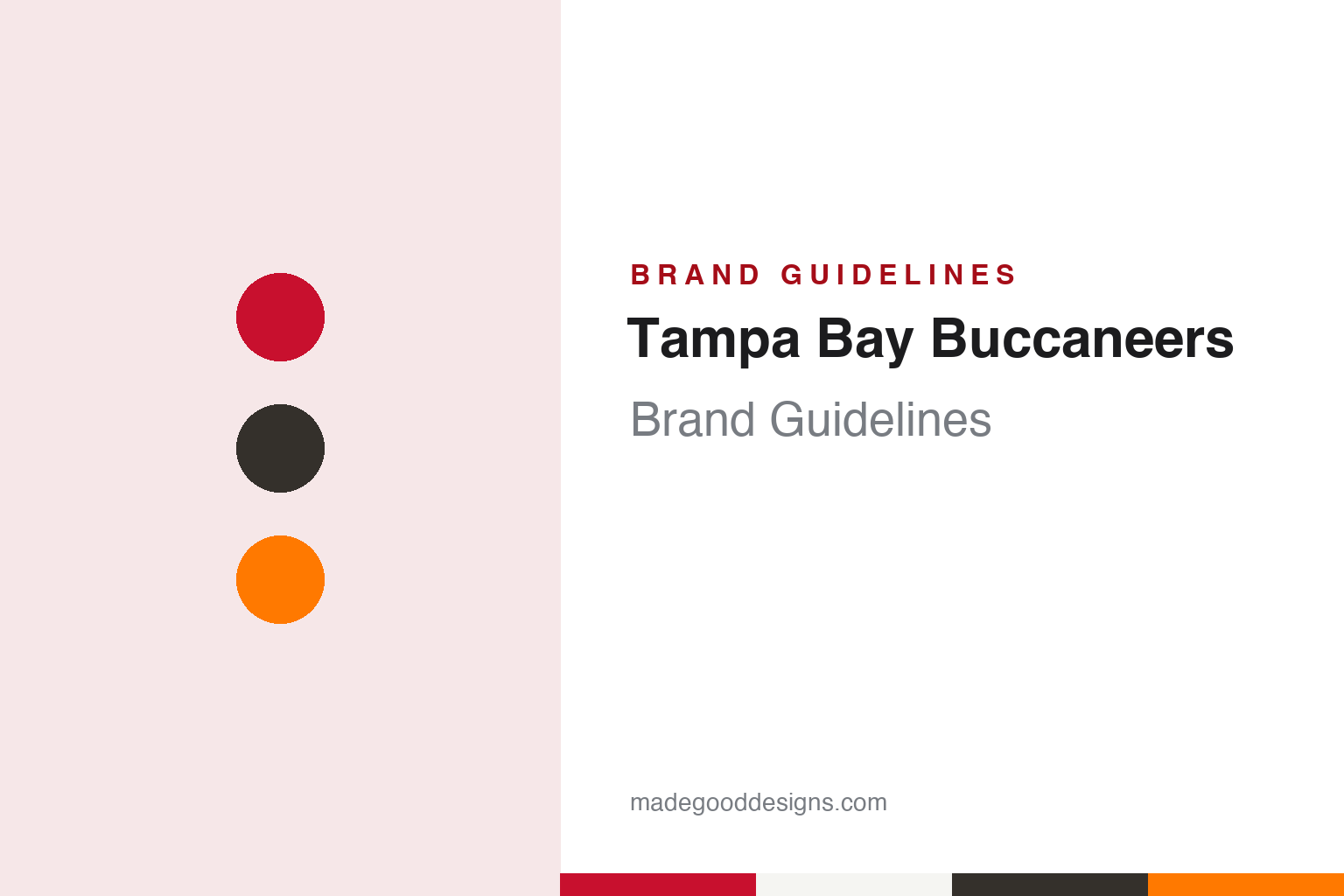
Tampa Bay Buccaneers Brand Guidelines
A winking pirate in orange, a battle flag in red, and a pewter that keeps coming back.
Aa
Two constants: a flag red, pewter and Creamsicle orange palette and a condensed display register. Abstract homage — not a Tampa Bay Buccaneers product or mark; no helmet, uniform or logo is reproduced.
A name from the Gulf Coast
A fan contest, a pirate legend and orange for the citrus groves.
The Tampa Bay Buccaneers were named well before their first kickoff. English Wikipedia says the franchise joined the NFL in 1974 as an expansion team, alongside the Seattle Seahawks, and played its first season in 1976, switching conferences with Seattle after that one year. In ESPN’s NFL Nation guide to the origins of every league team name, published on 2 February 2022, the Buccaneers reporter Jenna Laine wrote that the then-owner Hugh Culverhouse held a fan contest in 1974 to pick a nickname, and that “Buccaneers” was chosen as a nod to the pirates who explored Florida’s Gulf Coast in the 17th century.
Wikipedia dates the selection of the name to February 1975 and says it was meant to recall José Gaspar, the pirate of local legend, and the buccaneers of the Caribbean. The short form “Bucs” caught on almost at once, Wikipedia says, while “Bay Bucs” never did.
The colours were argued over before a game was played. Wikipedia says the club first proposed green, orange and white, with orange standing for the Florida citrus industry. Green was dropped within months because artists’ renditions looked too close to the aqua of the Miami Dolphins and the greens of the University of Miami and Florida A&M. Red came in as the accent, a gesture to the former Tampa Spartans and, loosely, to Florida State, so that the scheme drew on several of the state’s college teams. Officially, Wikipedia says, the colours of this era were Florida orange, red and white.
The first logo came from a newspaper cartoonist. Wikipedia credits Lamar Sparkman, a long-time cartoonist at the Tampa Tribune and a member of Ye Mystic Krewe of Gasparilla, with a moustached pirate in a plumed slouch hat, with a hoop earring in his left ear and a dagger between his teeth. To keep clear of the Raiders’ eye-patched pirate, Sparkman gave his figure a wink rather than a patch, and drew him as a gallant swashbuckler. Wikipedia says the St. Petersburg Times sportswriter Hubert Mizell coined the nickname “Bucco Bruce” in a February 1976 column, and it stuck.
Colour
Culverhouse to the Glazers, and Tampa Stadium to Raymond James.
The orange uniforms gave the era its other nickname. Wikipedia says the original home kit paired orange jerseys with white numerals outlined in red, white trousers and striped socks, a look later called the “Creamsicle” uniform after the ice-cream bar. In the first season the orange jerseys appeared only in preseason. After one year the numerals on the white jerseys were reversed to red with an orange outline, which read better on television, and the striped socks went. In 1992 Bucco Bruce was redrawn crisper and larger, and orange trousers joined the set.
Ownership changed after Culverhouse, whom Wikipedia lists as owner from 1976 to 1994. Wikipedia says Malcolm Glazer, a real-estate businessman, bought the franchise in January 1995 and put his sons Bryan, Edward and Joel Glazer in charge of its finances. The Glazer family has owned the club since 1995; FOX 13 Tampa Bay described Ed Glazer as the team’s owner and CEO in April 2020. Wikipedia says Malcolm Glazer also owned Manchester United.
The new owners wanted a new look quickly, but a stadium came first. Wikipedia says the Glazers announced plans for new colours, logos and uniforms soon after the purchase, that the NFL said 1995 was too late to switch, and that the change was postponed while stadium talks stalled; in March 1996 the club said the Creamsicles would stay at least another year. A ballot measure to fund a new stadium passed in September 1996, and the redesign went ahead. The Buccaneers moved from Tampa Stadium to Raymond James Stadium in 1998.
The training base moved too. Wikipedia says the club worked for decades from One Buccaneer Place, a small complex near Tampa International Airport built in 1975, before opening a new facility across the street from Raymond James Stadium in 2006, named the AdventHealth Training Facility in 2018.
Typography
Design and documentation.
A professional football club’s visual identity has to work at very different scales: a mark painted on the side of a helmet, a wordmark stitched across a jersey, a logo printed on a ticket, and signage that spans a stadium façade. Helmet logos in particular are designed to read from a distance and from several angles, so they tend to rely on a single bold silhouette, a limited set of colours and clear outlines that separate the mark from the shell beneath it.
When a club relocates or changes its name, designers face a choice between continuity and a clean break. Some identities carry an existing symbol to a new city and change only the place name in the wordmark; others introduce a new name, a new animal or figure, and a new palette while keeping a link to local history or geography. Regional names, which describe a state or an area rather than one city, are often chosen to widen the audience a team speaks to.
Uniform refreshes usually follow a slower rhythm. Clubs adjust outlines, update typefaces for numbers and names, introduce alternate or throwback jerseys, and refine colour values, often in partnership with the league’s uniform supplier. The guides in this round look at how those decisions show up in each club’s logo, colours and lettering.
Aa
A condensed display sans — the register of a sideline number and an end-zone banner. (Specimen set in Teko, a sans-serif STAND-IN; NOT the Tampa Bay Buccaneers logo or wordmark.)
From a winking pirate to a battle flag
Red and pewter in 1997, a 2014 refresh, a 2020 return and orange on special days.
The 1997 redesign replaced almost everything. Wikipedia says the Buccaneers worked with the NFL on a more marketable look, making red and pewter the primary colours with black and orange as accents. Bucco Bruce gave way to a red, wind-swept flag bearing a white pirate skull and crossed sabres, with a larger sabre as the flagpole; an orange football and orange pinstriping kept a link to the old colours. Wikipedia says the word “Buccaneers” was set in a new font, Totally Gothic. FOX 13 Tampa Bay, reporting on 7 April 2020, described the 1997 change the same way: orange and red replaced by pewter and a darker red, and a new logo with a skull and crossed swords on a red battle flag, which the station said had become a major part of the team’s imagery. Wikipedia says that at an unveiling at The Pier on 7 April 1997 Bucco Bruce was made to walk the plank of the ship Bounty, then pardoned at the last minute by Governor Lawton Chiles.
The flag was refreshed in 2014. Wikipedia says a revised logo and helmet were shown on 20 February that year and new uniforms on 3 March, with an enlarged helmet logo, a darker pewter shell, a chrome-effect facemask, reflective number outlines and Creamsicle orange back as trim; the numerals drew comparisons with digital alarm clocks. The 2020 set answered that. FOX 13 reported that the uniforms unveiled that April returned to the darker red worn from 1997 to 2013, replaced the alarm-clock number font with the earlier one, and added an all-pewter Color Rush kit. The station quoted Ed Glazer: “This new but familiar look is a direct result of the valuable feedback we received from our fans.”
Orange has come back on occasion. Wikipedia says the club kept the old uniforms off the field and off merchandise for years after 1997, then wore orange throwbacks, with the colour now called “Orange Glaze”, on 8 November 2009; they paused after 2012 under the one-helmet rule and returned in 2023. For the 2025 season, Wikipedia says, a white “’76 Uniform” with the Bucco Bruce helmet marked the club’s 50th season.
For a design guide, the Tampa Bay Buccaneers show how a club can retire a character mark completely and later bring it back as a special-occasion look. Compare it with Tampa Bay Rays, the region’s baseball club, and Manchester United, the football club Malcolm Glazer also owned. For this guide we use flag red, pewter and Creamsicle orange with a condensed sans, an unofficial interpretation; no product or logo is reproduced.
Explore & save
Keep Tampa Bay Buccaneers’s identity on hand — save it to a board in the Made Good inspiration library.
Tampa Bay Buccaneers identity set
Pin the Tampa Bay Buccaneers flag red, pewter and Creamsicle orange palette and the condensed display sans register to your own board.