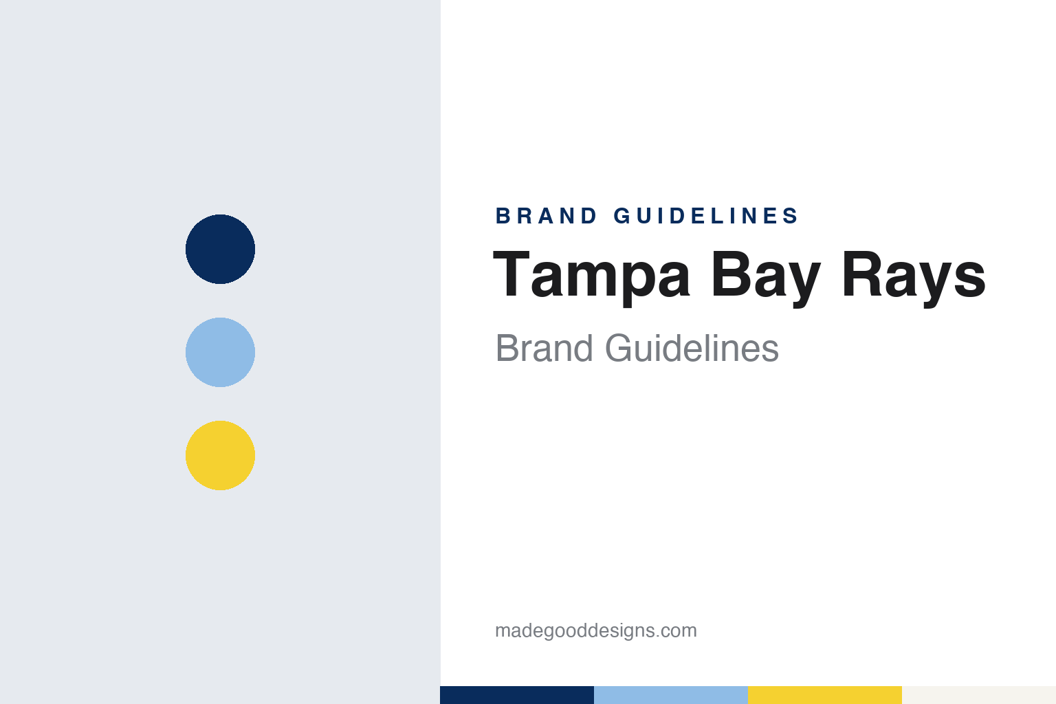
Tampa Bay Rays Brand Guidelines
A devil dropped from the name, a sunburst on the R, and the blues of the bay.
Aa
Two constants: a bay navy, Columbia blue and sunburst yellow palette and a block wordmark and sunburst register. Abstract homage — not a Tampa Bay Rays mark; no cap logo, sunburst or wordmark is reproduced.
A dome waiting for a team
A stadium built on spec, a name bought out of reach, and a devil ray instead.
The ballpark came before the club. In a history of the franchise for the Society for American Baseball Research, last revised on 1 October 2026, Steve Rennie writes that construction of the Florida Suncoast Dome in St. Petersburg began in late 1986 and that the building was finished by 1990, with no team to play in it. Clubs from Chicago, Minnesota, Seattle, Texas and Oakland used the empty dome as leverage in their own stadium talks, and the region missed out when expansion franchises went to Miami and Denver for 1993. The dome was renamed the ThunderDome and then Tropicana Field, after the juice brand based in nearby Bradenton.
The franchise arrived in the next round. English Wikipedia records that an ownership group led by Tampa investor Vince Naimoli was approved on 9 March 1995, the same day as the club in Phoenix, and Rennie describes Naimoli as managing general partner of a group of local business owners. The team began play in the American League in 1998.
The name took a detour. Wikipedia says Naimoli first wanted “Tampa Bay Sting Rays,” but the rights were held by a minor-league club in Maui, so he chose another species and introduced the team as the Tampa Bay Devil Rays. Some local church pastors told the Tampa Bay Times that the word “devil” offended them, Wikipedia notes, but fans backed the name in a telephone poll that offered “Manta Rays” as the alternative.
The early look was loud. Wikipedia describes white home and grey road uniforms with “Devil Rays” and “Tampa Bay” in a multicoloured “rainbow” across the chest, and caps in black, some with a purple brim, carrying a devil ray graphic and no letters at all; a black cap with a smaller ray and the letters “TB” was worn for most games. Writing in Sports Business Journal on 11 November 2007, Pete Williams called those first uniforms “a kaleidoscope of aquamarine colors.” The mascot Raymond, described as a “seadog,” was introduced in that same 1998 season, Wikipedia says.
Colour
From green to navy, and from Naimoli to Sternberg.
The colours shifted within a few years. Wikipedia says that in 2001 the club dropped the multicoloured lettering, played down purple in favour of green, and shortened the home jersey to read simply “Rays,” keeping “Tampa Bay” on the road. Williams describes that change as a modest rebrand that encouraged the use of “Rays” without officially dropping “Devil.” By 2005 the home caps had turned green and a small ray with a long tail sat beneath the name on the chest.
Ownership changed next. Rennie writes that Stuart Sternberg, a former partner at Goldman Sachs, reached agreement to take control from Naimoli and in October 2005 became controlling owner ahead of the original schedule. One of his priorities, Rennie says, was to distance the franchise from its past by dropping “Devil” from the name, along with a complete visual makeover.
The new identity was launched on 8 November 2007. The Associated Press reported that night that the club had officially shortened its nickname to “Rays” at a celebration in a downtown St. Petersburg park, with players, manager Joe Maddon and former players modelling the new uniforms in a fashion show. Navy blue and light blue replaced green and black as the primary colours, and the new logo and uniforms carried “Rays” in navy lettering with a light blue shadow. Sternberg told the AP that “Rays” had been his own first choice, and that the club had also weighed names such as Cannons, Stars, Wave and Dukes before settling on Rays and a logo with a bright yellow sunburst. An updated devil ray patch stayed on the left sleeve.
Williams filled in the design story. He reported that the marks were created by MLB Design Services after exploratory work on possible names with Interbrand, the New York branding firm, and that the club ran fan focus groups on the name and design. The two blues were meant to stand for the waters of Tampa Bay, the sweeping right leg of the “R” was drawn to resemble a wave, and the small sunburst was meant to carry the “rays of hope” around the club. Sternberg told Williams it was important “to incorporate what Florida is without using another sea creature.” The launch party was sponsored by the club’s cable partner, Bright House Networks, whose own logo also used a yellow sunburst, and the new road uniform at first carried no city name at all.
Typography
Design and documentation.
Baseball clubs founded in later expansion waves arrive without decades of inherited imagery, so their identities are built deliberately and often rebuilt within a generation. A new club usually launches with a full kit of parts at once: a name chosen with public input, a primary logo, a script or block wordmark, a cap insignia, home and road uniforms and a colour set meant to read clearly on television. When the club later changes its name, moves into a new ballpark or passes to new owners, that kit is frequently redrawn as a whole rather than adjusted piece by piece.
Renames tend to simplify. A long or regional name may be shortened, or a state name swapped for a city name, so the club can claim a home market more directly. Colour is the other lever. Warm-climate clubs often borrow from local surroundings, with sea blues, sunset oranges, citrus yellows and tropical greens, while later redesigns sometimes move to darker, more restrained palettes that hold up on screens, merchandise and cap fronts.
Domed and retractable-roof ballparks add their own design layer. Signage, wayfinding and scoreboard graphics sit under artificial light or shifting daylight, and the building itself often becomes part of the club’s visual story, appearing in advertising, ticketing and broadcast graphics alongside the logo and wordmark.
Rr
A tall, condensed block — the register of a navy “Rays” wordmark with a sunburst on the R. (Specimen set in Oswald, a sans STAND-IN; NOT the Tampa Bay Rays logo, sunburst or wordmark.)
Tampa Bay Rays
A sunburst that stayed, and a rainbow that came back.
The 2008 look has barely moved since. Wikipedia describes a white home jersey with “Rays” in dark blue and a yellow sunburst on the “R,” a grey road version, dark blue piping and caps with a white “TB.” A navy alternate added Columbia blue piping, and a Columbia blue jersey followed for Sunday home games; from 2018 it was paired with a dark blue cap carrying the old devil ray logo, and in 2022 the sunburst replaced the wordmark on its chest. From 2012 to 2017 the club also wore “faux-back” uniforms in gold, navy and powder blue, designed to show what the team might have worn had it existed around 1980.
The past has since moved back into the rotation. Wikipedia records that the 1998 rainbow Devil Rays uniforms, worn on throwback days from 2018, were added to the regular set in 2023 for the club’s 25th season. In 2024 a dark City Connect uniform put “Tampa Bay” across the chest in black lettering outlined in neon, with a cap showing the Sunshine Skyway Bridge and a stingray, and a further logo of three palm trees and a pelican, the bird on the flag of St. Petersburg. On 21 September 2026 the club unveiled a grey road jersey that modernises the rainbow design, to serve as the primary road uniform from 2027; the Columbia blue top was retired after the 2026 season. A second mascot, DJ Kitty, a cat in a Rays jersey at a turntable, joined Raymond in 2010.
The building and the owners have both changed recently. Rennie writes that Hurricane Milton tore the roof of Tropicana Field in October 2024, and that the team played the 2025 season at George M. Steinbrenner Field in Tampa. Bay News 9 reported on 30 September 2025 that a group led by Patrick Zalupski, founder and chief executive of the Jacksonville home builder Dream Finders Homes, had closed its purchase of the club, with Bill Cosgrove and Ken Babby among its leaders; the St Pete Catalyst reported that the deal also included the Tampa Bay Rowdies soccer club. The Zalupski group has owned the Rays since 2025, and in January 2026, Rennie writes, the club announced plans for a new ballpark on the Hillsborough College campus in Tampa.
For a design guide, Tampa Bay Rays shows how a club can keep one animal and one idea while swapping almost everything else: a name trimmed by a word, a palette taken from the water, and a small sunburst made to carry the rebrand. Compare the city’s hockey club in our Tampa Bay Lightning guide, and the league-wide marks in the MLB guide. For this guide we use bay navy, Columbia blue and sunburst yellow with a condensed sans, an unofficial interpretation; no product or logo is reproduced.
Explore & save
Keep Tampa Bay Rays’s identity on hand — save it to a board in the Made Good inspiration library.
Tampa Bay Rays identity set
Pin the Tampa Bay Rays bay navy, Columbia blue and sunburst yellow palette and the block wordmark and sunburst register to your own board.