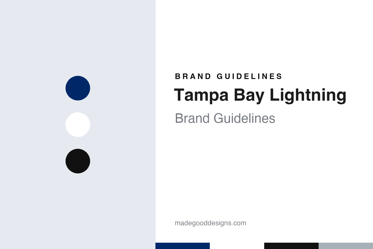
Tampa Bay Lightning Brand Guidelines
One bolt in a circle, struck in blue on white.
Aa
Two constants: a bolt blue, ice white and trim black palette and a condensed storm capitals register. Abstract homage — not a Tampa Bay Lightning mark; no bolt logo, roundel or jersey is reproduced.
A name from a summer storm
Phil Esposito, a backyard barbecue and a team that played in a livestock hall.
The Tampa Bay Lightning began as the project of Phil Esposito, the former NHL forward, who decided in 1990 that he wanted to bring an expansion team to the Tampa Bay area. In a long history of the club’s origins in the Tampa Bay Times, published on 13 June 2015, Ben Montgomery wrote that on 1 May 1990 Esposito told the hockey world he was interested in a team for Tampa Bay, and that he already had a name: the Lightning. English Wikipedia says Esposito’s Tampa-based group, fronted by Phil and his brother Tony Esposito together with Mel Lowell, won the franchise on 6 December 1990.
The story of the name is told by the club itself. An article on the team’s official website by Bryan Burns recounts that Esposito was at a summer barbecue at the home of a Tampa lawyer and business associate, Bennie Lazzara, when a dark thunderstorm formed nearby and lightning lit up the sky. Lazzara told him the area was known for its lightning, and, according to the club’s account, Lazzara’s mother came out of the house, heard the two men discussing names and suggested calling the team the Lightning. Esposito told the club’s writer that he decided on the spot. Wikipedia likewise ties the name to the area’s reputation for lightning storms.
The club did run a naming contest for fans, but in the club’s telling the decision had already been made. Burns writes that the finalists included “Oceanics,” which Esposito dismissed with a joke about Jacques Cousteau, and that the Pelicans and the Gators were also suggested; Esposito turned down the Gators because the name already belonged to football. A small number of entrants who had proposed “Lightning” were, he recalled, acknowledged by the club.
The money took longer than the name. Montgomery reported that Esposito’s original investors pulled out, and that a Wall Street lawyer, David LeFevre, connected the group with Japanese investors. Wikipedia names the main backer as Kokusai Green, a golf course and resort operator, and Montgomery wrote that in September 1991 the Japanese partners became general partner, holding the majority of the team.
Colour
Black, blue and silver in the early years, then a single blue bolt from 2011.
The club’s early homes were unusual. Montgomery reported that for its opening season the team signed a lease on the Expo Hall at the Florida State Fairgrounds, a livestock pavilion, and installed its own seats and scoreboards. The Lightning then played at the domed baseball stadium in St. Petersburg now called Tropicana Field, which was renamed the ThunderDome for hockey, before moving to a new downtown arena on the Garrison Channel in Tampa for the 1996–97 season. That building opened as the Ice Palace and is now called Benchmark International Arena, according to Wikipedia.
The original uniforms set the early look. Wikipedia describes simple stripes on the sleeves and tail with contrasting shoulders, black over a white jersey and white over the black, carrying an alternate logo of a lightning bolt over the outline of Florida. The underarm gussets featured what the club called “victory stripes,” thin bands alternating black, silver and blue. For 1996–97 the club added a mainly blue third jersey with a sublimated wave and rain pattern, bolts down the sleeves and a silver-grey yoke; it was retired after the 1998–99 season.
A modernised logo arrived on 25 August 2007, alongside the league’s Reebok Edge uniforms. Wikipedia says it kept the bolt theme but set “Tampa Bay” across the top in tall capitals and dropped the word “Lightning.” A bright “electric blue” third jersey followed in 2008–09, replacing the crest with the word “BOLTS” running diagonally down the front.
The decisive change came in 2011. On 23 January 2011 the Tampa Bay Times Lightning blog reported that the club had filed paperwork with the league to change its colours and logo for the 2011–12 season, and that the new scheme was expected to be blue and white, with black and the silver trim set aside and a plain bolt replacing the words on the home crest. Wikipedia says the new logo and home and away jerseys were unveiled at a news conference at the St. Pete Times Forum on 31 January 2011, and that the club gave away free T-shirts with the simplified logo on 4 February while still wearing the old uniforms. The new set used a traditional sweater design; black was added back as a trim colour on the numbers in response to fans, and the victory stripes were dropped.
Ownership has changed several times. After Kokusai Green, Wikipedia lists Art Williams from 1998, the Detroit Pistons owner Bill Davidson from 1999 and a group led by Oren Koules and Len Barrie from 2008. Boston investor Jeffrey Vinik bought the team during the 2009–10 season. Wikipedia says the franchise is now owned by Vinik Sports Group, with an investor group led by Doug Ostrover and Marc Lipschultz holding a majority stake and Vinik remaining chairman and governor during a transition period.
Typography
Design and documentation.
An expansion club starts its brand from nothing, so the identity tends to arrive as a sequence of public moments rather than as a single drawing. A name is chosen, sometimes after a fan vote or a shortlist, and announced at an event designed to be filmed and shared. The crest usually follows on the same day or soon after, presented alongside a primary colour set, a secondary mark, a wordmark and the first sweater designs.
Those pieces are meant to work together. The primary logo has to read on a helmet, at centre ice, on a ticket app icon and on a souvenir cap, which pushes designers towards bold silhouettes and a small number of flat colours. Secondary marks often borrow a local landmark, a regional story or a piece of wordplay, giving merchandise a second voice.
Colour names matter as much as the hues themselves. Clubs often give their tones descriptive names tied to place or theme, and those names travel into press releases, retail tags and broadcast graphics. The arena is the last layer: signage, concourse graphics, ice markings and naming-rights wordmarks all have to sit alongside the team’s own marks, so a building’s branding becomes part of how the club looks on screen.
TB
Condensed storm capitals — the register of a bolt crest, a diagonal BOLTS wordmark and an arena ribbon board. (Specimen set in Barlow Condensed, a condensed sans STAND-IN; NOT the Tampa Bay Lightning logo or wordmark.)
Tampa Bay Lightning
Black alternates, reverse retros and a bug for a mascot.
The blue and white set has stayed largely intact, with small changes around it. When Adidas took over as the league’s uniform supplier for 2017–18, Wikipedia says, the Lightning made minor tweaks, including the removal of the “TAMPA BAY” wordmark from the white away sweater. On 7 February 2019 the club unveiled an all-black uniform with no blue or white, using sublimated black and grey patterns on the sleeves, socks and back numbers.
Later alternates have reached back to the earlier eras. The 2020–21 “Reverse Retro” sweater reused the design worn from 2001 to 2007, but with blue as the base and black as a trim colour, according to Wikipedia; the 2022–23 version took the 1996–99 third jersey and put it on a white base. For the 2022 Stadium Series the club wore a white uniform with a blue stripe shaped like a thunderbolt along the bottom, an updated “BOLTS” wordmark on the front and numbers with pointed accents. A black alternate introduced for 2023–24 made the roundel logo the main crest and brought back the victory stripes on the sleeves, with white numbers trimmed in black and blue modelled on the original uniforms.
Outdoor games have added local references. For the 2026 Stadium Series at Raymond James Stadium, Wikipedia says, the Lightning wore blue with sky-blue accents and sublimated lightning marks, a diagonal “TBL” crest in the 2022 lettering and pirate details on the sleeves and patch alluding to Tampa’s Gasparilla pirate festival and to the stadium’s football tenant. The club mascot, ThunderBug, is a lightning bug who performs at games and appears in the community.
For a design guide, Tampa Bay Lightning shows how a club can simplify a busy early identity into one shape, a single bolt, and then use alternates to revisit the older black, silver and wave-pattern looks without disturbing the primary set. Compare the NHL, the Toronto Maple Leafs, another blue and white NHL club, and the Washington Capitals. For this guide we use bolt blue, ice white and trim black with a condensed sans, an unofficial interpretation; no product or logo is reproduced.
Explore & save
Keep Tampa Bay Lightning’s identity on hand — save it to a board in the Made Good inspiration library.
Tampa Bay Lightning identity set
Pin the Tampa Bay Lightning bolt blue, ice white and trim black palette and the condensed storm capitals register to your own board.