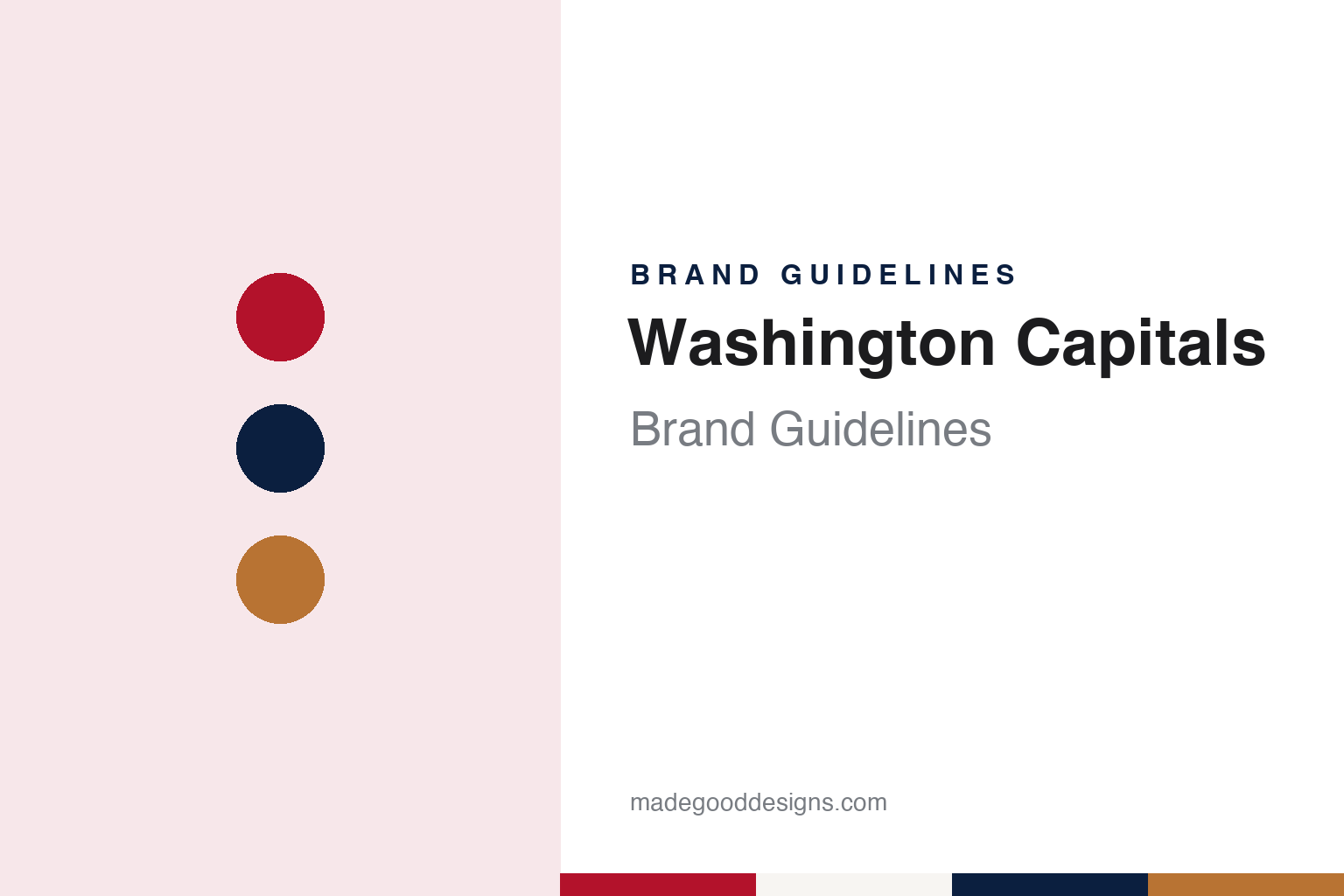
Washington Capitals Brand Guidelines
A stick-shaped t, three stars and an eagle that came and went, in red, white and blue.
Aa
Two constants: a Capital red, federal navy and eagle copper palette and a condensed sans register. Abstract homage — not a Washington Capitals product or mark; no crest, sweater or logo is reproduced.
An arena needs a team
A hockey club born so a building could be built.
The Washington Capitals entered the National Hockey League for the 1974–75 season, alongside the Kansas City Scouts. English Wikipedia says the league awarded the expansion franchise to Washington on 8 June 1972, and that the club was owned by Abe Pollin, who also owned the NBA team then known as the Bullets. Pollin built the Capital Centre in Landover, Maryland, in the suburbs of the capital, to house both teams.
The hockey club was, in part, a condition of that building. John Domen of the Washington radio station WTOP interviewed Pollin’s son Jim for a piece published on 18 October 2024, as the club began its fiftieth season. Jim Pollin said that for his father to build an arena he needed both a hockey team and a basketball team, so a hockey team was a must. He said Washington had not been expected to win a franchise, and credited Bill Wirtz, then owner of the Chicago Black Hawks, who knew Abe Pollin through the NBA, with putting in good words for him.
The name came from the public. Wikipedia, citing a 2024 history piece by the club’s writer Mike Vogel, says the name was settled through a contest, and that other names put forward included Comets, Cyclones, Streaks and Domes. “Capitals” tied the club to the city’s role as the nation’s capital, and Wikipedia gives “Caps” as the club’s colloquial name.
The early years were hard on the business. WTOP recounted how, by 1982, the club’s finances were shaky enough that it might have folded. Jim Pollin said his father decided the city had to support the team, which launched the “Save the Caps” campaign: corporations and individuals bought season tickets so that games would sell out. He told WTOP that the city came together and that the atmosphere in the arena changed. Wikipedia adds that new part-owners joined at that point, among them Dick Patrick, on whose advice Pollin hired David Poile as general manager.
The club stayed in Landover until 1997, when Wikipedia says it moved into the MCI Center in Washington, the arena now called Capital One Arena. Ownership passed in 1999: the Washington Post described Ted Leonsis in 2007 as the majority owner “who assumed control of the team in 1999.” Wikipedia says Leonsis owns the club today through Monumental Sports & Entertainment, the company that also controls the Wizards, the former Bullets.
Colour
Stars and stripes, then an eagle in copper.
The first identity borrowed from the national flag. Wikipedia says the Capitals took the ice in red, white and blue jerseys with contrast-coloured shoulders and stars on the chest and sleeves based on the flag of the United States. The original crest was a wordmark: the Washington Post later called the t in “Capitals,” drawn as a hockey stick, a familiar part of it. Wikipedia says the crest was modified a few times over the next two decades, but the stars-and-stripes uniform lasted until 1995.
Then the club changed almost everything. Johnny Ludden of the Washington Post described the unveiling of the new logo and uniforms at a news conference at Planet Hollywood in June 1995, where the theme of the day was flight: the team showed off blue and bronze uniforms with a swooping bald eagle. Wikipedia describes the palette as blue, black and copper, with an American bald eagle and five stars as the primary logo, and an alternate logo showing the dome of the U.S. Capitol with crossed hockey sticks behind it.
The eagle era had its own variations. Wikipedia says a black alternate jersey arrived for 1997–98, with copper stripes at the cuffs and waist and the Capitol logo on the chest, while the white and blue jerseys carried the eagle. The team name, at first set along the lower black stripe, was removed from the white jersey in 1997. Before the 2000–01 season the blue road jersey was retired and the black one took its place. Wikipedia shows two black, blue and copper logo versions, one used from 1995 to 2002 and another from 2002 to 2007.
The 1995 redesign also introduced the club’s costumed character. Wikipedia says the mascot since 1995 has been Slapshot, a bald eagle wearing the number 00, and, citing a Baltimore Sun report of 18 November 1995, that he was named by a fifth-grade pupil who won a naming contest. Slapshot has outlived the copper uniforms that came with him, and the eagle itself has kept returning on alternate jerseys in the decades since.
Typography
Design and documentation.
An expansion club starts its brand from nothing, so the identity tends to arrive as a sequence of public moments rather than as a single drawing. A name is chosen, sometimes after a fan vote or a shortlist, and announced at an event designed to be filmed and shared. The crest usually follows on the same day or soon after, presented alongside a primary colour set, a secondary mark, a wordmark and the first sweater designs.
Those pieces are meant to work together. The primary logo has to read on a helmet, at centre ice, on a ticket app icon and on a souvenir cap, which pushes designers towards bold silhouettes and a small number of flat colours. Secondary marks often borrow a local landmark, a regional story or a piece of wordplay, giving merchandise a second voice.
Colour names matter as much as the hues themselves. Clubs often give their tones descriptive names tied to place or theme, and those names travel into press releases, retail tags and broadcast graphics. The arena is the last layer: signage, concourse graphics, ice markings and naming-rights wordmarks all have to sit alongside the team’s own marks, so a building’s branding becomes part of how the club looks on screen.
Aa
A condensed sans — the register of block sweater numbers and arena signage. (Specimen set in Oswald, a condensed sans STAND-IN; NOT the Washington Capitals logo.)
Back to red, white and blue
Twelve years later, the stars return — with a new meaning.
The eagle gave way in 2007. Tarik El-Bashir reported in the Washington Post on 22 June 2007 that, twelve years to the day after dropping the original logo and colours, the Capitals were returning to red, white and blue, with stars on the chest and the “t” in “Capitals” shaped like a hockey stick across the front. The new set was to be shown that night at the NHL entry draft in Columbus, Ohio. The paper said the look had been developed with Reebok for nearly three years and put a modern touch on the uniform worn from 1974 to 1995. Leonsis told the paper that going back to red, white and blue was about returning to tradition, and that he had grown up a Caps fan.
The Post described the details. “Capitals” ran in dark blue lettering across the chest, the “t” extending down to form a hockey stick beside a stylised puck, with “Washington” in capitals above. Above the city’s name sat three stars, which the paper said represented Maryland, the District and Virginia. A shoulder patch showed a bald eagle with a “W” worked into its spread wings, perched above a silhouette of the Capitol. The red home jersey had white numbers outlined in blue, and the white road jersey red numbers outlined in blue. Tim McDermott, the club’s chief marketing officer, called the change an “identity change” and a “brand awakening.” Wikipedia adds that the three stars also echo the flag of Washington, D.C., itself drawn from George Washington’s family arms, and that fans nicknamed the eagle-and-W mark the “Weagle.”
Alternates since then have mined both eras. Wikipedia lists a white jersey with the original logo for the 2011 Winter Classic; a vintage deep-red jersey with a large starred “W” for the 2015 Winter Classic at Nationals Park, which Sports Illustrated covered on 23 September 2014; a navy “Caps” uniform for the 2018 Stadium Series at the U.S. Naval Academy; and a white 2023 Stadium Series uniform built around the Weagle. Reverse Retro uniforms in 2021 and 2022 brought back the “screaming eagle” in red and then in black with copper, and Wikipedia says a red-based screaming eagle alternate was introduced for 2025–26.
For a design guide, the Washington Capitals show how a club can leave its founding colours, build a full second identity around an eagle and then return to the original with new meaning layered into the same stars. Compare it with New York Rangers, another red, white and blue NHL identity, and Pittsburgh Penguins, which faced the Capitals in the 2000 and 2001 playoffs. For this guide we use Capital red, federal navy and eagle copper with a sans, an unofficial interpretation; no product or logo is reproduced.
Explore & save
Keep Washington Capitals’s identity on hand — save it to a board in the Made Good inspiration library.
Washington Capitals identity set
Pin the Washington Capitals red, navy and eagle copper palette and the condensed sans register to your own board.