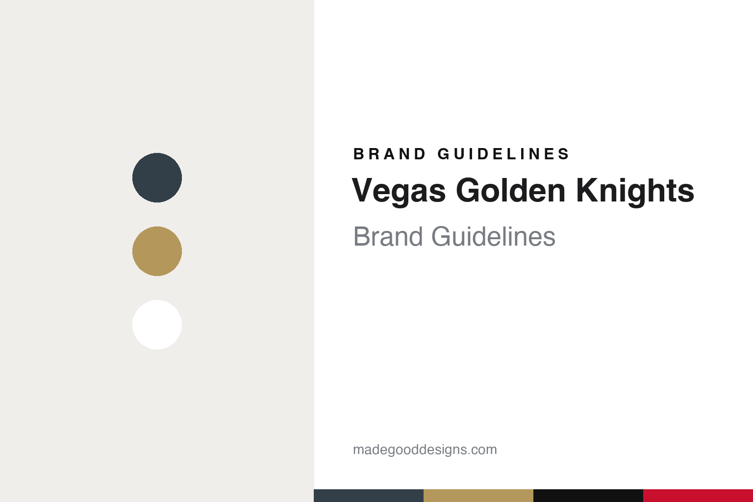
Vegas Golden Knights Brand Guidelines
A helmet, a shield and a V, set in steel grey and gold.
Aa
Two constants: a steel grey, helmet gold and shield black palette and an armoured inscriptional capitals register. Abstract homage — not a Vegas Golden Knights mark; no helmet shield, swords logo or jersey is reproduced.
A knight with a golden name
West Point, a parachute team and three words instead of four.
The Vegas Golden Knights were approved as a National Hockey League expansion club at the league owners’ meeting held in Las Vegas on 22 June 2016, with play to begin in the 2017–18 season. English Wikipedia says the application came from the businessman Bill Foley, who then began hiring the club’s principal staff and working out its identity. The name, logo and primary colour were revealed together five months later.
The reveal took place on the evening of 22 November 2016 at Toshiba Plaza, outside T-Mobile Arena on the Las Vegas Strip. Writing in the Las Vegas Sun the next day, Case Keefer reported that Foley led a countdown before the name and logo appeared on the arena’s outdoor video board, and that official T-shirts, hats and sweatshirts made by Adidas went on sale at a pop-up shop the same night. Keefer reported that Golden Knights had been on Foley’s list of finalists since the summer and that the club settled on it in September, after receiving the NHL’s clearance; the remaining weeks went into refining the logo.
The word “Knights” came from Foley’s own background. Wikipedia says it is a homage to the Black Knights of the United States Military Academy at West Point, Foley’s alma mater, and that Foley had hoped to call the team the Black Knights but dropped the idea after resistance from federal officials. Keefer wrote that Foley could never shake his wish to use “Knights” as an ode to West Point, and that the fact that Golden Knights is the name of the Army’s parachute team further drew him to it. Among the runners-up Foley mentioned to the Sun were Nighthawks, Desert Hawks and Sidewinders.
The other two words were practical choices. Foley told the Sun that Silver Knights had been an option, since Nevada is the Silver State, but that he preferred gold, pointing to the state’s gold mining; he added that Desert Knights did not have enough character for him. He dropped “Las” from the city name for two reasons, according to Keefer: local people say “Vegas,” and a four-word team name felt too long to him. Wikipedia adds that “Vegas Knights” was not available because the London Knights hold the “Knights” name in Canada.
Colour
A helmet inside a shield, a star from the city sign and a steel grey base.
The logo went through several versions before the reveal. Keefer reported in the Las Vegas Sun that the primary symbol began as a knight in armour, switched briefly to a knight on a horse, and ended as the black and gold seal with a helmet shown on the night. Wikipedia describes the final mark as a barbute helmet set on a black and gold shield, with a V-shaped opening in the face of the helmet. Keefer wrote that the V stands for “Vegas” and that the gold was also meant to suggest the colour of the local terrain.
A secondary logo puts two crossed swords behind a red star. According to both the Sun and Wikipedia, the star is drawn to resemble the one on the Welcome to Fabulous Las Vegas sign, and it is coloured a metallic red to evoke the city skyline and the Red Rock Canyon landscape west of the city. The club’s primary colour is steel grey, which the team says represents “strength and durability”; gold and red complete the set, with black standing for “power and intensity,” in Wikipedia’s summary of the team’s description.
The original uniforms were shown publicly on 20 June 2017. Wikipedia says the home sweaters were steel grey with black, gold and red stripes, the road sweaters white with steel grey, gold and red stripes, and the crossed-swords mark sat on both shoulders. A gold alternate followed on 2 October 2020, essentially the road design with gold and white swapped, and shiny gold helmets appeared as an alternate to the grey ones on 11 February 2021. From the 2022–23 season the gold sweater became the primary home uniform and the grey one moved to alternate status.
The name also met legal objections. CNBC reported on 12 January 2018 that the US Army had filed a formal complaint arguing that the team’s name and colours were too similar to those of its Golden Knights parachute team; Wikipedia says the Army later dropped its opposition after the two sides negotiated a trademark coexistence agreement.
The club is controlled by Black Knight Sports and Entertainment, a group led by Foley. Wikipedia says the Maloof family, part of the original ownership group, sold the bulk of its shares to Foley in early January 2024, with Adrienne Maloof keeping a minority stake.
Typography
Design and documentation.
An expansion club starts its brand from nothing, so the identity tends to arrive as a sequence of public moments rather than as a single drawing. A name is chosen, sometimes after a fan vote or a shortlist, and announced at an event designed to be filmed and shared. The crest usually follows on the same day or soon after, presented alongside a primary colour set, a secondary mark, a wordmark and the first sweater designs.
Those pieces are meant to work together. The primary logo has to read on a helmet, at centre ice, on a ticket app icon and on a souvenir cap, which pushes designers towards bold silhouettes and a small number of flat colours. Secondary marks often borrow a local landmark, a regional story or a piece of wordplay, giving merchandise a second voice.
Colour names matter as much as the hues themselves. Clubs often give their tones descriptive names tied to place or theme, and those names travel into press releases, retail tags and broadcast graphics. The arena is the last layer: signage, concourse graphics, ice markings and naming-rights wordmarks all have to sit alongside the team’s own marks, so a building’s branding becomes part of how the club looks on screen.
VGK
Armoured inscriptional capitals — the register of a helmet crest, a shield and a wordmark on a Strip arena façade. (Specimen set in Cinzel, an inscriptional serif STAND-IN; NOT the Vegas Golden Knights logo or wordmark.)
Vegas Golden Knights
Alternates borrowed from the Strip, a red retro and a reptile mascot.
Because the club had no back catalogue of its own, its throwback designs have borrowed from the city instead. Wikipedia says the earlier “Reverse Retro” alternate used a red base with the crossed-swords logo on the front and drew in part on Manon Rhéaume, the goaltender who played for the Las Vegas Thunder of the International Hockey League. The second Reverse Retro design was a faux-back styled as if from 1995, with a black base and a diagonal “VEGAS” wordmark inspired by vintage hotel signs on the Strip; the wordmark glows in the dark.
An outdoor game gave the club another chance to invent a past. For the 2024 Winter Classic, played against Seattle, the Golden Knights wore white faux-back uniforms styled as if from 1917, with heritage gold stripes, grey pants and grey helmets and a stylised grey “V” crest with petal accents and gold trim. Wikipedia says the design was officially unveiled on 22 November 2023.
The mascot sidesteps the knight theme altogether. The club’s mascot is Chance, a Gila monster. Wikipedia says he was introduced at the team’s second home game, on 13 October 2017, and that the club decided against a knight mascot because it found knight costumes used by other teams were not very child-friendly. A skating knight still often appears in the pre-game show at T-Mobile Arena, the Strip venue the team has called home since its opening season. The club’s minor-league affiliate in Henderson, the Silver Knights, uses a shield-shaped logo with a silver horse whose eyes match the Golden Knights’ gold, according to Wikipedia.
For a design guide, Vegas Golden Knights shows how a new club can build an identity from a few borrowed references: a military academy nickname, a precious metal, a road sign and the colours of the desert around the city. Compare the NHL, the Las Vegas Raiders, who share the city, and the Seattle Kraken, their 2024 Winter Classic opponents. For this guide we use steel grey, helmet gold and shield black with an inscriptional serif, an unofficial interpretation; no product or logo is reproduced.
Explore & save
Keep Vegas Golden Knights’s identity on hand — save it to a board in the Made Good inspiration library.
Vegas Golden Knights identity set
Pin the Vegas Golden Knights steel grey, helmet gold and shield black palette and the armoured inscriptional capitals register to your own board.