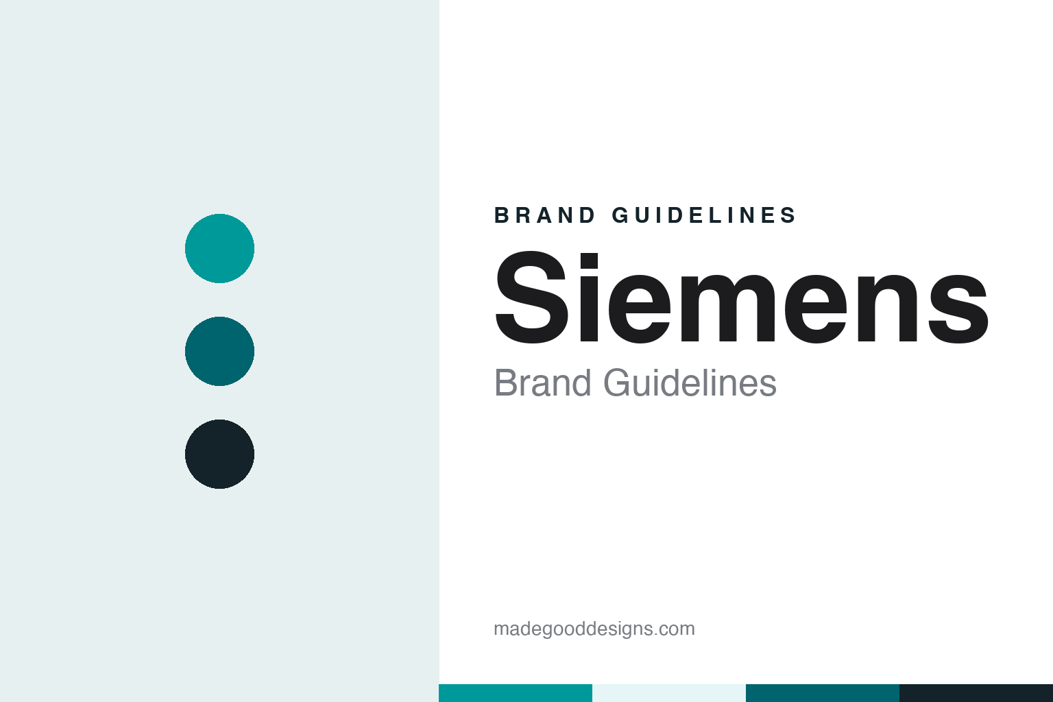
Siemens Brand Guidelines
Two founders, one surname and a colour called petrol.
Aa
Two constants: a petrol, deep petrol and night palette and a Humanist sans register. Abstract homage — not a Siemens asset or mark; no logo, symbol or wordmark is reproduced.
A Berlin workshop
Siemens & Halske, 1847.
Siemens began as a partnership named after both its founders. On 12 October 1847, Wikipedia says, the Telegraphen-Bauanstalt von Siemens & Halske opened its workshop in Berlin. The partners were Werner von Siemens and the mechanic Johann Georg Halske, and the business formed around Siemens’s pointer telegraph, which used a needle to point to letters in sequence instead of relying on Morse code, according to Wikipedia’s history of the company’s medical arm.
The original name described the trade precisely: a telegraph construction workshop belonging to Siemens and Halske. Over time the descriptive part and the second surname dropped out of the everyday brand. What survived on equipment, buildings and advertising was the single word Siemens.
The company grew through a set of separately named businesses before it took its present form. Wikipedia lists three so-called parent companies: Siemens & Halske, founded in 1847; Siemens-Schuckertwerke, formed in 1903 with the Nuremberg firm of Schuckert; and Siemens-Reiniger-Werke, formed in 1932 from a merger of medical equipment makers in Erlangen, Rudolstadt and Berlin. Each name carried Siemens at the front and a partner or predecessor behind it.
In 1966 the three merged to form Siemens AG, Wikipedia says. The hyphenated and paired names gave way to one corporate name, and the company today lists its headquarters in Munich and Berlin. The merger is the point at which the brand became, in legal as well as everyday terms, a single surname.
The early partnerships also left names that later stood on their own. In 1919, Wikipedia says, Siemens & Halske and two other companies jointly formed the lamp maker Osram, a brand that would remain linked to Siemens for most of the following century before its own separation.
Colour
A wordmark and a colour called petrol.
The Siemens identity rests on two assets: the wordmark, set in capital letters, and a blue-green colour the company calls petrol. The colour has a name inside the group. The brand pages of Siemens Healthineers, the medical technology company that carries the Siemens name, describe “Siemens Petrol” as the key accent colour of their own design system, sitting alongside an orange brand colour and a headline typeface the company developed itself, SH-Bree-Headline.
The same pages say the Healthineers design language stands for precision and high technology, and that the company runs its own brand extranet, called Brandville, to hold its brand requirements and specifications in one place. The Healthineers name and orange sit in front; Siemens Petrol remains as the accent.
The verbal identity has changed more often than the colour. On 25 May 2016, Viet Nam News reported that Siemens AG had unveiled a new brand identity called “Ingenuity for life”. The company said the line summed up what Siemens had stood for since Werner von Siemens produced his inventions, and the newspaper quoted then chief executive Joe Kaeser explaining that “ingenuity” meant engineering expertise, entrepreneurial spirit and the power of innovation, while “for life” meant creating long-term value in every generation. The report said the strengthened global brand appearance went with a positioning around electrification, automation and digitalisation.
The business names underneath the wordmark are plain descriptions. As of 2023, Wikipedia lists the principal divisions as Digital Industries, Smart Infrastructure, Mobility and Financial Services, with Siemens Mobility operating as an independent entity. Each pairs the Siemens name with a short English label for what the unit does, in the same way the 19th-century firm paired its founders’ names with “telegraph construction”.
Leadership changed again in February 2021, when Roland Busch replaced Joe Kaeser as chief executive, Wikipedia says.
Typography
Industrial names, symbols and colours.
Industrial company names tend to start as descriptions of people or processes. Many began with a founder’s surname, a pair of partners’ names joined by an ampersand, or a long legal title that listed what the firm made and where. Over time those titles were shortened in everyday use, and the short form often became the official name: a surname on its own, or a set of initials that customers and staff had been using for decades.
The marks that sit beside those names are usually simple shapes. Squares, ovals, diamonds and plain rules recur because they print cleanly on drums, sacks, vehicles, signage and paperwork, and because they hold their shape at very small and very large sizes. Many identities rely on a single corporate colour, applied across a wordmark and a few supporting elements, rather than a broad palette.
Mergers and spin-offs test these systems. When companies combine, the new group must choose whether to keep one name, join two, or invent a third; when a group later splits, each part needs a name and mark of its own. Those decisions, and the dates on which they took effect, are often the clearest record of how an industrial brand has changed.
Aa
A humanist sans — after a capital-letter wordmark and a petrol colour. (Specimen set in Mulish, a sans STAND-IN; NOT the Siemens logo or any Siemens typeface.)
Siemens
Spin-offs that kept the name.
Much of the recent Siemens story is about businesses leaving the group, some with the name and some without. Wikipedia lists the semiconductor maker Infineon Technologies in 1999, Siemens Mobile in 2005, Gigaset Communications in 2008, the lighting business Osram in 2013, Siemens Healthineers in 2017 and Siemens Energy in 2020. Infineon, Gigaset and Osram took names of their own; the healthcare and energy companies kept Siemens at the front.
Joint ventures carried paired names for a time. Nokia Siemens Networks was a fixed and mobile network company formed with Nokia, which bought out Siemens in August 2013, and Fujitsu Siemens Computers became Fujitsu Technology Solutions in April 2009 when Fujitsu bought Siemens’s share, Wikipedia says.
The healthcare business shows the other route. Its name, Healthineers, was coined in-house; the company says it combines “healthcare”, “engineers” and “pioneers” as a tribute to its employees. On 18 March 2018 the Taipei Times, carrying an AFP report, said shares in Siemens Healthineers had made their debut on the Frankfurt stock exchange on the Friday, after an initial public offering by the parent. The report placed the listing alongside other changes in the group, including the merger of the Siemens wind energy unit with Spain’s Gamesa.
The energy business followed. Wikipedia says that in 2020 the energy division was spun off as the separate Siemens Energy AG, with Siemens keeping a stake. With Healthineers and Siemens Energy listed separately, the Siemens name is carried by more than one listed company.
For a design guide, Siemens shows how a founder’s surname can outlast a partner’s name, a string of mergers and the departure of whole divisions, while the petrol colour stays shared with the Healthineers business. Compare GE, another electrical industrial brand known by a short form of its name, and BASF, a German industrial company whose name was shortened to initials. For this guide we use petrol, a deep petrol and night with a sans, an unofficial interpretation; no product or logo is reproduced.
Explore & save
Keep Siemens’s identity on hand — save it to a board in the Made Good inspiration library.
Siemens identity set
Pin the Siemens petrol, deep petrol and night palette and the Humanist sans register to your own board.