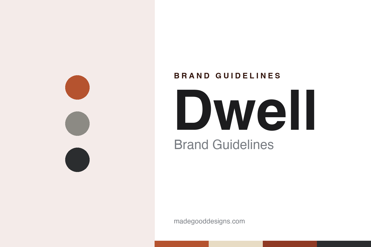
Dwell Brand Guidelines
A house magazine started by someone building a house.
Aa
Two constants: a redwood, brick and steel palette and a geometric sans register. Abstract homage — not a Dwell asset or mark; no logo, cover or wordmark is reproduced.
A magazine born from a renovation
Mill Valley, a direct-mail test and a San Francisco office.
Dwell began with one person’s house. In an interview published by the San Francisco Bay ferry magazine Bay Crossings in July 2006, Dwell’s then publisher Michela O’Connor Abrams told the story of the founder, Lara Hedberg Deam. Deam, originally from Wisconsin, had bought a rundown house in Mill Valley, north of San Francisco, and set out to rebuild it. Abrams said that in the early weeks of working with an architect Deam realised she lacked the vocabulary to explain what she wanted, so she went back to school, returned to the project with the architect Bob Hatfield and finished the house. Out of that experience came the idea for a magazine that spoke about modern houses without the jargon of architecture journals. According to Abrams, Deam, who came from a family in direct mail, wrote a business plan and tested the concept with a direct-mail campaign before committing to it. MediaPost told the same story in a commentary dated 3 August 2005, describing Deam refurbishing her home in Mill Valley and running a direct-marketing test to see whether her taste was shared more widely.
English Wikipedia dates the launch to October 2000, with Deam as chief executive and the architecture and design critic Karrie Jacobs as editor-in-chief. Slate reviewed the new title on 21 December 2000, alongside another young magazine called One, and noted that both were based in San Francisco. The reviewer described Dwell as a magazine devoted to high modernism in residential design, called Jacobs a former design and architecture writer for New York magazine, and said the founder had gone to architecture school after struggling to express her ideas for a house to architects. The review walked through Dwell’s second issue, themed “There Is Too a There There”, which looked at modern single-family houses in places such as the outskirts of Milwaukee, Baton Rouge and Louisville, and a back-of-book debate about New Urbanism.
The editor’s chair changed hands several times. Wikipedia says Jacobs left in August 2002 and was replaced by senior editor Allison Arieff; Sam Grawe followed from 2006 to 2011, then Amanda Dameron from 2011 to 2017, and William Hanley became editor-in-chief in 2019. On the business side, Abrams told Bay Crossings that she had joined Deam as president of the company in the summer of 2002, working from an office near San Francisco’s Ferry Building.
Colour
From an independent title to a Ziff Davis brand.
Dwell was independently owned until 2022, and its later history is a series of dated changes in ownership and form. Wikipedia records that in January 2020 the entrepreneur Zach Klein was announced as Dwell’s chief executive. An earlier change was online. Fast Company’s Co.Design site reported on 1 July 2016 that dwell.com had been rebuilt as a discovery and collaboration platform, where readers could save images into collections, annotate photographs with product names, ask questions and publish their own posts. The writer, Diana Budds, disclosed that she had been a Dwell editor until mid-2015. The new site was led by Dwell’s chief technology officer Bobby Gaza, formerly of Apple and Beats Music; the public beta opened that weekend, with an iOS app expected in August.
Later in 2016, Wikipedia says, Dwell announced Modern by Dwell Magazine, a furniture and decor collection for the retailer Target, designed by Dwell’s co-creative directors of product design Chris Deam and Nick Dine. The magazine had already tested ideas in the physical world: Wikipedia describes the Dwell Home Design Invitational, launched in January 2003 and conceived by Allison Arieff, which asked a group of architects to design a modern prefabricated house for a site in Pittsboro, North Carolina; the New York practice Resolution: 4 Architecture won with a modular scheme announced at the International Contemporary Furniture Fair.
The sale came in 2022. Axios reported on 15 September 2022 that Recurrent Ventures, a digital media company that already owned the home titles Domino and Business of Home, had acquired Dwell, with the deal closing that week. Klein told Axios that Dwell would continue as a standalone brand with its management in place, and that it was building a licensing business, with a custom tile line made with Heath Ceramics and an outdoor furniture line with Chicory. Business of Home reported on 1 May 2026 that Recurrent had sold Dwell, Domino and Business of Home to Ziff Davis, owner of CNET and Mashable, where the three titles would form a new lifestyle group led by Business of Home founder Julia Noran Johnston. The same report described Dwell as a now-bimonthly magazine about modern residential architecture, whose focus has widened to sustainable building and small-space living. The footer of dwell.com now reads “Dwell, a Ziff Davis company.”
Typography
A nameplate, a cover photograph and a typeface system.
A magazine’s masthead can stay in one plain serif and still change in small steps. Jeremy Leslie of magCulture wrote in September 2015 that the Fantastic Man logo is set in Times Roman, that the earlier covers carried a stacked, centred version of it, and that issue No. 21 broke away from that arrangement before No. 22 returned to it. In No. 22 the magazine also introduced Founders Grotesk, by Kris Sowersby, as a new headline sans. Leslie described pages built on strict typographic rules, with little decoration beyond the fonts, and a look based on an approach rather than a fixed set of devices. It’s Nice That described the same magazine in October 2015 as mostly black and white, with rule lines, two columns and long passages of text.
Other titles put more of the identity into the cover image itself. AnOther says the first cover of AnOther Magazine, in 2001, was a photograph by Nick Knight of two young lovers cast as Adam and Eve, and that Jefferson Hack’s foreword framed it as the magazine’s statement for that season. For its fifteenth anniversary in 2016, It’s Nice That reported, AnOther made a limited edition with a 3D hologram cover of Karl Lagerfeld, made by the holographer Rob Munday, alongside covers of other subjects in the same issue. When reading a magazine’s identity, look at how the masthead is set and how often it moves, which typefaces carry the headlines, and whether the cover photograph or the cover object carries the brand.
Aa
Clean geometric letters — the register of Dwell’s modernist pages. (Specimen set in Jost, a geometric-sans STAND-IN; NOT the Dwell logo, NOT Noe and NOT any Dwell typeface.)
Dwell
Real houses on the cover, type at the centre of the identity.
Dwell has described its own identity in terms of type. In a post on dwell.com dated 7 January 2017, signed by editor-in-chief Amanda Dameron, the magazine announced that its January/February 2017 issue would carry an updated look, with new typefaces, more custom illustrations, reworked pacing, new departments and longer features. The post said typography was central to Dwell’s visual history and identity, and that the starting point of the redesign was a pair of new typefaces chosen by design director Rob Hewitt, who wanted faces that were practical and utilitarian but had their own character. One of them, Noe, which Dwell described as grounded in Bauhaus thinking through its geometric construction, was to be used for running body text and as the main display type. The redesigned issue was due on newsstands on 24 January 2017.
The editorial formula behind the covers was set early. Slate’s 2000 review described house stories that followed owners from their early ideas through design and construction, including their trouble getting a bank to pay for an architect, and a magazine organised around ordinary problems such as storage and window security. MediaPost’s 2005 commentary described a July/August 2005 issue on waterfront homes whose cover showed a couple standing on a dock above a lake, and a front section presenting new home products, buildings and books. In the 2006 Bay Crossings interview, Abrams said Deam wanted a visual and written voice that would encourage architecture for its own time rather than decoration.
Online, the identity moved from page to platform: the 2016 relaunch described by Fast Company set stories in a large hero image with clear text on a white background and no banner ads or sidebars, with editor-written captions and tags attached to each photograph.
For a design guide, Dwell shows how a magazine can make the reader’s own house the subject: real owners on the cover, step-by-step house stories inside, and a typeface choice treated as the foundation of a redesign. Compare it with the Portland-born quarterly Kinfolk and with the Condé Nast shelter title Architectural Digest. For this guide we use redwood siding, clay brick and steel window with a geometric sans, an unofficial interpretation; no product or logo is reproduced.
Explore & save
Keep Dwell’s identity on hand — save it to a board in the Made Good inspiration library.
Dwell identity set
Pin the Dwell redwood, brick and steel palette and the geometric sans register to your own board.