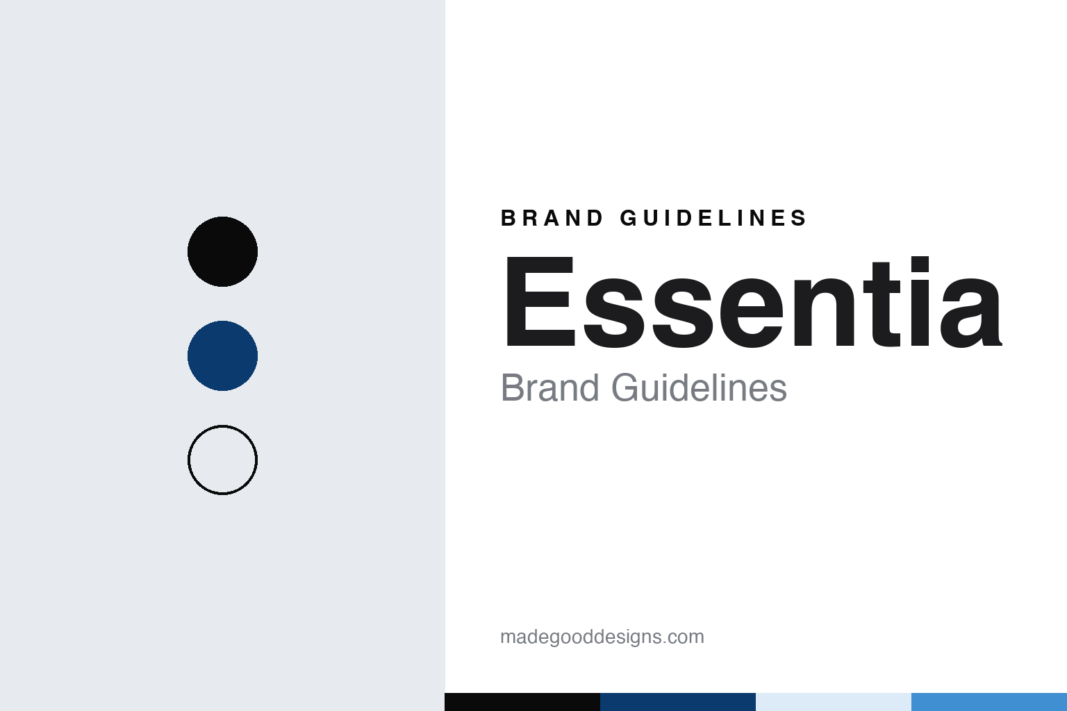
Essentia Brand Guidelines
Ken Uptain’s 1998 bottled water from Bothell.
Aa
Two constants: a wrap black, deep blue and ice palette and a bold grotesque sans register. Abstract homage — not an Essentia product or mark; no label, logo or bottle is reproduced.
A Bothell water brand
Ken Uptain’s company, and a bottle that lasted fourteen years.
Essentia is an American bottled-water brand from Bothell, Washington, north-east of Seattle. It was founded by Ken Uptain, who launched it in 1998; the Herald Business Journal of Everett reported in May 2014 that Uptain had first tried a water made by a Japanese company in 1997 and brought out his own product the following year. The company markets Essentia as an ionised alkaline water, and the private-equity firm First Bev said in 2021 that Essentia had pioneered that category in 1998.
The Herald Business Journal described a company that had kept its headquarters in Bothell as it grew. In 2014, it reported, the water was bottled in Southern California and Pennsylvania, with a further site planned in Arkansas, and production ran through processing equipment housed in a shipping container, with purified water going in at one end and finished product coming out at the other.
The first big change to the pack came in 2012. In July that year, Packaging Insights and BevNET reported, Essentia introduced a new logo that gave more weight to its plus sign, replaced its original rippled bottle with a smooth bottle carrying new labels, and launched a new website. “Our package has served us well for the past 14 years, but it was definitely time to freshen it up,” said Uptain, then the company’s president and owner. A switch to a sports cap that year was credited with a rise in sales in a Hartman Group analysis published by FoodNavigator-USA in October 2015.
Colour
An “E+”, a black wrap and an “Overachieving H2O.”
The larger identity change came in 2017. BevNET reported in May 2017 on a new logo and a marketing campaign built around the tagline “Overachieving H2O,” with billboards, wall murals, subway panels, radio, digital and social-media work concentrated in Los Angeles, New York City and Portland, Oregon. The announcement credited three firms with roles in the brand’s evolution: the strategy company Sticks, the Seattle brand and packaging agency Retail Voodoo, and the creative agency Periscope.
The executive behind it was Karyn Abrahamson, who joined Essentia as vice-president of marketing and brand innovation and was promoted to chief marketing officer in April 2018, BeverageDaily reported in May 2018. She told the magazine she had hired Retail Voodoo to help evolve the brand identity into something “far more aspirational and lifestyle oriented,” and that the “Overachieving H2O” idea was first tested in Portland in 2016 before it was extended to Los Angeles and New York the following year. BeverageDaily described the change as a move away from ingredient-led messaging, which it said had made the brand hard to tell apart from other blue bottles, towards a positioning built on celebrating achievement. By then, the magazine reported, the company said Essentia was sold in more than 60,000 stores, and its target audience was drinkers aged 18 to 34.
The new mark reached the shelf first on multipacks. Packaging Gateway reported in November 2017 that Essentia’s 12-packs would move to all-black wraps carrying the redesigned “E+” logo and lines from the brand’s manifesto, while single bottles stayed as they were; the magazine presented the change as the next phase of the brand’s evolution. Abrahamson said the new packaging “reflects the evolution of our brand’s identity,” and Tahne Davis, the company’s director of brand development and visual merchandising, called the design bold, impactful and aspirational.
Typography
Design and documentation.
The seven brands in this group are all bottled water names: Acqua Panna, Highland Spring, smartwater, San Benedetto, Poland Spring, Essentia and Buxton. Bottled water brands in general sit at many different points in the trade, from family companies that still run their own springs to labels that now belong to much larger drinks groups, and a single brand can be sold everywhere from a corner shop to a restaurant table.
A bottled water brand’s identity is usually carried less by the water itself than by a label, a name and the place it promises, because the company behind the name may have changed hands, added new sources or grown far beyond the place where it started. That makes the questions behind each name worth asking plainly: who started it, who owns it now, and where its water is actually sourced and bottled.
Each guide separates what independent sources record from what the company says about itself — its founding story, its owners over time, where its water is sourced and bottled and how its labels have changed — and marks plainly what rests only on the company’s own word.
E+
A bold grotesque sans for a letter and a plus sign. (Specimen set in Archivo, a sans-serif STAND-IN; NOT the Essentia logo.)
Essentia
From First Bev to Nestlé USA.
Essentia’s ownership changed as the brand grew. The Los Angeles private-equity firm First Bev, founded in 2005, had invested in the company, and on 5 March 2021 Nestlé USA announced that it had acquired Essentia, Food Dive reported the same day, quoting Nestlé USA’s chairman and chief executive Steve Presley. First Bev’s own announcement named Uptain alongside its founder Bill Anderson and its managing partner Jack Belsito. The purchase came weeks after Nestlé agreed to sell its regional North American spring-water brands, among them Poland Spring, to the private-equity firms One Rock Capital Partners and Metropoulos & Co., a deal announced in February 2021 that turned Nestlé Waters North America into BlueTriton Brands, English Wikipedia says; and Food Dive presented it as part of the transformation of Nestlé’s water business announced in June 2020. In October 2026 the brand’s website ran its email sign-up under Nestlé USA’s terms.
The brand’s marketing has also been taken to court. A proposed class action filed in the federal court for the Eastern District of New York in September 2018 challenged how the company described its water; it was voluntarily dismissed in January 2019, according to the consumer group Truth in Advertising.
The name needs a little care online. Essentia is also the name of an unrelated health-care system in Minnesota; the water brand’s own site is essentiawater.com.
For a design guide, Essentia shows how a plus sign, a smooth bottle and a black multipack wrap can give a bottled water a recognisable identity on a crowded shelf. Compare smartwater, Coca-Cola’s bottled water, and Acqua Panna, the Tuscan spring water. For this guide we use wrap black, deep blue and ice with a sans, an unofficial interpretation; no product or logo is reproduced.
Explore & save
Keep Essentia’s identity on hand — save it to a board in the Made Good inspiration library.
Essentia identity set
Pin the Essentia wrap black, deep blue and ice palette and the bold grotesque sans register to your own board.