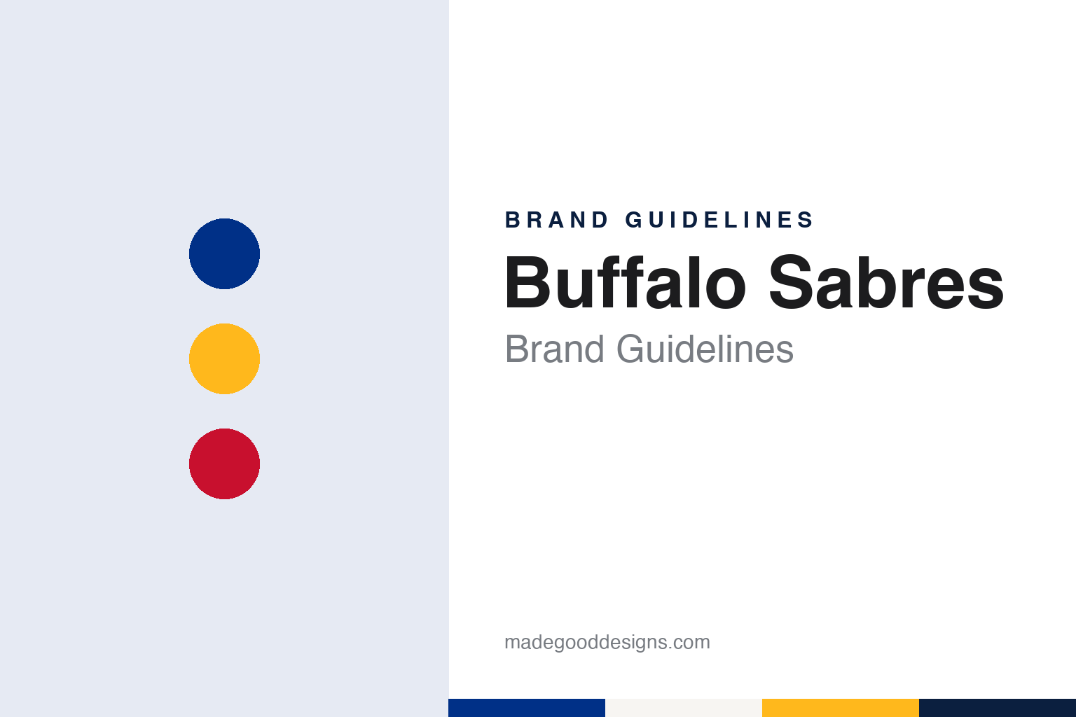
Buffalo Sabres Brand Guidelines
A contest name, a bison over crossed sabres and a long road back to royal blue and gold.
Aa
Two constants: a Sabres royal, sabre gold and sabre red palette and a condensed sans register. Abstract homage — not a Buffalo Sabres product or mark; no crest, sweater or logo is reproduced.
A contest, two brothers and a sword
A city that wanted something other than another Bison.
The Buffalo Sabres joined the National Hockey League in 1970, in the same expansion that added the Vancouver Canucks. English Wikipedia names the founding owners as the brothers Seymour H. Knox III and Northrup Knox, members of a long-established Western New York family, together with the Buffalo lawyer Robert O. Swados. The city already had a hockey history: an American Hockey League club called the Buffalo Bisons had played there for decades, and the same 1970 off-season brought the Buffalo Bills into the National Football League and a new basketball team, the Braves, into the NBA.
The name came from the public. Wikipedia says the Knoxes wanted something other than “bison”, a stock name used by Buffalo teams for generations, and so commissioned a name-the-team contest. Among the entries were the Mugwumps, the Buzzing Bees and the Flying Zeppelins. NHL.com, in a feature on team nicknames by Cristina Ledra and Pat Pickens published on 23 November 2016, says “Sabres” was suggested by four separate entrants, and quotes the owners’ reasoning: a sabre is “renowned as a clean, sharp, decisive and penetrating weapon on offense, as well as a strong parrying weapon on defense.” Wikipedia adds that Seymour Knox saw the sabre as a weapon carried by a leader.
The nearby border also shapes the club’s rituals. Wikipedia notes that both the Canadian and the American national anthems are sung before every home game, whoever the visitors are.
Until 1996 the team played at the Buffalo Memorial Auditorium, known locally as the Aud. In 1996 it moved to a new downtown arena, opened as Marine Midland Arena and renamed several times since; Wikipedia lists HSBC Arena and First Niagara Center among its past names, and the building is now KeyBank Center. The move from the Aud also brought a full change of colours, which the next section follows.
Colour
A bison, two sabres and a circle of blue and gold.
The original crest put all three ideas of the name into one roundel. Wikipedia describes the primary logo as a bison atop two crossed sabres inside a blue circle with gold trim. The bison kept the city’s old animal, the sabres carried the new name, and the circle gave the mark a badge-like shape that sits easily on a sweater. The same source says this logo was used from 1970 to 1996, and that it returned as the primary mark in 2020.
The early uniforms were simple. Wikipedia says that throughout the Aud years the Sabres wore white uniforms with a blue and gold shoulder yoke and alternating gold, white and blue stripes at home, and blue uniforms with gold stripes on the road. From 1978 the primary logo was also placed on the shoulders. Royal blue and gold remained the club’s colours until 1996.
The 1996 move changed nearly everything. Wikipedia says that on arriving at the new arena the Sabres replaced blue and gold with red, black and silver, and introduced a bison head as the primary logo. Black and white uniforms carried a bull’s-head silhouette design across the front and a “Sabre B” alternate logo on the shoulders. In 2000 the club added a red third jersey with black and silver sleeve stripes, the word “Buffalo” near the waist and a black circle with two crossed sabres, a nod to the original crest.
One early-season game showed how a wordmark can carry a message. Wikipedia records that on 7 October 2001, in a road game against the New York Rangers, the Sabres wore their white jerseys with the bison head replaced by a diagonal “NEW YORK” wordmark, as a tribute to the state after the attacks of 11 September.
The next redesign drew a strong reaction. On 16 September 2006, Wikipedia says, the club unveiled uniforms in midnight blue, maize, silver and white, with chest numbers and a new stylised bison. Critics compared the mark to a banana slug and nicknamed it the “Buffaslug”. The classic blue look came back as a third jersey, and on 18 September 2010 a modern version of the 1970–96 crest became the primary home jersey again, in navy and gold rather than royal blue.
Typography
Design and documentation.
Hockey clubs added during expansion periods usually begin with a blank sheet: a new name, a new crest and a set of colours chosen before a single game has been played. Those early decisions tend to lean on place. Designers often reach for local landscape, wildlife, regional history or a civic symbol, so that the mark feels rooted in the city even though the club itself is new. Colour names follow the same instinct, with teams describing their reds, greens, golds and blues through references to local industry, forests, rivers or civic heritage rather than plain swatch labels.
Crests also change over time. A club may introduce a sharper, more illustrative mark in one era, then later return to a simpler letterform or an older emblem drawn from the city’s earlier hockey history. These heritage returns are usually presented as a reconnection with the past and often arrive alongside new jerseys, refreshed wordmarks and updated arena graphics. Arenas carry their own visual traditions too, from goal songs and horns to banners and entrance rituals, and those elements become part of how a hockey brand is experienced as much as any logo printed on a sweater.
Aa
A condensed sans — the register of block sweater numbers and arena signage. (Specimen set in Oswald, a condensed sans STAND-IN; NOT the Buffalo Sabres logo.)
Return to royal
A city flag in the collar, a black throwback and an owner since 2011.
The navy years ended with a deliberate step back. NHL.com reported on 12 August 2020 that the Sabres had revealed their uniforms for the coming season the day before under the slogan “Return to Royal”, a throwback to the royal blue, gold and white of the original set with modern updates. The report said the inside collar now carried two lightning bolts and a star, a homage to the flag of Buffalo, whose design surrounds the city seal with thirteen lightning bolts and stars. White piping was added above the traditional gold stripes, and the logo dropped the silver accents of the original crest while using the stitching pattern of the club’s 50th-anniversary badge. Wikipedia adds that the front numbers, worn since 2006, were removed.
The red and black era did not disappear. Wikipedia says a “Reverse Retro” alternate in 2020–21 brought back the crossed-sabres mark of 2000 in royal, gold and white. On 31 August 2022 the club announced that the black uniform of the late 1990s and early 2000s would return as its third jersey, and a second Reverse Retro used the same template in white, blue and gold. A cream-based version of the classic uniform appeared at the 2022 Heritage Classic.
Ownership has changed hands several times. Wikipedia says Northrup Knox sold the club to John Rigas, owner of Adelphia Communications, during the 1997–98 season, and that the NHL took control of the team after Rigas and his sons were indicted in 2002. A consortium led by the Rochester businessman Tom Golisano, with former team president Larry Quinn, followed, and Golisano was introduced as owner on 19 March 2003. The Associated Press, in a report carried by the San Diego Union-Tribune on 3 February 2011, said Golisano had agreed to sell the team to Terry Pegula, founder of the energy company East Resources, under a deal that included a provision that the team could never be moved from Buffalo. Wikipedia says NHL owners approved the sale on 18 February 2011. Pegula has owned the Sabres since 2011, and Wikipedia says he was introduced to fans at the arena on 23 February 2011.
For a design guide, the Buffalo Sabres show how a club can wander far from its founding colours and still find that the oldest crest is the one its city wants to see. Compare it with Buffalo Bills, the city’s football club and a fellow 1970 arrival in its league, and NHL, the league whose shield sits on every Sabres sweater. For this guide we use Sabres royal, sabre gold and sabre red with a sans, an unofficial interpretation; no product or logo is reproduced.
Explore & save
Keep Buffalo Sabres’s identity on hand — save it to a board in the Made Good inspiration library.
Buffalo Sabres identity set
Pin the Buffalo Sabres royal, gold and red palette and the condensed sans register to your own board.