Boston Red Sox Brand Guidelines
A rename for red stockings, a ballpark from 1912 and a pair of hanging socks.
Aa
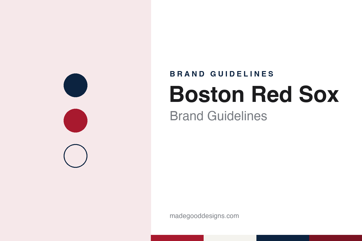
Two constants: a stocking red, navy and home white palette and an ornate jersey serif register. Abstract homage — not a Boston Red Sox product or mark; no cap, uniform or logo is reproduced.
The Bostons
A club without a name, then a colour for a name.
The Boston Red Sox began in 1901, when the American League, newly declared a major league, placed a franchise in Boston to compete with the city’s National League club. English Wikipedia says the club played at the Huntington Avenue Grounds until 1911 and was originally owned by C. W. Somers, who in January 1902 sold all but one share to Henry Killilea; in April 1904 it was bought by John I. Taylor of Boston.
For its opening seasons the club had no official nickname. Wikipedia says it wore dark blue stockings and was simply called “Boston”, “the Bostons” or the “Americans”, after its league, in a two-team city. Writing for Baseball Almanac, the Red Sox historian Bill Nowlin set out his reading of the Boston dailies of 1903 and of game accounts in the Chicago Tribune, The New York Times and The Washington Post, and concluded that “Pilgrims”, a name later attached to the early club in many reference works, was a myth: he found no contemporary use of it in 1903, and the earliest reference he located was in a Boston Journal article of December 1907. Nowlin noted that the club’s 2003 media guide recognised the “Boston Americans”. Wikipedia traces “Pilgrims” to a poem sung at the 1907 home opener.
The name arrived with a colour. Nowlin, citing Glenn Stout and Dick Johnson’s history Red Sox Century, wrote that Taylor decided to name the team the Red Sox on 18 December 1907 and on the same date ordered new uniforms with bright red stockings from a sporting-goods supplier. Wikipedia says Taylor announced that day that the club had adopted red as its new team colour, after the city’s National League club had switched to an all-white uniform in 1907, and that “Sox” followed the lead of newspapers that used the short form of “Stockings” in headlines, as they already did for the Chicago White Sox. The red stocking itself had a Boston past: Wikipedia records that after the Cincinnati Red Stockings, named for their red hose, folded at the end of 1870, their manager Harry Wright was hired to organise a new team in Boston and brought the “Red Stockings” nickname with him.
The 1908 season was the one in which the name took the field. Nowlin wrote that the club was not called the Red Sox during 1907, and that the name began with the 1908 season.
Colour
Taylor, Yawkey, a trust and a sports group.
The club moved to Fenway Park in 1912, and Wikipedia says it has played its home games there since. Ownership has changed far less often than the uniforms. In 1933 Tom Yawkey bought the team. Wikipedia says his wife, Jean R. Yawkey, took control of the club in 1976, and that in 1992 control passed to the Yawkey Trust, led by John Harrington. The two Yawkeys’ initials are spelled out in Morse code in two stripes on the left-field wall at Fenway, a piece of ballpark signage that records an ownership era in dots and dashes.
In 2002 the Yawkey Trust sold the club to New England Sports Ventures, a group headed by principal owner John Henry, with Tom Werner as executive chairman and Larry Lucchino as president and chief executive, ending the Yawkey era. That group is now Fenway Sports Group, which Wikipedia says also owns the English football club Liverpool, the National Hockey League’s Pittsburgh Penguins and part of the NASCAR team RFK Racing. Fenway Sports Group, under its earlier name at the outset, has owned the Red Sox since 2002.
The uniform has a long, slow lineage, which Wikipedia’s article on the club’s logos and uniforms sets out. The original 1908 home shirt carried a silhouette of a red sock with “BOSTON” in blocky white letters, and it was worn for that season alone. From 1909 to 1935 the club wore “BOSTON” and “RED SOX” in blocky red letters. The present home shirt, white with red piping at the neck and down the placket and “RED SOX” in red letters outlined in blue arched across the chest, has been in use in its ornate lettering since 1936, and the home uniform carries no player names on the back.
The road uniform has moved back and forth. Wikipedia says the current cap and uniform set dates from 1946, and that since then the road lettering has switched between blue and red, with blue block letters to 1971, red lettering on pullovers from 1972, blue again from 1979, red with the home typeface in 1990, blue in the home typeface in 2009 and red again in 2014. A red alternate home jersey with blue lettering arrived in 2003, and a green jersey has been worn for the spring-training St. Patrick’s Day game.
Typography
Design and documentation.
A sports team’s visual identity works across surfaces that rarely sit still. The crest or primary mark has to hold up on a jersey chest, a cap front, a centre-court decal and a phone-sized app icon, so designers tend to favour bold silhouettes, a limited set of flat colours and outlines that survive embroidery, screen printing and paint. Secondary marks and monograms carry the identity where the full crest would be too busy, such as a sleeve, a helmet side or a social-media avatar.
Wordmarks do a different job. A team name set in custom lettering has to read from the upper deck and on a television graphic at once, which is why many wordmarks use condensed or slab-serif letterforms, generous tracking and a consistent arch or baseline. Uniform numbers follow league rules on size and contrast, and teams often commission a dedicated numeral set so that a 6 and an 8 stay distinct at a distance. Arena and stadium signage then repeats the same palette and letterforms on scoreboards, concourse wayfinding and court or field markings, turning the venue itself into part of the brand system.
Aa
An ornate jersey serif — the register of an arched chest script and a ballpark wall. (Specimen set in Playfair Display, a serif STAND-IN; NOT the Boston Red Sox logo.)
The Hanging Sox
A pair of socks promoted to the top of the set.
The club’s name is a garment, and so is its principal logo. On 11 December 2008 Boston.com reported that the Red Sox had unveiled new logos, uniforms and caps at an evening event, to take effect on the field at the start of the 2009 season. According to the team’s press release, as quoted by Boston.com, the “Hanging Sox” logo, which had appeared on a Red Sox uniform as early as 1931, would become the team’s new primary logo and be used more often. The “Circle Sox” logo, redesigned, would serve as a secondary logo alongside the red “B”, and all three logos were streamlined, in the release’s words, to reflect uniformity in font and messaging.
The same package changed what the players wore. Boston.com reported a new grey primary road uniform and alternate home and road jerseys worn with new Hanging Sox caps in place of the traditional “B” cap. According to the team, the paper said, the changes grew out of a “turn back the clock” game against the San Diego Padres on 22 June 2007, and were meant to return select visual elements to the club’s core traditions. The team’s chief operating officer, Mike Dee, told MLB.com, as quoted by Boston.com, that the club had already moved to blue as its road colour and red as its home colour in outerwear such as dugout jackets and batting-practice jerseys, and that the uniforms continued that split. Wikipedia adds that a Hanging Sox patch went onto the left sleeve of the road uniform in 2009, and that the alternate Hanging Sox cap was worn in 2009 alone.
Transition of the new primary logo onto signs, printed matter and other materials was to follow over the coming months, the release said, so the change ran from the uniform outward to the ballpark and the club’s collateral.
For a design guide, the Boston Red Sox show how a name taken from a uniform order in 1907 can keep feeding an identity, from a red sock on the 1908 shirt to a pair of hanging socks at the head of the logo set a century later. Compare it with MLB, the league whose batter silhouette appears on the same uniforms, and New York Yankees, the club that wore its new pinstripes against Boston on opening day in 1912. For this guide we use stocking red, navy and home white with a serif, an unofficial interpretation; no product or logo is reproduced.
Explore & save
Keep Boston Red Sox’s identity on hand — save it to a board in the Made Good inspiration library.
Boston Red Sox identity set
Pin the Boston Red Sox stocking red, navy and home white palette and the ornate jersey serif register to your own board.