Atlanta Hawks Brand Guidelines
A hawk that flew through four cities before landing in Georgia.
Aa
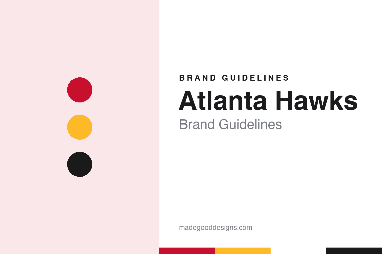
Two constants: a torch red, legacy yellow and infinity black palette and a condensed athletic lettering register. Abstract homage — not an Atlanta Hawks mark; no hawk-head logo, jersey or wordmark is reproduced.
Buffalo, Moline, Milwaukee, St. Louis
A Bison, a Blackhawk and a bird that kept its name.
The Atlanta Hawks name was not born in Georgia, or even in the South. Writing in Forbes on 21 June 2021, Andrew Wagner traced the franchise back to 1946, when it was known as the Buffalo Bisons and played in the National Basketball League, a circuit built mostly around smaller Midwestern industrial towns. English Wikipedia says the club was owned by Ben Kerner and Leo Ferris, played at the Buffalo Memorial Auditorium, and lasted only a few weeks in upstate New York before Ferris announced a move on Christmas Day 1946.
The new home was Moline, Illinois, and the new name came with it. Wagner explained that the team was renamed the Tri-Cities Blackhawks, a reference to the Tri-Cities region of Moline and Rock Island in Illinois and Davenport in Iowa. Wikipedia adds that the team played at Wharton Field House in Moline and that newspapers also called it the Tri-City or Quad-City Blackhawks. The Blackhawks joined the NBA in 1949, when the NBL merged with the Basketball Association of America.
The merger left the Blackhawks in a small market among big-city rivals. Wagner wrote that the league pushed Kerner to look for a larger city after the 1950 season, and that he found one in Milwaukee, where the team played at the Milwaukee Arena. The move in 1951 shortened the name to the Milwaukee Hawks, the form the club has kept ever since. After four seasons in Wisconsin the Hawks moved again, in 1955, to St. Louis, where they played at the Kiel Auditorium.
Atlanta came next. Wikipedia says that on 3 May 1968 Kerner agreed to sell the Hawks to the Atlanta property developer Tom Cousins and the former Georgia governor Carl Sanders, and that once the league approved the deal the new owners moved the team to Atlanta for the 1968–69 season. The Hawks played their first four Atlanta seasons at Alexander Memorial Coliseum on the Georgia Tech campus while Cousins’ company built the Omni Coliseum downtown, which opened in 1972. Wagner’s summary is simple: the Hawks have called Atlanta home since 1968.
Colour
From Ted Turner to the Ressler group.
The team has changed hands several times in Atlanta, and each owner has left traces on the identity. Wikipedia records that the cable television entrepreneur Ted Turner, who also owned the Atlanta Braves, bought the Hawks in 1977. The club passed to Time Warner when it merged with Turner Broadcasting in 1996, and on 31 March 2004 Time Warner sold the team to a group of executives known as Atlanta Spirit LLC.
The present owners arrived in 2015. The Atlanta Journal-Constitution reported on 22 April 2015 that a group led by Antony Ressler, co-founder of the private equity firms Apollo Global Management and Ares Management, had reached an agreement to buy the Hawks together with the operating rights to Philips Arena. The paper said the team had announced the agreement that evening, that Ressler would be the clear majority owner, and that smaller stakes would go to the former NBA player Grant Hill, the entrepreneurs Jesse Itzler and Sara Blakely, and Richard Schnall, with part of the previous Atlanta group, led by Michael Gearon Jr., keeping a share. The NBA Board of Governors still had to approve the sale; Wikipedia says it did so on 24 June 2015. Ressler and his wife, the actor Jami Gertz, are listed as owners, and the Ressler group has owned the Hawks since 2015.
The colours moved with the owners and the arenas. Wikipedia says red and white have been part of the palette for much of the time since the 1950s, with red, blue and white used in St. Louis and in the first Atlanta years. The team wore baby blue and white after the 1968 move and switched to blue, green and white in 1970. When the Omni opened in 1972 the Hawks shared it, and an owner, with the new Atlanta Flames hockey team, and Wikipedia says the two clubs united their colours: the Hawks dropped their short-lived green and blue for white, gold and red, and introduced a simplified logo with a hawk-head silhouette inside a circle.
That head is widely known as the “Pac-Man” logo. Wikipedia describes the whole logo history as a swing between two ideas: a full-bodied hawk holding a basketball in its claws, and the hawk head in profile. Black was added as an accent colour in 1992, and from 2007 to 2015 the team returned to red, blue and white with silver.
Typography
Design and documentation.
A professional basketball logo has to work at very different sizes: as a centre-court graphic seen from the rafters, as a small patch on a shorts leg and as a square icon on a phone. Clubs often keep a family of marks rather than a single emblem, pairing a primary logo with a wordmark, a monogram and a secondary badge that can stand in where space is tight. Redesigns usually adjust that family together, simplifying outlines, thickening strokes and limiting the colour list so the marks print cleanly on fabric and wood.
Uniform patterns carry much of a team’s personality. Pinstripes, side panels, gradient fills and skyline or landscape motifs give a jersey a recognisable silhouette even when the lettering cannot be read. Throwback or “classic” editions revive an older set for a season, often with its original typeface and trim, and they let a club test how fondly a past look is remembered before deciding whether to bring parts of it back permanently. Mascots add a third layer: a costumed character with its own colours and personality gives the identity a playful voice for younger audiences, community events and arena entertainment.
Aa
A condensed athletic letter — the register of a jersey wordmark and an arena scoreboard. (Specimen set in Oswald, a condensed sans STAND-IN; NOT the Atlanta Hawks logo or wordmark.)
Atlanta Hawks
Pac-Man returns, volt green comes and goes, and the 1970s come back.
The hawk head came back in stages. Wikipedia says that on 1 May 2014 the club unveiled a new secondary logo, a modernised version of the “Pac-Man” mark it had used from 1972 to 1995, and that the head, set in a roundel, became the primary logo after the 2014–15 season. On 24 June 2015, the same day the sale to the Ressler group was approved, the team showed new home, road and alternate uniforms with a scheme of Torch Red, Volt Green and Georgia Granite Gray. It also introduced coloured game socks, part of the league’s new sock deal with Stance; until then, Wikipedia notes, official game socks had mostly been plain white or black.
The volt green did not last. When Nike became the league’s uniform supplier in 2017, the Hawks carried their uniforms over under the new Icon, Association and Statement names. On 21 July 2020 they unveiled a new set modelled on the uniforms of the mid-1970s and returned to the red, black and yellow combination they had worn from 1992 to 2007, adding gray as an accent. The league’s uniform guide now names the colours torch red, legacy yellow, infinity black and gray, according to Wikipedia.
The City editions have been the team’s sketchbook. Wikipedia lists a black 2017–18 uniform with volt green accents, asymmetric striping from the early 1970s and futuristic lettering as a nod to the city’s hip-hop scene; a white set with black and metallic gold for the 2018–19 season, the team’s 50th in Atlanta; black with peach accents for Peachtree Street in 2019–20; a black and gold tribute to Martin Luther King Jr. in 2020–21; and a 2021–22 mash-up that combined a yellow base, the full-bodied hawk of the late 1990s, the 1980s “Hawks” script and the 1970s “Atlanta” script. The 2023–24 edition used a black base with heritage blue and light brown trim and a lowercase “atl”.
For a design guide, the Atlanta Hawks show how a club that changed cities four times can still hold one idea steady: a bird, drawn either whole or as a single head, in a circle, in red. Compare it with the NBA, whose uniform programme frames every Hawks kit, and the Atlanta Braves, the baseball club Ted Turner owned alongside the Hawks. For this guide we use torch red, legacy yellow and infinity black with a condensed sans, an unofficial interpretation; no product or logo is reproduced.
Explore & save
Keep Atlanta Hawks’s identity on hand — save it to a board in the Made Good inspiration library.
Atlanta Hawks identity set
Pin the Atlanta Hawks torch red, legacy yellow and infinity black palette and the condensed athletic lettering register to your own board.