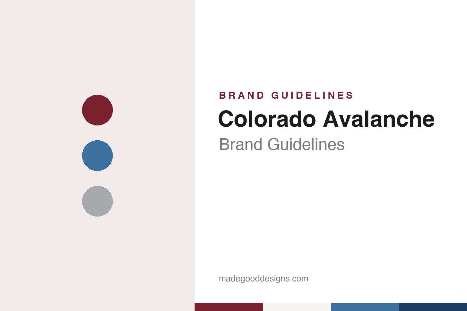
Colorado Avalanche Brand Guidelines
A Quebec franchise, a leaked name and a snow-wrapped A, in burgundy and steel blue.
Aa
Two constants: an Avalanche burgundy, steel blue and mining silver palette and a condensed sans register. Abstract homage — not a Colorado Avalanche product or mark; no crest, sweater or logo is reproduced.
From Quebec to Denver
A franchise that crossed a continent, and a name that changed overnight.
The Colorado Avalanche began life in another country and another league. English Wikipedia says the franchise started as the Quebec Nordiques, one of the original clubs of the World Hockey Association when that league opened in 1972, and joined the National Hockey League in 1979 alongside three other WHA teams. The club played in Quebec City until 1995, and its Nordiques uniforms return in the later chapters of this story.
The move came in 1995. Helene Elliott of the Los Angeles Times reported on 26 May 1995 that the club’s five shareholders, having failed to persuade the government of Quebec to build an arena and provide wider support, had sold the franchise to COMSAT Entertainment Group of Denver. The same company already owned the NBA’s Denver Nuggets, and Elliott wrote that the hockey team would play at McNichols Arena until a planned new building was finished. Wikipedia says the sale became official on 1 July 1995, and that COMSAT placed its Denver teams in a subsidiary called Ascent Entertainment Group.
A new city needed a new name, and the first choice did not survive. Adrian Dater, who covered the team for The Denver Post, told the story on the paper’s hockey blog on 21 July 2014. He wrote that the club was meant to be called the Rocky Mountain Extreme, the idea of the then owner Charlie Lyons, a former Colorado ski enthusiast attached to extreme sports. Dater broke the name in a late-summer 1995 story. Callers to a Denver radio show attacked it all afternoon, and the next morning the team president, Shawn Hunter, rang Dater to say the report would not prove accurate. The rival Rocky Mountain News ran a column saying there had never been any Extreme.
Dater wrote that the scoop had been right at the time, and that the reaction let the club drop the idea. Logos for the Extreme had already been drawn, and in 2014 their designer released them publicly. The name the club took instead, Dater wrote, was chosen by fans in a “Feedback Forum” that offered Avalanche alongside seven other options, among them Black Bears, Rapids, Cougars, Outlaws, Renegades, Storm and Wranglers. Wikipedia says COMSAT had also considered Blizzards and had at one stage filed to protect Black Bears, and that the Colorado Avalanche name was revealed on 10 August 1995.
The choice also settled a question of territory. Wikipedia says COMSAT debated whether to present the team as a Denver club or as a regional franchise for Colorado or the whole Rocky Mountain region. The final name tied the club to the state, and Wikipedia notes the colloquial short form “Avs.”
Colour
Burgundy, steel blue and a letter in the snow.
The same design team that drew the abandoned Extreme marks produced the identity that replaced them. Dater wrote in The Denver Post in 2014 that Michael Beindorff, working with Dan Price, designed the Avalanche logo after the name changed. The primary mark, as Wikipedia describes it, is a burgundy letter A with snow wrapped around it like a sliding slope, a hockey puck tucked into the lower right of the snow, and a steel-blue oval behind. The mark puts the team name, the sport and the snow into one emblem.
Wikipedia lists the club colours as burgundy, steel blue, black, silver and white. Black was later dropped from much of the uniform, as the final section notes. The original alternate mark was the foot of a Yeti, worn on the shoulders of home and away jerseys from 1995. Wikipedia says it stayed in use until 2015.
The first uniforms carried the mountain idea into the cut of the cloth. Wikipedia says the coloured jersey worn from 1995 was mostly burgundy and steel blue, with two black and white zigzag lines, one across the shoulders and one near the waist; the area between the lines was burgundy and the area outside them steel blue, with similar jagged lines around the neck. The white jersey reversed the scheme. The same source says the NHL switched home and road colours in 2003, so the coloured jersey moved to home games.
Alternates added more variations on the theme. Wikipedia records a mostly burgundy third jersey introduced in 2001–02, with “Colorado” written diagonally across the front, horizontal black and white bands from the waist down and five-band sleeve stripes. It was set aside when the league moved to Reebok’s Edge template in 2007. A steel-blue third jersey arrived on 14 November 2009, carrying the A logo inside burgundy shoulder patches and dropping the waist bands. Through these changes the snow-wrapped A stayed on the chest, and the burgundy and steel-blue pairing stayed as the base of every set.
Typography
Design and documentation.
An expansion club starts its brand from nothing, so the identity tends to arrive as a sequence of public moments rather than as a single drawing. A name is chosen, sometimes after a fan vote or a shortlist, and announced at an event designed to be filmed and shared. The crest usually follows on the same day or soon after, presented alongside a primary colour set, a secondary mark, a wordmark and the first sweater designs.
Those pieces are meant to work together. The primary logo has to read on a helmet, at centre ice, on a ticket app icon and on a souvenir cap, which pushes designers towards bold silhouettes and a small number of flat colours. Secondary marks often borrow a local landmark, a regional story or a piece of wordplay, giving merchandise a second voice.
Colour names matter as much as the hues themselves. Clubs often give their tones descriptive names tied to place or theme, and those names travel into press releases, retail tags and broadcast graphics. The arena is the last layer: signage, concourse graphics, ice markings and naming-rights wordmarks all have to sit alongside the team’s own marks, so a building’s branding becomes part of how the club looks on screen.
Aa
A condensed sans — the register of block sweater numbers and arena signage. (Specimen set in Oswald, a condensed sans STAND-IN; NOT the Colorado Avalanche logo.)
Flags, silver and a Quebec echo
A state-flag C, a mining-silver trim and Nordiques blue on the ice again.
The identity began to borrow from Colorado itself in 2015. Wikipedia, citing a SportsLogos.net report of 26 June 2015, says the club replaced the Yeti foot with a new alternate mark built from the insignia of the Colorado state flag, recoloured in team tones, and wore it on the shoulders for the 2015–16 season with a 20th-anniversary patch. A navy third jersey that year carried a simplified, recoloured version of the logo of the Colorado Rockies, the NHL team that had played in Denver before leaving in 1982.
The 2017 change of supplier became a chance to look back. The Denver Post reported on 21 June 2017 that the club’s new Adidas uniforms were inspired by its 1995 inaugural set, keeping the signature peaked hemlines, the arm striping and the team colours. The paper said a bold silver trim had been added to honour the history of mining in Colorado, and that a Colorado “C” on both shoulders referred to the state flag.
Later alternates reached further into the past. Wikipedia says the 2020 Stadium Series uniform drew on the state’s landscape and on the Cadet Chapel of the United States Air Force Academy, with a steel-blue top, a burgundy lower half and white accents forming an A. A “Reverse Retro” uniform in 2020–21 took the classic Nordiques design and recoloured it in Avalanche colours, while steel blue replaced black on the pants and helmets. A second Reverse Retro in 2022–23 used the 1995 white template in the blue, red and gold of the old Rockies and the state flag. In the 2025–26 season, Wikipedia says, the club wore the Nordiques’ classic baby-blue uniforms for a run of games.
Ownership has shifted several times since the move. Wikipedia says COMSAT agreed to sell Ascent to Liberty Media in 1997, and that in July 2000 the real estate developer Stan Kroenke bought the Avalanche, the Nuggets and their arena, then known as the Pepsi Center. ESPN, carrying an Associated Press report on 25 August 2010, said the NFL had approved Kroenke as majority owner of the St. Louis Rams on condition that he hand control of the Nuggets and Avalanche to his son Josh. Wikipedia lists Kroenke Sports & Entertainment as the owner today, and the Avalanche share Ball Arena in Denver with the Nuggets.
For a design guide, the Colorado Avalanche show how a team can take a name it had not planned, wrap it into a single letter and then let its state’s flag, silver and hockey history supply every later variation. Compare it with Denver Nuggets, the basketball club that has shared owners and arenas with it since 1995, and Denver Broncos, the city’s football club. For this guide we use Avalanche burgundy, steel blue and mining silver with a sans, an unofficial interpretation; no product or logo is reproduced.
Explore & save
Keep Colorado Avalanche’s identity on hand — save it to a board in the Made Good inspiration library.
Colorado Avalanche identity set
Pin the Colorado Avalanche burgundy, steel blue and mining silver palette and the condensed sans register to your own board.