Red Bull Brand Guidelines
Two red bulls charging at a golden sun — a Thai tonic reborn as a global energy empire.
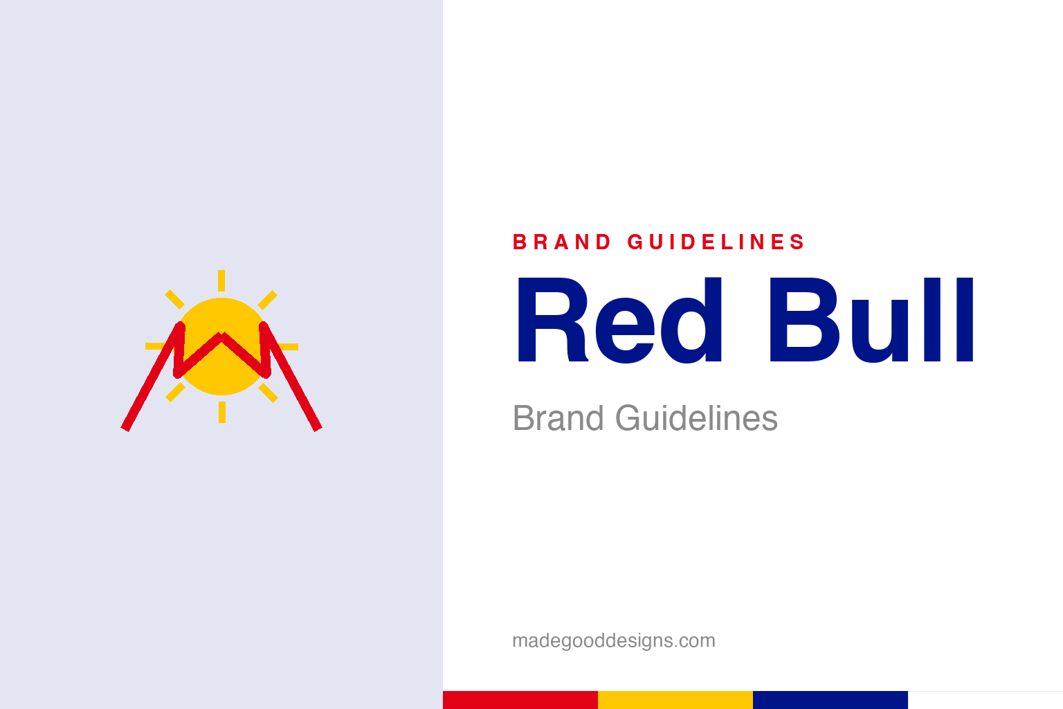
A sun with two charging chevrons — the idea, not the two bulls. Deliberately not the Red Bull mark.
Two bulls, one sun
Red Bull’s logo signals raw energy.
Red Bull’s logo is pure energy and power: two muscular red bulls charging at each other in front of a bright golden sun/disc. It’s an aggressive, dynamic, high-impact image — the bulls signalling strength, power, aggression and force, the sun signalling energy and vitality. For a product that promises to give you energy, focus and physical edge (its famous tagline: “Red Bull gives you wings”), the imagery is perfectly on-message. The whole mark communicates the drink’s promise instantly and viscerally: raw power and stimulation. Combined with the bold red, yellow and blue can, it’s loud, energetic and impossible to ignore — exactly right for a brand built on intensity. Our homage nods to a sun with two charging chevrons rather than the bulls.
A Thai tonic, reborn
Red Bull’s origin is often forgotten.
Red Bull’s real origin is a fascinating and often-overlooked story. The two-bulls-and-sun imagery — and the drink itself — comes from Thailand. There, a tonic drink called “Krating Daeng” (meaning “red gaur,” a gaur being a large wild bovine — loosely, “red bull”) was created by Chaleo Yoovidhya, and its logo already featured the charging bulls and sun. Austrian entrepreneur Dietrich Mateschitz discovered it while travelling, and together with Chaleo adapted it for Western markets: they co-founded Red Bull GmbH in 1984 and launched Red Bull in Austria in 1987. So the iconic logo was essentially translated, not invented — the bulls and sun came almost unchanged from the original Thai product, with the name rendered into English. (A precise note for a citation page: 1987 is the launch year; the company was founded in 1984.)
A marketing empire
Red Bull’s brand is built far beyond the can.
Red Bull’s true genius is that it built one of the most powerful marketing and media empires in the world — the brand extends far beyond the drink itself. Red Bull is synonymous with extreme sports, adventure, adrenaline and youth culture: it owns and sponsors Formula 1 teams and football clubs, stages spectacular events (cliff diving, air races, the record-breaking Stratos space jump), and runs a genuine media house producing films, magazines and content. This masterful strategy makes Red Bull feel like a lifestyle and a culture, not just a beverage — the drink of daring, energetic, adventurous people. By becoming a content and events powerhouse, Red Bull sells the experience and identity of high-octane living, with the energy drink as the vehicle. Few brands have so thoroughly turned themselves into a cultural movement, and it’s that empire — far more than the taste — that drives the brand’s extraordinary reach.
Imagery, identity and experience
Red Bull shows content-driven branding at its peak.
Red Bull offers powerful lessons in modern branding. First, the value of bold, on-message imagery: the charging bulls and sun instantly and viscerally communicate energy and power, perfectly matching the product’s promise — a reminder that a logo should express what the brand does, loudly and clearly. Second, an honest lesson about origins: Red Bull’s global icon was adapted, almost unchanged, from a Thai tonic — a good reminder that great brands are sometimes built by recognising and adapting an existing idea for a new market, not only by inventing from scratch.
Third, and most importantly, Red Bull is the definitive lesson in selling identity and experience over product. By building a vast empire of extreme sports, events and media, it made itself a lifestyle and a culture — the emblem of adrenaline, adventure and youthful energy — so that buying Red Bull means buying into that world. The energy drink is almost incidental to the brand it created. The takeaway is that the most powerful modern brands don’t just advertise a product; they build a world around it — content, events, culture, identity — that people want to belong to. Two charging bulls and a golden sun, borrowed from a Thai tonic, became the emblem of a global culture of daring — because Red Bull understood it was never really selling a drink. It was selling wings.
Type & the wordmark
Bold, energetic, high-impact lettering.
Red Bull’s wordmark is bold and energetic, paired with the bulls and sun. The specimen below stands in with a heavy sans.
Gives you wings
Bold, charged, energetic — type with adrenaline in it. (Specimen set in Archivo, a neutral stand-in.)
Red, yellow & blue
The charged palette. Click a swatch to copy the hex.
Red Bull’s palette is the bulls’ red #E30118, the sun’s yellow #FFC800 and the can’s navy #001489, with silver. Lead with red, yellow and blue below.
Explore & save
Keep the energy idea on hand — save the homage and the palette to a board.
Red Bull identity set
Pin the sun-and-charge homage, the red-yellow-blue palette and the experience-branding lesson to your own board.