Stefano della Bella is the etcher to study if you design at small sizes. Many of his prints are no bigger than a postcard, yet they hold whole landscapes, cavalry skirmishes and crowds. He did it with a light, open line, a lot of empty sky and a strong sense of where the eye should land. Britannica describes him as an Italian Baroque printmaker noted for military scenes in the manner of Jacques Callot, and the Getty Research Institute notes that he drew in the open air throughout his life, recording events and places rather than copying other artists’ compositions.
The prints shown here come from the Cleveland Museum of Art, which releases them under CC0. For more cleared works, browse the MGD museum inspiration collection.
Who was Stefano della Bella?
The Metropolitan Museum of Art, the Cleveland Museum of Art and Britannica all date his life to 1610–1664, and the Met and Britannica place both his birth and death in Florence. Britannica gives the exact dates as 18 May 1610 and 12 July 1664.
He came from a family of artists. The Getty Research Institute’s finding aid for its Della Bella etchings says his father, Francesco, was a sculptor in Giambologna’s workshop and that his brothers were a goldsmith, a sculptor and a painter. Both the Getty and Britannica say he began in goldsmiths’ workshops before turning to etching. Britannica and the London dealer Stephen Ongpin both name Remigio Cantagallina as a teacher of etching. Ongpin adds that he was strongly influenced by Callot’s work, though it is unlikely the two ever met.
The Getty records that, supported by Don Lorenzo de’ Medici, he worked in Florence from 1633 to 1639 with trips to Rome to study the antique. Ongpin describes him as eventually succeeding Callot as Medici court designer and printmaker, etching the festivals, tournaments and banquets the family staged in Florence.
Paris, Amsterdam and the return to Florence
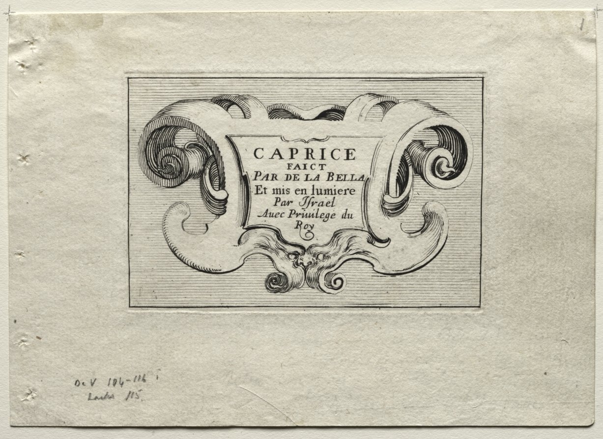
The Getty and Stephen Ongpin both date his move to Paris to 1639, Ongpin adding that he travelled with the Medici ambassador to the court of Louis XIII; Britannica dates his move to 1642, when, it says, Cardinal Richelieu engaged him to draw the siege and capture of Arras. All three record commissions from the French court, and the Getty and Ongpin add Cardinal Mazarin. In Paris, according to the Getty, his plates were sold by the publishers François Langlois, Israël Henriet and Pierre Mariette. The title page shown above is lettered “mis en lumière par Israël,” the publisher’s credit, with the royal privilege beneath.
Britannica says he went to Amsterdam in 1647 and absorbed Dutch landscape painting and Rembrandt’s prints, after which his work grew more atmospheric and delicate. The Getty dates his return to Florence to 1650, after hostility to Mazarin during the Fronde spread to Italians in Paris. Back home he gave drawing lessons to the future Grand Duke Cosimo III, a role both the Getty and Ongpin record, and Ongpin says he also designed costumes for Medici pageants and ballets.

What to look at in Stefano della Bella’s prints
The cartouche as a frame for type. The Caprices title page sets five short lines of capitals inside a frame of curling, leaf-like scrolls. The lettering is centred and spaced so it reads as a calm block, while all the movement sits in the ornament around it. Cleveland also holds his New Model for a Cartouche (1647), proof that he treated these frames as a subject in their own right.
Weight on one side, air on the other. In Cavaliers Watering their Horses, the dark tree, riders and horses are stacked at the right edge, and the rest of the sheet is open water and sky drawn with a few horizontal strokes. The imbalance creates depth and gives the small plate room to breathe.
Figures as a series. The Caprices are a set of small plates, catalogued by Cleveland as soldiers, pilgrims, beggars, a marine view and riders, each from about 1642. Seen together they work like a sticker sheet or icon family: one consistent line weight, one scale, many subjects.
Ornament for objects. The Getty’s holdings include suites of fantastic vases and panels of grotesques, decorative prints that craftsmen could copy. The Getty notes that the set is primarily decorative, and Ongpin describes designs for table ornaments among his drawings.
For the wider picture of this period, see our guide to Baroque art.
Technique: an open, bitten line
Etching lets the artist draw with a needle through an acid-resistant ground on a copper plate; acid then bites the exposed lines. Della Bella’s line is thin and loosely spaced, so the paper shows through even in shaded areas. Distant hills and buildings are often a single pale line, while the foreground gets denser hatching and darker, more deeply bitten strokes. That shift in weight is what pushes his small landscapes into depth. Our guide to etching explains the process step by step.
Measured from the Cleveland Museum of Art’s scan of the Caprices title page, the dominant tones are a warm grey-brown ink (#8c897b) on cream paper (#d9d5c3). These describe a photograph of an aged impression, not the original ink. You can sample your own tones with our image colour picker.

Small landscapes and the Four Elements
The Cleveland impression from The Four Elements, dated about 1648, shows how far he could stretch a narrow strip. It is a wide, low landscape of rocks, trees and tiny travellers, with the word “Terra” lettered in the bottom margin alongside his signature and the privilege line. The title is set in plain spaced capitals, centred under the image, the way a modern caption sits under a photograph. The horizon is low, and the composition is anchored by dark masses at both ends with a pale middle.
The date places it in the years Britannica links to his time in Amsterdam, when, it says, his work grew more atmospheric and was often executed in small formats.
Late prints
Cleveland holds a Flight into Egypt dated about 1662, a tall plate where the figures are pressed into the lower half under a large tree, and the etched line is denser and darker than in the Paris caprices. The Getty notes that after 1650 he stayed in Florence apart from a single trip to Rome, and continued to send plates and prints to Paris publishers.

How designers can borrow Stefano della Bella’s ideas
Frame quiet type with busy ornament. His cartouches keep the lettering plain and centred and put all the energy in the frame. The same split works for labels, packaging and book covers: decorative border, simple type.
Design the set, not the single image. The Caprices share a format, line weight and figure scale. Build icon sets, spot illustrations and social tiles the same way, with rules fixed before the drawing starts.
Use empty space as atmosphere. Leave sky and water almost blank and let a few lines suggest distance. In UI illustration that means fewer strokes in the background and more weight in the foreground.
Caption like a printmaker. His titles sit in the margin in small spaced capitals, separated from the picture. It is a clean model for image captions and gallery labels. For his source of inspiration, read our guide to Jacques Callot, and compare more prints in the printmaking theme.
Frequently asked questions
What is Stefano della Bella known for?
He is known for etchings: military scenes, small landscapes, figure caprices, ornament and records of Medici festivals. Britannica notes his military prints in the manner of Jacques Callot, and the Getty credits him with over a thousand prints.
Was Stefano della Bella a student of Jacques Callot?
Not directly. Britannica and Stephen Ongpin name Remigio Cantagallina as his etching teacher. Della Bella was strongly influenced by Callot’s prints, but Ongpin says the two probably never met.
When was Stefano della Bella in Paris?
The Getty and Stephen Ongpin date his arrival to 1639; Britannica gives 1642. The Getty and Britannica agree he returned to Florence around 1650.
Can I use Stefano della Bella’s prints in my work?
The four prints shown here are released by the Cleveland Museum of Art under CC0, and the Met flags many of his works as public domain. Check each museum’s own record before using any specific image.