Amnesty International Brand Guidelines
A newspaper appeal, a Christmas card and a candle in barbed wire.
Aa
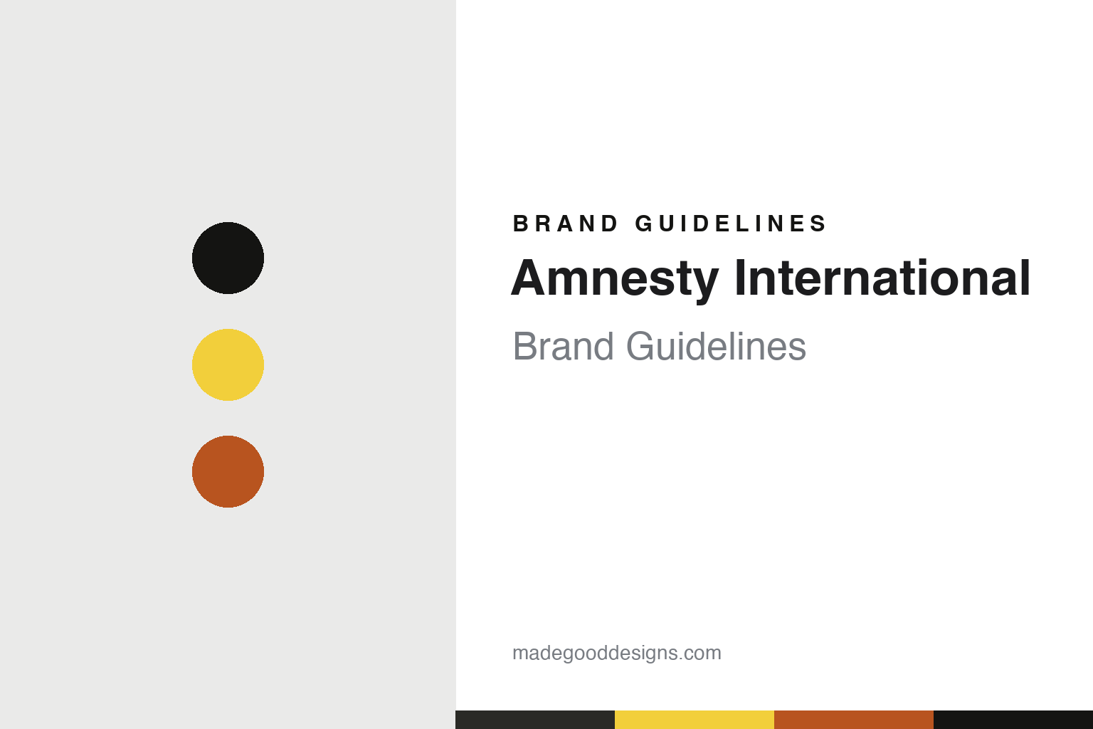
Two constants: a black and warm yellow palette and a condensed gothic register. Abstract homage — not an Amnesty International asset or mark; no candle, logo or wordmark is reproduced.
The Forgotten Prisoners
A newspaper article on 28 May 1961.
Amnesty International began as a newspaper article. On 28 May 1961 The Observer, edited by David Astor, published “The Forgotten Prisoners” by the English barrister Peter Benenson. It launched an “Appeal for Amnesty, 1961,” meant to rally public opinion for people jailed for their opinions or religion, and it gave those people a name: prisoners of conscience. By his own account he was on the London Underground in November 1960 when he read about two Portuguese students sentenced for drinking a toast to liberty under the Salazar government. Wikipedia adds that researchers have never traced that report.
He did not work alone. Wikipedia names Eric Baker, a Quaker whom Benenson’s memoirs call a partner in launching the project, and Alec Digges and Louis Blom-Cooper among those who helped reach the paper. The appeal was reprinted by newspapers abroad, and in the same year Benenson published Persecution 1961, on nine prisoners. A one-year appeal then became permanent: in July 1961 the leadership decided it should form the basis of an organisation, known at first simply as Amnesty, and a first meeting was held in London. Wikipedia dates the name Amnesty International to 30 September 1962. The Nobel Prize’s record gives 1961, London, as the founding.
The structure followed in the mid-1960s, with an International Secretariat, an executive committee and national sections. Its remit later widened from prisoners of conscience to torture and miscarriages of justice. Membership rose from 15,000 in 1969 to 200,000 by 1979, Wikipedia says. In 1977 it received the Nobel Peace Prize, “for worldwide respect for human rights” in the Nobel citation, followed by the United Nations Prize in the Field of Human Rights in 1978. The British section meanwhile began the comedy fundraising shows later known as The Secret Policeman’s Ball in 1976, with John Cleese and Martin Lewis. Amnesty now describes a global movement of more than 10 million people, with representatives from over 60 countries attending a yearly Global Assembly that sets decisions and selects its International Board.
Colour
A candle, a proverb and a very bright yellow.
The emblem is one of the few in this category with a named designer. Amnesty’s own brand hub says the candle was designed by Diana Redhouse, and FundingUniverse describes her as a British artist who may also have founded the first Amnesty local group, asked by Benenson to design the logo. Wikipedia says she drew it in 1963 as the organisation’s first Christmas card. It shows a lit candle wound in barbed wire, and it draws on the saying “better to light a candle than curse the darkness.” The brand hub and the Nobel Prize’s record both call that a Chinese proverb. Benenson’s own gloss, quoted in Amnesty’s 2015 identity toolkit, is less comforting: “The candle burns not for us, but for all those whom we failed to rescue from prison.”
The 2015 Visual Identity Toolkit shows how that drawing was organised into a system. The logo is always the wordmark and the candle together, and it works best on a yellow background, with black or white as the alternative. Yellow is treated as an argument rather than a decoration. “It’s bright. It’s vibrant. It’s impossible to ignore,” the toolkit says, adding that Amnesty uses it to highlight injustice, and that its use should be “sparing and not decorative.” Oranges and reds, taken from the candle flame, are offered as complements to it, and secondary colours are kept for information graphics and report references.
The current brand hub keeps the principle and tightens it. Black on yellow is the preferred logo, now described as three elements: wordmark, candle and a box that locks them together. The height of the flame sets the clear space, and the logo should stay under half the size of the main message, acting as a signature rather than the headline.
The brand typeface for Latin-script languages is Amnesty Trade Gothic, with bold condensed cuts for headlines in the toolkit, and the hub lists other faces for other scripts, Noto CJK for Japanese and Korean among them. Photography has its own rules. The toolkit says images should never be sensationalist, should avoid presenting people as helpless victims, and should show them as individuals with their own stories. Each picture should carry a date, names and an exact location in its caption, and the well-being of anyone recognisable comes first.
Typography
Campaign signs that have to be read fast.
A campaigning group has to be recognised in places a company rarely goes: on a banner at a protest, on the side of a boat, on a lapel, on the cover of a report about something grim. That pressure shapes how these organisations present themselves, and the published guidelines of two of them show how it is handled.
Greenpeace’s visual identity guidelines say its yellow campaign banners have been used in non-violent direct actions for more than 40 years, and they build a colour rule around them. Its display type, Zodiac Sans, was drawn from the shape of inflatable boats, according to the studio that made it. Ships are a medium in their own right: the guidelines keep the rainbow for Greenpeace vessels. Even the logo began, by the group’s own account, as a felt-tip word on a beer mat.
Amnesty International offers the matching case at a smaller scale. Its candle in barbed wire, which Wikipedia says was first drawn for a Christmas card, appears on a pin badge the group sells, and its 2015 toolkit sets a minimum height for the wordmark. The same toolkit asks for yellow to be used sparingly and keeps the logo out of cover photos on social media. The Nobel Prize’s record notes that the group’s findings are published in special reports, so the report cover is one of its everyday surfaces.
Field photography has rules of its own. Amnesty’s toolkit says images should never be sensationalist and should show people as individuals with their own stories, with the date, names and location in the caption. Greenpeace’s guidelines, for their part, cite a single picture from the whaling campaigns, a small inflatable between the harpoon and the whale, as an image that tells its story on sight.
Aa
A heavy condensed gothic for headlines, close in spirit to a campaign poster. (Specimen set in Oswald, a condensed gothic STAND-IN; NOT Amnesty Trade Gothic and NOT the Amnesty International logo.)
Amnesty International
An organisation that has had to examine itself.
Amnesty’s early years were less simple than its emblem. Wikipedia, citing later documents, says the British Foreign Office secretly supported it in its first years and in 1963 told its staff abroad to give “discreet support” to its campaigns. In 1966 a report on alleged torture at an interrogation centre in the British colony of Aden, written by the chairman of Amnesty’s Swedish section, went unpublished. Benenson came to believe the group had been infiltrated by British intelligence. In the same year the US government reported that Seán MacBride, the group’s first chairman, had been linked to a CIA funding operation, which MacBride denied. An inquiry reporting at Elsinore in Denmark in 1967 rejected Benenson’s allegations, and he resigned, Wikipedia says.
More recent reviews have been about the organisation itself. In February 2019 Amnesty’s seven-member senior leadership team offered to resign after an external report by the KonTerra Group warned of a “toxic” working environment and bullying, The Irish Times reported. The report said “organisational culture and management failures are the root cause of most staff wellbeing issues,” and in May 2019 Amnesty said five of the seven would leave, according to an agency report in the Mail & Guardian.
On 4 August 2022 Amnesty published a press release accusing Ukrainian forces of endangering civilians through their tactics. The head of Amnesty Ukraine resigned, and military and legal specialists criticised the work. Amnesty’s International Board commissioned independent reviews; a panel of five humanitarian-law experts said it was proper to assess a defender’s conduct but called the release “ambiguous, imprecise and in some respects legally questionable,” Ukraine’s Institute of Mass Information reported in April 2023, citing The New York Times, and on 17 May 2023 the board published an organisational report of findings and lessons. Russia’s justice ministry announced in April 2022 that Amnesty’s office there had been closed for what it called violations of Russian law, Wikipedia records, and Russia designated it an undesirable organisation in 2025.
For a design guide, Amnesty International shows how one small drawing and one loud colour can carry a movement across languages. Compare Human Rights Watch, another international human rights organisation, and ActionAid, another international charity brand. For this guide we use near-black and a warm candle yellow with a sans, an unofficial interpretation; no product or logo is reproduced.
Explore & save
Keep Amnesty International’s identity on hand — save it to a board in the Made Good inspiration library.
Amnesty International identity set
Pin the black and warm yellow palette and the condensed gothic register to your own board.