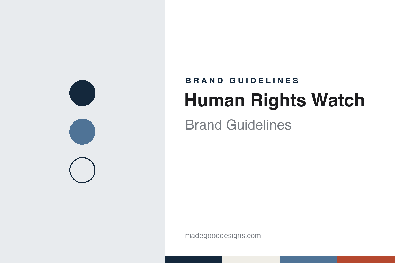
Human Rights Watch Brand Guidelines
The Helsinki monitor that became a global research group.
Aa
Two constants: a report navy, slate and paper palette and a plain report sans register. Abstract homage — not a Human Rights Watch asset; no logo or report cover is reproduced.
Helsinki Watch
A monitor for a treaty’s promises.
Human Rights Watch began in 1978 as Helsinki Watch. Its own history says the group was designed to support the citizens’ groups formed across the Soviet bloc to monitor compliance with the 1975 Helsinki Accords. English Wikipedia names three co-founders: Robert L. Bernstein, Jeri Laber and Aryeh Neier. New York University’s law school, writing in 2019, says Bernstein, who was president and chairman of the publisher Random House from 1966 to 1990, founded Helsinki Watch and served as founding chairman from 1978 to 1998. Laber was its executive director from 1978 to 1995, according to English Wikipedia, which also records that a Ford Foundation grant made the start possible.
The method came early. The group calls it “naming and shaming”: publicising abuses through the press and through direct exchanges with policymakers. Other committees followed. Americas Watch was founded in 1981, as civil wars ran across Central America, and it examined the role of foreign governments, particularly the United States, in supporting abusive regimes. Human Rights Watch dates Asia Watch to 1985, Africa Watch to 1988 and Middle East Watch to 1989, and says these were known together as “The Watch Committees.”
In 1988 the organisation adopted the single, all-inclusive name Human Rights Watch.
Colour
Research as the product.
Human Rights Watch is headquartered in New York and describes itself as roughly 500 people of more than 70 nationalities: country experts, lawyers, journalists and others. It says it refuses government funding and reviews all donations against its policies. English Wikipedia contrasts it with Amnesty International: Amnesty is a mass-membership organisation built around mobilising its members, while the main products of Human Rights Watch are crisis-driven research and long reports.
Its yearly publication is the World Report. The 2026 edition, which it calls its 36th annual review, covers developments in more than 100 countries. The group says its 1991 Persian Gulf War reporting was the first time it addressed violations of the laws of war in bombing campaigns, and that it has since added statistical research, satellite photography and bomb-data analysis to field interviews. It says it helped draft the Rome Statute that created the International Criminal Court. The 1997 Nobel Peace Prize went to the International Campaign to Ban Landmines and Jody Williams, NobelPrize.org records; Human Rights Watch says it shared in the prize as a founding member of the campaign.
Its records are archived. In 2004 the Rare Book and Manuscript Library at Columbia University became the home of the Human Rights Watch Archive, English Wikipedia says, with field notes, interview transcripts and video open to the public apart from security exceptions. Board records are closed.
Typography
Design and documentation.
A campaigning group has to be recognised in places a company rarely goes: on a banner at a protest, on the side of a boat, on a lapel, on the cover of a report about something grim. That pressure shapes how these organisations present themselves, and the published guidelines of two of them show how it is handled.
Greenpeace’s visual identity guidelines say its yellow campaign banners have been used in non-violent direct actions for more than 40 years, and they build a colour rule around them. Its display type, Zodiac Sans, was drawn from the shape of inflatable boats, according to the studio that made it. Ships are a medium in their own right: the guidelines keep the rainbow for Greenpeace vessels. Even the logo began, by the group’s own account, as a felt-tip word on a beer mat.
Amnesty International offers the matching case at a smaller scale. Its candle in barbed wire, which Wikipedia says was first drawn for a Christmas card, appears on a pin badge the group sells, and its 2015 toolkit sets a minimum height for the wordmark. The same toolkit asks for yellow to be used sparingly and keeps the logo out of cover photos on social media. The Nobel Prize’s record notes that the group’s findings are published in special reports, so the report cover is one of its everyday surfaces.
Field photography has rules of its own. Amnesty’s toolkit says images should never be sensationalist and should show people as individuals with their own stories, with the date, names and location in the caption. Greenpeace’s guidelines, for their part, cite a single picture from the whaling campaigns, a small inflatable between the harpoon and the whale, as an image that tells its story on sight.
Aa
A plain sans for a calm, report-led voice. (Specimen set in Source Sans 3, a sans STAND-IN; NOT the Human Rights Watch logo.)
Human Rights Watch
A logo designed without symbolism.
The logo has a documented story. Pages on the group’s website, marked copyright 2003, say a mark was chosen after a “difficult and long” review of a competition won by Zago Design of New York, and then developed further. It replaced an older globe-and-box logo. The designers, quoted by Human Rights Watch, said they avoided flags, crests and shields, along with chains, walls and barbed wire, and that they did not want the mark to look American. They called the globe “culturally outdated,” and went back to a circle set against a rectangle holding the name. They said “we have intentionally stripped it of symbolic meaning,” and that the group’s work “will inform the Mark, not the other way around.” They contrasted it with Amnesty and Greenpeace, whose logos, they argued, had come to represent a political stance, and described the group’s look as “calm, not in-your-face.” The mark on its website today is a blue square carrying the name in three stacked lines of white, widely spaced capitals.
The organisation’s record has its own disputes. In 2009 Bernstein criticised it in a New York Times essay over its reporting on Israel, English Wikipedia says, and in 2014 two Nobel Peace laureates led a letter from activists and scholars faulting its hiring ties to the US government. In 2021 it published a report accusing Israel of apartheid. In March 2020 The Intercept reported that it had accepted a 2012 gift from a Saudi businessman whose company it had documented for labour abuses, on condition the money not support its LGBT work in the Middle East and North Africa. The group returned the gift, called the decision “deeply regrettable” and announced an independent investigation. In February 2026 Al Jazeera reported that its Israel and Palestine director had resigned after a draft report on Palestinian refugees’ right of return was held back; the group said the research needed strengthening and that publication was paused.
Governments have pushed back too. English Wikipedia lists countries that have blocked its staff, and says it left Hong Kong in 2021 after Chinese sanctions. In November 2025 Russia declared it an “undesirable organisation,” Al Jazeera reported, which makes involvement with it a criminal offence there. Philippe Bolopion is its executive director.
For a design guide, Human Rights Watch shows how an organisation can ask a logo to step back and let the reports carry the weight. Compare Transparency International, another international watchdog known for an annual publication, and Amnesty International, with its candle emblem. For this guide we use a navy, a slate blue and a rust on a paper tone with a sans, an unofficial interpretation; no product or logo is reproduced.
Explore & save
Keep Human Rights Watch’s identity on hand — save it to a board in the Made Good inspiration library.
Human Rights Watch identity set
Pin the report navy, slate and paper palette and the plain report sans register to your own board.