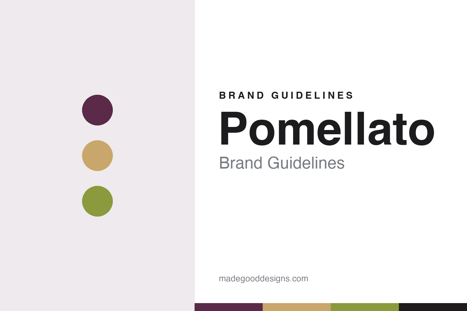
Pomellato Brand Guidelines
The Milan jeweller that treated gold like ready-to-wear.
Aa
Two constants: a plum, gold and green palette and a soft serif register. Abstract homage — not a Pomellato product or mark; no jewel, logo or hallmark is reproduced.
Prêt-à-porter gold
Jewellery changed like clothes.
Pomellato began in Milan in 1967. Its founder was Pino Rabolini, who, Kering says, came from a family of goldsmiths and dreamt of modern jewellery for a new generation of independent women. English and Italian Wikipedia both credit the company with introducing prêt-à-porter jewellery: the idea, in the English article’s words, that a jewel is not only a status symbol but an accessory to wear at any moment of the day and change like clothes. Il Post made the same link in 2016, noting that the house was founded in the years when women’s rights and ready-to-wear were both taking hold, and that its approach still reflected that spirit.
The name itself comes from the workshop. English Wikipedia says it was taken from the image of a small horse’s head on the corporate hallmark used in the atelier.
Through the 1990s, English Wikipedia says, Pomellato focused especially on coloured stones, and it also made its mark with chains. Il Post described the resulting look in 2016 as curved lines and coloured, semi-precious stones cut in broad, unusual shapes, often squared. English Wikipedia lists the design traits as rounded, tactile forms and a pavé made irregular by mixing gemstones of different sizes and colours.
A second brand followed in the mid-1990s. DoDo, launched in 1995 according to English Wikipedia and Il Post, and in 1994 according to Italian Wikipedia, took its name from the extinct bird; Italian Wikipedia records a collaboration with WWF Italia, and Il Post describes a line of animal-shaped charms. It became a separate brand in 2002.
In October 2009 Andrea Morante became chief executive and a minority shareholder of RA.MO, the Rabolini family’s holding company, which controlled both Pomellato and DoDo, Wikipedia records.
Colour
Nudo and the Milan bench.
The design that now defines the house arrived in 2001. Nudo, Italian for nude or bare, was launched as a small set of rings: five, according to the jewellery site Katerina Perez in 2024, in garnet, peridot, iolite and red tourmaline, according to A&E magazine in 2021. A&E explains the construction: a concealed fixing system inside the collet makes each square stone appear to float, and gem-cutters hand-cut 57 irregular facets into a cabochon-like surface. Kering describes the cut as patented. Both publications present Nudo as an ironic answer to the traditional solitaire ring, and Katerina Perez describes it as designed for stacking.
The idea has been extended steadily. A&E counted more than 35 different gems in the line by 2021, a first Nudo pendant in 2016, a bracelet in 2018, a sautoir in 2019, and a range of about 150 items. Stones named in these reports include prasiolite, chrysoprase, carnelian and pink quartz.
Il Post wrote in 2016 that Pomellato sells worldwide but that its jewels are still made by hand in Milan, with the cutting and finishing of rough gems taking place in the company’s own workshop. A&E said in 2021 that a Classic-size Nudo ring takes the Milan atelier four days, and Katerina Perez described in-house gem experts, cutters and goldsmiths in 2024. Kering names the site Casa Pomellato in its account of the high jewellery collection.
That high jewellery has two possible starting points. English Wikipedia says the house debuted in high-end jewellery in 2007, for its 40th year, with Pom Pom, a run of 40 pieces sold by appointment in New York, Paris, Milan and Monte Carlo. Kering’s timeline gives 2020 as the launch of the first-ever high jewellery collection. In 2023, Katerina Perez reported, the Ode to Milan high jewellery collection took Nudo into that category with its Nudo Triennale rings.
English Wikipedia names Vincenzo Castaldo creative director from 2004, and Kering says he celebrated his 20th year with the house in 2023. Il Post reported his view in 2016 that the house is harder to make known abroad because semi-precious stones are less valued there than diamonds. Kering says Pomellato reached 100% responsible gold sourcing in 2018.
Typography
Stones, sketches and shop windows.
Fine jewellery is sold on small things seen closely, so its houses present themselves through a settled set of images. Loose stones appear on grey velvet, a surface that gives the eye nothing to compete with. Pearl strands are laid out and sorted by tone, a way of showing that matching is itself the work.
Drawing comes next. Many houses show gouache design sketches, painted on paper so that a jewel can be judged at full size before any metal is cut. These sheets often go into archives and exhibitions alongside the finished pieces, because they show the design as a decision rather than an object. Chaumet’s nickel-silver mock-ups and Gianmaria Buccellati’s remark that he made a design so that a craftsperson could make it belong to the same habit.
Then the bench. Workshop photographs of hands, burins, wooden workbenches and half-set stones have become part of the category’s standard vocabulary. They show that a person made the piece, and they suit a trade in which skills are passed down at the bench.
Finally, there is the box and the street. Red and navy boxes make a purchase recognisable before the jewel is seen. On Place Vendôme in Paris, small windows and restrained frontages do the same job at the scale of a square: a handful of pieces, carefully lit, under a name in plain lettering. The guides in this set look at how each house uses those habits, and at who has owned each name along the way.
Aa
A soft serif for a house of curved gold. (Specimen set in Fraunces, a serif STAND-IN; NOT the Pomellato logo.)
Pomellato
Photography as the brand’s voice.
Pomellato’s image was built by photographers as much as by goldsmiths. Wikipedia says the campaigns of the 1960s went to Franco Scheichenbauer, and that from 1971 the company worked with the black-and-white photographer Gian Paolo Barbieri. Helmut Newton signed the campaigns from 1982 to 1984, and Kering’s timeline marks 1982 as his first. Barbieri returned in 1988 and 1989. His projects for the house included the book The Maps of Desire of 1989 and Innatural of 2004, which placed the jewels in tropical settings.
The 1990s brought Alistair Taylor-Young, Lord Snowdon and Javier Vallhonrat. In 2001, Wikipedia says, Pomellato left black and white for colour with Michel Comte, the same year Nudo appeared. Paolo Roversi shot the 2010 campaign, and Vallhonrat returned in 2011 to photograph Tilda Swinton. Italian Wikipedia names Salma Hayek as the face of the house from February 2015. Kering also names Peter Lindbergh among the house’s photographers.
Ownership changed in 2013. The luxury group then called PPR and now Kering took control: Il Post says a majority of the shares was bought, together with DoDo, and Italian Wikipedia dates the change to April, while English Wikipedia gives July as the month of acquisition. Morante stayed on, and National Jeweler reported that his departure had been planned since the sale. Il Post recorded growth from 42 to 62 single-brand stores in the years after the deal, and noted that Kering also owns Boucheron.
Sabina Belli, whom Il Post describes as a veteran of L’Oréal, LVMH and Bulgari, became chief executive in December 2015. In 2017 Pomellato launched Pomellato for Women, a platform advocating gender equality and raising awareness of violence against women, English Wikipedia says; Katerina Perez named Jane Fonda and Cate Blanchett among its supporters. In 2026 the leadership changed again. FashionUnited reported that Charlotte Fournet had succeeded Belli, who was named chair of Kering Italia, and that Fournet would be based in Milan and report to Jean-Marc Duplaix, Kering’s chief operating officer and head of Kering Jewelry. Krizia Cucurachi took over DoDo. Kering’s note, as quoted there, spoke of a distinctive use of colour, Milanese craftsmanship and bold design. Kering’s own timeline confirms the appointment.
For a design guide, Pomellato shows how a jeweller can build recognition on colour, cut and photography. Compare Boucheron, its stablemate at Kering, and Buccellati, another Milan jeweller. For this guide we use plum, gold and green with a serif, an unofficial interpretation; no product or logo is reproduced.
Explore & save
Keep Pomellato’s identity on hand — save it to a board in the Made Good inspiration library.
Pomellato identity set
Pin the Pomellato plum, gold and green palette and the soft serif register to your own board.