Lancaster University Brand Guidelines
The 1964 university on a Lancashire hilltop, and the shield that signs for it.
Aa
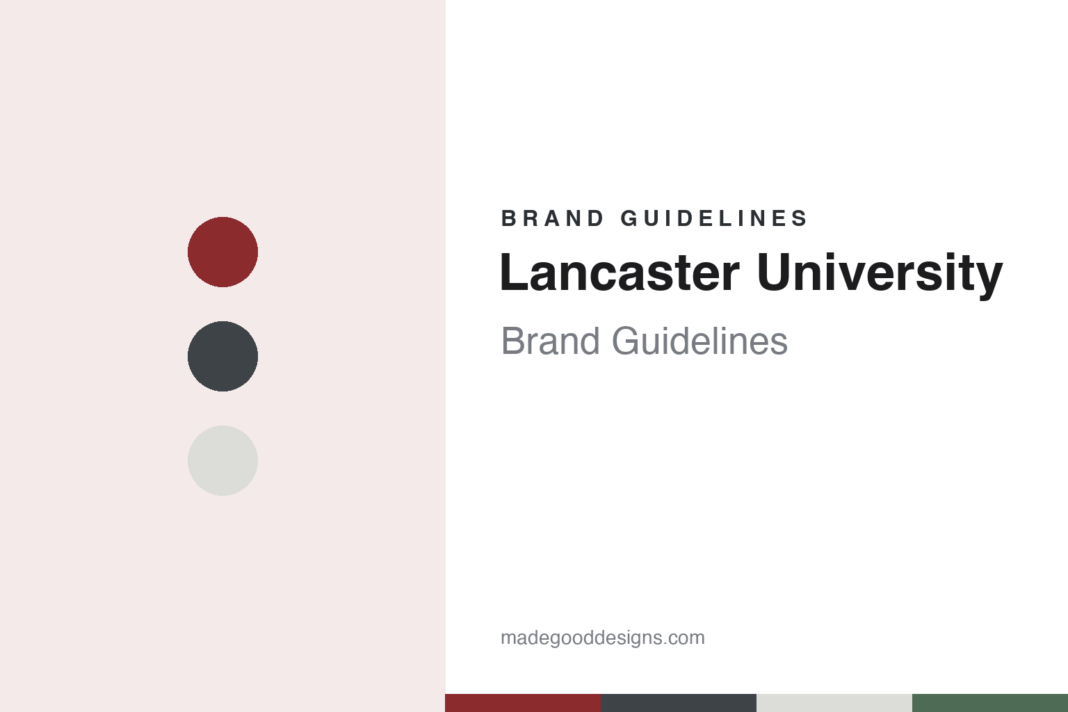
Two constants: a Lancaster brick red and slate palette and a slab serif register. Abstract homage — not a Lancaster University mark; no shield, logo or crest is reproduced.
Truth lies open to all
A city’s proposal, a charter and a lecture room in a theatre.
Lancaster University took its legal shape in 1964. Queen Elizabeth II approved its Charter and Statutes on 14 September 1964, the university’s own history says, and the first students arrived that October. Its official name, English Wikipedia notes, is The University of Lancaster.
The idea was older. A public meeting in Lancaster backed a proposal for a university college in 1947; the university says it lapsed for lack of government funding until Lancashire County Council revived it in early 1961, through a promotion committee chaired by Lord Derby. On 23 November 1961 the choice of Lancaster was announced in the House of Commons. The university describes itself as the last of the “Shakespearean Seven,” the new universities announced between 1958 and 1961. English Wikipedia credits the author Michael Beloff with the better-known label for the group, “plateglass.”
Its founding Vice-Chancellor, Charles Carter, took up the post on 1 April 1963. Princess Alexandra was installed as Chancellor in November 1964 and stayed until December 2004. The motto adopted at the start was “Patet omnibus veritas,” or “Truth lies open to all,” which English Wikipedia traces to an early seventeenth-century medical pamphlet.
The first years were spent in borrowed rooms. Teaching took place at St Leonard’s House in the city, and students lodged in Lancaster or Morecambe, the university says. English Wikipedia adds that the Grand Theatre was leased as the main lecture room and that the library used the old workshops of the stained-glass firm Shrigley and Hunt. One early decision has a particular interest for a brand guide: Carter set up what the university calls the first Marketing department of its kind in the UK, saying the subject needed “a greater share of good brains and honest research.”
Colour
A spine down the middle of a windy hill.
The permanent home is Bailrigg, a hilltop site about three miles south of the city that, according to English Wikipedia, Lancaster City Council donated in 1963. Work began in November 1965 and the first teaching and administrative buildings opened a year later. Departments moved out of the city between 1966 and 1970, the university says, and students began living on campus in 1968.
The architects were Peter Shepheard and Gabriel Epstein. The site’s weather shaped the plan. Shepheard recalled, in a passage quoted by English Wikipedia, visiting on a freezing, windy day when every plan blew away, and concluding that “it’s got to be cloisters.” The result was a covered walkway known as the Spine, with cars kept to a peripheral road and buildings of three or four storeys joined to one another. From a distance, the university says, it was hoped the campus would look like a Mediterranean hilltop village. Between 2016 and 2018 the Spine was remodelled in a project called Design The Spine, English Wikipedia says, replacing a decaying wooden canopy.
At the centre lies Alexandra Square, named after the first Chancellor. Epstein wanted its buildings to hold “a fruit salad of functions,” the university recalls, so that departments, housing and recreation were not kept apart. The fourteen-storey Bowland Tower stands to the south-east and, English Wikipedia says, disguises the boiler-house chimney.
The building with the closest tie to the identity is the Chaplaincy Centre, opened on 2 May 1969 to a design by the Preston firm Cassidy & Ashton. Its plan is a trefoil with a central spire, and that spire was once the main university logo, the university’s history and English Wikipedia both say. Later additions include The Ruskin, the library and museum designed by Sir Richard MacCormac, which holds a large John Ruskin collection.
Lancaster is also collegiate. Its eight undergraduate colleges are named after places in historic Lancashire, English Wikipedia says, and each has its own logo and primary colours under a separate set of college guidelines. Each summer the students meet those of York in the Roses Tournament, named after the fifteenth-century civil war.
Typography
Crests, concrete and open days.
Universities founded after 1950 could not borrow a medieval past, so their identities had to come from somewhere else. In Britain the buildings came first. The writer Michael Beloff chose the word “plateglass” for the new universities of the 1960s, for their modern design and wide expanses of glass in steel or concrete frames, and he wrote of the “grey or biscuit concrete massiveness” of most of their buildings and “the black towers of Essex.” The term set them apart from the Victorian redbrick universities and the ancient ones.
The marks followed a similar line, keeping the idea of a crest while simplifying it. Grafik described the Open University’s 1969 logo as a U with a crest-like structure and a punched-out O, respectful of heraldry while looking ahead. In 2022, campaign material said the same shield had become the starting point for a design system built with accessibility in mind.
Some of these universities reached the public through broadcast before most people could see a campus. The BBC dates the first Open University programme to 3 January 1971, on BBC Two, with academics as presenters and an animated logo and fanfare at the start. That late-night teaching ended in 2006. Monash University’s early fame in Australia came by a different route: Wikipedia says many people first heard of it through its student protests.
This guide follows these universities onto the surfaces where they meet the public: prospectus covers, banners on open days, degree certificates and national campaigns. For each one, it sets out what can be checked about the founding, the name and the identity, and it says who is making each claim, including when the claim comes from the university itself.
Aa
A slab serif for headings, as Lancaster uses Lexia. (Specimen set in Zilla Slab, a slab serif STAND-IN; NOT Lexia and NOT the Lancaster University logo.)
Lancaster University
Words and shield, never separated.
The university sets out its rules in a Brand Hub, built on the line that whether staff work in Linguistics or at Lancaster University Leipzig, “we are all Lancaster University.” Its logo is the words and the shield together, and the two “should never be separated or adjusted.” The logo should sit at the top right of a page wherever possible, with a clear zone around it, and should never print below 10mm in height. A reversed version adds a grey stroke to the shield’s edge, a mono version is kept for exceptional cases, and social media profile pictures may use the shield alone. New logos are discouraged because, the guidance says, they dilute recognition.
The shield comes from the coat of arms. English Wikipedia reads its parts as a wavy blue line for the River Lune, two red roses for the House of Lancaster and the county, an open book for learning and a lion from the arms of the Duchy of Lancaster, and says the logo carries the arms in slightly modified form. The university reserves the full coat of arms for documents such as degree certificates and for ceremonies.
Colour is tied to place. The hub names Lancaster red as communicating strength and prestige, and a dark grey, previously known as Quaker grey, as reflecting the region’s link with the Quaker movement. A green and a blue are inspired by countryside and coast, and should not be used together; an orange serves as accent. Type follows three tiers: Lexia, a slab serif, for primary headings; Effra for secondary headings; Aktiv Grotesk for body copy. Aptos covers everyday documents.
The name now travels. Lancaster University Leipzig opened in 2020 with Navitas, English Wikipedia says, and on 26 February 2025 Lancaster and Deakin University launched a joint campus in Bandung, Indonesia, with courses due to start that September, The PIE News reported. The hub gives overseas partnerships their own logo lock-ups.
The period has also been difficult. In November 2025 Beyond Radio reported that lecturers in the University and College Union had begun action short of a strike over plans that could cut more than 400 jobs. The university cited rising costs and falling international student numbers. Strikes planned for late November were suspended after talks, the station reported on 21 November, and the union described the threat of compulsory redundancies as beaten back.
For a design guide, Lancaster University shows how a strict published rulebook can tie a shield to a place through named colours. Compare University of York, its opponent in the Roses Tournament, and Deakin University, its partner in Bandung. For this guide we use a brick red, a slate and a moss green with a serif, an unofficial interpretation; no product or logo is reproduced.
Explore & save
Keep Lancaster University’s identity on hand — save it to a board in the Made Good inspiration library.
Lancaster University identity set
Pin the Lancaster brick red and slate palette and the slab serif register to your own board.