International Labour Organization Brand Guidelines
A peace-treaty labour body, a wartime move and a three-part cogwheel.
Aa
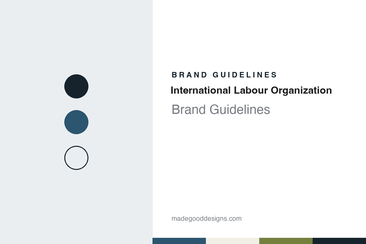
Two constants: a Geneva slate and wreath olive palette and a Civic sans register. Abstract homage — not an ILO asset; no emblem, seal or logo is reproduced.
Versailles
Labour standards written into a peace treaty.
The International Labour Organization was created in 1919 as part of the Treaty of Versailles, which ended the First World War. The ILO says this reflected a belief that universal and lasting peace can be accomplished only if it is based on social justice. It has no single founder. English Wikipedia says the Paris Peace Conference set up a Commission on International Labour Legislation, which first met on 1 February 1919 with the American union leader Samuel Gompers in the chair. The conference adopted its report on 11 April, and that report became Part XIII of the treaty.
The first International Labour Conference opened on 29 October 1919 in Washington, D.C., English Wikipedia says. The organization spent its first months in London and moved to Geneva in the summer of 1920, with Albert Thomas of France as its first Director, the ILO says. Nine conventions and ten recommendations followed in under two years, covering matters such as hours of work, unemployment, maternity protection and minimum age. When the Great Depression arrived, Britain’s Harold Butler succeeded Thomas in 1932, and the United States joined in 1934 while staying out of the League of Nations.
What sets the ILO apart is its structure. It calls itself “the only tripartite U.N. agency”: governments, employers and workers from 187 member states set labour standards and policies together. English Wikipedia describes three main bodies, the annual International Labour Conference, the Governing Body and the International Labour Office, and names Gilbert Houngbo of Togo as Director-General, elected in 2022.
Its buildings carried the same idea. The ILO says the architect Georges Epitaux designed a headquarters on Lake Geneva, opened in 1926, and that the three keys used at its inauguration stood for the three constituent groups. The foundation stone read Si vis pacem, cole justiciam: if you desire peace, cultivate justice. English Wikipedia says that building now houses the World Trade Organization. The present headquarters, a biconcave block on the hillside above the lake, was inaugurated in 1974, and the ILO says it was then the largest administrative building in Switzerland.
Colour
Montreal, Philadelphia and a Nobel.
The American John G. Winant became head of the ILO in 1939. An ILO library history says the Governing Body had arranged for work to continue in the event of war, but that Switzerland, surrounded by German occupation troops, left the organization no choice but to set up outside Geneva, and that Winant was adamant it should not become the instrument of totalitarian States.
The ILO’s own accounts date the temporary move to Montreal to May 1940, while its library says Canada officially agreed to the transfer in August 1940. Forty staff from 18 countries went to McGill University, where a McGill library history says they used Morrice Hall from August to November before moving elsewhere on campus. Another group stayed in Geneva, and the rest went home as national correspondents or to branch offices. A plaque unveiled at McGill on 14 September 1950 says the ILO directed its work from the campus until 1948. The ILO says it was the only international organization still in operation during those years.
The war also reshaped its aims. Under Winant’s successor, Edward Phelan of Ireland, delegates from 41 countries adopted the Declaration of Philadelphia in 1944, which says “labour is not a commodity” and still serves as the ILO’s charter of aims. In 1946 it became a specialized agency of the new United Nations.
Under the American David Morse, Director-General from 1948 to 1970, membership doubled. The Nobel Peace Prize followed in 1969, “for creating international legislation insuring certain norms for working conditions in every country”; the Nobel site counts 128 conventions adopted by then.
The later record includes open conflict. English Wikipedia says the United States gave notice of withdrawal in November 1975, after the ILO granted observer status to the Palestine Liberation Organization, and that the exit took effect on 1 November 1977. The Christian Science Monitor reported in February 1980 that the United States had charged that decisions were dominated by “a communist and third-world voting bloc” and that it had returned. In June 2000 the Conference used article 33 of the ILO Constitution for the first time, against Myanmar, after a 1998 Commission of Inquiry found forced labour there “widespread and systematic”; the remaining restrictions were lifted in June 2013. In November 2017 the Governing Body closed a complaint about forced labour in Qatar in favour of a cooperation programme. English Wikipedia reports that The New York Times alleged in 2023 that Qatari lobbying had shaped that outcome, and that ILO officials said progress there had come through delicate negotiations.
Typography
Emblems and public signs.
United Nations bodies share a family look that began with a single conference pin. The UN’s own emblem, a world map seen from the North Pole, was first set between crossed laurel branches and then between two olive branches, UN News recorded in 2009, and the General Assembly adopted a revised version in December 1946. Other bodies in the system have their own marks; English Wikipedia says the World Health Organization’s features the Rod of Asclepius, and it lists a family of agency flags derived from the UN’s.
Blue does much of the work. The UN Flag Code, issued in 1947 and amended in 1952, puts the white emblem on a blue field at fixed proportions, and the Code bars the flag from commercial use. On the ground the same marks appear on working equipment: UN News described the emblem on peacekeepers’ helmets, on helicopters and trucks carrying aid, and on leaflets. In refugee camps, English Wikipedia says, sleeping accommodation is frequently tents, prefabricated huts or dwellings built from local materials.
Paper is the other public face of these bodies. Reports, resolutions and flagship publications carry the name year after year: UNDP’s Human Development Report dates from 1990. Language is part of the system too. The UN’s six official languages are Arabic, Chinese, English, French, Russian and Spanish, and some bodies change their initials with the language, as UNDP does with PNUD in French and Spanish.
Use of these names and marks is restricted. General Assembly resolution 92(I) of 1946 prohibits use of the UN’s emblem, seal, name and initials without the Secretary-General’s authorisation, in particular for commercial purposes, a UNOPS instruction of 2020 explains. This guide therefore sets out what can be checked about each body’s founding, name and visual history, and reproduces no emblem, flag or logo.
Aa
A civic sans for a body of governments, employers and workers. (Specimen set in Archivo, a sans STAND-IN; NOT the ILO emblem or logo.)
International Labour Organization
From a seal to a three-part cogwheel.
The ILO’s emblem has changed several times, and it tells the story itself. In a 2018 news item it says the 1921 seal served as its first logo. In 1938 that gave way to a black triangle around the letters “ILO” in white, reinforcing the tripartite structure. In 1943–44 the colours were reversed, with black letters on white, slightly overlapping the triangle.
The present design arrived for the 50th anniversary. The ILO says a new logo was designed in 1968, introducing a cogwheel divided into three parts to symbolize the world of work and the tripartite structure, inside the UN wreath of olive leaves to reaffirm its place in the UN family. On 2 July 1969 the same emblem, without the dates 1919–1969, became the official logo. A 2004 Governing Body paper gives an earlier step, saying Director-General David Morse approved the emblem on 1 September 1967.
The mark has been questioned from inside. A Governing Body paper of March 2003 said the cogwheel was “no longer representative of the broader world of work.” It also said the logo’s acronym had to be translated, producing different logos for ILO, BIT, OIT and other versions, and that separate looks for departments had confused outside audiences. It proposed an abstract, sun-like symbol, with the name set beneath in the appropriate language and the olive wreath kept. The ILO’s 2018 item says it has used the 1969 logo from 1995 to that date, and it built that logo into its Centenary identifier, placed beside an open-ended number 100 and the line “Advancing social justice, promoting decent work.” That identifier was to be rolled out across around 40 offices.
Use is limited in several ways. The 2003 paper recalls a 1961 Conference resolution protecting the name and acronym, and cites Article 6ter of the Paris Convention on emblems of intergovernmental organizations. The ILO said official permission was needed to use the Centenary identifier. A 2004 paper said the ILO’s flag, designed in 1969, was “not a flag in the strict legal sense”: it was ceremonial, could not be shown outside ILO buildings and could not fly with national flags at official gatherings.
For a design guide, the International Labour Organization shows how one emblem can carry a three-part structure, and what letters in a logo can cost a multilingual body. Compare the United Nations, whose wreath of olive leaves it uses, and the International Monetary Fund. For this guide we use a Geneva slate and a wreath olive with a sans, an unofficial interpretation; no product or logo is reproduced.
Explore & save
Keep International Labour Organization’s identity on hand — save it to a board in the Made Good inspiration library.
International Labour Organization identity set
Pin the Geneva slate and wreath olive palette and the Civic sans register to your own board.