Greenpeace Brand Guidelines
A Vancouver boat, a beer-mat logo and a yellow banner.
Aa
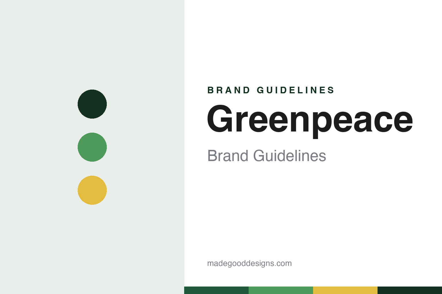
Two constants: a green and banner-yellow palette and a condensed sans register. Abstract homage — not a Greenpeace asset or mark; no logo, banner, ship or symbol is reproduced.
Don’t Make a Wave
A committee in Vancouver and a chartered fishing boat.
Greenpeace grew out of a protest in Vancouver, and it says itself that it had no single founder. The trigger was the United States’ programme of underground nuclear tests at Amchitka, an island in Alaska’s Aleutians. Opponents in British Columbia formed the Don’t Make a Wave Committee. The date depends on the source: Wikipedia records that the historian Frank Zelko puts it in 1969, that Greenpeace gives 1970, and that the committee’s certificate of incorporation is dated 5 October 1970. Greenpeace names the committee’s founders as Dorothy and Irving Stowe, Marie and Jim Bohlen, Ben and Dorothy Metcalfe and Robert Hunter; Wikipedia notes another account that lists Paul Cote with the Stowes and the Bohlens. Paul Watson and Patrick Moore have also claimed the title; Greenpeace calls them early members, not founders.
A benefit concert at Vancouver’s Pacific Coliseum on 16 October 1970 paid for the first campaign. The committee chartered the fishing boat Phyllis Cormack and renamed it Greenpeace, after a term coined by the activist Bill Darnell. It sailed on 15 September 1971 with what Greenpeace describes as a group of 12 activists. The US Coast Guard ship Confidence forced it back. The Amchitka test went ahead, and Wikipedia says the United States then dropped its plans for further tests there. Greenpeace treats the voyage as its beginning. Moore and the early director Rex Weyler date the formal change of name to the Greenpeace Foundation to 1972.
The focus widened quickly. In 1972 David McTaggart’s yacht Vega, renamed Greenpeace III, sailed into the exclusion zone at Moruroa to protest French atmospheric nuclear tests. In the mid-1970s members took boats out against Soviet whalers, placing themselves between harpoons and whales. By 1977 there were 15 to 20 groups using the name, Wikipedia says, and a Canadian office in debt. McTaggart pressed for one structure, the European groups cleared the debt, and Greenpeace International came into being on 14 October 1979. Today it is a Dutch foundation in Amsterdam. Greenpeace describes a network of 25 independent national and regional organisations in over 50 countries, with Greenpeace International as coordinator.
Colour
A felt-tip pen, a boat-shaped typeface and a rule about rainbows.
The logo’s origin story comes from Greenpeace itself. Its People Powered visual identity guidelines say that when Greenpeace International began in the late 1970s there was no agreed way to write the name. Some offices adapted the Sisiutl symbol, others used a peace sign and an ecology icon, with “Green Peace” as two words, and the setting depended on which Letraset sheets were lying around the office or ship. Rémi Parmentier, a founder of Greenpeace International, recalls in the guidelines a day in Paris in the early 1980s when the Letraset had run out and the local stationery shop was shut. Jean-Marc Pias, who made posters and stickers, ran to a bar and asked an artist friend, Patrick Garaude, to write the word. Garaude did it with a fat felt-tip pen on a beer mat. The guidelines call it the “graffiti logo,” and say it has been adapted for modern print and digital use while keeping its imperfect felt-tip quality.
The rest of the system is written around that mark. The guidelines make Greenpeace Green the primary display colour and one of its most distinguishing features, but say it is not for standard text, because it fails accessibility contrast on light backgrounds. A dark green takes over for small type. Action Yellow comes from the yellow campaign banners, which the guidelines say have been used in non-violent direct actions for more than 40 years, and it is reserved for calls to action. Office names run beside the logo in Work Sans or a local sans serif, with the logo always dominant.
The display type carries a piece of campaign history. Zodiac Sans is an open-source typeface by the studio Inkahoots, drawn for Greenpeace’s global identity guidelines. Inkahoots says it took its forms from the inflatable boats activists have used since their 1970s encounters with Russian whalers, and describes a condensed grotesque with geometric counters, slanted terminals and rounded corners. A stencil cut exists, and the guidelines ask designers to make sure it never looks militaristic. Greenpeace has developed a further version as Greenpeace Sans.
Two older emblems sit outside the everyday kit. The rainbow traces to the book Warriors of the Rainbow, which inspired Robert Hunter on the first voyage. The guidelines say it should not be a regular identity element apart from on the ships, where it has sailed with a peace dove since the first Rainbow Warrior in 1978. The Sisiutl, a crest the guidelines say was gifted to the first voyage’s crew, was altered over the decades until, in 2015, the Kwakwaka’wakw artist Beau Dick re-created the traditional symbol and re-gifted it on the understanding that it would never be changed.
Typography
Campaign signs that have to be read fast.
A campaigning group has to be recognised in places a company rarely goes: on a banner at a protest, on the side of a boat, on a lapel, on the cover of a report about something grim. That pressure shapes how these organisations present themselves, and the published guidelines of two of them show how it is handled.
Greenpeace’s visual identity guidelines say its yellow campaign banners have been used in non-violent direct actions for more than 40 years, and they build a colour rule around them. Its display type, Zodiac Sans, was drawn from the shape of inflatable boats, according to the studio that made it. Ships are a medium in their own right: the guidelines keep the rainbow for Greenpeace vessels. Even the logo began, by the group’s own account, as a felt-tip word on a beer mat.
Amnesty International offers the matching case at a smaller scale. Its candle in barbed wire, which Wikipedia says was first drawn for a Christmas card, appears on a pin badge the group sells, and its 2015 toolkit sets a minimum height for the wordmark. The same toolkit asks for yellow to be used sparingly and keeps the logo out of cover photos on social media. The Nobel Prize’s record notes that the group’s findings are published in special reports, so the report cover is one of its everyday surfaces.
Field photography has rules of its own. Amnesty’s toolkit says images should never be sensationalist and should show people as individuals with their own stories, with the date, names and location in the caption. Greenpeace’s guidelines, for their part, cite a single picture from the whaling campaigns, a small inflatable between the harpoon and the whale, as an image that tells its story on sight.
Aa
A condensed sans for headlines, far from a hand-drawn mark. (Specimen set in Barlow Condensed, a condensed sans STAND-IN; NOT the Greenpeace logo, and not Zodiac Sans.)
Greenpeace
A bombing, a letter from laureates and a long court case.
The most serious event in the group’s history happened in Auckland. On 10 July 1985 agents of France’s foreign intelligence service, the DGSE, attached two limpet mines to the first Rainbow Warrior, a former trawler that was preparing to lead a protest flotilla against French nuclear testing at Moruroa. The photographer Fernando Pereira drowned when the second mine went off. New Zealand police captured two of the agents, who pleaded guilty to manslaughter. France at first denied responsibility, its defence minister Charles Hernu resigned, and it formally apologised to New Zealand in 1986 and paid reparations, Wikipedia says. The ship was scuttled in Matauri Bay in December 1987 as a dive wreck. Greenpeace bought a successor, and a third Rainbow Warrior was launched on 14 October 2011.
The group has also drawn sharp criticism. In June 2016, 107 Nobel laureates signed an open letter urging it to end its opposition to genetically modified crops, Golden Rice in particular; Greenpeace answered that accusations it was blocking the rice were false. In December 2014 activists setting up a banner in Peru damaged an area around one of the Nazca Lines figures, and Greenpeace apologised to the Peruvian people, Wikipedia records.
The largest legal case is still running. Energy Transfer, the Dakota Access Pipeline company, sued Greenpeace USA, Greenpeace International and Greenpeace Fund over the 2016–17 protests near the Standing Rock reservation. On 19 March 2025 a jury in Mandan, North Dakota found against them, with Greenpeace USA liable on all the claims against it and the other two on fewer. Judge James Gion later cut the jury’s award by about half and finalised the judgment in February 2026, AFP reported. Greenpeace denies wrongdoing and calls the suit an abusive attempt to silence it; Energy Transfer says the case was about accountability for unlawful actions, not silencing critics. In June 2026 the Amsterdam District Court ruled that it could hear Greenpeace International’s separate Dutch case against the company, KFYR-TV reported. Greenpeace has said it will appeal.
For a design guide, Greenpeace shows how a hurried piece of handwriting can anchor a global identity once a system is built around it. Compare WWF, which rests on a single animal, and Friends of the Earth, another campaigning network. For this guide we use a deep green, a leaf green and an ochre yellow with a condensed sans, an unofficial interpretation; no product or logo is reproduced.
Explore & save
Keep Greenpeace’s identity on hand — save it to a board in the Made Good inspiration library.
Greenpeace identity set
Pin the green and banner-yellow palette and the condensed sans register to your own board.