WWF Brand Guidelines
A panda chosen partly because black-and-white was cheap to print — and now one of conservation’s great symbols.
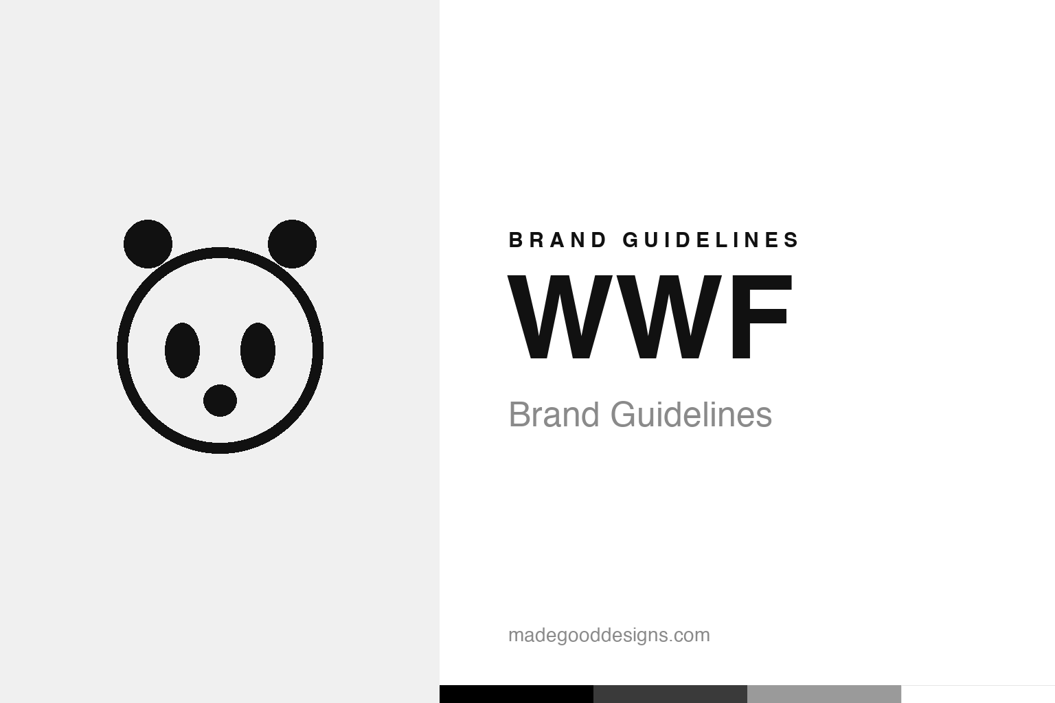
An abstract panda face — the idea, not the WWF mark. Deliberately not the WWF panda.
A panda for the planet
WWF’s logo is one of conservation’s icons.
The WWF giant panda is one of the most beloved and effective non-profit logos ever made. Created in 1961 — the year the World Wildlife Fund was founded — it was inspired by Chi-Chi, a giant panda who had arrived at London Zoo that year and captured public affection. Initial sketches were made by the naturalist Gerald Watterson, and the final logo was drawn by Sir Peter Scott, a founder of WWF and a gifted wildlife artist. The panda was a brilliant choice: a rare, gentle, universally loved animal that instantly signals wildlife, vulnerability and the need for conservation — warm and appealing rather than preachy. Our homage nods to an abstract panda face, not the WWF mark.
Black and white, by design
WWF’s palette was a practical, clever decision.
There’s a lovely practical story behind the logo’s look. Scott and the founders chose a black-and-white animal partly for a very practical reason: it was cheaper and easier to reproduce. In 1961, printing in colour was expensive, so a creature that is naturally black and white meant the logo could be printed cheaply and clearly on everything — letterheads, posters, publications — without any colour costs. Scott himself reportedly noted the appeal of an animal “with which to save money on printing.” It’s a wonderful example of a design constraint becoming a design strength: the practical need for a low-cost, high-contrast mark led to a bold, simple, striking black-and-white logo that reproduces perfectly at any size and stands out instantly. The limitation didn’t weaken the design — it defined and improved it.
An emblem that carries a mission
The panda represents far more than one species.
The genius of the WWF panda is how much meaning it carries. It doesn’t just represent giant pandas — it has come to symbolise wildlife conservation and environmental protection as a whole. The gentle, endangered, universally cherished panda embodies exactly the emotions WWF wants to evoke: care, urgency, tenderness and the fragility of nature. Seeing the panda instantly communicates “protect wildlife” without a single word, in any language, across every culture — a huge advantage for a global organisation. Over the decades the logo has been gradually simplified (notably in a 1986 redesign and later refinements), becoming ever cleaner and more graphic while keeping its essential, recognisable form. That careful evolution kept the mark modern and versatile without ever sacrificing the emotional warmth and instant recognisability that make it so effective.
Emotion, simplicity and constraint
The WWF panda is a model non-profit brand.
The WWF panda offers several powerful branding lessons. First, the importance of an emotionally resonant symbol: by choosing a gentle, beloved, vulnerable animal, WWF created a mark that instantly evokes the care and urgency its mission depends on — a reminder that the right symbol can communicate a cause more powerfully than any slogan. Second, the value of simplicity and versatility: the clean black-and-white panda works at any size, in any medium, across every culture and language, which is exactly what a global organisation needs.
Third, and most memorably, that constraints can strengthen design. The practical need for a cheap-to-print, high-contrast logo led directly to the bold, simple, striking black-and-white mark — the limitation became the design’s greatest asset. And fourth, the power of careful, respectful evolution: WWF has simplified and refined the panda over the decades to keep it modern, without ever losing its recognisable, emotive core. The result is one of the most effective non-profit logos in existence — a mark that carries an entire global mission in a single gentle, black-and-white face. It proves that great identity design isn’t about complexity or budget; it’s about choosing a symbol with genuine emotional meaning, keeping it simple, and letting a smart constraint sharpen it. From a panda at London Zoo and a printing budget, WWF built a symbol the whole world understands.
Type & the wordmark
A clean, serious, trustworthy wordmark.
WWF pairs the panda with a clean, serious wordmark (its “WWF” letters). The specimen below stands in with a neutral sans.
For a living planet
Clean, serious, trustworthy — type that lets the panda speak. (Specimen set in Archivo, a neutral stand-in.)
Black & white
Pure, practical monochrome. Click a swatch to copy the hex.
The WWF panda is pure black #000000 on white #FFFFFF — chosen partly to save on printing. Lead with black below.
Explore & save
Keep the panda idea on hand — save the homage and the monochrome palette to a board.
WWF identity set
Pin the panda-face homage, the monochrome palette and the constraint-as-strength lesson to your own board.


