University of Warwick Brand Guidelines
A 1965 university, a two-triangle W, and a crest redrawn for its sixtieth year.
Aa
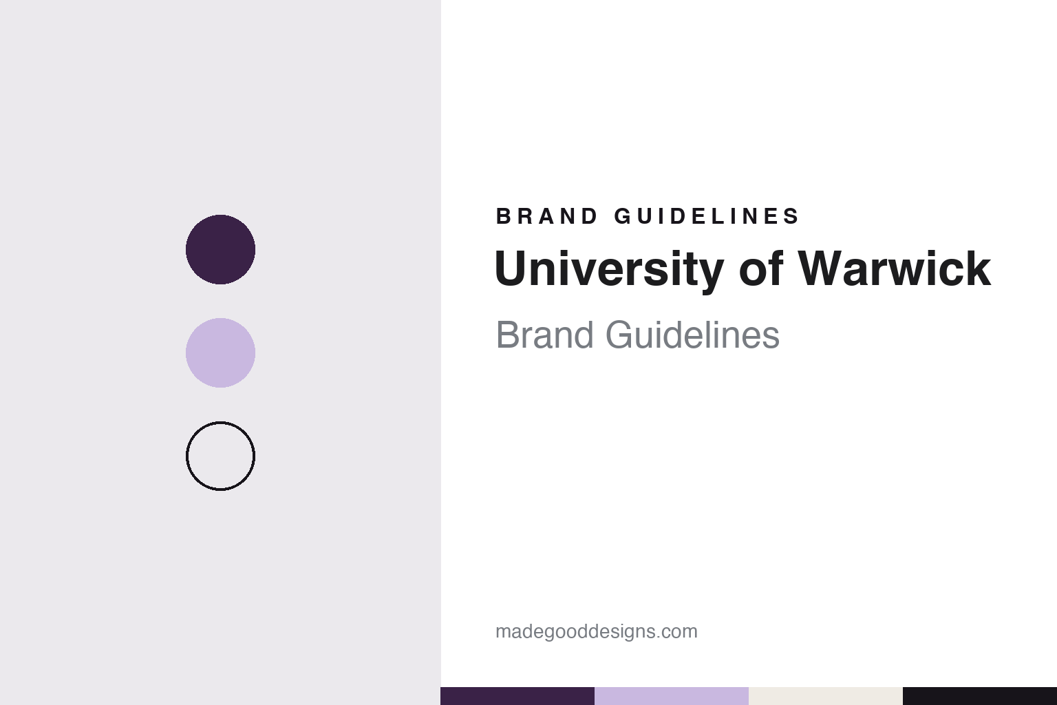
Two constants: a plum, lilac and ink palette and a bold grotesque register. Abstract homage — not a University of Warwick mark; no crest, wordmark or logo is reproduced.
A charter in 1965
Approved in 1961, chartered in 1965, and named for a town it does not sit in.
The University of Warwick is not in Warwick. The university says government approval came in 1961 and its Royal Charter of Incorporation in 1965, on a 400-acre site granted jointly by the city of Coventry and the county of Warwickshire. A small intake of graduate students arrived in 1964, and the first 450 undergraduates in October 1965. English Wikipedia says local sponsors debated whether to name it after Coventry or Warwickshire; the name chosen points to a county town about eight miles to the southwest, while Coventry’s centre lies about three and a half miles to the northeast.
The university’s own history dates its first buildings to 1965, with the Library, the Science and Arts Buildings and the Rootes Residences up on central campus by 1970. Senate House and the Arts Centre followed in 1974, the Students’ Union Building in 1975. English Wikipedia lists the university among the works of the architects Yorke Rosenberg Mardall, dated 1966. The former Coventry College of Education merged with the university in 1978–79. Wikipedia dates Warwick Business School to 1967, Warwick Law School to 1968, WMG to 1980 and Warwick Medical School to 2000, and records the merger with the Wellesbourne and Kirton sites of Horticulture Research International in 2004.
The episode most often attached to the young university came early. In a 2018 seminar abstract published by the Wits Institute for Social and Economic Research, the historian Carolyn Steedman sets it out: early in 1970 students occupied the Warwick Registry in protest at the university’s reluctance to give them autonomous control of a Students’ Union building. During the second occupation, in February, students opened administrative files and found letters and other documents suggesting surveillance of certain staff and political profiling of prospective students. E. P. Thompson, appointed to the history school in 1965, was called in, the papers were copied and distributed among staff, and he published a polemic on the affair in New Society on 19 February. He left Warwick that September.
The higher education writer Andrew McGettigan, writing in 2014, adds that the administration fought a legal battle to stop the press publishing the documents. Thompson edited the book Warwick University Ltd, published in 1970 and reissued by Spokesman Books in 2014. English Wikipedia describes it as a critique of an administration too aligned with business interests, and says that under its vice-chancellor Lord Butterworth Warwick was the first UK university to take a business approach to higher education.
Colour
From the crest to a W, and back to the crest.
Warwick’s coat of arms has been part of its identity since 1965, the illustrator Tobias Hall said in the university’s 2025 announcement. English Wikipedia describes it as carrying atoms of two lithium isotopes and a DNA helix for science, the Bear and Ragged Staff associated with Warwickshire, and the Elephant and Castle of Coventry. The Boar, the student newspaper, gives the motto as Mens agitat molem, “Mind moves matter.” For everyday use, an opinion piece in the same paper in April 2025 recalled a logotype spelling out the university’s name with an elongated R, still visible then on campus bins and work vehicles.
In April 2015, as the fiftieth anniversary approached, the university replaced that logotype with a two-triangle W. The Boar reported on 21 April that the head of marketing unveiled it at the Students’ Union Societies Convention, that a university document named the main colour “Warwick aubergine” and spoke of introducing “the language of possibility” into its writing, and that similar logos at York and Exeter were cited as part of the reason to change. One student said it looked as if a child had designed it; another called it crisp and modern. Times Higher Education reported on 24 April that a petition to halt the rebrand had 4,173 supporters, while a university spokesman said students were the first people asked to work with designers, and that the logo would not replace the crest, which would stay unchanged. The Boar later put the petition above 4,900 signatures. The rebrand went ahead.
The W lasted a decade. In November 2023 the university announced a “simplification” that fixed it in a single colour and format, The Boar reported. A year later it was under review: the paper said a small survey by the brand team had found that almost no participants could draw the logo from memory. The Brand Evolution consultation ran from 1 to 16 October 2024 with three visual concepts, all using an “unshackled bear” taken from the ceremonial crest. “By unshackling the bear from the ragged staff, the bear has freedom to explore,” the survey said. Respondents also weighed two positioning statements, “Beyond” and “UltraExploration.”
By December the Modernised Crest had won: 61% of internal audiences preferred it, and 85% of external audiences said it appealed to them, The Boar reported. The paper’s own readers were cooler, with 62% preferring the W in a social media poll. The least liked concept, the bear alone beside the name, was said by one respondent to suggest a zoo or a clothing brand.
Typography
How newer universities present themselves.
Universities founded after 1950 could not borrow a medieval past, so their identities had to come from somewhere else. In Britain the buildings came first. The writer Michael Beloff chose the word “plateglass” for the new universities of the 1960s, for their modern design and wide expanses of glass in steel or concrete frames, and he wrote of the “grey or biscuit concrete massiveness” of most of their buildings and “the black towers of Essex.” The term set them apart from the Victorian redbrick universities and the ancient ones.
The marks followed a similar line, keeping the idea of a crest while simplifying it. Grafik described the Open University’s 1969 logo as a U with a crest-like structure and a punched-out O, respectful of heraldry while looking ahead. In 2022, campaign material said the same shield had become the starting point for a design system built with accessibility in mind.
Some of these universities reached the public through broadcast before most people could see a campus. The BBC dates the first Open University programme to 3 January 1971, on BBC Two, with academics as presenters and an animated logo and fanfare at the start. That late-night teaching ended in 2006. Monash University’s early fame in Australia came by a different route: Wikipedia says many people first heard of it through its student protests.
This guide follows these universities onto the surfaces where they meet the public: prospectus covers, banners on open days, degree certificates and national campaigns. For each one, it sets out what can be checked about the founding, the name and the identity, and it says who is making each claim, including when the claim comes from the university itself.
Aa
A bold grotesque, the register of the 2025 website. (Specimen set in Archivo, a sans STAND-IN; NOT the University of Warwick logo or wordmark.)
Beyond
A woodcut-style crest, a bold wordmark and three years of rollout.
The new identity launched on 18 June 2025. The university says it was developed with the brand consultancy Mammoth, which helped co-ordinate the research and define and design the brand; that the illustrator Tobias Hall, whose woodcut style it describes as mixed with modern practices, designed the modernised crest; and that the photographer Megan Eagles shot a new image library. Alongside the crest come a bold wordmark, a revised brand framework and a renewed colour palette, phased across university platforms over three years.
The Boar summed up the crest on launch day as a bear, an elephant, a book and an atom, and said the redesigned website used pastel colours and the typeface Neue Haas Grotesk. Two changes carry the meaning. The bear is off its chain, and one of the two atoms has become a book, for the arts and humanities. An April 2025 opinion piece in the paper added that the DNA strand stays, the Latin banner goes, and the crest would appear only in black and white or lilac. Creative Bloq said in June 2025 that the new look got the balance right. The Boar called the rebrand divisive, and on 29 September 2025 reported criticism of the international marketing push that followed it, which included paid articles in Harper’s Bazaar India, The Times of India and Monocle.
The public brand portal states the idea in the university’s own words. “Beyond is our mantra,” it says, and its purpose line is “Pointing the way ahead, so that together, we can make a better world.” The behaviours are “Going forward and further,” “Thinking freely,” “Thriving on difference,” “Creating connections” and “Sharing opportunities.” The university cites more than 10,000 opinions in its press release and over 5,000 stakeholders on the portal, and describes a position rooted in “unconventionalism.” The portal’s menu lists guidelines for visual identity, design elements, tone of voice, iconography and photography, and its home page carries the line “This is University of Warwick. This is Beyond.”
For a design guide, University of Warwick shows how a young institution can spend a decade on a stripped-back letter and then return to heraldry it has redrawn, keeping the animals and unchaining the bear. Compare Lancaster University and the University of York, two other English universities of the 1960s, and Monash University, with which Warwick announced a strategic partnership in February 2012, English Wikipedia says. For this guide we use plum, lilac and ink with a sans, an unofficial interpretation; no product or logo is reproduced.
Explore & save
Keep University of Warwick’s identity on hand — save it to a board in the Made Good inspiration library.
University of Warwick identity set
Pin the University of Warwick plum, lilac and ink palette and the bold grotesque register to your own board.