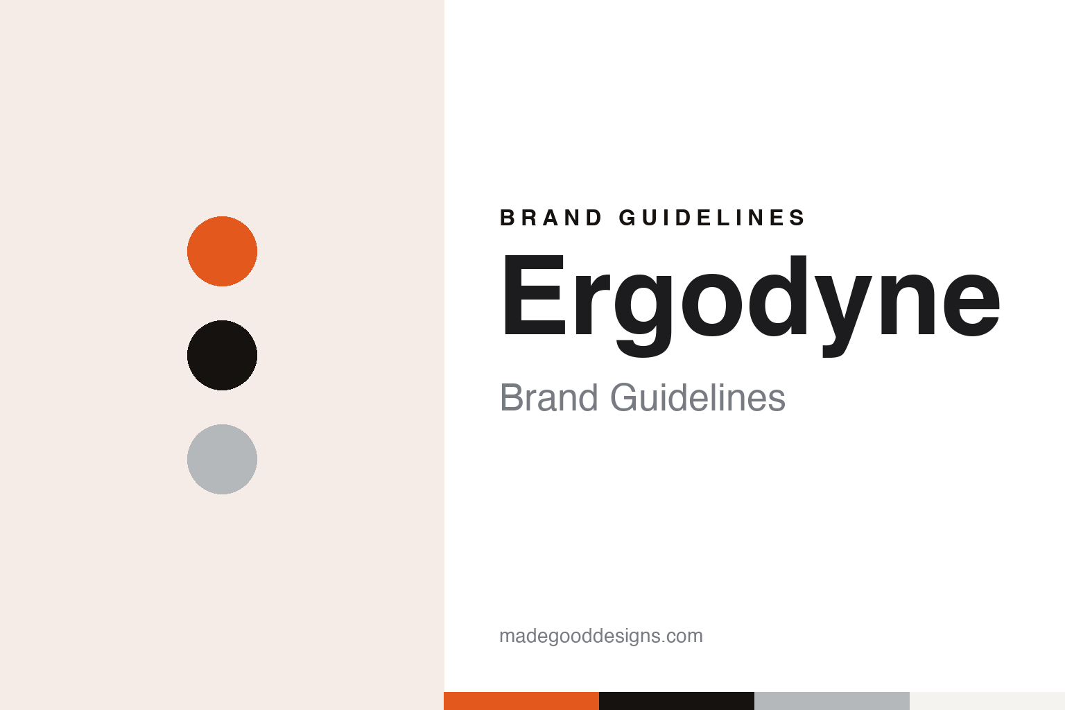
Ergodyne Brand Guidelines
A 1983 back support, an orange badge and a mascot called Ergoman.
Aa
Two constants: an orange, black and grey palette and a condensed sans register. Abstract homage — not an Ergodyne product or mark; no badge, mascot or logo is reproduced.
Tenacious Holdings
One back support and a three-pillar range.
Ergodyne, based in St. Paul, Minnesota, began in 1983. The company says it was started by Dr. Thomas W. Votel, and that its first product was an industrial back support — “the first industrial back support,” in its words, launched, it says, before the word ergonomics was even in the dictionary. Its legal name is Tenacious Holdings, Inc.: the website’s copyright line reads “Tenacious Holdings, Inc. (dba Ergodyne), a Klein Tools Company,” and the Fort Worth Business Press described Tenacious Holdings in 2018 as the parent company of Ergodyne.
From that single product the company built a range it sells as Tenacious Work Gear, organised into three “pillars.” Protection covers gloves, knee pads, supports, eyewear, head protection and high-visibility clothing; Prevention covers tool tethering, carrying straps and storage; and Elements covers cooling, warming, skin products, shelters and traction. The company says it treated protective equipment from the start “as one part of a programmatic preventative strategy” rather than as standalone gear, and it has added training material, a podcast and a library of how-to videos to its site.
Votel led the company for decades. He was still president when Klein Tools bought it in 2018, and a company announcement of October 2021 names him as president and chief executive. By December 2025 Ergodyne was describing him as its founder, “longtime leader and retired president,” when the International Safety Equipment Association, the US industry body known as ISEA, gave him its Ryan-Willson Service Award of Excellence at its 2025 annual meeting in Washington, D.C. The award was presented by Greg Schrab, Ergodyne’s president and an ISEA board member, who writes on the company website that he joined in 1995.
Colour
An orange badge, Ergoman and a published rulebook.
The range is sold under a family of sub-brands, each listed as a registered trademark on the company’s website. ProFlex covers gloves, knee pads and supports; Skullerz covers safety helmets and eyewear; Chill-Its and N-Ferno cover cooling and warming products. Other registered names include Squids tool lanyards, Arsenal storage, SHAX work shelters and GloWear high-visibility clothing. In October 2021 the company announced Skullerz safety helmets built with Mips, a Swedish helmet technology it said had until then been used mainly in recreational helmets, in Class C and Class E versions.
Ergodyne publishes its brand rules. Its online Brand Style Guide says “the spirit of the Ergodyne brand lives in the badge,” a mark it describes as carrying an established date, a bold colour scheme and “the signature Ergoman,” the figure that serves as its mascot. The badge is printed in rich black and Pantone 1655, a strong orange, and the guide asks for an outer white stroke in all instances, calling it “a critical element” that separates the badge from any background. Clear space is set at one Ergoman on every side; the full badge is not to be used smaller than one inch, and a plain wordmark takes over below that size. Users are asked not to skew, squash, rotate or recolour it.
“Our color is our brand and we are proud of it,” the guide says of the orange, which it calls “the boldest of hues.” The supporting colours are a rich black and Cool Gray 4, mixed with white and grey in sample palettes. The company’s nickname for itself, used in staff biographies on its site, is the “Orange Planet,” and among its trademarks is the phrase “Stay Orange.”
The guide also names its typefaces. Champion HTF Welterweight is its headline sans, with Hoboken as a looser alternative; Trade Gothic Next carries product information; Gotham serves from headlines to body copy; Arial is kept for presentations and office documents; and Oswald, available on Google Fonts, is the preferred face for the web. Its slogan, repeated across the site, is “Make the Workplace a Betterplace.”
Typography
Work gear and its documentation.
Personal protective equipment is sold on sight as much as on specification, and the makers in this guide present themselves in a shared visual language. The strongest signal is colour: fluorescent yellow and orange, the tones of high-visibility vests, jackets and rainwear, appear across catalogues, packaging and trade-show stands, usually set against a dark navy, charcoal or black.
Photography does much of the work. Catalogues and websites show safety glasses, earmuffs and hard hats on workers rather than on a white background alone: a welder behind a visor, a road crew in reflective stripes, a warehouse picker in cut-resistant gloves. Construction sites, factory floors and utility work are the usual settings, and many makers add a second, outdoor register for shooters, hunters and anglers, with camouflage, sunglasses styling and range photography.
Product pages lean on order. Gloves are shown in grids by coating, cuff and size; glasses in rows by lens tint; earplugs and earmuffs by type. Standards and ratings are printed as part of the design, in badges and code numbers, and ranges are often organised by the hazard or the trade they are sold for rather than by style alone.
The trade meets at fairs. A+A in Düsseldorf, the international trade fair for safety and health at work, gathers makers and distributors from around the world, and in the United States the National Safety Council’s Safety Congress & Expo serves a similar role. Many makers also sell through distributor networks and buying groups, so brochures, counter displays and sell sheets carry as much of the identity as the logo itself. This guide sets out what can be checked about each brand — who founded it, who owns it and where it is based — and attributes claims to the company where they rest on its own word.
Aa
A condensed sans — Ergodyne’s guide names Oswald as its preferred web face. (Specimen set in Oswald, a sans STAND-IN; NOT the Ergodyne logo or badge.)
Ergodyne
A Klein Tools company since 2018.
In September 2018 Ergodyne became part of Klein Tools. On 5 September that year, the Fort Worth Business Press reported, Klein Tools, based in Mansfield, Texas, and Tenacious Holdings announced that Klein had acquired Ergodyne. The paper said Ergodyne would be run as a separate business unit at its existing headquarters in St. Paul, with Tom Votel remaining president, and described Klein as a maker of professional hand tools in business since 1857 and in its sixth generation of family ownership. English Wikipedia records the purchase among Klein’s acquisitions, alongside Australian tool brands it bought in 2013 and 2019.
Klein’s co-president, Tom Klein Jr., said at the time that the two companies had “much in common, including our commitment to innovation, safety, our customers and our reputations for producing high-quality products.” Votel said Ergodyne “couldn’t be more excited to join the Klein brand and family.” Ergodyne’s own timeline now describes the deal as joining “the Klein Tools family,” and every page of its website ends with the words “a Klein Tools Company.”
The brand has kept its own name and voice since then. Its newsroom shows it launching products under the Ergodyne name through 2026, including photochromic safety glasses in August and new winter gear in October.
For a design guide, Ergodyne shows how a brand can run a whole identity on one orange and a mascot, and publish the rules for anyone to read. Compare MCR Safety, another US work-gear brand built around a mascot, and 3M. For this guide we use an orange, a near-black and a cool grey with a condensed sans, an unofficial interpretation; no product or logo is reproduced.
Explore & save
Keep Ergodyne’s identity on hand — save it to a board in the Made Good inspiration library.
Ergodyne identity set
Pin the Ergodyne orange, black and grey palette and the condensed sans register to your own board.