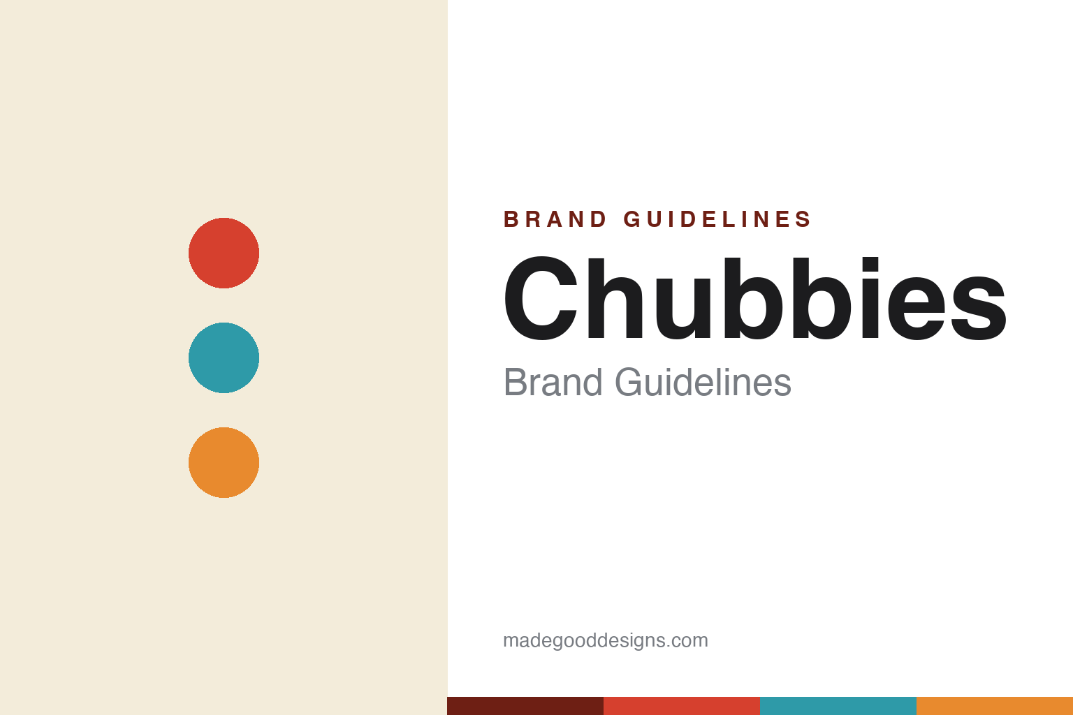
Chubbies Brand Guidelines
Sky’s out, thighs out.
Aa
Two constants: a bold retro palette and a loud display wordmark spirit. Abstract homage — not the Chubbies wordmark or prints.
The uniform of the weekend
Chubbies made shorts a comedy brand.
Chubbies is a lesson in voice as a brand. Founded in 2011 by four Stanford friends (now Austin-based), it sold retro, shorter-inseam “weekend” shorts for men — and wrapped them in relentless humour and nostalgia. It “talks like a beer brand, not an apparel brand”: famously funny emails, cheeky social copy, and a weekend-freedom ethos captured by its registered line “Sky’s Out, Thighs Out.”
The look matches the voice — bold, retro, Americana colour and loud vacation-era prints (’80s and ’90s throwback), across shorts, swim trunks, the “Original Short Shorts,” and beyond. The internet did the rest: Chubbies grew on comedy and community, not fashion seriousness.
(Honest notes: Chubbies was acquired by Solo Brands (the Solo Stove parent) in 2021 for a reported ~$130 million. Solo Brands has since faced serious public financial trouble — a 2024 going-concern warning and a 2025 near-delisting from the NYSE — though Chubbies has been the group’s bright spot (its own growing segment). No official brand hex is published.)
Colour
Chubbies lives in bold retro colour. Click a swatch to copy the hex.
Chubbies’ identity is bold, retro and sun-soaked — a retro red, an ocean teal, a sunset orange, a cream, and an ink. The palette is loud ’80s–’90s vacation nostalgia — Americana reds, beachy teals and sunset oranges — deployed across ever-changing loud prints rather than one fixed colour. It signals fun, freedom and irreverence, not fashion seriousness. The honest caveat: with no published brand hex, these tones are an original, unofficial interpretation, not first-party values.
The lesson is loud retro colour matches a loud voice. Chubbies’ world is a nostalgic beach vacation. For designers, it is a reminder that a bold, saturated retro palette (and a rotating print library) can make a brand feel like a good time — the visual equivalent of its comedic copy. The takeaways: match palette energy to brand voice; lean on nostalgia for warmth and instant recognition; and treat any single hex as unofficial — using a deep red-brown for small text so the retro brights stay loud.
Typography
The wordmark spirit is a bold display sans — loud and confident.
Chubbies’ identity carries a loud, confident, comedic spirit — a bold wordmark over retro colour and loud prints. A heavy display sans captures the mood: it is impactful and fun, the register of a brand that shouts jokes and weekend freedom. Set against bold retro colour, the heavy type feels energetic and irreverent — exactly the good-time personality Chubbies carries. It is loud rather than refined, mirroring copy that never takes itself seriously. (Chubbies’ real wordmark and prints — including the registered “Sky’s Out, Thighs Out” — are trademarks and trade dress we describe but do not reproduce, and the exact typeface is not published, so we don’t assert it.) Because the specific mark is not ours to use, the honest description is “a bold display spirit,” not the Chubbies logo. The type behaves like the brand: loud, confident and fun.
Aa
A bold display spirit — loud and confident. (Specimen set in Anton, a heavy display sans; NOT the Chubbies logo, which is a trademark.)
Comedy as a moat
Chubbies stands for the weekend.
Chubbies is a lesson in humour as a durable differentiator. Anyone can make shorts; Chubbies made a comedy brand — a beer-brand voice, absurdly funny emails, loud retro prints — that turned a simple product into “the uniform of the weekend.” The jokes and the nostalgia are the moat; the shorts are almost incidental. The differentiator is a genuinely funny, consistent voice.
For designers and brand-builders, Chubbies offers a clear takeaway: voice and tone can be the whole brand. The lessons: commit fully to a comedic, consistent voice across every touchpoint (especially email); match it with a loud, nostalgic palette and print system; and build community around a feeling (the weekend). It is also a reminder to stay accurate: Chubbies was acquired by Solo Brands in 2021, and that parent has since faced going-concern and near-delisting trouble even as Chubbies grew — with the palette here an unofficial interpretation. Chubbies sold the weekend — proof that voice can be the difference.
Explore & save
Keep Chubbies’s identity on hand — save it to a board in the Made Good inspiration library.
Chubbies identity set
Pin the bold-retro palette and the loud-display spirit to your own board.