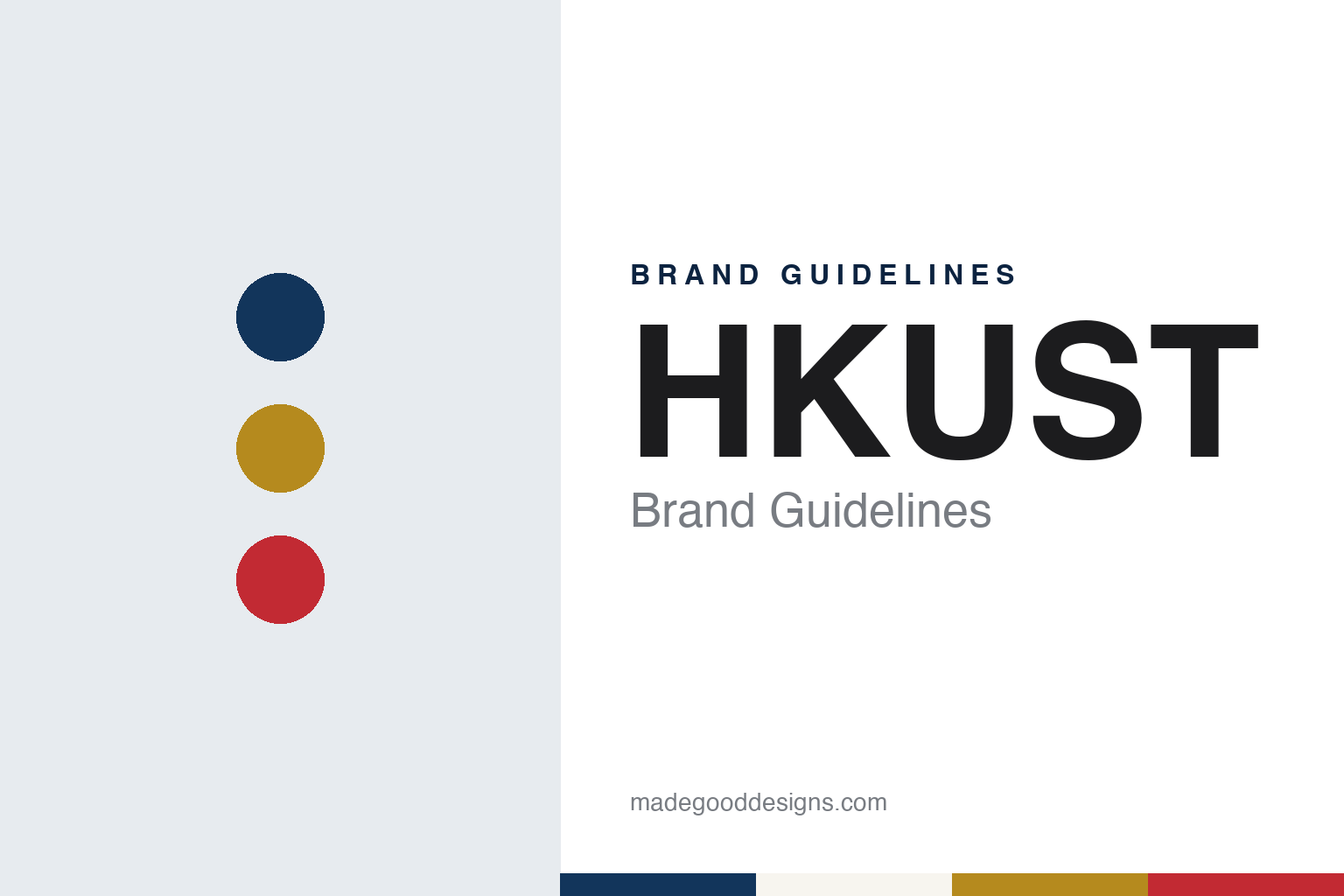
HKUST Brand Guidelines
Hong Kong’s third university: a blue and gold emblem, a Futura logotype and a red sundial on the piazza.
Aa
Two constants: a navy, gold and sundial red palette and a Geometric sans register. Abstract homage — not an HKUST mark; no emblem, logo or sculpture is reproduced.
The Third University
A campus built against the clock.
The Hong Kong University of Science and Technology, known as HKUST, was planned under the working name the “Third University,” after the University of Hong Kong and the Chinese University of Hong Kong. Chinese Wikipedia dates the announcement to the governor’s policy address of October 1985; the university’s milestones page says March 1986. English Wikipedia credits the idea to Sir Sze-Yuen Chung and the governor Sir Edward Youde; the HKUST Library says Youde appointed Chung chairman of the Planning Committee in May 1986. That committee met six times between September 1986 and April 1988 to settle the name, the site, the architecture and the academic profile. Chinese Wikipedia says the name was fixed in January 1987 from more than a hundred suggestions. Chia-Wei Woo was appointed founding president in September 1988.
The site was Kohima Barracks at Tai Po Tsai, on the Clear Water Bay Peninsula. English Wikipedia says the land had been earmarked for a British Army garrison, a plan shelved after the 1984 Sino-British Joint Declaration, and that the then Prince of Wales laid the foundation stone on 8 November 1989. It adds that the opening had been scheduled for 1994, until the planning committee brought it forward by three years in 1987. The library says the Royal Hong Kong Jockey Club offered in February 1987 to finance the campus and manage the project.
The university opened on time. Its first 560 undergraduates and 140 postgraduates arrived on 2 October 1991, and the opening ceremony followed on 10 October, the library says; English Wikipedia names the governor, Sir David Wilson, as opening it.
The speed had a public cost. On 2 June 1993 the Chief Secretary tabled the government’s response to Report No. 17A of the Legislative Council’s Public Accounts Committee, on the construction of the university, the result of a 15-month investigation held largely in public. The statement called the rise in the project estimate the central issue, saying the original 1988 estimate rested on a very preliminary design and that building costs had risen sharply. The government accepted the committee’s recommendations, including tighter control of joint projects, while arguing that flexibility had been needed to finish in time. The legislator Emily Lau replied that the architectural design competition had also drawn attention, “maybe even more.” Chinese Wikipedia says critics of the time called it the “Rolls-Royce university”; English Wikipedia says the campus follows a master plan by Simon Kwan & Associates and Percy Thomas Partnership, the runner-up entry in a competition.
Colour
Rules set out in print.
HKUST publishes its rules. The HKUST Brand Guidelines, in an edition dated August 2024, run to more than a hundred pages and open with a plain line: “A brand is what people think about us.” The proposition is “Creating value through innovation,” the attributes are innovative, dynamic, can-do spirit, responsible and international, and the audience is described in five figures, from “The Non-Conformist” to “The World Citizen.” A Brand Assets Unit looks after the guidelines.
The rules start with the name. The full name comes first in any communication, and “The” is part of it and capitalised. After that, “HKUST” stands alone, with no spaces between the letters and no “The” in front; “THKUST” is listed as incorrect.
The combination logo joins a logotype and a logomark, in English, Chinese, bilingual and abbreviated versions. The logotype is set in Futura Medium for English, with Heiti for Traditional Chinese and Source Han Sans for Simplified Chinese. Body text uses Muli, with Arial as the fallback. Users may not incline, condense, re-create or recolour the logo. One exception is practical: where “HKUST” is used as a graphic rather than an identity, any font and style is allowed, provided it does not replace the official logo.
The emblem carries a good deal of meaning. The guidelines describe “the golden head of wisdom over the open book of knowledge,” with a flask for science between the arms that hold the book, or a transmission tower for engineering, technology, communication and management. They also see a sun radiating gold, “that very traditional Chinese color,” over an ocean of “the deep blue representative of Hong Kong.” Three Greek letters, upsilon, psi and tau, spell UST. Chinese Wikipedia notes that the university has no coat of arms from the College of Arms, unlike its two older neighbours, and uses only blue and gold in the emblem. Its parts must not be broken up.
Colour is handled the same way. The standard palette has six colours, led by a deep blue and a gold, with yellow, gray, black and white. A set of twelve accents sits beside them. The guidelines also list tones to avoid because they are “currently used by other local universities as their theme colors.”
Typography
How newer universities present themselves.
Universities founded after 1950 could not borrow a medieval past, so their identities had to come from somewhere else. In Britain the buildings came first. The writer Michael Beloff chose the word “plateglass” for the new universities of the 1960s, for their modern design and wide expanses of glass in steel or concrete frames, and he wrote of the “grey or biscuit concrete massiveness” of most of their buildings and “the black towers of Essex.” The term set them apart from the Victorian redbrick universities and the ancient ones.
The marks followed a similar line, keeping the idea of a crest while simplifying it. Grafik described the Open University’s 1969 logo as a U with a crest-like structure and a punched-out O, respectful of heraldry while looking ahead. In 2022, campaign material said the same shield had become the starting point for a design system built with accessibility in mind.
Some of these universities reached the public through broadcast before most people could see a campus. The BBC dates the first Open University programme to 3 January 1971, on BBC Two, with academics as presenters and an animated logo and fanfare at the start. That late-night teaching ended in 2006. Monash University’s early fame in Australia came by a different route: Wikipedia says many people first heard of it through its student protests.
This guide follows these universities onto the surfaces where they meet the public: prospectus covers, banners on open days, degree certificates and national campaigns. For each one, it sets out what can be checked about the founding, the name and the identity, and it says who is making each claim, including when the claim comes from the university itself.
Aa
A geometric sans, close in spirit to the Futura Medium of the logotype. (Specimen set in Jost, a sans STAND-IN; NOT the HKUST logo.)
HKUST
A sculpture that became a trademark.
The university’s most prominent symbol is not its emblem. On the entrance piazza stands The Red Bird Sundial, an 8.5-metre steel sundial titled “Circle of Time.” HKUST’s Campus Management Office says it was commissioned by the Hong Kong Jockey Club from the Perth-based sculptors Charles Smith and Joan Walsh-Smith and installed on 8 October 1991, two days before the opening ceremony. Its podium carries a mural of 39 Chinese achievements in science and technology.
The guidelines call it “the most prominent brand icon of HKUST,” and treat it as one. Its logo is a registered trademark, replicas must keep exact proportions, and it may appear only in a specified red or its original material. “The Red Bird Sundial” is the only official name, and nicknames “are not preferred”; English and Chinese Wikipedia both record the nickname “the Turkey.” Chinese Wikipedia adds that the sculpture is better known in Hong Kong than the emblem.
Photography has its own section. Pictures should use natural light, catch people in action rather than posed, and show the university’s international mix; the guidelines also claim “the best views of the city.”
The brand now covers more than one campus. HKUST signed agreements with Guangzhou in December 2018 and says HKUST(GZ) opened in September 2022; the guidelines include separate name, logo and typeface sections for it. On 18 November 2025, RTHK reported, the Executive Council chose HKUST’s proposal for Hong Kong’s third medical school over those of Baptist and Polytechnic universities, with 50 students due in 2028. Times Higher Education reported that the decision followed an eight-month assessment. Departments follow a set formula, with the university logo on the left and the unit’s name on the right, and the brand site now also offers a 35th-anniversary logo.
For a design guide, HKUST shows how a young university can write its rules down in detail and still have a sculpture on its piazza as its most prominent symbol. Compare National University of Singapore, whose mark also holds an open book, and KAIST, another Asian university of science and technology. For this guide we use navy, gold and a sundial red with a sans, an unofficial interpretation; no product or logo is reproduced.
Explore & save
Keep HKUST’s identity on hand — save it to a board in the Made Good inspiration library.
HKUST identity set
Pin the HKUST navy, gold and sundial red palette and the Geometric sans register to your own board.