Theodor de Bry is often remembered for the illustrated volumes on the Americas that his Frankfurt workshop began publishing in 1590. Look at the prints museums actually hold, though, and a second artist appears: a designer of ornament for goldsmiths, of engraved title pages, alphabets and dish designs, working at the scale of a playing card. That side of his work, about frames, lettering, contrast and modular decoration, is the more useful one for designers today.
Who was Theodor de Bry?
The Metropolitan Museum of Art records him as Netherlandish, born in Liège in 1528 and died in Frankfurt in 1598. The Art Institute of Chicago gives the same years, and the Cleveland Museum of Art catalogues him as Flemish, 1528–1598. His prints and books carry Frankfurt imprints in the 1590s: the Met dates his engraved alphabet to 1595 with a Frankfurt place of publication, and lists him as engraver and publisher of a 1597 Frankfurt book designed by Jean Jacques Boissard.
He ran a family business. The Met records his son Johann Theodor de Bry as born in Strasbourg in 1561 and dying in Bad Schwalbach in 1623, and both the Met and the Art Institute catalogue many workshop prints under the son’s name. This guide follows the museums’ attributions.
A dated outline of key works
- c. 1577–78, dish design. The Cleveland Museum of Art dates The Captain of Folly: Design for a Dish with Medallion, a round engraving 12.2 cm across, to these years. Its portrait is inscribed in Dutch and French.
- c. 1588, tazza designs. The Met holds a series of round designs for the interiors of tazze (shallow footed cups), dated about 1588, including portraits of political figures and allegories of pride and charity. The Art Institute dates its impression of The Seven Works of Charity to 1588 and Pride and Madness to about 1588.
- 1580–1600, ornament for craftsmen. The Met catalogues blackwork designs for brooches, buckles, pendants and knife handles, and the small frieze series Grotisch fur alle Kunstler (“grotesques for all artists”).
- 1590, Virginia. The Met’s record of Admiranda narratio, the 1590 Virginia volume, lists Theodor de Bry and Gijsbert van Veen as engravers, John White as the source of the images, Thomas Hariot as author and Johann Wechel as printer.
- 1593, emblem book. Both the Met and the Art Institute hold plates from Emblemata Nobilitati et Vulgo Scitu Digna, dated 1593.
- 1595, alphabet and America volume 5. The Met holds his Nova Alphati Effictio, 24 engraved letters “designed and published by Theodor de Bry”. The Art Institute holds the Columbus frontispiece from volume 5 of the America series, also dated 1595.
- 1611, after his death. The Met’s copy of Emblemata Secularia, credited to Theodor de Bry, was printed at Oppenheim in 1611, a sign that the workshop kept his designs in print.
What to look at in a Theodor de Bry print
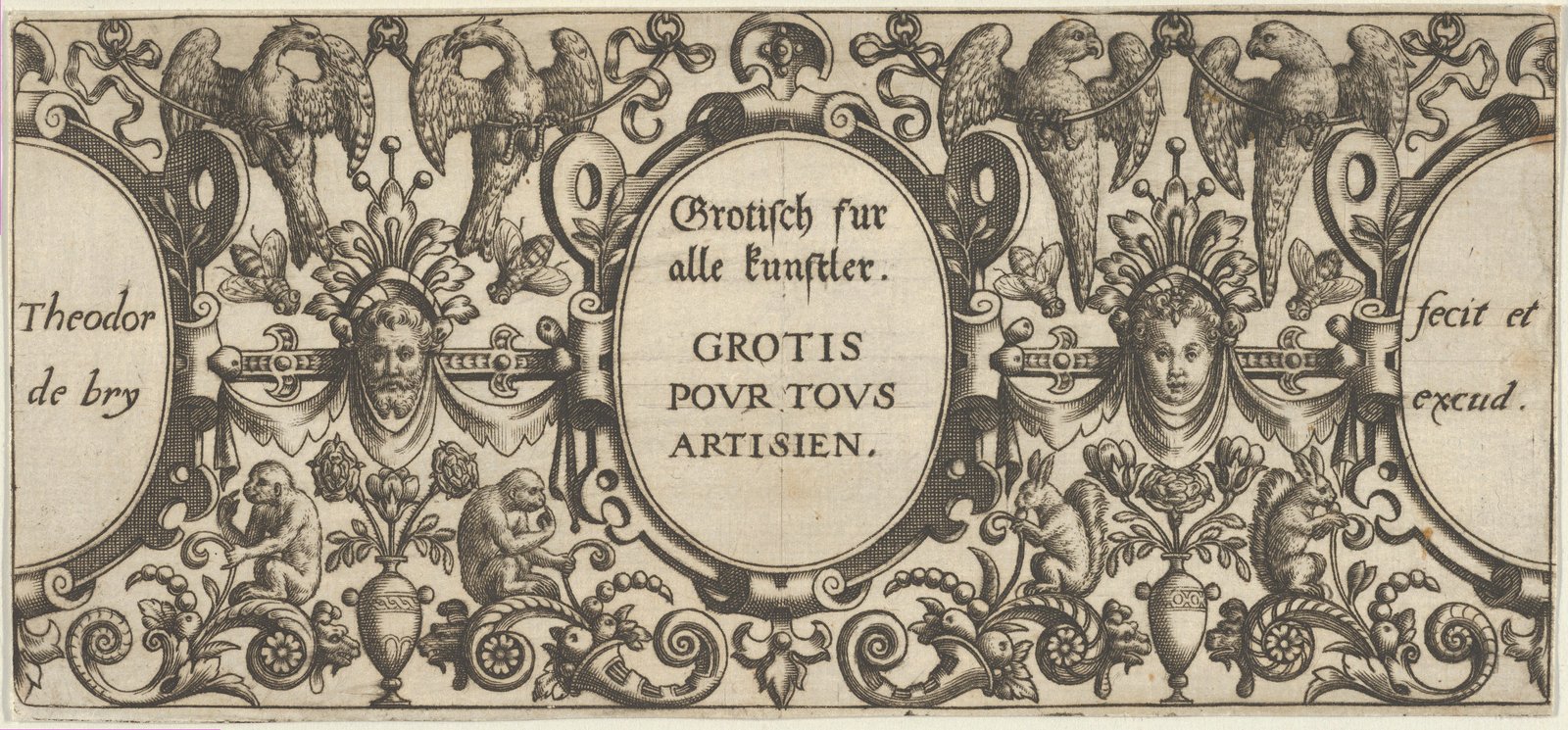
The frame does the work. Almost every sheet is built around a container: an oval cartouche, a roundel, a pointed knife-handle shape. In the Grotisch title page above, the text sits in a central oval, flanked by two side panels that hold the signature. Everything else, from the masks and birds to the monkeys, squirrels and urns of flowers, is arranged symmetrically around those three fields.
Symmetry with small variations. The left and right halves mirror each other in structure, but not in detail: a bearded mask faces a young one, monkeys on one side, squirrels on the other. Mirroring reads as stable; small swaps keep the eye moving.
Dark grounds for contrast. His jewellery and tazza designs often set pale figures and scrolls against a field of dense black hatching, the look the Met catalogues as “blackwork”. It reads almost like a reversed-out graphic: light shapes cut from a dark ground, ideal for small sizes where fine outlines would get lost.
Lettering inside the image. Text is never an afterthought. Latin mottoes run in bands around roundels, captions sit in plaques, and the signature becomes part of the ornament.
Lettering, signatures and the title page
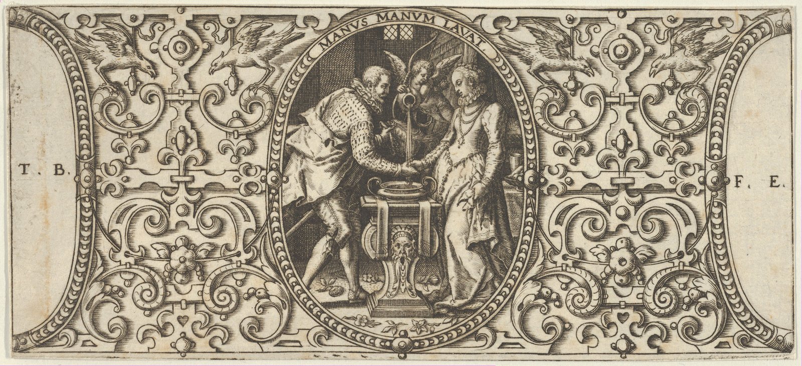
In the Grotisch title page, the lettering is set in two languages, German in a slanted hand-lettered style and French in spaced Roman capitals, so one sheet could sell in two markets. The side panels read “Theodor de bry” and “fecit et excud.”, the Latin formula a printmaker used to say he both made and published the plate. A companion sheet from the same series, shown above, carries the motto MANUS MANUM LAVAT (“one hand washes the other”) in a curved band above a scene of a couple shaking hands, with the initials T.B. and F.E. tucked into the side panels.
This is branding in the modern sense: a consistent signature, format and density of detail. His 1595 alphabet extends the idea, building each capital into a scene. Several plates of that alphabet include classical nudes, so it is not reproduced here, but the principle of the decorated initial carries straight into display type and drop caps. The alphabets theme collects comparable letterforms.
Technique: engraving for goldsmiths and books
De Bry worked in engraving, cutting lines into a copper plate with a burin. The Met’s records show the range of uses: designs for metalwork, such as tazze, knife handles and jewellery; a stoneware ewer of about 1595 decorated after one of his designs; and book illustration. The Cleveland Museum of Art also holds an engraved egg-shaped watch of 1590–1600 whose decoration it attributes to him.
Ornament prints like these were working tools for goldsmiths and other craftsmen, which explains their format: small, dense and self-contained, with each motif usable on its own. The roundels for tazze are designed to be seen from above, so they radiate from the centre, with an inner portrait or scene, a ring of figures and a text band at the rim.
The palette is ink on paper. Measured from the museum’s scan of the Grotisch title page, the ink reads as a warm grey-brown, #5a5349, against paper tones of #dacfb8 and #c8baa1, with a mid-tone of #8d816d where hatching mixes the two. These are scan values, not original materials, but they make a dependable warm monochrome. You can sample your own with the image colour picker.
The America volumes: how to read them
From 1590 the workshop published a long illustrated series on European voyages to the Americas. The plates of Indigenous peoples in these books are European constructions, not documentary records. The Met’s record of the Virginia volume credits the images to drawings by John White, which were then re-engraved in Frankfurt by de Bry and Gijsbert van Veen for a European audience. Treat them as evidence of how Europeans pictured the Americas, not as accurate depictions of the people shown.
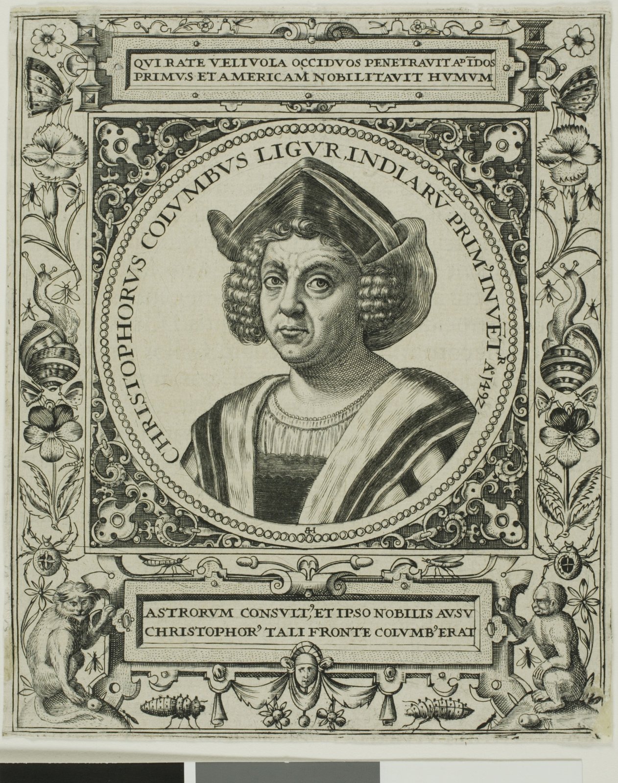
The frontispieces show the workshop’s system at book scale. The Columbus portrait, which the Art Institute attributes to Johann Theodor de Bry after a painting by Sebastiano del Piombo, sits in a circular frame with a Latin inscription running around it. Above and below are rectangular text plaques, and the side borders are filled with flowers, insects and two seated monkeys. It is the same grammar as the small ornament sheets: central image, lettered ring, symmetrical border.
How designers can borrow from Theodor de Bry
- Design the container first. Pick an oval, roundel or panel for the key message, then build ornament outward. It keeps dense layouts readable.
- Run text along a path. A motto set around a circle, as in his roundels, works well for badges, seals, coasters and labels.
- Use reversed-out contrast at small sizes. Light motifs on a dark, textured ground hold up on tiny icons, foil stamps and engraving-style illustrations.
- Mirror the structure, vary the details. Symmetrical frames with small left–right swaps give pattern borders life without losing order.
- Make the signature part of the system. A consistent maker’s mark, placed in the same position on every piece, builds recognition across a series.
- Keep the palette to ink and paper. A warm dark brown and two paper tones are enough for an engraved feel; build the range in the MGD museum inspiration collection alongside other prints.
For context, compare his sheets with the wider print culture of the Renaissance and with the ornament prints of Étienne Delaune, which make a useful comparison in scale and density.
Frequently asked questions
Who was Theodor de Bry?
Theodor de Bry was a Netherlandish engraver, ornament designer and publisher, born in Liège in 1528 and died in Frankfurt in 1598, according to the Met. His workshop, continued by his sons, published illustrated books including a series on the Americas.
Are Theodor de Bry’s America engravings accurate?
They should not be read as documentary records. The plates were made in a European workshop from intermediary drawings, such as John White’s for the 1590 Virginia volume, and reflect European conventions and commercial aims.
What did Theodor de Bry design besides book illustrations?
Museum collections hold his designs for tazze, dishes, knife handles, brooches and pendants, ornamental friezes, title pages and a 1595 engraved alphabet.
Are Theodor de Bry’s prints public domain?
The three prints shown here are flagged public domain or CC0 by the Met and the Art Institute of Chicago. Check each museum’s open-access flag before reusing any other impression.