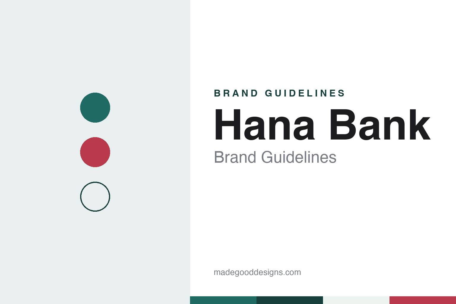
Hana Bank Brand Guidelines
A finance house that became one bank, then two, then one name.
Aa
Two constants: a teal, pine and berry palette and a humanist Korean sans register. Abstract homage — not a Hana Bank asset; no symbol, logotype or typeface is reproduced.
From Finance House to Bank
A 1971 investment finance company.
Hana Bank did not start as a bank. Its own history page dates its origin to June 1971, when Korea Investment Finance Corporation (한국투자금융) was founded in Seoul, and records its conversion into a commercial bank in July 1991. English Wikipedia gives the same outline: the finance company kept its first name until 1991 and changed to Hana Bank as it began banking operations.
The name was chosen as part of a full identity programme. The bank’s corporate-identity page says it appointed Infinite Group as its identity agency in January 1991, settled on the name 하나은행 (Hana Bank) in February, fixed its design criteria in March and approved the final design in August that year. 하나 is the Korean word for “one.” The bank says the identity rests on its founding values of independence, autonomy and enterprise, and on the ideas of a trusted, forward-looking, global bank that works alongside its customers.
Growth came through mergers. English Wikipedia says Hana Bank acquired Chungcheong Bank in 1998 and merged with Boram Bank in 1999. In August 2002 it was announced that Hana would merge with Seoul Bank, a lender founded in 1959 that had been taken into government ownership in December 1997; Hana had been chosen in a competitive bidding process, and the merger was completed in December 2002, according to the same article.
The identity was refreshed along the way. The bank’s timeline lists a renewal by Design Park in October 1998, a maintenance contract with Interdecom from 1999, and a further modification by Interdecom in November 2003.
Colour
Korea Exchange Bank, then one name again.
The biggest change came with Korea Exchange Bank. English Wikipedia describes KEB as a government-owned bank set up in 1967 to specialise in foreign-exchange business, and says Hana Financial Group, Hana Bank’s parent, completed its purchase of KEB from Lone Star Funds and the Export–Import Bank of Korea in February 2012. The two banks were then run side by side for several years.
In September 2015 they merged. The bank’s timeline records the launch of the combined KEB Hana Bank that month, and Korean Wikipedia notes that, legally, it was Korea Exchange Bank that absorbed the old Hana Bank, with the two computer systems combined in June 2016. The bank’s identity page lists a further modification of the corporate identity in September 2015 by Frum Insight and Brand&Company.
The double name lasted just over four years. The Asia Business Daily reported that from 3 February 2020 the bank changed its brand name from KEB Hana Bank to Hana Bank, unveiling it at its Euljiro headquarters in Jung-gu, Seoul. The paper said the change was meant to unify the group under the single “Hana” name already used by affiliates such as Hana Card and Hana Financial Investment.
The visual system is described in some detail. The bank says its symbol shows “a posture of welcoming customers,” drawn dynamically, together with the enterprising spirit of its staff reaching out to the world. Its Korean logotype uses a condensed letterform chosen to look modern, young and distinctive; its English logotype is based on the Stone typeface, redrawn to match the symbol, to suggest refinement and the conservatism expected of a financial institution.
Typography
How Korean banks present themselves.
South Korean banks tend to present themselves with short names and simple symbols. Many trade under initials or a single word, and they usually show the Hangul name and the Latin name side by side, so that the same mark works on a branch sign in Seoul, an overseas office and a phone screen. Bright, clean colours are common across the sector, from yellows and warm tones to teals, blues and greens, set against plenty of white space.
Several banks have built their identities beyond a logo. KB Financial Group publishes its own typeface family and a cast of mascots, the Star Friends, which appear in its advertising; Hana Financial Group has its own typeface too, and offers it free to the public. Character mascots, house fonts and short slogans give these brands a friendly face that carries across advertising, apps and branches.
Much of the customer’s contact now happens on a phone. Bank websites and apps tend to be minimal and app-first, with pages organised around deposits and savings, loans, mobile banking, overseas transfers and digital wallets, and many services that once needed a branch visit are offered online. Banks also use their apps for things beyond banking, such as event ticketing or tie-ins with sports clubs.
Sport and publishing round out the picture. Korean banks sponsor athletes, teams and running and golf events, and some produce branded dramas and web series for online audiences. Their annual reports and sustainability reports are published in Korean and English and set out each group’s structure, history and identity, which makes them a useful starting point for anyone studying how these brands are built.
Aa
A humanist Korean sans, after a bank with its own free typeface. (Specimen set in IBM Plex Sans KR, a sans STAND-IN; NOT the Hana Bank logo or the Hana typeface.)
Hana Bank
A typeface anyone may use.
Hana’s most unusual design asset is its typeface. The bank’s identity page says Hana Financial Group developed an exclusive typeface, the Hana font (하나체), in March 2009 — the first among Korean banks, the group says — and released Hana 2.0 in March 2023. Built on the group’s logotype and identity forms, it is meant to convey a young and trustworthy image, and it is used in advertising, publicity material and everyday work across the group.
The bank also offers the font to the public. Its page says the typeface is free for individuals and companies, including for commercial use, with Windows and Mac downloads; users may not modify or resell it, must use it in the form in which it is distributed, and may not use it to make a corporate or brand identity. The intellectual property stays with Hana Financial Group.
Day to day, the bank meets many customers through its Hana 1Q app (하나원큐), which its timeline says was launched in a new version in August 2020, alongside HANA EZ, an app for overseas money transfers. The app also carries the bank’s football tie-in: in March 2024 The Asia Business Daily reported that Hana Bank was selling home-game tickets for the K League 1 club Daejeon Hana Citizen through the app, open even to users without a Hana Bank account. English Wikipedia adds that in January 2021 Hana won approval from Taiwan’s regulators to open a branch there, which it describes as the first by a South Korean bank on the island.
For a design guide, Hana Bank shows how one short word, a welcoming symbol and a typeface given away to the public can hold together a bank built from several mergers. Compare KB Kookmin Bank, which also has its own house typeface, and Woori Bank. For this guide we use a teal, deep pine and berry with a sans, an unofficial interpretation; no product or logo is reproduced.
Explore & save
Keep Hana Bank’s identity on hand — save it to a board in the Made Good inspiration library.
Hana Bank identity set
Keep the Hana Bank teal, pine and berry palette and the humanist Korean sans register for your own board.