Deliveroo Brand Guidelines
A little teal kangaroo and a colour nobody else owned — how a food-delivery brand carved out its corner.
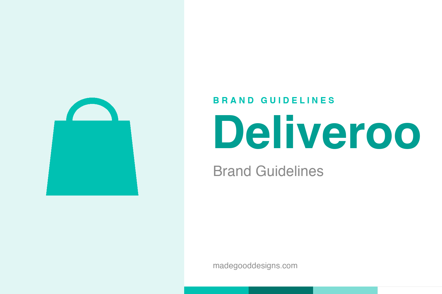
An abstract delivery bag in teal — the delivery idea, not the Roo. Deliberately not the Deliveroo mark.
A kangaroo for fast delivery
Deliveroo’s ‘Roo’ turns speed into a symbol.
Deliveroo’s mark is the “Roo” — a minimal, geometric kangaroo, adopted in the 2016 rebrand by agency DesignStudio (replacing an earlier, more literal kangaroo). The choice is neat on two levels: a kangaroo suggests speed, bounding energy and carrying something in a pouch — exactly what a food-delivery service does — and it puns on the company’s name (Delive-roo). The 2016 version simplified the animal into a clean, flexible symbol that works as a tiny app icon or a giant sign on a rider’s thermal bag. Our homage nods to the service with an abstract delivery bag, not the Roo itself.
Owning teal
Deliveroo’s real branding win is a colour.
Deliveroo’s most valuable asset might not be the kangaroo at all — it’s the colour. That distinctive teal/turquoise is everywhere the brand touches the physical world: the riders’ jackets, the insulated food bags criss-crossing cities, the app, the packaging. In the crowded, fast-moving food-delivery category, that unmistakable teal makes Deliveroo instantly recognisable on the street — you spot a rider a block away and know exactly which service it is. Choosing a colour that competitors weren’t using (not the obvious red or green) and then applying it relentlessly across a highly visible, mobile fleet is a textbook piece of brand strategy. The riders are the billboards, and the teal is what makes the billboards work.
A London startup’s fast rise
Deliveroo built a brand as quickly as it built a network.
Deliveroo was founded in 2013 in London by Will Shu (and Greg Orlowski), reportedly because Shu, newly arrived in the city, was frustrated by how hard it was to get good food delivered. It grew rapidly across the UK, Europe and beyond, becoming one of the most visible names in the on-demand economy. For a company scaling that fast, a strong, consistent identity was essential — it had to look established and trustworthy in every new city at once, and it had to make its physical presence (thousands of riders) work as advertising. The teal-and-Roo system did both: friendly and modern enough to be likeable, distinctive enough to dominate the streetscape wherever it launched.
Design you can see from a block away
Deliveroo’s identity is built for the real, physical world.
What makes Deliveroo a great modern branding case is how much of its identity lives off-screen. Plenty of tech brands optimise for the app icon; Deliveroo also had to optimise for a rider on a bike at dusk, seen from across a busy street. That real-world visibility shaped everything: a bold, saturated teal that pops against grey cities, a simple kangaroo that reads at a glance and at any size, a system designed to look coherent on a jacket, a bag, a moped and a phone screen simultaneously.
It’s a useful counterpoint to the idea that modern branding is only about screens. For a company whose service is fundamentally physical — real food, real riders, real streets — the identity has to perform in three dimensions and in motion. Deliveroo nailed that by treating its fleet as a mobile advertising network and giving it an ownable colour and a friendly, legible symbol. The lesson echoes Grab, UPS and Shell elsewhere in this series: when your brand moves through the physical world, a distinctive colour and a simple, scalable mark are worth more than any amount of on-screen cleverness. Deliveroo picked a teal nobody owned, put it on ten thousand bags, and made a city its billboard.
Read across the whole arc, Deliveroo’s story lands on a familiar but essential truth: distinctiveness plus consistency equals value. It is not enough to be different once; a brand must be recognisably, reliably itself across decades, contexts and formats. That reliability is what lets meaning accumulate, until a shape or a colour or a name can summon an entire set of associations in a single instant. Every strong identity arrives at the same place by a different road — a clear idea, expressed simply, and then defended patiently for as long as the brand endures.
Type & the wordmark
A friendly, modern sans in bright teal.
Deliveroo pairs the Roo with a friendly, modern sans-serif wordmark in its signature teal — approachable and contemporary. The specimen below stands in with a neutral sans.
Food, fast
Even, friendly, modern — type as bright and quick as the service it names. (Specimen set in Archivo, a neutral stand-in.)
Deliveroo teal
One ownable teal. Click a swatch to copy the hex.
Deliveroo’s identity is anchored by a bright teal #00C1B2 (a neon variant #00CDBC also appears), with white and dark teal. Lead with the teal below.
Explore & save
Keep the teal idea on hand — save the bag homage and Deliveroo teal to a board.
Deliveroo identity set
Pin the delivery-bag homage, Deliveroo teal and the ‘own a colour’ lesson to your own board.