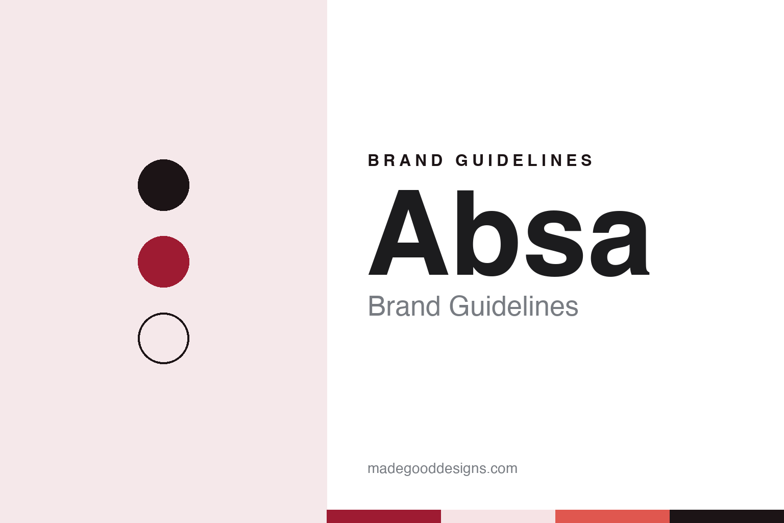
Absa Brand Guidelines
Volkskas roots, the Barclays years and a 2018 lowercase circle.
Aa
Two constants: an Absa range of reds and a rounded sans register. Abstract homage — not an Absa product or mark; no logo, card or branch sign is reproduced.
Four banks, one name
A building society, an Afrikaner bank and a merger.
Absa is a banking group built from mergers. English Wikipedia’s article on Volkskas says that bank was founded in 1934 as a cooperative loan bank, became a commercial bank in 1941 and, by the time of the merger, had become South Africa’s largest Afrikaner bank. In 1991, the same article says, Volkskas joined the United Building Society, Allied Building Society and Trust Bank to form Amalgamated Banks of South Africa, or ABSA. English Wikipedia’s main Absa Group article dates the holding company’s incorporation to 1986 and places the purchase of the Bankorp group — which brought TrustBank, Senbank and Bankfin — in 1992, so the two articles differ on when Trust Bank came in.
For most of the 1990s the group traded under its old names. In 1997 the holding company became ABSA Group Limited and adopted a new corporate identity, and the following year the “United,” “Volkskas,” “Allied” and “TrustBank” brands were retired in favour of the single ABSA name, the group article says. That consolidation is the starting point for the brand customers recognise today.
The Bankorp years left a long legal tail. The group article records that in 2017 the Public Protector found that assistance the Reserve Bank had given Bankorp between 1985 and 1992 was unlawful and recommended repayment; the report was set aside by the High Court in Pretoria, and in July 2019 the Constitutional Court upheld that court’s costs ruling against the office.
Colour
Barclays, then a relaunch.
In 2005 the British bank Barclays bought control of Absa. The Mail & Guardian reported in March 2005 that the finance minister was weighing the Registrar of Banks’ recommendation on Barclays’ offer for a controlling stake; English Wikipedia gives the outcome as a 56.4 percent holding bought in May 2005. In 2013 the group took over Barclays’ other African banks and, in August that year, renamed itself Barclays Africa Group Limited, with Barclays’ holding rising to 62.3 percent, the group article says. Outside South Africa its banks traded as Barclays.
The change back came after Barclays sold down. MarkLives reported on 2 March 2018 that the group intended to return to the name Absa Group and to trade as Absa across its operations in ten markets, which were then branded Barclays; English Wikipedia says the new name took effect on 30 May 2018, and that Barclays sold its remaining stake in August 2022.
The relaunch was a full redesign. Writing in MarkLives on 30 July 2018, the agency GRID Worldwide said the logo was meant to be “a word, not an acronym”: a lowercase “absa” framed by a dynamic circle, set in a bespoke typeface by the London logo and type designer Miles Newlyn. It described a “principle-based” brand whose palette has a wide range of reds — named “passion red,” “smile red,” “surprise red” and “calm red” — and work that ran from ATM screens and sounds to branch furniture, bank cards and the banking app, with the mark designed to work as a tile on phone screens.
The same article set out the thinking behind the circle. The aim, GRID wrote, was a sense of “oneness” that could bring two distinct brands together across Africa and unite colleagues and customers, using a visual language that did not depend on any one language or script. It summed up the intended character as “brave, passionate and ready,” and coined the word “Africanacity” for an outlook it described as entrepreneurial, flexible and expressive. The earlier MarkLives report noted that a new media agency had been appointed for ten sub-Saharan markets from 1 March 2018, ahead of the relaunch.
Typography
How African banks present themselves.
African banks speak to very different audiences at once: city professionals and market traders, multinational companies and small farms, customers with a branch on the corner and customers whose nearest branch is a long journey away. Their identities tend to reflect that range. Bold geometric marks, simple enough to read on a branch sign, a card or a phone screen, sit alongside palettes built on strong blues, reds and greens.
Photography carries much of the message. Annual reports and campaign pages often pair city skylines with everyday customers photographed across the continent, from shop owners and farmers to students and young families. Many groups also publish footprint maps that show where they operate, a visual shorthand for a pan-African presence that may run through subsidiaries trading under different local names.
Digital channels have become a central part of the brand. Bank websites give prominent space to mobile apps and to USSD menus, the short dial codes that work on basic phones without data, alongside pages for small-business banking and agriculture lending programmes. The tone on these pages is usually practical, written to explain how to open an account, send money or apply for credit.
Reporting is the other half of the identity. Large banking groups publish integrated, sustainability and financial-inclusion reports, and these documents often carry the most considered typography and photography a bank produces. This guide looks at each brand’s history and what can be checked about how it presents itself, and treats the colours and type shown here as an unofficial interpretation rather than official brand assets.
Aa
A rounded sans — the 2018 Absa wordmark used a bespoke typeface by Miles Newlyn. (Specimen set in Plus Jakarta Sans, a sans STAND-IN; NOT the Absa logo or typeface.)
Absa
A pan-African bank in one colour family.
Today Absa Group Limited is listed on the Johannesburg Stock Exchange and based in Johannesburg. Its website, which calls the group “Truly African,” lists operations in South Africa, Botswana, Ghana, Kenya, Mauritius, Mozambique, Seychelles, Tanzania — through both Absa and the National Bank of Commerce — Uganda and Zambia, with representative offices in Namibia and Nigeria and international offices in London and New York. On 29 October 2026 the Dubai International Financial Centre announced that Absa had opened an office there to link Gulf investors with African markets.
The brand keeps red at its centre. In May 2025 the group launched a campaign called “We See Your Story” in Sandton, with a digital billboard of customers’ stories, as part of what it called Absa Red Week, its website says. The group also runs an in-house design team, the Absa Design Office, which recruits user-experience, interface and service designers and runs a year-long graduate programme in human-centred design, according to its careers pages. English Wikipedia notes that its Kenyan and Botswana banks remain listed on their own national stock exchanges.
For a design guide, Absa shows how a bank can turn an acronym into a word and hold several countries together with one colour family. Compare Barclays, its former parent, and Standard Bank, another Johannesburg group. For this guide we use a deep crimson, a warm coral and blush with a rounded sans, an unofficial interpretation; no product or logo is reproduced.
Explore & save
Keep Absa’s identity on hand — save it to a board in the Made Good inspiration library.
Absa identity set
Pin the Absa crimson, coral and blush palette and the rounded sans register to your own board.