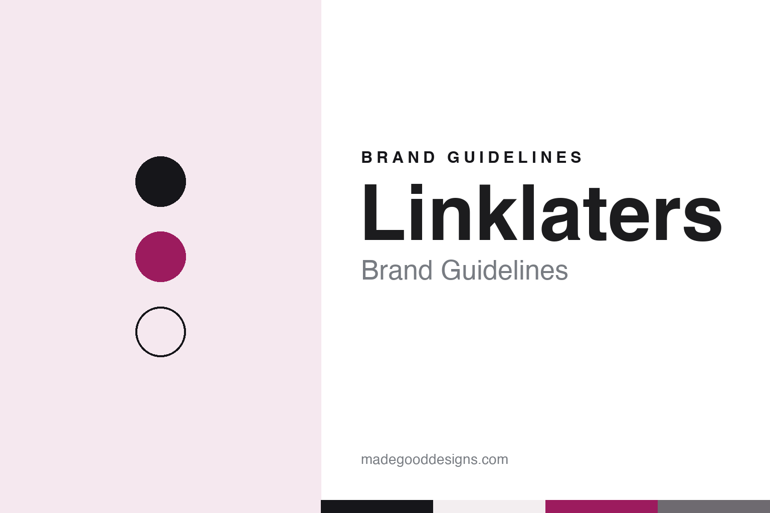
Linklaters Brand Guidelines
The 1838 City firm that bet on a golfball typeface and magenta.
Aa
Two constants: a magenta, ink and grey palette and a typewriter mono register. Abstract homage — not a Linklaters mark; no logo, lettering or document is reproduced.
Linklaters & Paines
A young solicitor, a practice off the Strand and a name that stayed.
Linklaters dates itself to 1838 in London. According to Passing the Flame, the history the firm commissioned from the writer Humphrey Keenlyside for its 175th anniversary in 2013, John Linklater was admitted as a solicitor in the Easter term of 1838, aged 21, and was taken straight into partnership by Julius Dods, whose practice had built a reputation advising small businesses through the bankruptcies that followed a banking crisis. The plural in the name, the book says, comes from John and his brother James, who also went into the law.
The name outlasted the family. The book records that no Linklater remained in the firm after 1879, and suggests the partners kept the name because it already carried value — what would now be called a brand. In 1918 Linklater & Co merged with Surtees, Philpotts & Co, its first merger, and on 4 May 1920 it signed a merger agreement with Paines, Blyth & Huxtable to form Linklaters & Paines, which started with nine partners.
The war years are covered plainly in the same history. Most work was put on hold during the Second World War, and the firm’s offices at Bond Court were destroyed in the bombing of London in 1941; the firm worked on from smaller offices it already rented in Cannon Street, and the practice picked up quickly after the war. The book traces its first real international push to 1966, when it began working in the Eurobond market.
From the mid-1960s the firm was widely known by its initials, L&P. The internal newsletter took the name L&P News in August 1986, and the letters even appeared in the carpets of Barrington House, the City building that was the firm’s office for some 40 years, the book says.
Colour
Saatchi, Wolff Olins and a colour argument.
The modern identity began with a review. In 1997, as the firm prepared to move its London operation to a new office on Silk Street and to expand into continental Europe, it commissioned the agency Saatchi & Saatchi to look at its brand. Their report of May 1997, as Passing the Flame summarises it, recommended shortening the name to “Linklaters”: that name was recognised internationally and “potentially more dynamic,” while “L&P” was not, and “& Paines” was seen as obsolete and easily mispronounced abroad. The agency also proposed an abstract “mark” — two wavy shapes in near parallel, meant to suggest a star — which partners nicknamed for its resemblance to washing on a line. In 1999, after a debate across the partnership, “Paines” was dropped and the firm became Linklaters “in all its manifestations.”
A second, deeper rebrand followed the European mergers. The consultancy Wolff Olins reviewed both the name and the firm’s positioning, and introduced two innovations, the book says: a new typeface and the use of colour. The typeface was based on the keys of the original IBM golfball typewriters, and its backward, upside-down “L” started heated arguments, as did the question of whether to put a full stop after the name. Colour was more contentious still. Opponents warned that rivals would poke fun with “Pinklaters,” and some American partners said they would refuse to use it.
Colour won over black and white. The shade chosen was a magenta, which the book identifies by its Pantone number, 227. In April 2002 the review was presented to the partnership together with the strapline “Achieving the unachievable”; first reactions were poor, the book says, but most partners came round during the meeting, and the new lettering was signed off for name cards that year.
Ten years on, Keenlyside wrote, the lettering and the colour were well established across recruitment, client events and client service. The identity also reaches small documents. In September 2019 Legal Cheek reported that Linklaters, which it described as a magic circle firm, had brought in a design agency to redesign its training-contract offer letter, moving away from a standard word-processed document to a format that gave the firm’s logo more prominence; its graduate recruitment partner told the site that offers were being answered faster.
Typography
How law firms present themselves.
Large UK and global law firms sell advice rather than objects, so their identities rest on names, words and a small number of visual constants. Many trade under founders’ surnames that have been shortened or combined through mergers, and the wordmark is usually set plainly, in one weight, with the colour doing quiet work: often a single accent, used sparingly against white, grey or a dark neutral.
The firm website carries most of the brand. A typical site is organised around expertise and sectors, with practice pages for areas such as finance, disputes or competition, and an office list or map that shows how many cities and countries the firm covers. Partner profiles, with photographs, practice areas and contact details, sit at the centre of the client-facing pages, because clients often choose a lawyer as much as a firm.
Firms also publish a steady stream of thought leadership: insights, briefings, blogs, webinars and seminars on regulation, markets and technology. Alongside these sit annual reports or results pages, statements on responsible business, inclusion and sustainability, and pro bono reports that describe unpaid work for charities and community groups. Graduate-recruitment pages, sometimes run as separate microsites, address law students with a different, warmer voice, while alumni networks keep former lawyers in touch.
The firms in this guide, many of them with long roots in London, share that vocabulary, but their histories differ: some go back to the eighteenth or nineteenth century, others are the products of mergers this century, and several now operate as international partnerships spanning dozens of countries. This guide sets out what can be checked about each one, from founding and mergers to how it presents itself today, and marks clearly what rests on the firm’s own word.
Aa
A typewriter register, after a typeface drawn from golfball keys. (Specimen set in IBM Plex Mono, a mono STAND-IN; NOT the Linklaters lettering or logo.)
Linklaters
From an alliance to one firm.
The European expansion came through an alliance. In 1990 a group of continental firms — among them De Brauw Blackstone Westbroek of the Netherlands and the German firm that became Oppenhoff & Rädler in 1995 — formed the Alliance of European Lawyers. After years of debate about how to enter Europe, Linklaters and the Alliance’s member firms signed an agreement in Genval, Belgium, on 22 July 1998 to create Linklaters & Alliance, a co-operation agreement made “with a view to merger,” according to Passing the Flame. The merger with Oppenhoff & Rädler was signed in November 2000 and took effect on 15 January 2001. By 2002 the German, Belgian, Luxembourg and Swedish firms had merged in, and the “Linklaters & Alliance” name was dropped. The sources used for this guide do not say how the German predecessor firm fared between 1933 and 1945.
The name kept working as an asset after that. When four of the firm’s central and eastern European offices were transferred to a new firm in 2008, it was named Kinstellar, an anagram of Linklaters chosen deliberately to build on the old name, the book says. Linklaters also opened offices in its own name in Madrid in 1999 and Lisbon in 2001.
Today the firm is led by Aedamar Comiskey, who in May 2021 was elected its first female senior partner, Legal Cheek reported, for a five-year term from 1 July 2021; she had joined the firm as a trainee in the early 1990s. In November 2026 the firm’s website described 29 offices in 20 countries and about 6,000 people, and said clients had relied on it “for almost 200 years.”
For a design guide, Linklaters shows how a law firm can turn a single colour and an unusual typeface into an identity, and how hard that decision can be inside a partnership. Compare Freshfields, which shortened its own name in 2024, and Clifford Chance, another London firm. For this guide we use a magenta, ink and grey with a typewriter-style mono, an unofficial interpretation; no product or logo is reproduced.
Explore & save
Keep Linklaters’s identity on hand — save it to a board in the Made Good inspiration library.
Linklaters identity set
Pin the Linklaters magenta, ink and grey palette and the typewriter monospace register to your own board.