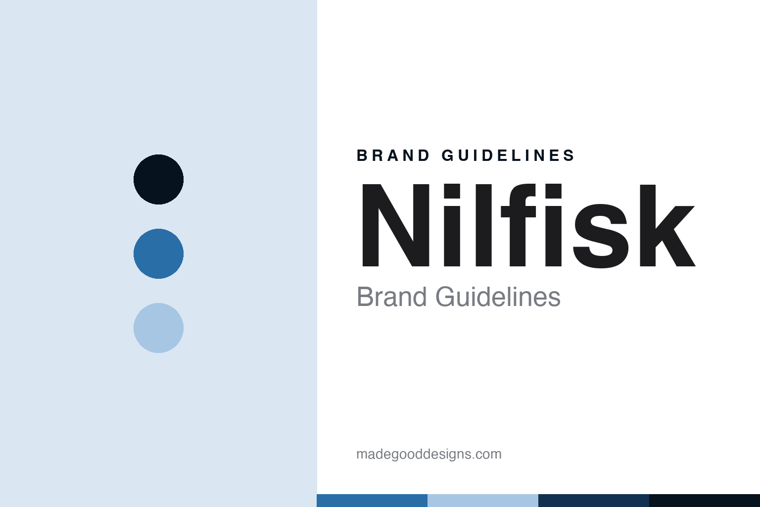
Nilfisk Brand Guidelines
The Danish professional.
Aa
Two constants: a nordic-blue palette and a professional-sans register. Abstract homage — not a Nilfisk product or mark; no washer, scrubber or logo is reproduced.
The Danish professional
Nilfisk is a 1906 Copenhagen company, spun off from NKT in 2017 and listed as NLFSK — weighted toward professional and industrial cleaning rather than the consumer aisle.
Nilfisk follows Kärcher as the round’s professional node — a century-old Danish cleaning company, now an independent listed business, weighted toward professional and industrial equipment more than the consumer shelf. Its answer to a round about who owns the washers is the public-professional one: a Copenhagen firm spun out on its own and aimed at the trade.
Its identity is the Danish professional. The 1906 founding, the NKT spin-off and the professional weighting are the story here. Old, public, pro. The Danish professional.
(Honest notes, so the founding, the ownership and the making are framed accurately, with two corrections. Nilfisk sells cleaning equipment as its heroes — floor scrubber-dryers, industrial vacuums and high-pressure cleaners; we report its language as the brand’s own. On founding, corrected: Nilfisk was founded in Denmark in 1906 as Fisker and Nielsen by two founders, P.A. Fisker and Hans Marius Nielsen, and the name derives from Nielsen and Fisker, with Fisker designing an early European vacuum in 1910. On headquarters, corrected: it was historically in Brøndby but moved to Nordhavn in central Copenhagen in 2023. On ownership: it was long part of NKT Holding, spun off in 2017 and listed on Nasdaq Copenhagen as NLFSK, an independent public company. On position: it is weighted toward professional and industrial cleaning, more than Kärcher, though it has a consumer line. On the making: global, across Europe, China, Mexico and the US, and we note the Springdale, Arkansas plant was destroyed by a tornado in 2022, a natural-disaster event. Its designs and the Nilfisk name are IP we describe but do not reproduce; there is no official brand hex; these tones are an unofficial interpretation.)
Colour
Nilfisk lives in a nordic blue. Click a swatch to copy the hex.
Nilfisk’s identity is century-old, public and professional — a nordic blue, an ink, a pale blue, a deep navy, and a paper. The palette leans nordic blue and deep navy: a calm, professional register that nods to industrial and trade cleaning rather than a loud logo colour. It signals the Danish professional — century-old, public and professional. The honest caveat: with no official brand hex, and only blue-grey branding documented, these values are a professional, unofficial interpretation, not first-party colours.
The lesson is a nordic blue signals a calm, professional identity. Nilfisk’s world is the industrial cleaning floor. For designers, it is a reminder that a calm blue and a deep navy can carry a professional, industrial brand — a trade tone held as an accent, not a product shot. Because a mid hue can fail as small text, keep type dark and let the colour live in the accents, palette and band. The takeaways: correct the founding to 1906 and two founders, Fisker and Nielsen; correct the headquarters to Nordhavn Copenhagen; note the NKT spin-off and NLFSK listing in 2017; and weight it toward professional cleaning.
Typography
The register is a professional sans — century-old, public, professional.
Nilfisk’s identity carries a century-old, public spirit — a heritage firm aimed at the trade. A professional sans captures the mood: clean, exact and industrial, the register of professional equipment. Set in a nordic-blue palette, the professional sans feels calm and capable — exactly the personality Nilfisk carries. It behaves like a made, industrial thing rather than a loud logo, mirroring a rinse-band and a pressure-line. (Nilfisk’s real products and the name are things we describe but do not reproduce, and the exact typeface is not ours to use.) Because it is not ours to use, the honest description is “a professional-sans brand,” shown here in a stand-in. The type behaves like the brand: century-old, public and professional.
Aa
A professional-sans brand — calm and capable. (Specimen set in Manrope, a professional-sans STAND-IN; NOT the Nilfisk logo or products.)
The pressure-washer node
Nilfisk stands for the Danish professional.
Nilfisk sits second in the round as its professional node. A nordic-blue palette, a professional sans and a 1906 founding make one thing — the Danish professional — the whole identity: century-old, public and professional. The 1906 founding is the pitch, the NKT spin-off is the frame, and the professional weighting is the point. The point is a Copenhagen firm spun out on its own and aimed at the trade, in a round about who owns the washers.
Put to work, the identity is the brand told straight, the founding and headquarters corrected and the listing noted. A brand in this spirit would correct the founding to 1906 and two founders, correct the headquarters to Nordhavn Copenhagen, note the NKT spin-off and NLFSK listing in 2017, and weight it toward professional cleaning. A reader in this spirit would keep the facts right: Nilfisk sells scrubber-dryers, industrial vacuums and high-pressure cleaners; it was founded in 1906 as Fisker and Nielsen by two founders; its headquarters moved to Nordhavn in 2023; and it was spun off from NKT and listed as NLFSK in 2017. Nilfisk sits after Kärcher and before AR Blue Clean. The honest editorial moves are to correct the founding, to correct the headquarters, to note the listing, and to weight the position.
For designers and brand-builders, Nilfisk carries the pressure-washer node: correct a founder count — and note a spin-off cleanly. The lessons: a brand can be a heritage firm aimed at the trade, here Nilfisk; a founding is corrected to 1906 and two founders, Fisker and Nielsen, whose names give Nilfisk, with Fisker’s 1910 vacuum noted; a headquarters is corrected to Nordhavn in central Copenhagen, moved in 2023 from Brøndby; an ownership is noted cleanly, long part of NKT Holding, spun off in 2017 and listed on Nasdaq Copenhagen as NLFSK; and a position is weighted toward professional and industrial cleaning, more than the consumer aisle, with the making global and the Springdale tornado noted as a natural-disaster event. It is also a reminder to stay precise: Nilfisk is the public, professional Danish brand of the pressure-washer aisle — with the palette here an unofficial interpretation. The hook is that weighting: Nilfisk is the Danish professional, a 1906 Copenhagen company spun off from NKT in 2017 and listed as NLFSK, weighted toward professional and industrial cleaning rather than the consumer aisle. Read that way, Nilfisk is less a single washer than the Danish professional: century-old, public, professional. The lesson for a brand is that correcting a founder count and noting a spin-off cleanly reinforce the honesty, and correcting the headquarters keeps it earned. Nilfisk made the-Danish-professional the identity — proof that an honestly-corrected heritage firm can anchor a node.
Explore & save
Keep Nilfisk’s identity on hand — save it to a board in the Made Good inspiration library.
Nilfisk identity set
Pin the nordic-blue palette and the professional-sans register to your own board.


