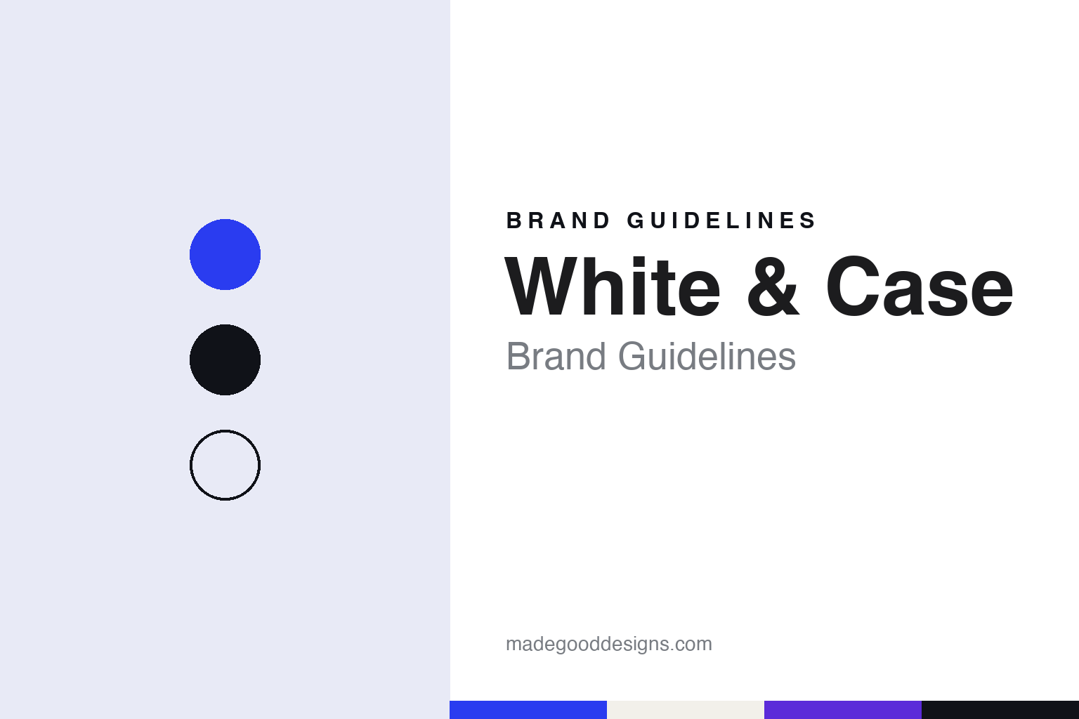
White & Case Brand Guidelines
A 1901 Wall Street partnership with a new Roman-cut mark.
Aa
Two constants: an electric blue, ink and marble palette and an inscriptional serif register. Abstract homage — not a White & Case mark; no logo, monogram or wordmark is reproduced.
Wall Street, 1901
Two lawyers, a bank and a partnership under two surnames.
White & Case was founded in New York on 1 May 1901, when two Wall Street lawyers, Justin DuPratt White and George B. Case, set up a partnership under their two surnames, according to Wikipedia. White had studied law at Cornell, where he was an editor of The Cornell Daily Sun; Case had studied at Yale and then at Columbia Law School. Wikipedia says the pair were close to the banker Henry P. Davison, who later helped create the Federal Reserve, and that among the firm’s first clients was Bankers Trust Company.
The move abroad came later. Legal Cheek, writing in October 2026, said White & Case traces its roots to a first office in New York in 1901 and established its London office in 1971, as it looked to work in the growing Eurodollar market. Wikipedia says the firm expanded into many more markets under James Hurlock, chairman from 1980 to 2000, a period in which its roster of lawyers tripled, and that in 1994 it was among the first American law firms to open offices in Vietnam.
Leadership has passed through a short line of chairs. Wikipedia names Duane Wall as chairman from 2000 and Hugh Verrier from October 2007, and says Verrier brought in the consultancy McKinsey & Company to review the firm’s worldwide operations soon after taking over. In June 2023, Legal Cheek reported that the partners had elected Heather McDevitt, a New York litigator who had joined as a partner in 2002 and later led the firm’s pharmaceutical and healthcare industry group, as the firm’s first female chair, taking office on 1 September 2023 after Verrier’s sixteen years in the role. Over that period, the same report said, the partnership grew by 60 percent.
Colour
Offices, values and a practice built across borders.
White & Case presents itself as one firm spread across many countries. Its own website, read in November 2026, says it has more than 2,000 lawyers across 43 offices in 29 countries — a lower count than the 46 offices in 31 countries given by Wikipedia — and that clients have turned to it “for more than 125 years.” The same page sets out three values, Pioneering, United and Human, describing the second as being “one firm with a shared sense of purpose.” The firm publishes a yearly review each spring; the edition covering 2025, titled “Perspective,” is dated 31 March 2026 on its website.
Wikipedia singles out two practices. It says the firm’s antitrust group and its international arbitration group have been ranked in the top tier by Global Competition Review (in 2020) and Global Arbitration Review (each year from 2015 to 2019), and that in June 2020 the firm hired a team from Winston & Strawn to build a practice advising special-purpose acquisition companies. Wikipedia also records that the firm set up a global pro bono practice in 2010, organised around access to justice, the rule of law and work for non-governmental organisations, and that Law360 profiled that work in 2012.
In London it hires trainee solicitors through both a vacation scheme and direct training-contract applications, with up to 50 training contracts a year, according to the Legal Cheek Firms Most List cited in October 2026. Recruitment platforms are among the places where the new identity described below is being rolled out.
Typography
How large US law firms present themselves.
Large American law firms tend to present themselves with restraint. Many are named after founding or senior partners, and their names are often set as sober wordmarks: a serif with a long institutional pedigree, or a plain grotesque sans, usually in a single colour. Navy, near-black and white are common choices, with an occasional accent kept for links and headings rather than for decoration. Long partnership titles are frequently cut down over the decades to two surnames joined by an ampersand, or to a single surname used in conversation.
Their websites are built around how clients and recruits search. Practice-area and industry pages sit near the top, alongside a directory of lawyer biographies, each with a headshot, admissions, education and representative work. Latham & Watkins, for example, organises its main menu under People, Capabilities, Achievements, Insights and Global Citizenship, and lists every office by city on its About Us page.
Publishing is a large part of the presentation. Firms issue client alerts on new laws and rulings, along with articles, podcasts and webcasts grouped under headings such as insights or thought leadership. Many also publish pro bono reports, figures on community service and reports on diversity and inclusion, and some set out environmental commitments for their offices.
Recruiting pages form a separate register, written for law students and junior lawyers: summer associate programmes, training, office life and alumni networks. Across all of these pages the visual system usually stays quiet, so that the firm’s name, its people and its record of work carry the identity. The guides in this series look at how individual firms use those conventions, and where their histories and names differ.
Aa
An inscriptional serif — after a mark the design press links to Trajan’s Column. (Specimen set in Cinzel, a serif STAND-IN; NOT the White & Case logo.)
White & Case
A Roman-cut wordmark and a blue called Catalyst.
In October 2026 White & Case unveiled a new brand identity. Legal Cheek reported on 7 October that it replaced the firm’s lighter blue background and plain block capitals with a darker palette and a more stylised wordmark. It quoted the firm as saying the identity reflects “who we are and how we work,” and that “complexity is not a hurdle. It is where we find our edge.” A version of that line now opens the “Our Firm” page of the website, which describes complexity as “the force that brings our edge.”
The design came from Uncommon Creative Studio. Creative Boom, writing on 27 October 2026, called it the firm’s first big rebrand in 13 years. It said the new logo draws on the inscriptions of Trajan’s Column and on Roman stone carving: a tightly stacked lockup in which diagonal cuts slice through letters such as the W so that they seem to lean forward. The ampersand has been reworked as a standalone monogram, intended to sit equally on a laptop screen, a lapel pin or a marble sculpture in a lobby. The same directional cuts run through a set of custom headline serifs, set large in phrases such as “Forward energy.”
Colour changed most. Creative Boom said navy was dropped in favour of an electric shade the studio named Catalyst Blue, balanced by Marble White and Ink Black, with secondary tones called Ion, Thermal, Solar and Ultraviolet — together what Uncommon calls a “high voltage palette.” A proprietary tool, Energy Studio, stretches part of each photograph into sharp streaks of colour, so that a city skyline or a field of wind turbines dissolves into lines. One poster pairs the words “Complexity creates risk” with “We see opportunity.” The identity is rolling out across recruitment platforms, client documents, pitch materials, advertising and a podcast, with a brand film, The Power of Complexity. The firm’s chief marketing officer told the magazine that brand can be “a powerful source of differentiation.”
For a design guide, White & Case shows how a firm of more than a century can trade plain block capitals for a carved serif and a new blue while keeping its founders’ two surnames and the ampersand between them. Compare Sullivan & Cromwell, another New York firm named for its founders, and Wachtell, Lipton. For this guide we use an electric blue, ink and a warm marble white with a serif, an unofficial interpretation; no product or logo is reproduced.
Explore & save
Keep White & Case’s identity on hand — save it to a board in the Made Good inspiration library.
White & Case identity set
Pin the White & Case electric blue, ink and marble palette and the inscriptional serif register to your own board.