KB Kookmin Bank Brand Guidelines
A citizens’ bank, a housing bank and a star.
Aa
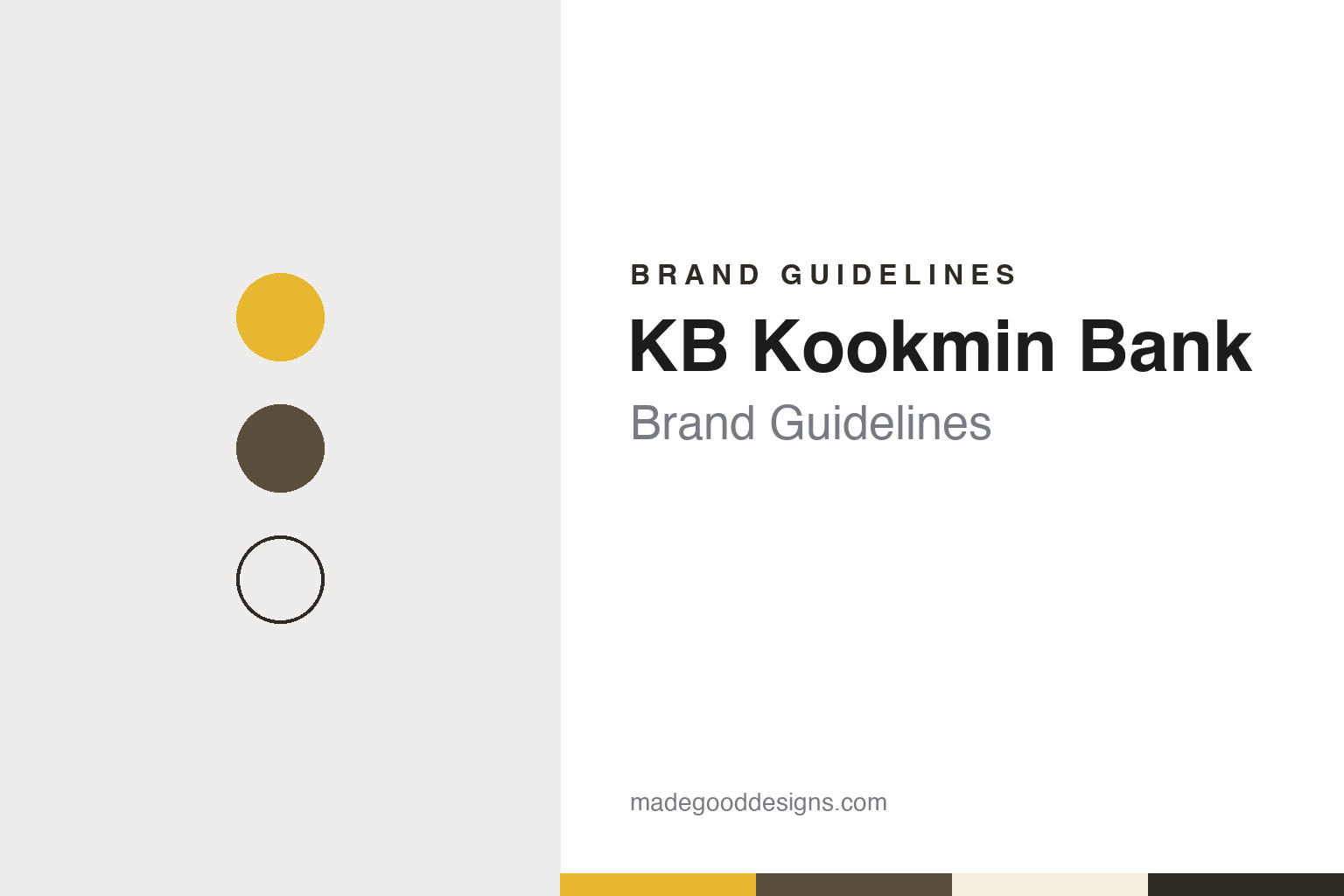
Two constants: a yellow, umber and charcoal palette and a clean Korean sans register. Abstract homage — not a KB Kookmin Bank asset; no symbol, logotype or character is reproduced.
Citizens and Homes
Two state-founded banks, one merger.
KB Kookmin Bank is the product of two older banks. The first, Kookmin Bank, was set up by the South Korean government to serve households: English Wikipedia says the Citizens National Bank was founded in late 1962 to provide financial services for middle- and low-income customers, and KB Financial Group’s own timeline dates the bank’s founding to February 1963. The Korean name, 국민은행 (Gungmin Eunhaeng), means “citizens’ bank,” and the romanised “Kookmin” became the English name too.
The second was Housing Bank, which the KB timeline says was founded in July 1967 and later renamed Housing & Commercial Bank. As its name suggests, it grew up around home finance: the timeline lists housing savings deposits, housing bonds and the management of the National Housing Fund among its early businesses.
Both banks expanded through the 1990s. English Wikipedia says the government began privatising Kookmin with a 10 percent share offering in 1994, while the bank opened offices abroad in Luxembourg, Tokyo, Singapore and Hong Kong. After the Asian financial crisis of 1997, Kookmin absorbed Daedong Bank in 1998 and Korea Long-Term Credit Bank soon after, and Housing & Commercial Bank took over Dongnam Bank, according to Wikipedia and the KB timeline. The KB timeline also says Kookmin launched Korea’s first internet banking service before the merger, a claim the group makes about itself.
The two banks signed a merger agreement in April 2001. Korean Wikipedia gives 1 November 2001 as the date the merged Kookmin Bank was established and listed on the New York Stock Exchange, followed by its Korea Exchange listing on 9 November. Housing & Commercial Bank brought one more detail with it: the KB timeline says it had been selected as a partner of the 2002 FIFA World Cup.
Colour
A new name, a holding company and a mark.
The merged bank soon took the initials it trades under today. Korean Wikipedia says the brand changed to KB국민은행 (KB Kookmin Bank) on 2 October 2002, and the KB timeline records that the bank “unveils new CI” — a new corporate identity — that October. In September 2003 the bank absorbed Kookmin Credit Card, and in December 2003, Korean Wikipedia says, the government sold its remaining shares and the bank was fully privatised.
In 2008 the bank moved under a holding company. Korean Wikipedia gives 29 September 2008 for the launch of KB Financial Group, after which the group’s shares replaced the bank’s on the Korea Exchange. The group’s history page says it brought in credit card, insurance and securities businesses over the following years; the bank remains its core.
The identity is set out on the group’s website. Its symbol, the Star-b, is “shaped like a star,” and the group says it expresses “forward-looking thinking” and an ambition to become a world-class financial institution. The Korean and English logotypes are drawn in KB’s own typeface and can be used alone or with the symbol in horizontal, vertical and stacked signatures, which the group asks users not to alter.
That typeface is a family of its own. KB Financial Font comes in a Display version, in Bold, Medium, Medium Italic and Light, which the group says combines straight lines for trustworthiness with curves for friendliness; and a Text version, in Bold, Medium and Light, drawn in a square-frame style for body copy. The star motif continues in the group’s mascots, the Star Friends: five characters — a rabbit called KiKi, a duck called A.GO, a bear called B.B, a llama called Lamu and a broccoli called Kolly — who, in the group’s story, came to Earth from different stars and appear in its advertising and media.
Typography
How Korean banks present themselves.
South Korean banks tend to present themselves with short names and simple symbols. Many trade under initials or a single word, and they usually show the Hangul name and the Latin name side by side, so that the same mark works on a branch sign in Seoul, an overseas office and a phone screen. Bright, clean colours are common across the sector, from yellows and warm tones to teals, blues and greens, set against plenty of white space.
Several banks have built their identities beyond a logo. KB Financial Group publishes its own typeface family and a cast of mascots, the Star Friends, which appear in its advertising; Hana Financial Group has its own typeface too, and offers it free to the public. Character mascots, house fonts and short slogans give these brands a friendly face that carries across advertising, apps and branches.
Much of the customer’s contact now happens on a phone. Bank websites and apps tend to be minimal and app-first, with pages organised around deposits and savings, loans, mobile banking, overseas transfers and digital wallets, and many services that once needed a branch visit are offered online. Banks also use their apps for things beyond banking, such as event ticketing or tie-ins with sports clubs.
Sport and publishing round out the picture. Korean banks sponsor athletes, teams and running and golf events, and some produce branded dramas and web series for online audiences. Their annual reports and sustainability reports are published in Korean and English and set out each group’s structure, history and identity, which makes them a useful starting point for anyone studying how these brands are built.
Aa
A clean Korean sans with Hangul and Latin side by side. (Specimen set in Gothic A1, a sans STAND-IN; NOT the KB Kookmin Bank logo or KB Financial Font.)
KB Kookmin Bank
Stars, dramas and a brand ranking.
KB Kookmin Bank’s recent brand work leans on stories as much as on the star. In July 2026 The Korea Times reported that the bank’s four-part branded drama, “Star to START: K-Business Begins,” had passed 4 million cumulative views on YouTube, the lender said. The 15-minute episodes follow a relationship manager visiting owners of small and medium-sized businesses, with the bank’s corporate lending, trade finance and advisory services written into the plot. The paper added that an earlier web series, “Half and Half House,” followed young renters caught up in jeonse deposit fraud and passed 1.4 million views.
The bank also takes part in sport. The group’s sponsorship pages list athletes in figure skating and short-track speed skating, and on 3 May 2026 the bank staged its first KB Star Run, which The Asia Business Daily reported drew about 6,000 runners to 5km and 10km courses around Yeouido Hangang Park in Seoul. In June 2026 the same paper reported the bank’s announcement that Interbrand’s 2026 ranking of Korean brands had placed it first by brand value among domestic banks for the 14th year in a row, and sixth among all Korean companies.
The group’s history page sets out a long run of digital launches, from mobile banking in the mid-2000s to a next-generation internet banking service in 2008, and today the bank presents itself largely through its apps and online services alongside its branch network. Korean Wikipedia notes that in 2018 the bank moved its head office to the former Housing & Commercial Bank headquarters building in Yeouido, Seoul, after selling its Myeongdong building.
For a design guide, KB Kookmin Bank shows how a single symbol, a house typeface and a cast of characters can carry one identity across a bank, a financial group and its advertising. Compare Hana Bank, which also commissioned its own typeface, and Woori Bank, another Seoul bank shaped by mergers. For this guide we use a star yellow, warm umber and charcoal with a sans, an unofficial interpretation; no product or logo is reproduced.
Explore & save
Keep KB Kookmin Bank’s identity on hand — save it to a board in the Made Good inspiration library.
KB Kookmin Bank identity set
Keep the KB Kookmin Bank yellow, umber and charcoal palette and the clean Korean sans register for your own board.