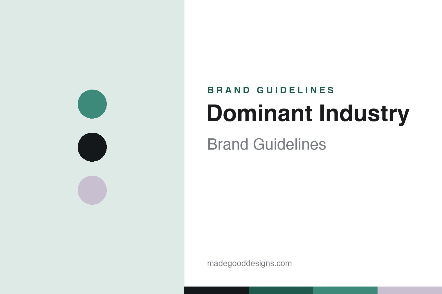
Dominant Industry Brand Guidelines
Korean premium ink — a pearly shimmer line and a droplet bottle made to be given.
Aa
Two constants: a celadon-and-pearl palette and a minimal sans. Abstract homage — not the Dominant Industry wordmark or logo.
Premium ink, made to be given
Dominant Industry designs the whole object.
Dominant Industry is a lesson in designing the object, not just the ink. It’s a Korean boutique/premium ink maker, handmade in small batches in Paju, South Korea, founded around 2020 (we hedge the exact year). It positions itself at the premium, gift-grade end of the modern Korean designer-ink scene.
Its signature line is the Pearl series — shimmer inks with pearly, metallic particles that work best in medium and broad nibs. Around it sit the everyday Standard series, the fragranced Scented series (Ylang Ylang, Bog Sage and the like), and the specialty Alchemist calligraphy line. The colour storytelling leans on nature — seasons and landscapes, with names like Autumn Forest, Early Spring and Goryeo Celadon.
What sets Dominant Industry apart as much as the ink is the presentation: a distinctive droplet-shaped 25ml glass bottle presented with a cotton pouch and box — genuinely gift-grade packaging that makes each ink feel like a considered object. ⚠️ One myth to clear up: Dominant Industry is sometimes said to suspend real dried flowers or particles in the bottle — but that striking effect belongs to other brands, not Dominant Industry; its distinction is the Pearl shimmer, the droplet bottle and the packaging, so we don’t claim petals-in-the-glass. (Honest notes: the founding year is hedged; shimmer inks need shaking and suit broader nibs; it’s distinct from Colorverse and Wearingeul; and no official brand hex is published.)
Colour
Dominant Industry lives in a celadon-and-pearl palette. Click a swatch to copy the hex.
Dominant Industry’s identity is premium, calm and designed — a soft celadon, ink black, and a pearl shimmer. The palette reads as the brand: the muted green of Goryeo celadon, the black of ink, and the pearly glint of the shimmer line, quiet and gift-like. It’s a considered, premium world that signals craft, nature and presentation. It’s a celadon-and-pearl palette that signals premium designed ink. The honest caveat: Dominant Industry makes many colours and publishes no official brand hex, so the celadon, ink and pearl here are an original, unofficial interpretation, not first-party values.
The lesson is a celadon-and-pearl palette signals quiet, premium craft. Dominant Industry’s world reads as calm and considered. For designers, it’s a reminder that a soft, cultured colour (celadon) with a pearly accent can express premium restraint and gift-worthiness. The takeaways: use a soft cultured tone with a pearly accent for quiet premium; let the object and packaging carry the value; and treat any single hex as unofficial when there’s no published spec.
Typography
The wordmark spirit is a minimal sans — quiet and premium.
Dominant Industry’s identity carries a quiet, premium, designed spirit — a “Dominant Industry” wordmark whose restrained forms match a brand that treats an ink bottle as a gift object. A minimal sans captures the mood: it’s calm and premium, matching a house of shimmer inks in droplet bottles with cotton pouches. Set against a celadon palette, the minimal sans feels considered and gift-like — exactly the Pearl-shimmer, droplet-bottle personality Dominant Industry carries. It’s quiet rather than loud, mirroring a carefully packaged object. (Dominant Industry’s real wordmark is a trademark we describe but don’t reproduce.) Because the exact mark isn’t ours to use, the honest description is “a minimal sans spirit,” not the Dominant Industry logo. The type behaves like the brand: quiet, premium and designed.
Aa
A minimal sans spirit — quiet and premium. (Specimen set in Jost, a geometric sans; NOT the Dominant Industry logo, which is a trademark.)
Packaging as the difference
Dominant Industry sells a gift.
Dominant Industry is a lesson in making the object as considered as the contents. The ink is good — the Pearl shimmer line and the nature-themed colours are genuinely lovely — but plenty of Korean makers make lovely ink. What Dominant Industry adds is a designed object: the droplet-shaped bottle, the cotton pouch, the box — presentation gift-grade enough that buying the ink feels like buying a present (often for yourself). That reframes the purchase from “some ink” to “a considered object,” which supports a premium price and gives the brand a physical signature you’d recognise on a shelf. It’s the same move Ferris Wheel Press makes with its ornate bottles, executed in a quieter, more minimalist Korean register — proof that in a colour-saturated category, the vessel can be as much of a differentiator as the colour.
For designers and brand-builders, Dominant Industry offers a clear takeaway: in a commodity category, designing the object can differentiate as much as the product. The lessons: invest in a signature vessel and packaging (the droplet bottle, the pouch) so the purchase feels like a gift; let a hero line (Pearl shimmer) headline while a calm identity carries the rest; and keep the facts precise — Dominant Industry is a Korean premium ink house from Paju. It’s also a reminder to keep it honest: the founding year is hedged; it does not suspend dried flowers in the bottle (a different brand does); shimmer inks need shaking and suit broader nibs; and no official brand hex is published, so the palette here is an interpretation. Dominant Industry sells a gift — proof that the object can be the difference.
Explore & save
Keep Dominant Industry’s identity on hand — save it to a board in the Made Good inspiration library.
Dominant Industry identity set
Pin the celadon-and-pearl palette and the minimal-sans spirit to your own board.


