QTS Brand Guidelines
The Kansas data-centre company that renamed its front door with one letter.
Aa
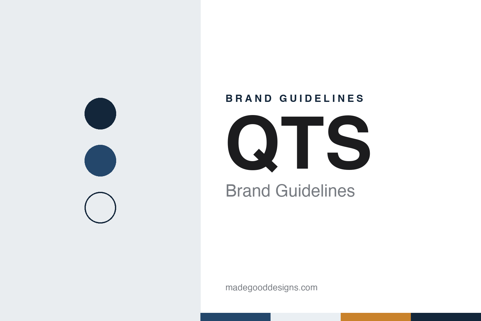
Two constants: a blue, mist and amber palette and a geometric sans register. Abstract homage — not a QTS asset or mark; no building, logo or nameplate is reproduced.
Quality Technology Services
A Kansas data centre and a family investment group.
QTS began as Quality Technology Services, a company built in Kansas by Chad Williams. English Wikipedia dates the start to 2003, when Williams bought a data centre in Kansas; the company itself counted 2025 as its twentieth anniversary, in a March 2025 release datelined Overland Park, Kansas. That release also says QTS was originally founded out of the Quality Group of Companies, a family office investment company that Williams went on to lead again.
The young company grew by buying buildings other businesses no longer needed. Wikipedia records that in October 2005 it acquired the e^deltacom data-centre unit of Deltacom in Suwanee, Georgia, and that in 2006 it bought a very large data centre in Atlanta, together with the hosting business Globix Hosting and the US company of NTT that owned a facility in the New York area. Expansion into Silicon Valley followed in 2007 and into Florida in 2008. The Suwanee site is still part of the business: QTS’s website lists an operations support centre there.
One documented example of this approach came in 2010. Data Center Knowledge reported on 5 April 2010 that QTS had bought the former Qimonda memory-chip plant in Sandston, near Richmond, Virginia, in a bankruptcy-court sale. The property covered 210 acres and more than 1.3 million square feet of buildings, including two chip fabrication halls, and the publication said QTS planned to convert it into a data-centre campus for custom data centres and managed services. The same article noted that QTS was not the first to turn a chip plant into a data centre, pointing to a former Seagate plant in San Jose and a former LG plant in Wales. Wikipedia adds that subsea cable systems operated by Telxius now land at the Richmond facility.
Colour
A public listing, then Blackstone.
QTS became a public company in October 2013, when QTS Realty Trust listed in New York, according to Wikipedia. Earlier that year, Wikipedia says, it had bought Herakles and its data centre in San Francisco and 40 acres in Irving, Texas, for a new campus. As a real estate investment trust it kept buying: Wikipedia lists the former Chicago Sun-Times printing plant, bought in 2014 for conversion into a data centre, the hosting firm Carpathia Hosting in 2015, a campus in New Jersey from DuPont Fabros Technology in 2016, and two data centres in the Netherlands, at Groningen and Eemshaven, in April 2019.
The listed period ended in 2021. Blackstone and QTS announced on 31 August 2021 that affiliates of Blackstone Infrastructure Partners, Blackstone Real Estate Income Trust and Blackstone Property Partners had completed their acquisition of QTS Realty Trust, and that its shares would no longer be listed. In that release Williams said the company’s “Powered by People” approach would remain its foundation, a phrase that still appears across the QTS website.
Under Blackstone the company has moved into the United Kingdom and southern Europe. The BBC reported on 15 April 2024 that Northumberland County Council was considering plans from Blackstone for a hyperscale data-centre campus at Cambois, on the site once meant for the collapsed Britishvolt battery factory; Wikipedia now lists Cambois as a QTS site. QTS’s website also lists a London office, and its 2026 community pages describe public consultation at Vimercate in Italy.
Leadership changed in 2025. QTS announced on 25 March 2025 that Williams would step down as chief executive and chairman from 18 April 2025 and return to the Quality Group of Companies, and that David Robey, the chief operating officer, and Tag Greason, the chief growth officer, would become co-chief executives. The release put the workforce at more than 1,600 people. The company says it serves hyperscale technology companies, enterprises and government agencies.
Typography
How data-centre operators present themselves.
Data-centre operators sell something most of their customers will rarely see in person. The product is space, power, cooling and connections inside buildings that are secure by design, so the industry has built a recognisable visual language to stand in for the real thing. Long white halls lined with rows of server racks, often lit in a cool blue, are the most common image on websites, in reports and on trade-show stands.
The second stock image is the campus from the air. Aerial photographs show low, windowless buildings set out in a grid, with car parks, substations and fenced yards around them. Close-ups fill in the detail: banks of cooling towers or chillers on a roof, rows of backup generators, cable trays crowded with fibre and power cords, and engineers in hi-vis vests checking a tablet between the racks. The pictures are meant to suggest scale, order and control rather than any single product.
Names and marks tend to follow the same logic. Many operators use short coined names, initials or plain descriptive words, set in clean sans-serif type, and organise their sites with city or airport codes and numbers. Colour schemes lean on blues, greys and one sharper accent, and campaigns talk about capacity, connectivity and growth in measured, technical language. Because the buildings look alike, the difference is often carried by naming, maps of locations and the way a company describes its customers.
Much of this identity is presented in person at industry gatherings such as Datacloud Global Congress and PTC, where operators, investors and network companies meet. Stands, keynote slides and printed site maps there tend to repeat the same visual cues as the websites: hall photography, campus renders and lists of markets. The guides in this group look at how individual operators use those shared conventions.
Aa
A geometric sans for a company that now goes by one letter. (Specimen set in Sora, a sans STAND-IN; NOT the QTS logo.)
QTS
A new mark in 2025 and Q.com in 2026.
QTS changed how it presents itself twice in two years. On 16 June 2025 the company announced a refreshed brand identity and a new logo, saying its original logo had served for more than two decades. The co-chief executives said the brand had “always been a beacon” and that the values behind it were not changing. The announcement did not name a designer or describe the new colours.
The second change was its address. On 23 March 2026 QTS introduced Q.com as its new website, with the line “One Letter. Unlimited Potential.” The company said a single letter removes translation barriers and spelling confusion, and that under ICANN rules only a very limited number of single-letter domains are permitted, with Q.com one of just three. It stressed that the company itself was unchanged: the old qtsdatacenters.com address now forwards to Q.com. Its site carries the tagline “Designed to be different” and lists core values including character, integrity and trust, and the US headquarters it gives today is in Sterling, Virginia.
For a design guide, QTS shows how a data-centre company can treat its name as a design asset: three letters for most of its life, then a single letter as its web address. Compare the identities of AirTrunk, another Blackstone-backed operator, and Equinix. For this guide we use a prairie blue, a server-hall mist and a wheat amber with a geometric sans, an unofficial interpretation; no product or logo is reproduced.
Explore & save
Keep QTS’s identity on hand — save it to a board in the Made Good inspiration library.
QTS identity set
Pin the QTS blue, mist and amber palette and the geometric sans register to your own board.