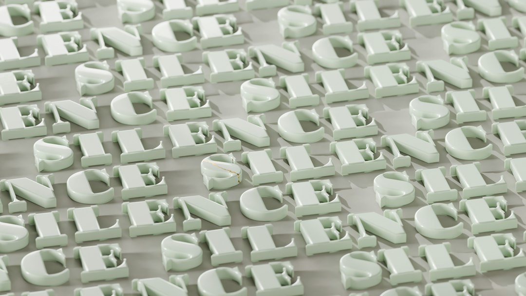
Roboto Slab font pairings start with its family ties. Roboto Slab is the slab serif member of the Roboto family, designed by Christian Robertson to be used alongside Roboto and Roboto Condensed. Like Roboto, it has a dual nature: a mechanical skeleton with largely geometric forms, combined with friendly, open curves and letters that keep their natural widths for a comfortable reading rhythm. It was added to Google Fonts in 2013 and is free under the Apache License 2.0. Its firm slabs give headlines a solid, dependable look, so the partner’s job is to carry paragraphs, interface text and italic emphasis with a lighter touch.
Is Roboto Slab a heading or body font?
Roboto Slab is best used as a heading font. On Google Fonts it is a variable font with a weight axis from 100 to 900, so you can set anything from a hairline Thin to a heavy Black headline. It has no italic styles, though, and that is the main reason it rarely works as the main body font: paragraphs need italics for emphasis, titles and quotes, and a faked oblique looks clumsy. Its open shapes do keep short text such as captions, callouts and pull quotes readable. The common pattern is Roboto Slab in Medium to Bold for titles and section heads, with a sans-serif that has full italics for everything else. All five pairings below follow that pattern.
Best fonts to pair with Roboto Slab
Each partner below is a sans-serif with true italic styles and several weights that can carry body text beneath Roboto Slab headings. All are free on Google Fonts.
| Pairing | Use as | Why it works |
|---|---|---|
| Roboto Slab + Roboto | Heading + Body | Roboto shares the same skeleton and designer as Roboto Slab, so slab headings and sans body text match in proportion. |
| Roboto Slab + Open Sans | Heading + Body | Open Sans is a friendly humanist sans whose open body text softens the mechanical firmness of Roboto Slab headings. |
| Roboto Slab + Lato | Heading + Body | Lato’s warm, rounded sans-serif forms make approachable body copy under sturdy Roboto Slab titles. |
| Roboto Slab + Inter | Heading + Body | Inter is a neutral, screen-tuned sans that keeps dense interface text crisp beneath bold Roboto Slab headlines. |
| Roboto Slab + Nunito Sans | Heading + Body | Nunito Sans has soft, rounded terminals that give a gentle, friendly body text below solid Roboto Slab headings. |
Roboto Slab + Roboto (the family pairing)
The most coherent choice keeps everything in one family. Roboto and Roboto Slab share the same skeleton, both credit Christian Robertson, and the Google Fonts description presents the slab as a family to use alongside Roboto and Roboto Condensed. Set Roboto Slab Bold for page titles and section heads, and Roboto Regular for body text, with Roboto Italic for emphasis. Because the proportions match, the page feels designed as a system, while the slabs still separate headings from text at a glance. Roboto’s width axis also gives you narrower styles for tables and labels. This pairing suits documentation, Android-style apps, dashboards and help centers. For more options, see our Roboto font pairings guide.
Roboto Slab + Open Sans (for blogs and service sites)
If you want something friendlier than an all-Roboto system, pair Roboto Slab headings with Open Sans body text. Open Sans is a humanist sans by Steve Matteson with a weight axis from 300 to 800 and matching italics, and its open, upright shapes read comfortably in long paragraphs. Against those softer forms, Roboto Slab’s firm slabs give headings a clear, confident presence. The combination is practical and easy to read, which makes it a good fit for small business sites, blogs, nonprofits and local services. Use Roboto Slab in Medium or SemiBold for subheads so they stand out without feeling heavy.
Roboto Slab + Inter (for product and SaaS interfaces)
For interface-heavy pages, Inter is the safest body partner. Inter is a neutral sans designed for screens, with a weight axis from 100 to 900, an optical size axis and full italics, so it handles forms, tables, buttons and microcopy cleanly. Roboto Slab headlines add a sturdier, more distinctive voice than another sans would, which helps product sites avoid looking generic. Keep the slab for page and section titles only, and let Inter do all interface work. This suits SaaS marketing pages, developer tools and data products. See more Inter options in our Inter font pairing guide.
How to pair fonts with Roboto Slab yourself
Treat Roboto Slab as your heading font and choose a body font that includes true italic styles, because Roboto Slab has none. Pick a sans-serif rather than another serif, since two serif styles with slabs and brackets tend to clash. Neutral partners such as Inter or Roboto keep the page technical and tidy, while warmer ones such as Lato or Nunito Sans make it friendlier. Use Roboto Slab’s weight range to build hierarchy: Bold for titles, Medium for subheads, Light for large decorative numbers. Try combinations in our font pairing generator, and compare with other slabs in our Bitter font pairings guide.
Frequently Asked Questions
What font pairs best with Roboto Slab?
Roboto is the closest match because the two share a designer and skeleton. Open Sans and Lato give friendlier body text, Inter suits product interfaces, and Nunito Sans adds a soft, rounded tone.
Can Roboto Slab be used for body text?
It can be used for short text such as captions and callouts, but it is not ideal for long body copy because the family has no italics. Use it for headings and choose a body font that includes true italic styles.
Does Roboto Slab have italics?
No. Roboto Slab on Google Fonts has upright styles only, in a variable weight range from 100 to 900. Use your partner font’s italics for emphasis.
Is Roboto Slab free?
Yes. Roboto Slab is free on Google Fonts under the Apache License 2.0, so you can use it for personal and commercial websites, apps, branding and print, and self-host it.
Who designed Roboto Slab?
Roboto Slab was designed by Christian Robertson, the designer credited on the Roboto family, and was added to Google Fonts in 2013.


