Roger Fry spent his career arguing that the way a picture is built matters more than what it shows. As a critic he introduced London to Cézanne, Gauguin, Van Gogh and Matisse; as a painter he tested those ideas on landscapes, still lifes and portraits; and as the founder of the Omega Workshops he pushed them onto fabrics, books and household goods. That combination of theory, practice and production makes him unusually useful for designers. This guide covers what to look at in his work, a short dated career outline, his technique, and how to borrow his ideas today.
A note on images: the Cleveland Museum of Art releases its scan of one Fry drawing under CC0, and that is the only image used here. Other works mentioned below are described in text with the museum that holds them; the Met and the Art Institute of Chicago do not flag their Fry objects as public domain, so nothing here suggests those images are free to reuse.
Why Roger Fry matters to designers
Britannica describes Fry as an English art critic and artist, known above all as the champion of the movement he termed Post-Impressionism. The label he coined for a 1910 exhibition is still how most people group the artists who came after Impressionism, which you can explore in our guide to Post-Impressionism.
What makes Fry more than a historical name for designers is that he refused to separate fine art from applied art. At the Omega Workshops, painters designed printed linens, books and household goods, and the results were sold under a shared mark instead of individual signatures. He treated a printed fabric as a place to work out the same problems of colour and rhythm as a canvas. That attitude is close to how a modern design studio works: one visual language applied across products, packaging and print.
What to look at: structure before detail
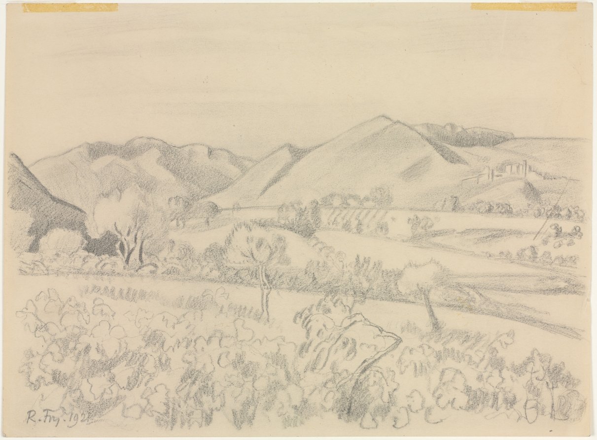
Start with the Cleveland drawing Landscape (1921, graphite). The scene is a broad valley with vines in the foreground, a few trees in the middle distance, and hills with a small hilltop village behind. Notice how the hills are reduced to big, simple wedges with a firm contour and a little hatching for shadow. The vines are not drawn leaf by leaf; they are a field of looping marks that read as texture. The sky is left almost empty.
That is the lesson Fry took from Cézanne: build the picture from a few large planes, then let smaller marks sit inside them. The composition here is also clearly banded, with a dense foreground, a lighter middle band and a quiet top third, so the eye moves up through the sheet in steps. The same three-band structure works for posters, hero banners and landing pages: a busy base, a calmer middle, and open space at the top for a headline.
Look, too, at the signature: “R. Fry. 1921” written small in the lower left corner, in the same graphite as the drawing. It is part of the image without competing with it, a good model for how a maker’s mark or logo can sit in a layout.
Measured from the museum’s scan of this sheet, the paper tones cluster around #decfb4, #d7c8af, #e4d6bb and #c0b49e. These are the colours of aged paper in the scan, not pigments Fry chose, but they make a soft, warm neutral set for backgrounds behind dark line work. Try them in the colour palette generator.
The Omega Workshops: pattern, colour and a shared mark
The Omega Workshops opened to the public at 33 Fitzroy Square, London, in July 1913, according to Studio International, and English Heritage’s blue plaque on the building records that Fry ran the Omega there from 1913 to 1919. Vanessa Bell and Duncan Grant were among the artists who worked with him, and Omega products were typically sold unsigned, identified by the Greek letter omega instead of an individual name.
The Art Institute of Chicago holds a good example of the Omega’s design thinking: Amenophis (1913), a dress or furnishing fabric in plain-weave linen, block printed. The museum records it as designed by Fry after one of his own paintings, produced by the Omega and printed by the Maromme Print Works in Rouen, France. In other words, a painting was translated into a repeat pattern and manufactured by a commercial printer, a direct line from studio experiment to product. The same museum also holds Original Woodcuts by Various Artists (1918), a book of fourteen black woodcuts published by the Omega, with contributions from Fry, Bell, Grant, Edward McKnight Kauffer and others.
Omega designs are generally described in terms of flat, bright colour, loose hand-drawn shapes and abstract or semi-abstract motifs that look painted rather than mechanically drawn. For more on cloth and repeat design, browse the museum textiles theme, and for Fry’s closest collaborators see our guides to Vanessa Bell and Duncan Grant.
A short Roger Fry career outline
Fry was born in London in 1866 and died there in 1934, the dates given by Britannica and by the Cleveland Museum of Art and Art Institute of Chicago catalogue records.
In 1906, according to the Met’s own Modern Art Index, he was hired as curator of European painting at The Metropolitan Museum of Art in New York; other accounts give slightly different start and end dates for the post. The Met still holds his watercolour Façade of Chartres Cathedral (1906, watercolour, pen and coloured ink over graphite).
In 1910 he organised the exhibition Manet and the Post-Impressionists at the Grafton Galleries in London, which brought Cézanne, Van Gogh, Gauguin and Matisse to a broad British audience and caused a stir in London. A second Post-Impressionist exhibition followed at the same galleries in 1912. The Omega Workshops ran from 1913 to 1919.
His essays were collected as Vision and Design in 1920, and he published Cézanne: A Study of His Development in 1927. In 1933 he was appointed Slade Professor of Fine Art at Cambridge, according to the Encyclopedia.com biography. He died the following year.
Technique in brief
Fry worked across oil painting, watercolour, drawing and design. The Met’s late paintings show the range: Gabrielle Soëne (1919) is oil on canvas, and The Mantelpiece (1919) is oil on paperboard mounted on wood, a modest still-life subject treated as an arrangement of blocks of colour. The Art Institute of Chicago’s Tall Trees in Landscape (1921) is charcoal on cream wove paper, made the same year as the Cleveland graphite drawing.
In the drawings, line does most of the work. Contours are firm but not stiff, shading is a light zigzag of hatching, and areas of pattern are suggested with repeated loops. In the Omega textiles, the painter’s hand is kept visible even after block printing, so shapes look brushed rather than ruled. Across both, Fry favoured clear overall structure, a limited number of large shapes, and colour or texture used to separate planes.
How to borrow Roger Fry’s ideas today
Block in the big shapes first. Before adding detail, reduce a layout or illustration to three or four large planes, as Fry does with the hills in Landscape. If the composition works as blocks, detail will only strengthen it.
Band the composition. Use a dense lower band, a lighter middle and open space at the top. It gives the eye a path and leaves room for type.
Turn a painting into a pattern. The Amenophis fabric started as a painting. Scan a loose sketch or brush study, simplify it, and test it as a repeat for packaging, wallpaper or a website background.
Use one mark for the whole studio. The Omega sold work under a shared symbol, not individual names. A single strong monogram applied to every product is still an efficient way to build a recognisable brand.
Keep the hand visible. Let some brush texture or uneven line survive into final artwork. It keeps flat colour from feeling cold.
Sign small. Place your mark the way Fry placed his: small, in a corner, in the same medium as the work. See more works for study in the museum collection.
Frequently asked questions
Who was Roger Fry?
Roger Fry (1866–1934) was an English painter, art critic and designer. He organised the 1910 exhibition Manet and the Post-Impressionists in London, coined the term Post-Impressionism, and ran the Omega Workshops from 1913 to 1919.
What were the Omega Workshops?
The Omega Workshops were a London design venture at 33 Fitzroy Square, run by Fry from 1913 to 1919, where artists including Vanessa Bell and Duncan Grant designed textiles, books and other household goods, usually sold unsigned under the omega mark.
What is Roger Fry’s book Vision and Design?
Vision and Design (1920) is a collection of Fry’s essays on art and design. It argues for close attention to form and structure in both art and everyday objects.
Can I use images of Roger Fry’s work?
The Cleveland Museum of Art releases its scan of Fry’s Landscape (1921) under CC0. Other museums do not flag their Fry objects as public domain, so check each museum’s own licence before reusing any image.