Triodos Bank Brand Guidelines
A Dutch values-based bank named after three roads.
Aa
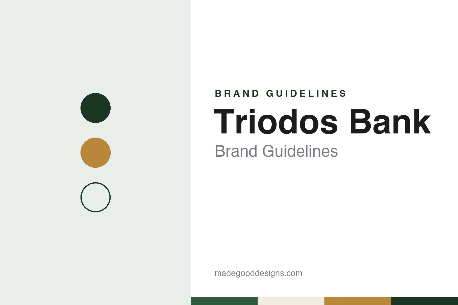
Two constants: a moss, ochre and oat palette and a warm editorial serif register. Abstract homage — not a Triodos Bank asset; no logo, card or app screen is reproduced.
Three roads
A study group, a foundation and a licence.
Triodos Bank grew out of a study group. Dutch Wikipedia says the banker Rudolf Mees started a group in 1968 to think about handling money sustainably, and that in 1971 he founded the Stichting Triodos with the organisational adviser Lex Bos, the economist Adriaan Deking Dura and the tax specialist Dieter Brüll, to support innovative projects and businesses. In 1980 the foundation set up Triodos Bank NV with a full banking licence from the Dutch central bank. English Wikipedia describes the bank as founded as an anthroposophical initiative.
The name is the brand’s first idea. Both English and Dutch Wikipedia derive it from the Greek tri, three, and hodos, road: a meeting of three roads, which the bank reads as people, planet and profit. The bank’s own website states its mission as making money “work for positive change” and says that since 1980 it has enabled people, organisations and businesses to use their money in ways that benefit people and the environment.
Expansion came country by country. According to Dutch Wikipedia, the first branch outside the Netherlands opened in Ghent in September 1993; in 1994 Triodos took over the British ethical bank Mercury Provident, and Triodos Bank UK followed in 1995. Triodos Investment Management was set up as a subsidiary in 1999 to manage sustainable investment funds. A Spanish branch opened in 2004, an international head office in Zeist in 2006, and the credit agency opened in Frankfurt in 2005 became a full German bank at the end of 2009. Today its website lists banking in Belgium, Germany, the Netherlands, Spain and the United Kingdom, and in June 2025 DutchNews reported that it had nearly 750,000 customers across five countries.
Colour
Positive screening and a public loan list.
What the bank lends to is the core of its identity. English Wikipedia says Triodos lends only to businesses and charities it judges to bring social or ecological benefit, a “positive screening” that goes beyond simply avoiding harmful companies, and lists borrowers such as fair-trade initiatives, organic farms, arts organisations, renewable-energy projects and social enterprises. At the 2025 listing, DutchNews reported, the bank’s chief executive said it does not invest in the arms trade, factory farming or fossil fuels.
The bank makes those loans visible. Its website has a section called Know where your money goes, which lets visitors search the businesses and charities it finances by sector, from arts and culture and organic farming to sustainable energy and social housing, and by place. English Wikipedia also lists The Colour of Money, a print and online magazine produced by the bank.
Triodos has also worked with other banks of the same kind. In March 2009, Dutch Wikipedia says, it founded the Global Alliance for Banking on Values with BRAC Bank of Bangladesh, Germany’s GLS Bank and the American ShoreBank. English Wikipedia notes that the Financial Times and the International Finance Corporation named it Sustainable Bank of the Year in 2009.
Its head office follows the same line. In 2019 Triodos Bank and Triodos Investment Management moved into a new head office on the De Reehorst estate beside Driebergen-Zeist station, designed by the architect Thomas Rau; Dutch Wikipedia says the building won the Gouden Kikker award for the most sustainable project in the Netherlands in 2020.
Typography
Benelux banking.
Banks in the Netherlands, Belgium and Luxembourg tend to present themselves with restraint. The usual starting point is a clear sans-serif wordmark, often paired with a simple symbol, set in one or two strong colours. Green, orange, red and blue recur across the region, and many of the names are short: initials, contractions of older merger names, or a single coined word that is easy to say in more than one language.
The messages behind those marks often go back to how the banks are owned and what they say they stand for. Cooperative banks put their members and local roots up front, savings banks and state-owned banks point to their public role, and a growing number of banks lead with sustainability, publishing impact reports alongside their annual reports. Several of today’s names were formed by mergers, and their identities have had to carry two or more histories at once.
Language shapes the design work too. Dutch, French and English often sit side by side, and in Luxembourg Luxembourgish and German join them, so type has to stay readable across longer words, accents and switching between languages on the same page. Photography is usually kept to a minimum, with plain layouts, generous white space and simple icons doing most of the work on websites and in apps.
The pages people visit most are practical ones: everyday banking, savings, mortgages, business accounts and the mobile app. Behind them sit the formal documents, from annual and impact reports to investor pages, where the same colours and type carry a more sober tone. For a designer, the region shows how a bank can stay recognisable through colour and a short name while keeping its interface quiet and functional.
Aa
A warm editorial serif for a bank that publishes its loans. (Specimen set in Fraunces, a serif STAND-IN; NOT the Triodos Bank logo.)
Triodos Bank
Depository receipts and a listing.
Ownership is where Triodos differs most from listed banks. Its shares are held by a foundation, the Stichting Administratiekantoor Aandelen Triodos Bank (SAAT), which issues depository receipts to individuals and institutions; holders receive dividends but have limited voting rights, no holder may own more than 10%, and votes per holder are capped. Wikipedia says the structure was chosen to guard against hostile takeovers. Since its founding the bank had run trading in the receipts itself, at a price based on its net asset value.
That system stopped in 2020. With more sellers than buyers, the bank suspended trading on 18 March 2020, resumed it with limits on 13 October 2020 and halted it again on 5 January 2021, according to English and Dutch Wikipedia. In December 2021 it decided to move trading to a multilateral trading facility; SAAT approved the move on 11 October 2022, with Captin BV running the platform, and trading reopened there on 5 July 2023. A foundation of receipt holders asked the Enterprise Chamber of the Amsterdam Court of Appeal to order an investigation on 10 October 2022, and in May 2025 Spain’s Supreme Court rejected claims by receipt holders, finding that the bank had informed them properly, Dutch Wikipedia says.
The bank then chose a public market. On 18 June 2025, DutchNews reported, its depository receipts began trading on Euronext Amsterdam under the symbol TRIO; the bank said the move was meant to improve access for new and existing investors, after offering receipt holders compensation in January 2025 for the fall in value since 2020.
For a design guide, Triodos Bank shows how a name with a meaning and a public list of loans can carry a bank’s message more than any slogan. Compare Rabobank, whose cash machines Triodos customers in the Netherlands use under a partnership, Dutch Wikipedia says, and ING, a Dutch bank on the same exchange. For this guide we use moss, ochre and oat with a serif, an unofficial interpretation; no product or logo is reproduced.
Explore & save
Keep Triodos Bank’s identity on hand — save it to a board in the Made Good inspiration library.
Triodos Bank identity set
Pin the Triodos Bank moss, ochre and oat palette and the warm editorial serif register to your own board.